Expander
The Expander control lets you show or hide less important content that's related to a piece of primary content that's always visible. Items contained in the Header are always visible. The user can expand and collapse the Content area, where secondary content is displayed, by interacting with the header. When the content area is expanded, it pushes other UI elements out of the way; it does not overlay other UI. The Expander can expand upwards or downwards.
Both the Header and Content areas can contain any content, from simple text to complex UI layouts. For example, you can use the control to show additional options for an item.
Is this the right control?
Use an Expander when some primary content should always be visible, but related secondary content may be hidden until needed. This UI is commonly used when display space is limited and when information or options can be grouped together. Hiding the secondary content until it's needed can also help to focus the user on the most important parts of your app.
UWP and WinUI 2
Important
The information and examples in this article are optimized for apps that use the Windows App SDK and WinUI 3, but are generally applicable to UWP apps that use WinUI 2. See the UWP API reference for platform specific information and examples.
This section contains information you need to use the control in a UWP or WinUI 2 app.
The Expander for UWP apps requires the Windows UI Library 2. For more info, including installation instructions, see Windows UI Library. APIs for this control exist in the Microsoft.UI.Xaml.Controls namespace.
- WinUI 2 Apis: Expander class, Header property, Content property
- Open the WinUI 2 Gallery app and see the Expander in action. The WinUI 2 Gallery app includes interactive examples of most WinUI 2 controls, features, and functionality. Get the app from the Microsoft Store or get the source code on GitHub.
To use the code in this article with WinUI 2, use an alias in XAML (we use muxc) to represent the Windows UI Library APIs that are included in your project. See Get Started with WinUI 2 for more info.
xmlns:muxc="using:Microsoft.UI.Xaml.Controls"

<muxc:Expander />
Create an Expander
- Important APIs: Expander class, Header property, Content property
The WinUI 3 Gallery app includes interactive examples of most WinUI 3 controls, features, and functionality. Get the app from the Microsoft Store or get the source code on GitHub
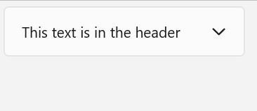
This example shows how to create a simple Expander with the default styling. The Header property defines the element that is always visible. The Content property defines the element that can be collapsed and expanded. This example creates an Expander that looks like the previous illustration.
<Expander Header="This text is in the header"
               Content="This is in the content"/>
Expander content
The Content property of an Expander can be any type of object, but is typically a string or UIElement. For more details about setting the Content property, see the Remarks section of the ContentControl class.
You can use complex, interactive UI as the content of the Expander, including nested Expander controls in the content of a parent Expander as shown here.
Content alignment
You can align content by setting the HorizontalContentAlignment and VerticalContentAlignment properties on the Expander control. When you set these properties, the alignment applies only to the expanded content, not the header.
Control the size of an Expander
By default, the Header and Content areas automatically size to fit their contents. It's important to use the correct techniques to control the size of the Expander to avoid undesirable appearance or behavior.
Width
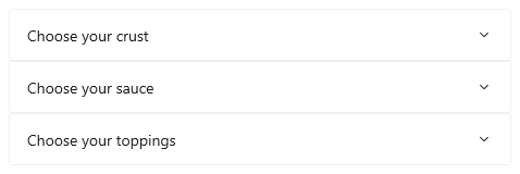
If the content is wider than the header, the header width increases to match the content area when expanded, and shrinks when the content area is collapsed. To prevent the control width from changing when expanded or collapsed, you can set an explicit width, or, if the control is the child of a Panel, set HorizontalAlignment to Stretch and let the layout panel control the sizing.
Here, a series of related Expander controls are placed in a StackPanel. The HorizontalAlignment of each Expander in the StackPanel is set to Stretch using a Style in the StackPanel Resources, and the width of the StackPanel determines the width of the Expander controls.
<StackPanel x:Name="ExpanderStack" MaxWidth="600">
    <StackPanel.Resources>
        <Style TargetType="Expander">
            <Setter Property="HorizontalAlignment" Value="Stretch"/>
            <Setter Property="HorizontalContentAlignment" Value="Stretch"/>
        </Style>
    </StackPanel.Resources>
    <Expander Header="Choose your crust"> ... </Expander>
    <Expander Header="Choose your sauce"> ... </Expander>
    <Expander Header="Choose your toppings"> ... </Expander>
 </StackPanel>
Height
Do not specify a Height on the Expander. If you do, the control will reserve that space even when the content area is collapsed, which defeats the purpose of the Expander. To specify the size of the expanded content area, set size dimensions on the content of the Expander. If you need to, you can constrain the Height of the content and make the content scrollable.
Scrollable content
If your content is too large for the size of the content area, you can wrap the content a ScrollViewer to make the content area scrollable. The Expander control does not automatically provide scrolling capability.
When you place a ScrollViewer in the Expander content, set the height on the ScrollViewer control to the required height for the content area. If you instead set the height dimension on the content inside the ScrollViewer, ScrollViewer doesn't recognize this setting and therefore does not provide scrollable content.
The following example shows how to create an Expander control that contains scrollable text as its content.
<Expander Header="Expander with scrollable content">
    <ScrollViewer MaxHeight="200">
        <Grid>
            <TextBlock TextWrapping="Wrap">
                Lorem ipsum dolor sit amet, consectetur adipisicing elit,
                sed do eiusmod tempor incididunt ut labore et dolore magna
                aliqua. Ut enim ad minim veniam, quis nostrud exercitation
                ullamco laboris nisi ut aliquip ex ea commodo consequat.
                Duis aute irure dolor in reprehenderit in voluptate velit
                esse cillum dolore eu fugiat nulla pariatur. Excepteur sint
                occaecat cupidatat non proident, sunt in culpa qui officia
                deserunt mollit anim id est laborum.
            </TextBlock>
        </Grid>
    </ScrollViewer>
</Expander>

Expanding and collapsing the content area
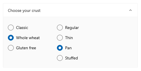
By default, the Expander is collapsed and expands downwards.
- Set the IsExpanded property to
trueto have the content area initially expanded. - Set the ExpandDirection property to Up to make the content expand upward.
<Expander IsExpanded="True" ExpandDirection="Up">
An Expander is expanded or collapsed either programatically by setting the IsExpanded property, or by interacting with the Header; it cannot be light-dismissed.
Tip
Transient UI, such as a Flyout or the open drop-down of a ComboBox, closes when you click or tap outside of it. This is called light-dismiss. The content area of an Expander is not considered transient and does not overlay other UI, so it does not support light-dismiss.
You can also handle the Expanding and Collapsed events to take an action when the content is shown or hidden. Here are some examples of these events.
Expanding event
In this example, you have a group of expanders and want to have only one open at a time. When the user opens an Expander, you handle the Expanding event and collapse all Expander controls in the group other than the one the user clicked.
Caution
Depending on your app and user experience, it might be a convenience to automatically collapse Expander controls when the user expands a different one. However, this also takes control away from the user. If the behavior might be useful, consider making it an option that the user can easily set.
<StackPanel x:Name="ExpanderStack">
    <Expander Header="Choose your crust"
                   Expanding="Expander_Expanding"> ... </Expander>
    <Expander Header="Choose your sauce"
                   Expanding="Expander_Expanding"> ... </Expander>
    <Expander Header="Choose your toppings"
                   Expanding="Expander_Expanding"> ... </Expander>
 </StackPanel>
// Let the user opt out of custom behavior.
private bool _autoCollapse = true;

private void Expander_Expanding(muxc.Expander sender,
                                muxc.ExpanderExpandingEventArgs args)
{
    if (_autoCollapse == true)
    {
        foreach (muxc.Expander ex in ExpanderStack.Children)
        {
            if (ex != sender && ex.IsExpanded)
                ex.IsExpanded = false;
        }
    }
}
Collapsed event
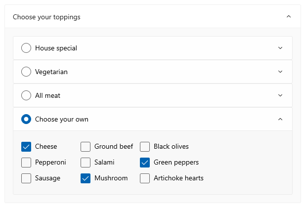
In this example, you handle the Collapsed event and populate the Header with a summary of options that are selected in the Content.
This image shows the Expander with the content expanded and options selected.
When collapsed, the selected options are summarized in the header so that the user can still see them without opening the Expander.

<Expander IsExpanded="True"
        Expanding="Expander_Expanding"
        Collapsed="Expander_Collapsed">
    <Expander.Header>
        <Grid>
            <TextBlock Text="Choose your crust"/>
            <TextBlock x:Name="tbCrustSelections"
                       HorizontalAlignment="Right"
                       Style="{StaticResource CaptionTextBlockStyle}"/>
        </Grid>
    </Expander.Header>
    <StackPanel Orientation="Horizontal">
        <RadioButtons x:Name="rbCrustType" SelectedIndex="0">
            <x:String>Classic</x:String>
            <x:String>Whole wheat</x:String>
            <x:String>Gluten free</x:String>
        </RadioButtons>
        <RadioButtons x:Name="rbCrustStyle" SelectedIndex="0"
                           Margin="48,0,0,0">
            <x:String>Regular</x:String>
            <x:String>Thin</x:String>
            <x:String>Pan</x:String>
            <x:String>Stuffed</x:String>
        </RadioButtons>
    </StackPanel>
</Expander>
private void Expander_Collapsed(muxc.Expander sender,
                                muxc.ExpanderCollapsedEventArgs args)
{
    // Update the header with options selected in the content.
    tbCrustSelections.Text = rbCrustType.SelectedItem.ToString() +
        ", " + rbCrustStyle.SelectedItem.ToString();
}
Lightweight styling
You can modify the default Style and ControlTemplate to give the control a unique appearance. See the Control Style and Template section of the Expander API docs for a list of the available theme resources. For more info, see the Light-weight styling section of the Styling controls article.
Recommendations
- Use an
Expanderwhen display space is limited and some secondary content may be hidden until the user requests it.
Code examples
This XAML creates the group of Expander controls shown in other parts of this article. The code for the Expanding and Collapsed event handlers is also shown in previous sections.
<StackPanel x:Name="ExpanderStack" MaxWidth="600">
    <StackPanel.Resources>
        <Style TargetType="Expander">
            <Setter Property="HorizontalAlignment" Value="Stretch"/>
            <Setter Property="HorizontalContentAlignment" Value="Stretch"/>
        </Style>
    </StackPanel.Resources>
    <Expander IsExpanded="True"
                   Expanding="Expander_Expanding"
                   Collapsed="Expander_Collapsed">
        <Expander.Header>
            <Grid>
                <TextBlock Text="Choose your crust"/>
                <TextBlock x:Name="tbCrustSelections"
                           HorizontalAlignment="Right"
        Style="{StaticResource CaptionTextBlockStyle}"/>
            </Grid>
        </Expander.Header>
        <StackPanel Orientation="Horizontal">
            <RadioButtons x:Name="rbCrustType" SelectedIndex="0">
                <x:String>Classic</x:String>
                <x:String>Whole wheat</x:String>
                <x:String>Gluten free</x:String>
            </RadioButtons>
            <RadioButtons x:Name="rbCrustStyle" SelectedIndex="0"
                   Margin="48,0,0,0">
                <x:String>Regular</x:String>
                <x:String>Thin</x:String>
                <x:String>Pan</x:String>
                <x:String>Stuffed</x:String>
            </RadioButtons>
        </StackPanel>
    </Expander>

    <Expander Header="Choose your sauce" Margin="24"
            Expanding="Expander_Expanding">
        <RadioButtons SelectedIndex="0" MaxColumns="2">
            <x:String>Classic red</x:String>
            <x:String>Garlic</x:String>
            <x:String>Pesto</x:String>
            <x:String>Barbecue</x:String>
        </RadioButtons>
    </Expander>

    <Expander Header="Choose your toppings"
                   Expanding="Expander_Expanding">
        <StackPanel>
            <Expander>
                <Expander.Header>
                    <RadioButton GroupName="Toppings" Content="House special"/>
                </Expander.Header>
                <TextBlock Text="Cheese, pepperoni, sausage, black olives, mushrooms"
                           TextWrapping="WrapWholeWords"/>
            </Expander>
            <Expander>
                <Expander.Header>
                    <RadioButton GroupName="Toppings" Content="Vegetarian"/>
                </Expander.Header>
                <TextBlock Text="Cheese, mushrooms, black olives, green peppers, artichoke hearts"
                           TextWrapping="WrapWholeWords"/>
            </Expander>
            <Expander>
                <Expander.Header>
                    <RadioButton GroupName="Toppings" Content="All meat"/>
                </Expander.Header>
                <TextBlock Text="Cheese, pepperoni, sausage, ground beef, salami"
                           TextWrapping="WrapWholeWords"/>
            </Expander>
            <Expander>
                <Expander.Header>
                    <RadioButton GroupName="Toppings" Content="Choose your own"/>
                </Expander.Header>
                <StackPanel Orientation="Horizontal">
                    <StackPanel>
                        <CheckBox Content="Cheese"/>
                        <CheckBox Content="Pepperoni"/>
                        <CheckBox Content="Sausage"/>
                    </StackPanel>
                    <StackPanel>
                        <CheckBox Content="Ground beef"/>
                        <CheckBox Content="Salami"/>
                        <CheckBox Content="Mushroom"/>
                    </StackPanel>
                    <StackPanel>
                        <CheckBox Content="Black olives"/>
                        <CheckBox Content="Green peppers"/>
                        <CheckBox Content="Artichoke hearts"/>
                    </StackPanel>
                </StackPanel>
            </Expander>
        </StackPanel>
    </Expander>
</StackPanel>
Related articles

Windows developer
Feedback
Coming soon: Throughout 2024 we will be phasing out GitHub Issues as the feedback mechanism for content and replacing it with a new feedback system. For more information see: https://aka.ms/ContentUserFeedback.
Submit and view feedback for