InRibbonGallery element
Represents the In-Ribbon Gallery, a gallery-based control that exposes a default subset of items directly in the Ribbon. Any remaining items are displayed when a drop-down menu button is clicked.
Usage
<InRibbonGallery
  CommandName = "xs:positiveInteger or xs:string"
  HasLargeItems = "Boolean"
  ItemHeight = "xs:integer"
  ItemWidth = "xs:integer"
  MinColumnsLarge = "xs:integer"
  MaxColumnsMedium = "xs:integer"
  MinColumnsMedium = "xs:integer"
  MaxColumns = "xs:integer"
  MaxRows = "xs:integer"
  TextPosition = "TextPositionType"
  Type = "xs:string">
  child elements
</InRibbonGallery>
Attributes
| Attribute | Type | Required | Description |
|---|---|---|---|
| CommandName |
xs:positiveInteger or xs:string |
No |
Associates the element with a Command. The value must be unique within the Ribbon XML document. Maximum length: 100 characters. |
| HasLargeItems |
Boolean |
No |
Determines whether the large or small image resource of the Command is displayed in the gallery control. Note:
|
| ItemHeight |
xs:integer |
No |
Together with ItemWidth, determines the size of the item image that is displayed in the gallery control. Note:
|
| ItemWidth |
xs:integer |
No |
Together with ItemHeight, determines the size of the item image that is displayed in the gallery control. Note:
|
| MaxColumns |
xs:integer |
No |
Specifies the maximum number of columns that the InRibbonGallery displays, for example, in the Large group layout drop-down. |
| MaxColumnsMedium |
xs:integer |
No |
Specifies the maximum number of columns that the InRibbonGallery displays in the Medium group layout, before switching to Large layout. |
| MaxRows |
xs:integer |
No |
Specifies the maximum number of rows for the layout of InRibbonGallery items. |
| MinColumnsLarge |
xs:integer |
No |
Specifies the minimum number of columns that the InRibbonGallery displays in the Large group layout, before switching to Medium. |
| MinColumnsMedium |
xs:integer |
No |
Specifies the minimum number of columns that the InRibbonGallery displays in the Medium group layout, before switching to Small. |
| TextPosition |
TextPositionType |
No |
Specifies where the item label is displayed, relative to the image. Restricted to one of the following values: |
| Type |
xs:string |
No |
Restricted to one of the following values: |
Child elements
| Element | Description |
|---|---|
| CheckBox |
May occur one or more times |
| InRibbonGallery.MenuGroups |
Must occur exactly once |
| InRibbonGallery.MenuLayout |
May occur at most once |
| Button |
May occur one or more times |
| SplitButton |
May occur one or more times |
| ToggleButton |
May occur one or more times |
Parent elements
| Element | Description |
|---|---|
| ControlGroup |
|
| Group |
|
| QuickAccessToolbar.ApplicationDefaults |
Note: Windows 8 and newer.
|
Remarks
Optional.
May occur at most once for each ControlGroup or Group element.
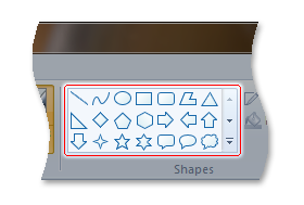
The following screen shot illustrates the Ribbon In-Ribbon Gallery control in Microsoft Paint for Windows 7.
Examples
The following example demonstrates the basic markup for an In-Ribbon Gallery.
This section of code shows the InRibbonGallery Command declarations, with an associated Group that acts as the parent container for the InRibbonGallery element.
<!-- InRibbonGallery -->
<Command Name="cmdInRibbonGalleryGroup"
         Symbol="cmdInRibbonGalleryGroup"
         Comment="InRibbonGallery Group"
         LabelTitle="InRibbonGallery"/>
<Command Name="cmdInRibbonGallery"
         Symbol="cmdInRibbonGallery"
         Comment="InRibbonGallery"
         LabelTitle="InRibbonGallery"/>
This section of code shows the InRibbonGallery control declarations.
<!-- InRibbonGallery -->
<Group CommandName="cmdInRibbonGalleryGroup" SizeDefinition="OneInRibbonGallery">
  <InRibbonGallery CommandName="cmdInRibbonGallery"
                   MaxColumns="10"
                   MaxColumnsMedium="5"
                   MinColumnsLarge="5"
                   MinColumnsMedium="3"
                   Type="Items">
    <InRibbonGallery.MenuLayout>
      <VerticalMenuLayout Rows="2"
                          Gripper="Vertical"/>
    </InRibbonGallery.MenuLayout>
    <InRibbonGallery.MenuGroups>
      <MenuGroup>
        <Button CommandName="cmdButton1"></Button>
        <Button CommandName="cmdButton2"></Button>
      </MenuGroup>
      <MenuGroup>
        <Button CommandName="cmdButton3"></Button>
      </MenuGroup>
    </InRibbonGallery.MenuGroups>
  </InRibbonGallery>
</Group>
Element information
- Minimum supported system: Windows 7
- Can be empty: No
See also
Feedback
Coming soon: Throughout 2024 we will be phasing out GitHub Issues as the feedback mechanism for content and replacing it with a new feedback system. For more information see: https://aka.ms/ContentUserFeedback.
Submit and view feedback for