MenuFlyout Class
Definition
Important
Some information relates to prerelease product that may be substantially modified before it’s released. Microsoft makes no warranties, express or implied, with respect to the information provided here.
Represents a flyout that displays a menu of commands.
/// [Microsoft.UI.Xaml.Markup.ContentProperty(Name="Items")]
/// [Windows.Foundation.Metadata.ContractVersion(Microsoft.UI.Xaml.WinUIContract, 65536)]
/// [Windows.Foundation.Metadata.MarshalingBehavior(Windows.Foundation.Metadata.MarshalingType.Agile)]
/// [Windows.Foundation.Metadata.Threading(Windows.Foundation.Metadata.ThreadingModel.Both)]
class MenuFlyout : FlyoutBase
[Microsoft.UI.Xaml.Markup.ContentProperty(Name="Items")]
[Windows.Foundation.Metadata.ContractVersion(typeof(Microsoft.UI.Xaml.WinUIContract), 65536)]
[Windows.Foundation.Metadata.MarshalingBehavior(Windows.Foundation.Metadata.MarshalingType.Agile)]
[Windows.Foundation.Metadata.Threading(Windows.Foundation.Metadata.ThreadingModel.Both)]
public class MenuFlyout : FlyoutBasePublic Class MenuFlyout
Inherits FlyoutBase<MenuFlyout>
oneOrMoreItems
</MenuFlyout>
- Inheritance
- Derived
- Attributes
Examples
Tip
For more info, design guidance, and code examples, see Menus and context menus.
The WinUI 3 Gallery app includes interactive examples of most WinUI 3 controls, features, and functionality. Get the app from the Microsoft Store or get the source code on GitHub.
This example creates a MenuFlyout class and uses the ContextFlyout property, a property available to most controls, to show the MenuFlyout class as a context menu.
<Rectangle Height="100" Width="100">
  <Rectangle.ContextFlyout>
    <MenuFlyout>
      <MenuFlyoutItem Text="Change color" Click="ChangeColorItem_Click" />
    </MenuFlyout>
  </Rectangle.ContextFlyout>
  <Rectangle.Fill>
    <SolidColorBrush x:Name="rectangleFill" Color="Red" />
  </Rectangle.Fill>
</Rectangle>
private void ChangeColorItem_Click(object sender, RoutedEventArgs e)
{
    // Change the color from red to blue or blue to red.
    if (rectangleFill.Color == Windows.UI.Colors.Red)
    {
        rectangleFill.Color = Windows.UI.Colors.Blue;
    }
    else
    {
        rectangleFill.Color = Windows.UI.Colors.Red;
    }
}
The next example is nearly identical, but instead of using the ContextFlyout property to show the MenuFlyout class as a context menu, the example uses the FlyoutBase.ShowAttachedFlyout property to show it as a menu.
<Rectangle
  Height="100" Width="100"
  Tapped="Rectangle_Tapped">
  <FlyoutBase.AttachedFlyout>
    <MenuFlyout>
      <MenuFlyoutItem Text="Change color" Click="ChangeColorItem_Click" />
    </MenuFlyout>
  </FlyoutBase.AttachedFlyout>
  <Rectangle.Fill>
    <SolidColorBrush x:Name="rectangleFill" Color="Red" />
  </Rectangle.Fill>
</Rectangle>
private void Rectangle_Tapped(object sender, TappedRoutedEventArgs e)
{
    FlyoutBase.ShowAttachedFlyout((FrameworkElement)sender);
}

private void ChangeColorItem_Click(object sender, RoutedEventArgs e)
{
    // Change the color from red to blue or blue to red.
    if (rectangleFill.Color == Windows.UI.Colors.Red)
    {
        rectangleFill.Color = Windows.UI.Colors.Blue;
    }
    else
    {
        rectangleFill.Color = Windows.UI.Colors.Red;
    }
}
This example shows how you can add and remove menu items at runtime based on changing conditions in your app.
<StackPanel Margin="40" Width="220">
    <Rectangle x:Name="Rect1" Height="100" Width="200"
               Stroke="Black" StrokeThickness="1" Fill="White">
        <Rectangle.ContextFlyout>
            <MenuFlyout x:Name="RectangleColorMenu"/>
        </Rectangle.ContextFlyout>
    </Rectangle>

    <StackPanel>
        <TextBlock TextWrapping="WrapWholeWords"
                   Text="Check colors to include in the menu, then choose a color from the context menu on the rectangle."/>
        <CheckBox Content="Blue" Click="CheckBox_Click" Tag="blue"/>
        <CheckBox Content="Green" Click="CheckBox_Click" Tag="green"/>
        <CheckBox Content="Red" Click="CheckBox_Click" Tag="red"/>
        <CheckBox Content="Yellow" Click="CheckBox_Click" Tag="yellow"/>
    </StackPanel>
</StackPanel>
private void CheckBox_Click(object sender, RoutedEventArgs e)
{
    // Using the Tag property lets you localize the display name
    // without affecting functionality.
    var cb = (CheckBox)sender;
    if (cb.IsChecked == true)
    {
        AddMenuItem(cb.Tag.ToString(), cb.Content.ToString());
    }
    else
    {
        RemoveMenuItem(cb.Content.ToString());
    }
}

private void AddMenuItem(string colorString, string locColorName)
{
    // Set the color.
    Color newColor = Colors.Blue;
    if (colorString == "green")
        newColor = Colors.Green;
    else if (colorString == "red")
        newColor = Colors.Red;
    else if (colorString == "yellow")
        newColor = Colors.Yellow;

    // Create the menu item.
    var newMenuItem = new MenuFlyoutItem();
    newMenuItem.Text = locColorName;
    newMenuItem.Click += (s, e1) =>
    {
        Rect1.Fill = new SolidColorBrush(newColor);
    };

    // Add the item to the menu.
    RectangleColorMenu.Items.Add(newMenuItem);

    // Sort the menu so it's always consistent.
    var orderedItems =  RectangleColorMenu.Items.OrderBy(i => ((MenuFlyoutItem)i).Text).ToList();
    RectangleColorMenu.Items.Clear();
    foreach (var item in orderedItems)
    {
        RectangleColorMenu.Items.Add(item);
    }
}

private void RemoveMenuItem(string locColorName)
{
    // Get any menu items to remove and remove them.
    var items = RectangleColorMenu.Items.Where(i => ((MenuFlyoutItem)i).Text == locColorName);
    foreach (MenuFlyoutItem item in items)
    {
        RectangleColorMenu.Items.Remove(item);
    }
}
Remarks
Tip
For more info, design guidance, and code examples, see Menus and context menus.
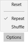
MenuFlyout temporarily displays a list of commands or options related to what the user is currently doing.
Use a Flyout control to display single items and a MenuFlyout control to show a menu of items. For more info, see Menus and context menus.
A MenuFlyout control can be used as the value of the Button.Flyout property. This is usually set in XAML as part of a UI definition of the page. Button is the only control that has a dedicated Flyout property. When set as Button.Flyout, the MenuFlyout displays when the button is tapped or otherwise invoked.
To associate a MenuFlyout with other controls as a content menu, use the ContextFlyout property that's available on any UIElement.
You can use the FlyoutBase.AttachedFlyout attached property to associate a MenuFlyout with other controls as a regular menu. When a MenuFlyout is assigned to other UI elements using FlyoutBase.AttachedFlyout, you must call either the ShowAt method or the static ShowAttachedFlyout method to display the flyout.
Control style and template
You can modify the default Style and ControlTemplate to give the control a unique appearance. For information about modifying a control's style and template, see XAML styles. The default style, template, and resources that define the look of the control are included in the generic.xaml file. For design purposes, generic.xaml is installed with the Windows App SDK NuGet package. By default, this location is \Users\<username>\.nuget\packages\microsoft.windowsappsdk\<version>\lib\uap10.0\Microsoft.UI\Themes\generic.xaml. Styles and resources from different versions of the SDK might have different values.
XAML also includes resources that you can use to modify the colors of a control in different visual states without modifying the control template. Modifying these resources is preferred to setting properties such as Background and Foreground. For more info, see the Light-weight styling section of the XAML styles article.
Constructors
| MenuFlyout() |
Initializes a new instance of the MenuFlyout class. |
Properties
| AllowFocusOnInteraction |
Gets or sets a value that indicates whether the element automatically gets focus when the user interacts with it. (Inherited from FlyoutBase) |
| AllowFocusWhenDisabled |
Gets or sets a value that specifies whether the control can receive focus when it's disabled. (Inherited from FlyoutBase) |
| AreOpenCloseAnimationsEnabled |
Gets or sets a value that indicates whether animations are played when the flyout is opened or closed. (Inherited from FlyoutBase) |
| Dispatcher |
Always returns |
| DispatcherQueue |
Gets the |
| ElementSoundMode |
Gets or sets a value that specifies the control's preference for whether it plays sounds. (Inherited from FlyoutBase) |
| InputDevicePrefersPrimaryCommands |
Gets a value that indicates whether the input device used to open the flyout does not easily open the secondary commands. (Inherited from FlyoutBase) |
| IsConstrainedToRootBounds |
Gets a value that indicates whether the flyout is shown within the bounds of the XAML root. This property is always true for Windows App SDK apps. (Inherited from FlyoutBase) |
| IsOpen |
Gets a value that indicates whether the flyout is open. (Inherited from FlyoutBase) |
| Items |
Gets the collection used to generate the content of the menu. |
| LightDismissOverlayMode |
Gets or sets a value that specifies whether the area outside of a light-dismiss UI is darkened. (Inherited from FlyoutBase) |
| MenuFlyoutPresenterStyle |
Gets or sets the style that is used when rendering the MenuFlyout. |
| MenuFlyoutPresenterStyleProperty |
Identifies the MenuFlyoutPresenterStyle dependency property. |
| OverlayInputPassThroughElement |
Gets or sets an element that should receive pointer input events even when underneath the flyout's overlay. (Inherited from FlyoutBase) |
| Placement |
Gets or sets the default placement to be used for the flyout, in relation to its placement target. (Inherited from FlyoutBase) |
| ShouldConstrainToRootBounds |
Gets or sets a value that indicates whether the flyout should be shown within the bounds of the XAML root. (Inherited from FlyoutBase) |
| ShowMode |
Gets or sets a value that indicates how a flyout behaves when shown. (Inherited from FlyoutBase) |
| SystemBackdrop |
Gets or sets the system backdrop to apply to this flyout. The backdrop is rendered behind the flyout content. (Inherited from FlyoutBase) |
| Target |
Gets the element to use as the flyout's placement target. (Inherited from FlyoutBase) |
| XamlRoot |
Gets or sets the XamlRoot in which this flyout is being viewed. (Inherited from FlyoutBase) |
Methods
| ClearValue(DependencyProperty) |
Clears the local value of a dependency property. (Inherited from DependencyObject) |
| CreatePresenter() |
When overridden in a derived class, initializes a control to show the flyout content as appropriate for the derived control. Note: This method has no base class implementation and must be overridden in a derived class. (Inherited from FlyoutBase) |
| GetAnimationBaseValue(DependencyProperty) |
Returns any base value established for a dependency property, which would apply in cases where an animation is not active. (Inherited from DependencyObject) |
| GetValue(DependencyProperty) |
Returns the current effective value of a dependency property from a DependencyObject. (Inherited from DependencyObject) |
| Hide() |
Closes the flyout. (Inherited from FlyoutBase) |
| OnProcessKeyboardAccelerators(ProcessKeyboardAcceleratorEventArgs) |
Called just before a keyboard shortcut (accelerator) is processed in your app. Invoked whenever application code or internal processes call ProcessKeyboardAccelerators. Override this method to influence the default accelerator handling. (Inherited from FlyoutBase) |
| ReadLocalValue(DependencyProperty) |
Returns the local value of a dependency property, if a local value is set. (Inherited from DependencyObject) |
| RegisterPropertyChangedCallback(DependencyProperty, DependencyPropertyChangedCallback) |
Registers a notification function for listening to changes to a specific DependencyProperty on this DependencyObject instance. (Inherited from DependencyObject) |
| SetValue(DependencyProperty, Object) |
Sets the local value of a dependency property on a DependencyObject. (Inherited from DependencyObject) |
| ShowAt(DependencyObject, FlyoutShowOptions) |
Shows the flyout placed in relation to the specified element using the specified options. (Inherited from FlyoutBase) |
| ShowAt(FrameworkElement) |
Shows the flyout placed in relation to the specified element. (Inherited from FlyoutBase) |
| ShowAt(UIElement, Point) |
Shows the flyout placed at the specified offset in relation to the specified target element. |
| TryInvokeKeyboardAccelerator(ProcessKeyboardAcceleratorEventArgs) |
Attempts to invoke a keyboard shortcut (accelerator). (Inherited from FlyoutBase) |
| UnregisterPropertyChangedCallback(DependencyProperty, Int64) |
Cancels a change notification that was previously registered by calling RegisterPropertyChangedCallback. (Inherited from DependencyObject) |
Events
| Closed |
Occurs when the flyout is hidden. (Inherited from FlyoutBase) |
| Closing |
Occurs when the flyout starts to be hidden. (Inherited from FlyoutBase) |
| Opened |
Occurs when the flyout is shown. (Inherited from FlyoutBase) |
| Opening |
Occurs before the flyout is shown. (Inherited from FlyoutBase) |
Applies to
See also
Feedback
Coming soon: Throughout 2024 we will be phasing out GitHub Issues as the feedback mechanism for content and replacing it with a new feedback system. For more information see: https://aka.ms/ContentUserFeedback.
Submit and view feedback for