Item templates for grid view
This section contains item templates that you can use with a GridView control. Use these templates to get the look of common app types.
To demonstrate data binding, these templates bind GridViewItems to the example Recording class from the data binding overview.
Note
Currently, when a DataTemplate contains multiple controls (for example, more than a single TextBlock), the default accessible name for screenreaders comes from .ToString() on the item. As a convenience you can instead set the AutomationProperties.Name on the root element of the DataTemplate. For more on accessibility, see Accessibililty overview.
Icon and text
Use these templates to display a collection of apps in a grid with an icon and text.

<GridView ItemsSource="{x:Bind ViewModel.Recordings}">
    <GridView.ItemTemplate>
        <DataTemplate x:Name="IconTextTemplate" x:DataType="local:Recording">
            <StackPanel Width="264" Height="48" Padding="12" Orientation="Horizontal" AutomationProperties.Name="{x:Bind CompositionName}">
                <SymbolIcon Symbol="Audio" VerticalAlignment="Top"/>
                <TextBlock Margin="12,0,0,0" Width="204" Text="{x:Bind CompositionName}"/>
            </StackPanel>
        </DataTemplate>
    </GridView.ItemTemplate>
    <GridView.ItemsPanel>
        <ItemsPanelTemplate>
            <ItemsWrapGrid MaximumRowsOrColumns="4" Orientation="Horizontal" HorizontalAlignment="Center"/>
        </ItemsPanelTemplate>
    </GridView.ItemsPanel>
</GridView>

<GridView ItemsSource="{x:Bind ViewModel.Recordings}">
<GridView.ItemTemplate>
<DataTemplate x:Name="IconTextTemplate2" x:DataType="local:Recording">
<StackPanel Width="264" Height="120" Padding="12" Orientation="Horizontal" AutomationProperties.Name="{x:Bind CompositionName}">
<FontIcon Margin="0,6,0,0" FontSize="48" FontFamily="Segoe MDL2 Assets" FontWeight="Bold" Glyph="" VerticalAlignment="Top"/>
<StackPanel Margin="16,1,0,0">
<TextBlock Width="176" Margin="0,0,0,2" TextWrapping="WrapWholeWords" TextTrimming="Clip" Text="{x:Bind CompositionName}"/>
<TextBlock Width="176" Height="48" Style="{ThemeResource CaptionTextBlockStyle}" Foreground="{ThemeResource SystemControlPageTextBaseMediumBrush}" TextWrapping="WrapWholeWords" TextTrimming="Clip" Text="{x:Bind ArtistName}" />
</StackPanel>
</StackPanel>
</DataTemplate>
</GridView.ItemTemplate>
<GridView.ItemsPanel>
<ItemsPanelTemplate>
<ItemsWrapGrid MaximumRowsOrColumns="4" Orientation="Horizontal" HorizontalAlignment="Center" Margin="40,0"/>
</ItemsPanelTemplate>
</GridView.ItemsPanel>
</GridView>
Image gallery
Use this template to display a collection of images in a grid with multi-select mode.
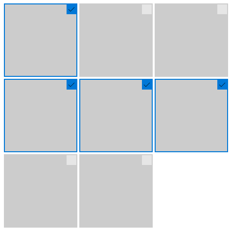
<GridView SelectionMode="Multiple">
    <GridView.ItemTemplate>
        <DataTemplate x:Name="ImageGalleryDataTemplate">
            <Image Source="Placeholder.png" Height="180" Width="180" Stretch="UniformToFill"/>
        </DataTemplate>
    </GridView.ItemTemplate>
    <GridView.ItemsPanel>
        <ItemsPanelTemplate>
            <ItemsWrapGrid MaximumRowsOrColumns="3" Orientation="Horizontal"/>
        </ItemsPanelTemplate>
    </GridView.ItemsPanel>
</GridView>
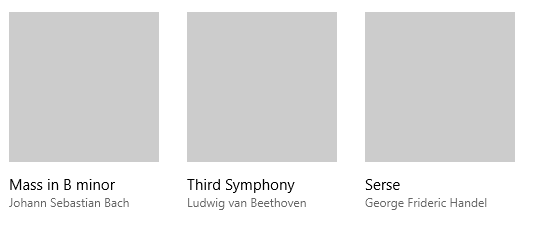
Image and text
Use these templates to display a media collection with text underneath.
<GridView ItemsSource="{x:Bind ViewModel.Recordings}">
    <GridView.ItemTemplate>
        <DataTemplate x:Name="ImageTextDataTemplate" x:DataType="local:Recording">
            <StackPanel Height="280" Width="180" Margin="12" AutomationProperties.Name="{x:Bind CompositionName}">
                <Image Source="Placeholder.png" Height="180" Width="180" Stretch="UniformToFill"/>
                <StackPanel Margin="0,12">
                    <TextBlock Text="{x:Bind CompositionName}"/>
                    <TextBlock Text="{x:Bind ArtistName}" Style="{ThemeResource CaptionTextBlockStyle}" Foreground="{ThemeResource SystemControlPageTextBaseMediumBrush}"/>
                </StackPanel>
            </StackPanel>
        </DataTemplate>
    </GridView.ItemTemplate>
    <GridView.ItemsPanel>
        <ItemsPanelTemplate>
            <ItemsWrapGrid MaximumRowsOrColumns="10" Orientation="Horizontal"/>
        </ItemsPanelTemplate>
    </GridView.ItemsPanel>
</GridView>

<GridView ItemsSource="{x:Bind ViewModel.Recordings}">
    <GridView.ItemTemplate>
        <DataTemplate x:Name="ImageTextDataTemplate2" x:DataType="local:Recording">
            <StackPanel Height="280" Width="320" Margin="12" AutomationProperties.Name="{x:Bind CompositionName}">
                <Image Source="Placeholder.png" Height="180" Width="320" Stretch="UniformToFill"/>
                <StackPanel Margin="0,12">
                    <TextBlock Text="{x:Bind CompositionName}"/>
                    <TextBlock Text="{x:Bind ArtistName}" Style="{ThemeResource CaptionTextBlockStyle}" Foreground="{ThemeResource SystemControlPageTextBaseMediumBrush}"/>
                </StackPanel>
            </StackPanel>
        </DataTemplate>
    </GridView.ItemTemplate>
    <GridView.ItemsPanel>
        <ItemsPanelTemplate>
            <ItemsWrapGrid MaximumRowsOrColumns="4" Orientation="Horizontal"/>
        </ItemsPanelTemplate>
    </GridView.ItemsPanel>
</GridView>
Image with text overlay
Use this template to display a media collection with text overlay.

<GridView ItemsSource="{x:Bind ViewModel.Recordings}">
    <GridView.ItemTemplate>
        <DataTemplate x:Name="ImageOverlayDataTemplate" x:DataType="local:Recording">
            <Grid Height="180" Width="320" AutomationProperties.Name="{x:Bind CompositionName}">
                <Image Source="Placeholder.png" Stretch="UniformToFill"/>
                <StackPanel Orientation="Vertical" Height="60" VerticalAlignment="Bottom" Background="{ThemeResource SystemBaseLowColor}" Padding="12">
                    <TextBlock Text="{x:Bind CompositionName}"/>
                    <TextBlock Text="{x:Bind ArtistName}" Style="{ThemeResource CaptionTextBlockStyle}" Foreground="{ThemeResource SystemControlPageTextBaseMediumBrush}"/>
                </StackPanel>
            </Grid>
        </DataTemplate>
    </GridView.ItemTemplate>
    <GridView.ItemsPanel>
        <ItemsPanelTemplate>
            <ItemsWrapGrid MaximumRowsOrColumns="4" Orientation="Horizontal"/>
        </ItemsPanelTemplate>
    </GridView.ItemsPanel>
</GridView>
Related articles

Windows developer
Palaute
Tulossa pian: vuoden 2024 aikana poistamme GitHub Issues -palvelun vaiheittain sisällön palautemekanismina ja korvaamme sen uudella palautejärjestelmällä. Saat lisätietoja täältä: https://aka.ms/ContentUserFeedback.
Lähetä ja näytä palaute kohteelle