PartDesign type
Important
The finance and operations (Dynamics 365) mobile app and platform have been deprecated. For more information, see Removed or deprecated platform features.
Part design object type.
Hierarchy
ContainerControlDesign
└─ PartDesign
Index
Properties
- alignItems
- alignSelf
- allowScroll
- background
- bindings
- border
- color
- design
- flexFlow
- flexSize
- fontSize
- fontWeight
- itemBorder
- items
- justifyItems
- label
- labelPosition
- name
- padding
- target
- type
Properties
alignItems
alignItems: string (optional)
This property is an alias for the CSS property "align-items". Please refer to this web page for documentation on the "align-items" property.
Inherited from Design.alignItems
alignSelf
alignSelf: string (optional)
allowScroll
allowScroll: string (optional)
True if the container will allow scrolling when its items do not fit into the container's available space. If a container has an item which may scroll, then set this property to false to prevent nested scrolling areas.
Inherited from ContainerControlDesign.allowScroll
background
background: string (optional)
The background color of the container.
Consider modifying the color attribute in the same container so that fonts overlaying the background color will appear appropriately.
Note: if background is set to "theme", the theme color of the app will be used.
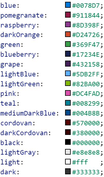
The following colors are available:
Inherited from ContainerControlDesign.background
bindings
bindings: any (optional)
border
border: "none" | "solid" | "left" | "right" | "top" | "bottom" (optional)
The border behavior of a control. This property will not be inherited by the children.
color
color: string (optional)
The foreground color of the container.
This will modify the color of all headers, items, labels, and icons within the container.
Consider setting the background color at the same time as necessary when setting this attribute.
Note: if color is set to "theme", the theme color of the app will be used.
The following colors are available:
design
design: PartDesign (optional)
Design for the target page.
flexFlow
flexFlow: string (optional)
Specifying this property makes the component a flex container component. This property is an alias for the CSS property "flex-flow". Please refer to this web page for documentation on the "flex-flow" property.
flexSize
flexSize: string (optional)
One number or two numbers written as a string. For example, "(size to grow) [(size-to-shrink)]" to accommodate available space in the immediate flex container. This property is an alias for the CSS property "flex". Please refer to this web page for documentation on the "flex" property.
fontSize
fontSize: "medium" | "xx-small" | "x-small" | "small" | "large" | "x-large" | "xx-large" (optional)
The proportional text size
fontWeight
fontWeight: "normal" | "bold" (optional)
Normal or bold text.
Inherited from Design.fontWeight
itemBorder
itemBorder: "solid" | "none" (optional)
If true, a border will appear around each row in the list. This property is equivalent to applying the border property individually to all items in the container.
Inherited from ContainerControlDesign.itemBorder
items
items: string | Design [ ] (optional)
An array containing the components to place inside of the container.
Inherited from ContainerControlDesign.items
justifyItems
justifyItems: "flex-start" | "flex-end" | "center" | "space-between" (optional)
This property is an alias for the CSS property "justify-content". Please refer to this web page for documentation on the "justify-content" property.
Inherited from Design.justifyItems
label
label: string (optional)
labelPosition
labelPosition: "stacked" | "hidden" | "inline" (optional)
Determines how a label is positioned, if at all. By default, labelPosition is set to stacked.
Inherited from Design.labelPosition
name
name: string (optional)
padding
padding: "none" | "small" | "std" (optional)
Allows specifying the component's padding behavior. A component will inherit the padding behavior specified by its parent container components.
target
target: PageTarget (optional)
Target page of the part.
type
type: ControlType (optional)
The type of the control as a string.
Commentaires
Bientôt disponible : pendant toute l’année 2024, nous allons éliminer progressivement Problèmes GitHub comme mécanisme de commentaires pour le contenu et le remplacer par un nouveau système de commentaires. Pour plus d’informations, voir : https://aka.ms/ContentUserFeedback.
Soumettre et afficher des commentaires pour