Esecuzione di comandi nelle app di Windows tramite StandardUICommand, XamlUICommand e ICommand
Questo argomento descrive l'esecuzione di comandi nelle app di Windows. Più precisamente, esamineremo come è possibile usare le classi XamlUICommand e StandardUICommand (con l'interfaccia ICommand) per condividere e gestire i comandi in vari tipi di controllo, indipendentemente dal dispositivo e dal tipo di input usati.
Condividere i comandi tra vari controlli, indipendentemente dal dal dispositivo e dal tipo di input
API importanti
Panoramica
I comandi possono essere richiamati direttamente tramite le interazioni dell'interfaccia utente, ad esempio facendo clic su un pulsante o selezionando un elemento in un menu di scelta rapida. Possono anche essere richiamati indirettamente tramite un dispositivo di input, ad esempio un tasto di scelta rapida, movimento, riconoscimento vocale o uno strumento di automazione/accessibilità. Una volta richiamato, il comando può essere gestito da un controllo (navigazione del testo in un controllo di modifica), una finestra (spostamento all'indietro) o l'applicazione (uscita).
I comandi possono operare in un contesto specifico all'interno dell'app, ad esempio l'eliminazione di testo o l'annullamento di un'azione, o possono essere privi di contesto, ad esempio disattivazione dell'audio o regolazione della luminosità.
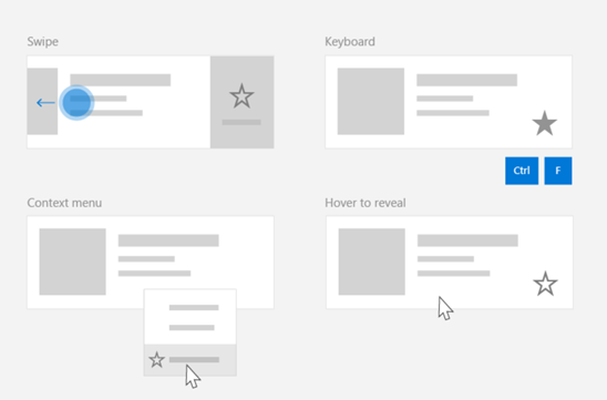
L'immagine seguente mostra due interfacce di comando (CommandBar e CommandBarFlyout mobile contestuale) che condividono alcuni degli stessi comandi.
Barra dei comandi

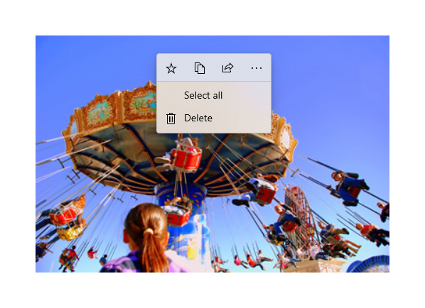
Menu di scelta rapida nella raccolta di Microsoft Foto
Interazioni dei comandi
A causa della varietà di dispositivi, tipi di input e aree dell'interfaccia utente che possono influire sul modo in cui viene richiamato un comando, è consigliabile esporre i comandi attraverso tutte le aree di esecuzione di comandi possibili. Queste possono includere una combinazione di Swipe, MenuBar, CommandBar, CommandBarFlyoute il tradizionale menu di scelta rapida.
Per i comandi critici, usare gli acceleratori specifici per input. Gli acceleratori per input permettono a un utente di eseguire azioni più rapidamente, in base al dispositivo di input in uso.
Ecco alcuni acceleratori per input comuni per vari tipi di input:
- Puntatore: pulsanti attivati al passaggio del mouse e della penna
- Tastiera: scelte rapide (tasti di scelta e tasti di scelta rapida)
- Tocco: scorrimento rapido
- Tocco: trascinamento verso il basso per aggiornare i dati
Devi considerare le esperienze utente e il tipo di input per rendere accessibili universalmente le funzionalità della tua applicazione. Le raccolte (soprattutto quelle modificabili dall'utente), ad esempio, in genere includono un'ampia gamma di comandi specifici che vengono eseguiti in modo molto diverso a seconda del dispositivo di input.
La tabella seguente mostra alcuni comandi tipici di raccolta e le modalità per la loro esposizione.
| Comando | Indipendente dall'input | Acceleratore tramite mouse | Acceleratore tramite tastiera | Acceleratore tramite tocco |
|---|---|---|---|---|
| Elimina elemento | Menu di scelta rapida | Pulsante attivato al passaggio del mouse | Tasto CANC | Scorri rapidamente per eliminare |
| Contrassegna elemento | Menu di scelta rapida | Pulsante attivato al passaggio del mouse | CTRL + MAIUSC + G | Scorri rapidamente per contrassegnare |
| Aggiorna dati | Menu di scelta rapida | N/D | Tasto F5 | Funzionalità Trascina verso il basso |
| Segna un elemento come preferito | Menu di scelta rapida | Pulsante attivato al passaggio del mouse | F, CTRL+S | Scorrere rapidamente per contrassegnare l'elemento come preferito |
Fornire sempre un menu di scelta rapida È consigliabile includere tutti i comandi contestuali rilevanti in un menu di scelta rapida tradizionale o CommandBarFlyout, perché entrambi sono supportati per tutti i tipi di input. Ad esempio, se un comando viene esposto solo durante un evento di spostamento del puntatore, non è utilizzabile in un dispositivo touch-only.
Comandi nelle applicazioni di Windows
Esistono vari modi in cui puoi condividere e gestire esperienze di esecuzione dei comandi in un'applicazione di Windows. Puoi definire i gestori eventi per le interazioni standard, ad esempio Click, nel code-behind (ciò può risultare molto inefficiente, a seconda della complessità dell'interfaccia utente), puoi associare listener di eventi per le interazioni standard a un gestore condiviso oppure puoi associare la proprietà Command del controllo a un'implementazione di ICommand che descrive la logica di comando.
Per fornire esperienze utente avanzate e complete in diverse aree di comando in modo efficiente e con la duplicazione del codice ridotta al minimo, è consigliabile usare le funzionalità di associazione di comando descritte in questo argomento (per la gestione degli eventi standard, vedere gli argomenti sui singoli eventi).
Per associare un controllo a una risorsa di comando condivisa, puoi implementare autonomamente le interfacce di ICommand oppure puoi compilare il comando dalla classe di base XamlUICommand o uno dei comandi della piattaforma definiti dalla classe derivata StandardUICommand.
- L'interfaccia ICommand (Windows.UI.Xaml.Input.ICommand o System.Windows.Input.ICommand) ti consente di creare comandi riutilizzabili e completamente personalizzati nell’intera app.
- Anche XamlUICommand offre questa funzionalità, ma semplifica lo sviluppo tramite l'esposizione di un set di proprietà Command integrate, ad esempio il comportamento del comando, le combinazioni di tasti (tasti di scelta e tasti di scelta rapida), icona, etichetta e descrizione.
- StandardUICommand semplifica ulteriormente le cose, consentendoti di scegliere da un set di comandi standard della piattaforma con proprietà predefinite.
Importante
Nelle applicazioni UWP, i comandi sono implementazioni dell’interfaccia Windows.UI.Xaml.Input.ICommand (C++) o System.Windows.Input.ICommand (C#), a seconda del linguaggio di framework scelto.
Esperienze di comando con la classe StandardUICommand
Derivata da XamlUICommand (derivato da Windows.UI.Xaml.Input.ICommand per C++ oppure System.Windows.Input.ICommand per C#), la classe StandardUICommand espone un set di comandi standard della piattaforma con proprietà predefinite, ad esempio l'icona, l’acceleratore tramite tastiera e la descrizione.
Uno StandardUICommand offre un modo rapido e coerente per definire i comandi comuni, ad esempio Save o Delete. Non resta altro che fornire le funzioni execute e canExecute.
Esempio
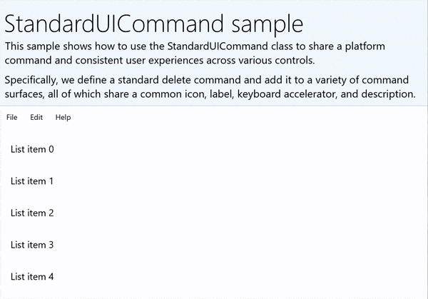
StandardUICommandSample
| Scaricare il codice per questo esempio |
|---|
| Esempio di esecuzione dei comandi UWP (StandardUICommand) |
Questo esempio illustra come migliorare una semplice classe ListView con un comando Elimina elemento implementato tramite la classe StandardUICommand, ottimizzando al contempo l'esperienza utente per un'ampia gamma di tipi di input usando una classe MenuBar, un controllo Swipe, i pulsanti attivati al passaggio del mouse e il menu di scelta rapida.
Nota
Questo esempio richiede il pacchetto Microsoft.UI.Xaml.Controls NuGet, parte della libreria dell'interfaccia utente di Microsoft Windows.
Xaml:
L'esempio dell'interfaccia utente include un ListView di cinque elementi. La classe StandardUICommand Elimina è associata a un MenuBarItem, uno SwipeItem, un AppBarButton e un menu ContextFlyout.
<Page
    x:Class="StandardUICommandSample.MainPage"
    xmlns="http://schemas.microsoft.com/winfx/2006/xaml/presentation"
    xmlns:x="http://schemas.microsoft.com/winfx/2006/xaml"
    xmlns:local="using:StandardUICommandSample"
    xmlns:d="http://schemas.microsoft.com/expression/blend/2008"
    xmlns:mc="http://schemas.openxmlformats.org/markup-compatibility/2006"
    xmlns:muxcontrols="using:Microsoft.UI.Xaml.Controls"
    mc:Ignorable="d"
    Background="{ThemeResource ApplicationPageBackgroundThemeBrush}">

    <Page.Resources>
        <Style x:Key="HorizontalSwipe"
               TargetType="ListViewItem"
               BasedOn="{StaticResource ListViewItemRevealStyle}">
            <Setter Property="Height" Value="60"/>
            <Setter Property="Padding" Value="0"/>
            <Setter Property="HorizontalContentAlignment" Value="Stretch"/>
            <Setter Property="VerticalContentAlignment" Value="Stretch"/>
            <Setter Property="BorderThickness" Value="0"/>
        </Style>
    </Page.Resources>

    <Grid Loaded="ControlExample_Loaded">
        <Grid.RowDefinitions>
            <RowDefinition Height="Auto" />
            <RowDefinition Height="Auto" />
            <RowDefinition Height="*"/>
        </Grid.RowDefinitions>

        <StackPanel Grid.Row="0"
                    Padding="10"
                    BorderThickness="0,0,0,1"
                    BorderBrush="LightBlue"
                    Background="AliceBlue">
            <TextBlock Style="{StaticResource HeaderTextBlockStyle}">
                StandardUICommand sample
            </TextBlock>
            <TextBlock Style="{StaticResource SubtitleTextBlockStyle}" Margin="0,0,0,10">
                This sample shows how to use the StandardUICommand class to
                share a platform command and consistent user experiences
                across various controls.
            </TextBlock>
            <TextBlock Style="{StaticResource SubtitleTextBlockStyle}" Margin="0,0,0,0">
                Specifically, we define a standard delete command and add it
                to a variety of command surfaces, all of which share a common
                icon, label, keyboard accelerator, and description.
            </TextBlock>
        </StackPanel>

        <muxcontrols:MenuBar Grid.Row="1" Padding="10">
            <muxcontrols:MenuBarItem Title="File">
            </muxcontrols:MenuBarItem>
            <muxcontrols:MenuBarItem Title="Edit">
                <MenuFlyoutItem x:Name="DeleteFlyoutItem"/>
            </muxcontrols:MenuBarItem>
            <muxcontrols:MenuBarItem Title="Help">
            </muxcontrols:MenuBarItem>
        </muxcontrols:MenuBar>

        <ListView x:Name="ListViewRight" Grid.Row="2"
                  Loaded="ListView_Loaded"
                  IsItemClickEnabled="True"
                  SelectionMode="Single"
                  SelectionChanged="ListView_SelectionChanged"
                  ItemContainerStyle="{StaticResource HorizontalSwipe}">
            <ListView.ItemTemplate>
                <DataTemplate x:DataType="local:ListItemData">
                    <UserControl PointerEntered="ListViewSwipeContainer_PointerEntered"
                                 PointerExited="ListViewSwipeContainer_PointerExited">
                        <UserControl.ContextFlyout>
                            <MenuFlyout>
                                <MenuFlyoutItem
                                    Command="{x:Bind Command}"
                                    CommandParameter="{x:Bind Text}" />
                            </MenuFlyout>
                        </UserControl.ContextFlyout>
                        <Grid AutomationProperties.Name="{x:Bind Text}">
                            <VisualStateManager.VisualStateGroups>
                                <VisualStateGroup x:Name="HoveringStates">
                                    <VisualState x:Name="HoverButtonsHidden" />
                                    <VisualState x:Name="HoverButtonsShown">
                                        <VisualState.Setters>
                                            <Setter Target="HoverButton.Visibility"
                                                    Value="Visible" />
                                        </VisualState.Setters>
                                    </VisualState>
                                </VisualStateGroup>
                            </VisualStateManager.VisualStateGroups>
                            <SwipeControl x:Name="ListViewSwipeContainer" >
                                <SwipeControl.RightItems>
                                    <SwipeItems Mode="Execute">
                                        <SwipeItem x:Name="DeleteSwipeItem"
                                                   Background="Red"
                                                   Command="{x:Bind Command}"
                                                   CommandParameter="{x:Bind Text}"/>
                                    </SwipeItems>
                                </SwipeControl.RightItems>
                                <Grid VerticalAlignment="Center">
                                    <TextBlock Text="{x:Bind Text}"
                                               Margin="10"
                                               FontSize="18"
                                               HorizontalAlignment="Left"
                                               VerticalAlignment="Center"/>
                                    <AppBarButton x:Name="HoverButton"
                                                  IsTabStop="False"
                                                  HorizontalAlignment="Right"
                                                  Visibility="Collapsed"
                                                  Command="{x:Bind Command}"
                                                  CommandParameter="{x:Bind Text}"/>
                                </Grid>
                            </SwipeControl>
                        </Grid>
                    </UserControl>
                </DataTemplate>
            </ListView.ItemTemplate>
        </ListView>
    </Grid>
</Page>
Code-behind
- In primo luogo, definiamo una classe
ListItemDatache contiene una stringa di testo e un'interfaccia ICommand per ogni controllo ListViewItem nella classe ListView.
public class ListItemData
{
    public String Text { get; set; }
    public ICommand Command { get; set; }
}
- Nella classe MainPage, definiamo una raccolta di oggetti
ListItemDataper l'oggetto DataTemplate dell'oggetto ItemTemplate della classe ListView. Questa viene quindi popolata con una raccolta iniziale di cinque elementi (con testo e classe StandardUICommand Elimina associati).
/// <summary>
/// ListView item collection.
/// </summary>
ObservableCollection<ListItemData> collection =
    new ObservableCollection<ListItemData>();

/// <summary>
/// Handler for the layout Grid control load event.
/// </summary>
/// <param name="sender">Source of the control loaded event</param>
/// <param name="e">Event args for the loaded event</param>
private void ControlExample_Loaded(object sender, RoutedEventArgs e)
{
    // Create the standard Delete command.
    var deleteCommand = new StandardUICommand(StandardUICommandKind.Delete);
    deleteCommand.ExecuteRequested += DeleteCommand_ExecuteRequested;

    DeleteFlyoutItem.Command = deleteCommand;

    for (var i = 0; i < 5; i++)
    {
        collection.Add(
            new ListItemData {
                Text = "List item " + i.ToString(),
                Command = deleteCommand });
    }
}

/// <summary>
/// Handler for the ListView control load event.
/// </summary>
/// <param name="sender">Source of the control loaded event</param>
/// <param name="e">Event args for the loaded event</param>
private void ListView_Loaded(object sender, RoutedEventArgs e)
{
    var listView = (ListView)sender;
    // Populate the ListView with the item collection.
    listView.ItemsSource = collection;
}
- Successivamente, definiremo il gestore ExecuteRequested di ICommand in cui viene implementato il comando di eliminazione elemento.
/// <summary>
/// Handler for the Delete command.
/// </summary>
/// <param name="sender">Source of the command event</param>
/// <param name="e">Event args for the command event</param>
private void DeleteCommand_ExecuteRequested(
    XamlUICommand sender, ExecuteRequestedEventArgs args)
{
    // If possible, remove specified item from collection.
    if (args.Parameter != null)
    {
        foreach (var i in collection)
        {
            if (i.Text == (args.Parameter as string))
            {
                collection.Remove(i);
                return;
            }
        }
    }
    if (ListViewRight.SelectedIndex != -1)
    {
        collection.RemoveAt(ListViewRight.SelectedIndex);
    }
}
- Infine, definiremo i gestori per vari eventi di ListView, tra cui PointerEntered, PointerExited e SelectionChanged. I gestori di eventi puntatore consentono di mostrare o nascondere il pulsante Elimina per ogni elemento.
/// <summary>
/// Handler for the ListView selection changed event.
/// </summary>
/// <param name="sender">Source of the selection changed event</param>
/// <param name="e">Event args for the selection changed event</param>
private void ListView_SelectionChanged(object sender, SelectionChangedEventArgs e)
{
    if (ListViewRight.SelectedIndex != -1)
    {
        var item = collection[ListViewRight.SelectedIndex];
    }
}

/// <summary>
/// Handler for the pointer entered event.
/// Displays the delete item "hover" buttons.
/// </summary>
/// <param name="sender">Source of the pointer entered event</param>
/// <param name="e">Event args for the pointer entered event</param>
private void ListViewSwipeContainer_PointerEntered(
    object sender, PointerRoutedEventArgs e)
{
    if (e.Pointer.PointerDeviceType ==
        Windows.Devices.Input.PointerDeviceType.Mouse ||
        e.Pointer.PointerDeviceType ==
        Windows.Devices.Input.PointerDeviceType.Pen)
    {
        VisualStateManager.GoToState(
            sender as Control, "HoverButtonsShown", true);
    }
}

/// <summary>
/// Handler for the pointer exited event.
/// Hides the delete item "hover" buttons.
/// </summary>
/// <param name="sender">Source of the pointer exited event</param>
/// <param name="e">Event args for the pointer exited event</param>

private void ListViewSwipeContainer_PointerExited(
    object sender, PointerRoutedEventArgs e)
{
    VisualStateManager.GoToState(
        sender as Control, "HoverButtonsHidden", true);
}
Esperienze di comando con la classe XamlUICommand
Se devi creare un comando che non è definito dalla classe StandardUICommand o vuoi maggiore controllo sull'aspetto del comando, la classe XamlUICommand deriva dall'interfaccia ICommand, aggiungendo diverse proprietà dell'interfaccia utente (ad esempio un'icona, un'etichetta, una descrizione e scelte rapide da tastiera), metodi ed eventi per definire rapidamente l'interfaccia utente e il comportamento di un comando personalizzato.
XamlUICommand ti consente di specificare l'interfaccia utente tramite l'associazione di controlli, ad esempio un'icona, un'etichetta, una descrizione e tasti di scelta rapida (sia un tasto di scelta che un acceleratore tramite tastiera), senza impostare singole proprietà.
Esempio
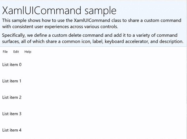
XamlUICommandSample
| Scaricare il codice per questo esempio |
|---|
| Esempio di esecuzione dei comandi UWP (XamlUICommand) |
Questo esempio condivide la funzionalità Elimina dell'esempio di StandardUICommand precedente, ma mostra come la classe XamlUICommand ti consente di definire un comando di eliminazione personalizzato con icona, etichetta, acceleratore tramite tastiera e descrizione personalizzati. Analogamente all'esempio di StandardUICommand, miglioreremo una semplice classe ListView con un comando Elimina elemento implementato tramite la classe XamlUICommand, ottimizzando al contempo l'esperienza utente per un'ampia gamma di tipi di input usando una classe MenuBar, un controllo Swipe, i pulsanti attivati al passaggio del mouse e il menu di scelta rapida.
Molti controlli della piattaforma usano le proprietà XamlUICommand dietro le quinte, proprio come l'esempio di StandardUICommand nella sezione precedente.
Nota
Questo esempio richiede il pacchetto Microsoft.UI.Xaml.Controls NuGet, parte della libreria dell'interfaccia utente di Microsoft Windows.
Xaml:
L'esempio dell'interfaccia utente include un ListView di cinque elementi. La classe personalizzata XamlUICommand CustomXamlUICommand è associato a un MenuBarItem, uno SwipeItem, un AppBarButton e un menu ContextFlyout.
<Page
x:Class="XamlUICommand_Sample.MainPage"
xmlns="http://schemas.microsoft.com/winfx/2006/xaml/presentation"
xmlns:x="http://schemas.microsoft.com/winfx/2006/xaml"
xmlns:local="using:XamlUICommand_Sample"
xmlns:d="http://schemas.microsoft.com/expression/blend/2008"
xmlns:mc="http://schemas.openxmlformats.org/markup-compatibility/2006"
xmlns:muxcontrols="using:Microsoft.UI.Xaml.Controls"
mc:Ignorable="d"
Background="{ThemeResource ApplicationPageBackgroundThemeBrush}">
<Page.Resources>
<XamlUICommand x:Name="CustomXamlUICommand"
ExecuteRequested="DeleteCommand_ExecuteRequested"
Description="Custom XamlUICommand"
Label="Custom XamlUICommand">
<XamlUICommand.IconSource>
<FontIconSource FontFamily="Wingdings" Glyph="M"/>
</XamlUICommand.IconSource>
<XamlUICommand.KeyboardAccelerators>
<KeyboardAccelerator Key="D" Modifiers="Control"/>
</XamlUICommand.KeyboardAccelerators>
</XamlUICommand>
<Style x:Key="HorizontalSwipe"
TargetType="ListViewItem"
BasedOn="{StaticResource ListViewItemRevealStyle}">
<Setter Property="Height" Value="70"/>
<Setter Property="Padding" Value="0"/>
<Setter Property="HorizontalContentAlignment" Value="Stretch"/>
<Setter Property="VerticalContentAlignment" Value="Stretch"/>
<Setter Property="BorderThickness" Value="0"/>
</Style>
</Page.Resources>
<Grid Loaded="ControlExample_Loaded" Name="MainGrid">
<Grid.RowDefinitions>
<RowDefinition Height="Auto" />
<RowDefinition Height="Auto" />
<RowDefinition Height="*"/>
</Grid.RowDefinitions>
<StackPanel Grid.Row="0"
Padding="10"
BorderThickness="0,0,0,1"
BorderBrush="LightBlue"
Background="AliceBlue">
<TextBlock Style="{StaticResource HeaderTextBlockStyle}">
XamlUICommand sample
</TextBlock>
<TextBlock Style="{StaticResource SubtitleTextBlockStyle}" Margin="0,0,0,10">
This sample shows how to use the XamlUICommand class to
share a custom command with consistent user experiences
across various controls.
</TextBlock>
<TextBlock Style="{StaticResource SubtitleTextBlockStyle}" Margin="0,0,0,0">
Specifically, we define a custom delete command and add it
to a variety of command surfaces, all of which share a common
icon, label, keyboard accelerator, and description.
</TextBlock>
</StackPanel>
<muxcontrols:MenuBar Grid.Row="1">
<muxcontrols:MenuBarItem Title="File">
</muxcontrols:MenuBarItem>
<muxcontrols:MenuBarItem Title="Edit">
<MenuFlyoutItem x:Name="DeleteFlyoutItem"
Command="{StaticResource CustomXamlUICommand}"/>
</muxcontrols:MenuBarItem>
<muxcontrols:MenuBarItem Title="Help">
</muxcontrols:MenuBarItem>
</muxcontrols:MenuBar>
<ListView x:Name="ListViewRight" Grid.Row="2"
Loaded="ListView_Loaded"
IsItemClickEnabled="True"
SelectionMode="Single"
SelectionChanged="ListView_SelectionChanged"
ItemContainerStyle="{StaticResource HorizontalSwipe}">
<ListView.ItemTemplate>
<DataTemplate x:DataType="local:ListItemData">
<UserControl PointerEntered="ListViewSwipeContainer_PointerEntered"
PointerExited="ListViewSwipeContainer_PointerExited">
<UserControl.ContextFlyout>
<MenuFlyout>
<MenuFlyoutItem
Command="{x:Bind Command}"
CommandParameter="{x:Bind Text}" />
</MenuFlyout>
</UserControl.ContextFlyout>
<Grid AutomationProperties.Name="{x:Bind Text}">
<VisualStateManager.VisualStateGroups>
<VisualStateGroup x:Name="HoveringStates">
<VisualState x:Name="HoverButtonsHidden" />
<VisualState x:Name="HoverButtonsShown">
<VisualState.Setters>
<Setter Target="HoverButton.Visibility"
Value="Visible" />
</VisualState.Setters>
</VisualState>
</VisualStateGroup>
</VisualStateManager.VisualStateGroups>
<SwipeControl x:Name="ListViewSwipeContainer">
<SwipeControl.RightItems>
<SwipeItems Mode="Execute">
<SwipeItem x:Name="DeleteSwipeItem"
Background="Red"
Command="{x:Bind Command}"
CommandParameter="{x:Bind Text}"/>
</SwipeItems>
</SwipeControl.RightItems>
<Grid VerticalAlignment="Center">
<TextBlock Text="{x:Bind Text}"
Margin="10"
FontSize="18"
HorizontalAlignment="Left"
VerticalAlignment="Center"/>
<AppBarButton x:Name="HoverButton"
IsTabStop="False"
HorizontalAlignment="Right"
Visibility="Collapsed"
Command="{x:Bind Command}"
CommandParameter="{x:Bind Text}"/>
</Grid>
</SwipeControl>
</Grid>
</UserControl>
</DataTemplate>
</ListView.ItemTemplate>
</ListView>
</Grid>
</Page>
Code-behind
- In primo luogo, definiamo una classe
ListItemDatache contiene una stringa di testo e un'interfaccia ICommand per ogni controllo ListViewItem nella classe ListView.
public class ListItemData
{
    public String Text { get; set; }
    public ICommand Command { get; set; }
}
- Nella classe MainPage, definiamo una raccolta di oggetti
ListItemDataper l'oggetto DataTemplate dell'oggetto ItemTemplate della classe ListView. Questa viene quindi popolata con una raccolta iniziale di cinque elementi (con testo e classe XamlUICommand associati).
ObservableCollection<ListItemData> collection = new ObservableCollection<ListItemData>();

private void ControlExample_Loaded(object sender, RoutedEventArgs e)
{
    for (var i = 0; i < 5; i++)
    {
        collection.Add(
           new ListItemData { Text = "List item " + i.ToString(), Command = CustomXamlUICommand });
    }
}

private void ListView_Loaded(object sender, RoutedEventArgs e)
{
    var listView = (ListView)sender;
    listView.ItemsSource = collection;
}
- Successivamente, definiremo il gestore ExecuteRequested di ICommand in cui viene implementato il comando di eliminazione elemento.
private void DeleteCommand_ExecuteRequested(
   XamlUICommand sender, ExecuteRequestedEventArgs args)
{
    if (args.Parameter != null)
    {
        foreach (var i in collection)
        {
            if (i.Text == (args.Parameter as string))
            {
                collection.Remove(i);
                return;
            }
        }
    }
    if (ListViewRight.SelectedIndex != -1)
    {
        collection.RemoveAt(ListViewRight.SelectedIndex);
    }
}
- Infine, definiremo i gestori per vari eventi di ListView, tra cui PointerEntered, PointerExited e SelectionChanged. I gestori di eventi puntatore consentono di mostrare o nascondere il pulsante Elimina per ogni elemento.
private void ListView_SelectionChanged(object sender, SelectionChangedEventArgs e)
{
    if (ListViewRight.SelectedIndex != -1)
    {
        var item = collection[ListViewRight.SelectedIndex];
    }
}

private void ListViewSwipeContainer_PointerEntered(object sender, PointerRoutedEventArgs e)
{
    if (e.Pointer.PointerDeviceType ==
        Windows.Devices.Input.PointerDeviceType.Mouse ||
        e.Pointer.PointerDeviceType == Windows.Devices.Input.PointerDeviceType.Pen)
    {
        VisualStateManager.GoToState(sender as Control, "HoverButtonsShown", true);
    }
}

private void ListViewSwipeContainer_PointerExited(object sender, PointerRoutedEventArgs e)
{
    VisualStateManager.GoToState(sender as Control, "HoverButtonsHidden", true);
}
Esperienze di comando con l'interfaccia ICommand
I controlli UWP standard (pulsante, elenco, selezione, calendario, testo predittivo) costituiscono la base per numerose esperienze di comando comuni. Per un elenco completo dei tipi di controllo, vedi Controlli e modelli per le app di Windows.
Il modo più semplice per supportare un'esperienza di esecuzione dei comandi strutturata consiste nel definire un'implementazione dell'interfaccia ICommand (Windows.UI.Xaml.Input.ICommand per C++ oppure System.Windows.Input.ICommand per C#). Questa istanza di ICommand può quindi essere associata ai controlli quali pulsanti.
Nota
In alcuni casi, potrebbe essere semplicemente più efficiente associare un metodo all'evento Click e una proprietà alla proprietà IsEnabled.
Esempio
Esempio di ICommand
| Scaricare il codice per questo esempio |
|---|
| Esempio di esecuzione dei comandi UWP (ICommand) |
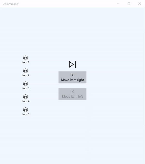
Questo esempio di base illustra come un singolo comando può essere richiamato con un clic su un pulsante, un acceleratore tramite tastiera e la rotazione della rotellina del mouse.
Useremo due classi ListView, una popolata con cinque elementi e l'altra vuota, e due pulsanti, uno per lo spostamento di elementi dalla classe ListView a sinistra alla classe ListView a destra e l'altro per lo spostamento di elementi da destra a sinistra. Tutti i pulsanti sono associati a un comando corrispondente (ViewModel.MoveRightCommand e ViewModel.MoveLeftCommand, rispettivamente) e sono abilitati e disabilitati automaticamente in base al numero di elementi nella classe ListView associata.
Il codice XAML seguente definisce l'interfaccia utente per questo esempio.
<Page
x:Class="UICommand1.View.MainPage"
xmlns="http://schemas.microsoft.com/winfx/2006/xaml/presentation"
xmlns:x="http://schemas.microsoft.com/winfx/2006/xaml"
xmlns:vm="using:UICommand1.ViewModel"
xmlns:d="http://schemas.microsoft.com/expression/blend/2008"
xmlns:mc="http://schemas.openxmlformats.org/markup-compatibility/2006"
mc:Ignorable="d"
Background="{ThemeResource ApplicationPageBackgroundThemeBrush}">
<Page.Resources>
<vm:OpacityConverter x:Key="opaque" />
</Page.Resources>
<Grid Name="ItemGrid"
Background="AliceBlue"
PointerWheelChanged="Page_PointerWheelChanged">
<Grid.ColumnDefinitions>
<ColumnDefinition Width="*"/>
<ColumnDefinition Width="2*"/>
<ColumnDefinition Width="*"/>
</Grid.ColumnDefinitions>
<ListView Grid.Column="0" VerticalAlignment="Center"
x:Name="CommandListView"
ItemsSource="{x:Bind Path=ViewModel.ListItemLeft}"
SelectionMode="None" IsItemClickEnabled="False"
HorizontalAlignment="Right">
<ListView.ItemTemplate>
<DataTemplate x:DataType="vm:ListItemData">
<Grid VerticalAlignment="Center">
<AppBarButton Label="{x:Bind ListItemText}">
<AppBarButton.Icon>
<SymbolIcon Symbol="{x:Bind ListItemIcon}"/>
</AppBarButton.Icon>
</AppBarButton>
</Grid>
</DataTemplate>
</ListView.ItemTemplate>
</ListView>
<Grid Grid.Column="1" Margin="0,0,0,0"
HorizontalAlignment="Center"
VerticalAlignment="Center">
<Grid.RowDefinitions>
<RowDefinition Height="*"/>
<RowDefinition Height="*"/>
<RowDefinition Height="*"/>
</Grid.RowDefinitions>
<StackPanel Grid.Row="1">
<FontIcon FontFamily="{StaticResource SymbolThemeFontFamily}"
FontSize="40" Glyph=""
Opacity="{x:Bind Path=ViewModel.ListItemLeft.Count,
Mode=OneWay, Converter={StaticResource opaque}}"/>
<Button Name="MoveItemRightButton"
Margin="0,10,0,10" Width="120" HorizontalAlignment="Center"
Command="{x:Bind Path=ViewModel.MoveRightCommand}">
<Button.KeyboardAccelerators>
<KeyboardAccelerator
Modifiers="Control"
Key="Add" />
</Button.KeyboardAccelerators>
<StackPanel>
<SymbolIcon Symbol="Next"/>
<TextBlock>Move item right</TextBlock>
</StackPanel>
</Button>
<Button Name="MoveItemLeftButton"
Margin="0,10,0,10" Width="120" HorizontalAlignment="Center"
Command="{x:Bind Path=ViewModel.MoveLeftCommand}">
<Button.KeyboardAccelerators>
<KeyboardAccelerator
Modifiers="Control"
Key="Subtract" />
</Button.KeyboardAccelerators>
<StackPanel>
<SymbolIcon Symbol="Previous"/>
<TextBlock>Move item left</TextBlock>
</StackPanel>
</Button>
<FontIcon FontFamily="{StaticResource SymbolThemeFontFamily}"
FontSize="40" Glyph=""
Opacity="{x:Bind Path=ViewModel.ListItemRight.Count,
Mode=OneWay, Converter={StaticResource opaque}}"/>
</StackPanel>
</Grid>
<ListView Grid.Column="2"
x:Name="CommandListViewRight"
VerticalAlignment="Center"
IsItemClickEnabled="False"
SelectionMode="None"
ItemsSource="{x:Bind Path=ViewModel.ListItemRight}"
HorizontalAlignment="Left">
<ListView.ItemTemplate>
<DataTemplate x:DataType="vm:ListItemData">
<Grid VerticalAlignment="Center">
<AppBarButton Label="{x:Bind ListItemText}">
<AppBarButton.Icon>
<SymbolIcon Symbol="{x:Bind ListItemIcon}"/>
</AppBarButton.Icon>
</AppBarButton>
</Grid>
</DataTemplate>
</ListView.ItemTemplate>
</ListView>
</Grid>
</Page>
Ecco il code-behind per l'interfaccia utente precedente.
Nel code-behind, ci connettiamo al modello di visualizzazione che contiene il codice di comando. Inoltre, definiamo un gestore per l'input dalla rotellina del mouse, che consente a sua volta di connettersi al codice di comando.
using Windows.UI.Xaml;
using Windows.UI.Xaml.Input;
using Windows.UI.Xaml.Controls;
using UICommand1.ViewModel;
using Windows.System;
using Windows.UI.Core;

namespace UICommand1.View
{
    /// <summary>
    /// An empty page that can be used on its own or navigated to within a Frame.
    /// </summary>
    public sealed partial class MainPage : Page
    {
        // Reference to our view model.
        public UICommand1ViewModel ViewModel { get; set; }

        // Initialize our view and view model.
        public MainPage()
        {
            this.InitializeComponent();
            ViewModel = new UICommand1ViewModel();
        }

        /// <summary>
        /// Handle mouse wheel input and assign our
        /// commands to appropriate direction of rotation.
        /// </summary>
        /// <param name="sender"></param>
        /// <param name="e"></param>
        private void Page_PointerWheelChanged(object sender, PointerRoutedEventArgs e)
        {
            var props = e.GetCurrentPoint(sender as UIElement).Properties;

            // Require CTRL key and accept only vertical mouse wheel movement
            // to eliminate accidental wheel input.
            if ((Window.Current.CoreWindow.GetKeyState(VirtualKey.Control) !=
                CoreVirtualKeyStates.None) && !props.IsHorizontalMouseWheel)
            {
                bool delta = props.MouseWheelDelta < 0 ? true : false;

                switch (delta)
                {
                    case true:
                        ViewModel.MoveRight();
                        break;
                    case false:
                        ViewModel.MoveLeft();
                        break;
                    default:
                        break;
                }
            }
        }
    }
}
Ecco il codice dal modello di visualizzazione
Il modello di visualizzazione consente di definire i dettagli di esecuzione per i due comandi nell'app, popolare una classe ListView e fornire un convertitore di valori di opacità per nascondere o visualizzare ulteriori elementi dell'interfaccia utente in base al conteggio degli elementi di ogni ListView.
using System;
using System.Collections.ObjectModel;
using System.ComponentModel;
using Windows.UI.Xaml.Controls;
using Windows.UI.Xaml.Data;

namespace UICommand1.ViewModel
{
    /// <summary>
    /// UI properties for our list items.
    /// </summary>
    public class ListItemData
    {
        /// <summary>
        /// Gets and sets the list item content string.
        /// </summary>
        public string ListItemText { get; set; }
        /// <summary>
        /// Gets and sets the list item icon.
        /// </summary>
        public Symbol ListItemIcon { get; set; }
    }

    /// <summary>
    /// View Model that sets up a command to handle invoking the move item buttons.
    /// </summary>
    public class UICommand1ViewModel
    {
        /// <summary>
        /// The command to invoke when the Move item left button is pressed.
        /// </summary>
        public RelayCommand MoveLeftCommand { get; private set; }

        /// <summary>
        /// The command to invoke when the Move item right button is pressed.
        /// </summary>
        public RelayCommand MoveRightCommand { get; private set; }

        // Item collections
        public ObservableCollection<ListItemData> ListItemLeft { get; } =
           new ObservableCollection<ListItemData>();
        public ObservableCollection<ListItemData> ListItemRight { get; } =
           new ObservableCollection<ListItemData>();

        public ListItemData listItem;

        /// <summary>
        /// Sets up a command to handle invoking the move item buttons.
        /// </summary>
        public UICommand1ViewModel()
        {
            MoveLeftCommand =
               new RelayCommand(new Action(MoveLeft), CanExecuteMoveLeftCommand);
            MoveRightCommand =
               new RelayCommand(new Action(MoveRight), CanExecuteMoveRightCommand);

            LoadItems();
        }

        /// <summary>
        ///  Populate our list of items.
        /// </summary>
        public void LoadItems()
        {
            for (var x = 0; x <= 4; x++)
            {
                listItem = new ListItemData();
                listItem.ListItemText = "Item " + (ListItemLeft.Count + 1).ToString();
                listItem.ListItemIcon = Symbol.Emoji;
                ListItemLeft.Add(listItem);
            }
        }

        /// <summary>
        /// Move left command valid when items present in the list on right.
        /// </summary>
        /// <returns>True, if count is greater than 0.</returns>
        private bool CanExecuteMoveLeftCommand()
        {
            return ListItemRight.Count > 0;
        }

        /// <summary>
        /// Move right command valid when items present in the list on left.
        /// </summary>
        /// <returns>True, if count is greater than 0.</returns>
        private bool CanExecuteMoveRightCommand()
        {
            return ListItemLeft.Count > 0;
        }

        /// <summary>
        /// The command implementation to execute when the Move item right button is pressed.
        /// </summary>
        public void MoveRight()
        {
            if (ListItemLeft.Count > 0)
            {
                listItem = new ListItemData();
                ListItemRight.Add(listItem);
                listItem.ListItemText = "Item " + ListItemRight.Count.ToString();
                listItem.ListItemIcon = Symbol.Emoji;
                ListItemLeft.RemoveAt(ListItemLeft.Count - 1);
                MoveRightCommand.RaiseCanExecuteChanged();
                MoveLeftCommand.RaiseCanExecuteChanged();
            }
        }

        /// <summary>
        /// The command implementation to execute when the Move item left button is pressed.
        /// </summary>
        public void MoveLeft()
        {
            if (ListItemRight.Count > 0)
            {
                listItem = new ListItemData();
                ListItemLeft.Add(listItem);
                listItem.ListItemText = "Item " + ListItemLeft.Count.ToString();
                listItem.ListItemIcon = Symbol.Emoji;
                ListItemRight.RemoveAt(ListItemRight.Count - 1);
                MoveRightCommand.RaiseCanExecuteChanged();
                MoveLeftCommand.RaiseCanExecuteChanged();
            }
        }

        /// <summary>
        /// Views subscribe to this event to get notified of property updates.
        /// </summary>
        public event PropertyChangedEventHandler PropertyChanged;

        /// <summary>
        /// Notify subscribers of updates to the named property
        /// </summary>
        /// <param name="propertyName">The full, case-sensitive, name of a property.</param>
        protected void NotifyPropertyChanged(string propertyName)
        {
            PropertyChangedEventHandler handler = this.PropertyChanged;
            if (handler != null)
            {
                PropertyChangedEventArgs args = new PropertyChangedEventArgs(propertyName);
                handler(this, args);
            }
        }
    }

    /// <summary>
    /// Convert a collection count to an opacity value of 0.0 or 1.0.
    /// </summary>
    public class OpacityConverter : IValueConverter
    {
        /// <summary>
        /// Converts a collection count to an opacity value of 0.0 or 1.0.
        /// </summary>
        /// <param name="value">The count passed in</param>
        /// <param name="targetType">Ignored.</param>
        /// <param name="parameter">Ignored</param>
        /// <param name="language">Ignored</param>
        /// <returns>1.0 if count > 0, otherwise returns 0.0</returns>
        public object Convert(object value, Type targetType, object parameter, string language)
        {
            return ((int)value > 0 ? 1.0 : 0.0);
        }

        /// <summary>
        /// Not used, converter is not intended for two-way binding.
        /// </summary>
        /// <param name="value">Ignored</param>
        /// <param name="targetType">Ignored</param>
        /// <param name="parameter">Ignored</param>
        /// <param name="language">Ignored</param>
        /// <returns></returns>
        public object ConvertBack(object value, Type targetType, object parameter, string language)
        {
            throw new NotImplementedException();
        }
    }
}
Infine, ecco l'implementazione dell'interfaccia ICommand
In questo caso, definiamo un comando che implementa l'interfaccia ICommand e inoltra semplicemente la funzionalità ad altri oggetti.
using System;
using System.Windows.Input;

namespace UICommand1
{
    /// <summary>
    /// A command whose sole purpose is to relay its functionality
    /// to other objects by invoking delegates.
    /// The default return value for the CanExecute method is 'true'.
    /// <see cref="RaiseCanExecuteChanged"/> needs to be called whenever
    /// <see cref="CanExecute"/> is expected to return a different value.
    /// </summary>
    public class RelayCommand : ICommand
    {
        private readonly Action _execute;
        private readonly Func<bool> _canExecute;

        /// <summary>
        /// Raised when RaiseCanExecuteChanged is called.
        /// </summary>
        public event EventHandler CanExecuteChanged;

        /// <summary>
        /// Creates a new command that can always execute.
        /// </summary>
        /// <param name="execute">The execution logic.</param>
        public RelayCommand(Action execute)
            : this(execute, null)
        {
        }

        /// <summary>
        /// Creates a new command.
        /// </summary>
        /// <param name="execute">The execution logic.</param>
        /// <param name="canExecute">The execution status logic.</param>
        public RelayCommand(Action execute, Func<bool> canExecute)
        {
            if (execute == null)
                throw new ArgumentNullException("execute");
            _execute = execute;
            _canExecute = canExecute;
        }

        /// <summary>
        /// Determines whether this <see cref="RelayCommand"/> can execute in its current state.
        /// </summary>
        /// <param name="parameter">
        /// Data used by the command. If the command does not require
        /// data to be passed, this object can be set to null.
        /// </param>
        /// <returns>true if this command can be executed; otherwise, false.</returns>
        public bool CanExecute(object parameter)
        {
            return _canExecute == null ? true : _canExecute();
        }

        /// <summary>
        /// Executes the <see cref="RelayCommand"/> on the current command target.
        /// </summary>
        /// <param name="parameter">
        /// Data used by the command. If the command does not require
        /// data to be passed, this object can be set to null.
        /// </param>
        public void Execute(object parameter)
        {
            _execute();
        }

        /// <summary>
        /// Method used to raise the <see cref="CanExecuteChanged"/> event
        /// to indicate that the return value of the <see cref="CanExecute"/>
        /// method has changed.
        /// </summary>
        public void RaiseCanExecuteChanged()
        {
            var handler = CanExecuteChanged;
            if (handler != null)
            {
                handler(this, EventArgs.Empty);
            }
        }
    }
}
Riepilogo
La piattaforma UWP (Universal Windows Platform) rappresenta un sistema di esecuzione comandi affidabile e flessibile che consente di creare app che condividono e gestiscono i comandi tra i tipi di controllo, i dispositivi e i tipi di input.
Quando crei comandi per le app di Windows, adotta gli approcci seguenti:
- Ascoltare e gestire gli eventi in XAML/code-behind
- Eseguire l'associazione a un metodo di gestione degli eventi, ad esempio Click
- Definire la tua implementazione di ICommand
- Creare oggetti XamlUICommand con i tuoi valori per un set di proprietà predefinito
- Creare oggetti StandardUICommand con un set di valori e proprietà della piattaforma predefiniti
Passaggi successivi
Per un esempio completo che illustra un'implementazione di XamlUICommand e StandardUICommand, vedi la Raccolta WinUI 2.
Vedi anche
Controlli e modelli per le app di Windows
Esempi
Esempi di argomento
- Esempio di esecuzione dei comandi UWP (StandardUICommand)
- Esempio di esecuzione dei comandi UWP (XamlUICommand)
- Esempio di esecuzione dei comandi UWP (ICommand)
Altri esempi

Commenti e suggerimenti
Presto disponibile: Nel corso del 2024 verranno gradualmente disattivati i problemi di GitHub come meccanismo di feedback per il contenuto e ciò verrà sostituito con un nuovo sistema di feedback. Per altre informazioni, vedere https://aka.ms/ContentUserFeedback.
Invia e visualizza il feedback per