コントロールのためのテンプレートを作成する方法 (WPF.NET)
Windows Presentation Foundation (WPF) を使用すると、独自の再利用可能なテンプレートを使用して、既存のコントロールの視覚的な構造と動作をカスタマイズできます。 テンプレートは、アプリケーション、ウィンドウ、ページにグローバルに適用することも、コントロールに直接適用することもできます。 新しいコントロールを作成する必要があるほとんどのシナリオは、代わりに既存のコントロール用の新しいテンプレートを作成することによってカバーできます。
重要
.NET 7 と .NET 6 用のデスクトップ ガイド ドキュメントは作成中です。
この記事では、Button コントロールの新しい ControlTemplate を作成する方法について説明します。
ControlTemplate を作成するタイミング
コントロールには、Background、Foreground、FontFamily などの多くのプロパティがあります。 これらのプロパティは、コントロールの外観のさまざまな側面を制御しますが、これらのプロパティを設定することによって行うことができる変更は制限されます。 たとえば、CheckBox では、Foreground プロパティを青に、FontStyle を斜体に設定できます。 コントロールの他のプロパティを設定するだけでは、必要な外見のカスタマイズが十分にできない場合は、ControlTemplate を作成します。
ほとんどのユーザー インターフェイスのボタンの外観はテキストが記載されている四角形で、基本的には同じです。 丸いボタンを作成する場合は、ボタンを継承する新しいコントロールを作成するか、ボタンの機能を再作成します。 さらに、新しいユーザー コントロールによって、円形のビジュアルを指定できます。
新しいコントロールを作成しないようにするには、既存のコントロールの視覚的なレイアウトをカスタマイズします。 丸いボタンを使用して、目的の視覚的なレイアウトで ControlTemplate を作成します。
一方、新しい機能、異なるプロパティ、および新しい設定を持つコントロールが必要な場合は、新しい UserControl を作成します。
必須コンポーネント
新しい WPF アプリケーションを作成し、MainWindow.xaml (または任意の別のウィンドウ) で <Window> 要素の次のプロパティを設定します。
| プロパティ | 値 |
|---|---|
| Title | Template Intro Sample |
| SizeToContent | WidthAndHeight |
| MinWidth | 250 |
<Window> 要素のコンテンツを次の XAML に設定します。
<StackPanel Margin="10">
    <Label>Unstyled Button</Label>
    <Button>Button 1</Button>
    <Label>Rounded Button</Label>
    <Button>Button 2</Button>
</StackPanel>
最終的に、MainWindow.xaml ファイルは次のようになります。
<Window x:Class="IntroToStylingAndTemplating.Window1"
        xmlns="http://schemas.microsoft.com/winfx/2006/xaml/presentation"
        xmlns:x="http://schemas.microsoft.com/winfx/2006/xaml"
        xmlns:d="http://schemas.microsoft.com/expression/blend/2008"
        xmlns:mc="http://schemas.openxmlformats.org/markup-compatibility/2006"
        xmlns:local="clr-namespace:IntroToStylingAndTemplating"
        mc:Ignorable="d"
        Title="Template Intro Sample" SizeToContent="WidthAndHeight" MinWidth="250">
    <StackPanel Margin="10">
        <Label>Unstyled Button</Label>
        <Button>Button 1</Button>
        <Label>Rounded Button</Label>
        <Button>Button 2</Button>
    </StackPanel>
</Window>
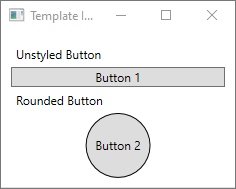
アプリケーションを実行すると、次のようになります。

ControlTemplate の作成
ControlTemplate を宣言する最も一般的な方法は、XAML ファイルの Resources セクションのリソースとして宣言する方法です。 テンプレートはリソースなので、すべてのリソースに適用されるものと同じスコープ規則に従います。 つまり、テンプレートの宣言場所は、テンプレートの適用場所に影響するということです。 たとえば、アプリケーション定義 XAML ファイルのルート要素でテンプレートを宣言すると、そのテンプレートはアプリケーションのどこでも使用できるようになります。 ウィンドウでテンプレートを定義すると、そのテンプレートはウィンドウ内のコントロールでのみ使用できます。
まず、MainWindow.xaml ファイルに Window.Resources 要素を追加します。
<Window x:Class="IntroToStylingAndTemplating.Window2"
        xmlns="http://schemas.microsoft.com/winfx/2006/xaml/presentation"
        xmlns:x="http://schemas.microsoft.com/winfx/2006/xaml"
        xmlns:d="http://schemas.microsoft.com/expression/blend/2008"
        xmlns:mc="http://schemas.openxmlformats.org/markup-compatibility/2006"
        xmlns:local="clr-namespace:IntroToStylingAndTemplating"
        mc:Ignorable="d"
        Title="Template Intro Sample" SizeToContent="WidthAndHeight" MinWidth="250">
    <Window.Resources>

    </Window.Resources>
    <StackPanel Margin="10">
        <Label>Unstyled Button</Label>
        <Button>Button 1</Button>
        <Label>Rounded Button</Label>
        <Button>Button 2</Button>
    </StackPanel>
</Window>
次のプロパティ セットを使用して、新しい <ControlTemplate> を作成します。
| プロパティ | 値 |
|---|---|
| x:Key | roundbutton |
| TargetType | Button |
このコントロール テンプレートは単純です。
- コントロールのルート要素である Grid
- ボタンの丸みのある外観を描画するための Ellipse
- ユーザー指定のボタンの内容を表示する ContentPresenter
<ControlTemplate x:Key="roundbutton" TargetType="Button">
    <Grid>
        <Ellipse Fill="{TemplateBinding Background}" Stroke="{TemplateBinding Foreground}" />
        <ContentPresenter HorizontalAlignment="Center" VerticalAlignment="Center" />
    </Grid>
</ControlTemplate>
TemplateBinding
新しい ControlTemplate を作成した場合も、パブリック プロパティを使用して、コントロールの外観を変更する必要が生じる場合があります。 TemplateBinding のマークアップ拡張機能は、ControlTemplate 内の要素のプロパティを、コントロールで定義されたパブリック プロパティにバインドする機能です。 TemplateBinding を使用すると、コントロールのプロパティをテンプレートのパラメーターとして機能させることができます。 つまり、コントロールのプロパティを設定すると、その値は TemplateBinding が機能している要素に渡されます。
Ellipse
<Ellipse> 要素の Fill プロパティおよび Stroke プロパティが、コントロールの Foreground プロパティと Background プロパティにバインドされていることに注意してください。
ContentPresenter
<ContentPresenter> 要素もテンプレートに追加されます。 このテンプレートはボタン用に設計されているため、ボタンは ContentControl から継承されることを考慮します。 このボタンに、要素のコンテンツが表示されます。 ボタン内には、プレーンテキストや別のコントロールなど、任意のものを設定できます。 次のボタンは、いずれも有効です。
<Button>My Text</Button>

<!-- and -->

<Button>
    <CheckBox>Checkbox in a button</CheckBox>
</Button>
前のどちらの例においても、テキストとチェック ボックスは Button.Content プロパティとして設定されています。 コンテンツとして設定されている内容は、テンプレートで実行される <ContentPresenter> によって表示できます。
ControlTemplate が ContentControl 型 (Button など) に適用されている場合は、要素ツリー内で ContentPresenter が検索されます。 ContentPresenter が見つかった場合、テンプレートはコントロールの Content プロパティを ContentPresenter に自動的にバインドします。
テンプレートを使用する
この記事の冒頭で宣言したボタンを見つけます。
<StackPanel Margin="10">
    <Label>Unstyled Button</Label>
    <Button>Button 1</Button>
    <Label>Rounded Button</Label>
    <Button>Button 2</Button>
</StackPanel>
2 番目のボタンの Template プロパティを次のように roundbutton リソースに設定します。
<StackPanel Margin="10">
    <Label>Unstyled Button</Label>
    <Button>Button 1</Button>
    <Label>Rounded Button</Label>
    <Button Template="{StaticResource roundbutton}">Button 2</Button>
</StackPanel>
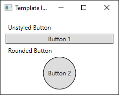
プロジェクトを実行して結果を確認すると、ボタンの背景が丸められていることがわかります。

ボタンが円ではなく、歪曲されていることに気付いたかもしれません。 <Ellipse> 要素の動作方法により、これらは常に空いているスペースを埋めるように拡張されます。 ボタンの width プロパティと height プロパティを同じ値に変更して円を一定にします。
<StackPanel Margin="10">
<Label>Unstyled Button</Label>
<Button>Button 1</Button>
<Label>Rounded Button</Label>
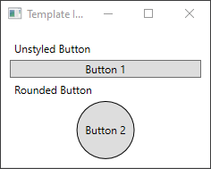
<Button Template="{StaticResource roundbutton}" Width="65" Height="65">Button 2</Button>
</StackPanel>
トリガーの追加
テンプレートが適用されているボタンの見た目が異なる場合でも、他のボタンと同じように動作します。 このボタンを押すと、Click イベントが発生します。 ただし、ボタンの上にマウスを移動しても、ボタンの見た目は変わりません。 これらの視覚的な相互作用は、すべてテンプレートによって定義されています。
WPF で提供されている動的イベントおよびプロパティ システムを使用して、特定のプロパティの値を監視し、必要に応じてテンプレートのスタイルを再作成することができます。 この例では、ボタンの IsMouseOver プロパティを見ていきます。 マウスがコントロールの上にあるときに、新しい色を使用して <Ellipse> のスタイルを設定します。 この種類のトリガーは、PropertyTrigger として知られています。
これを機能させるには、参照できる <Ellipse> に名前を追加する必要があります。 backgroundElement という名前を指定します。
<Ellipse x:Name="backgroundElement" Fill="{TemplateBinding Background}" Stroke="{TemplateBinding Foreground}" />
次に、ControlTemplate.Triggers コレクションに新しい Trigger を追加します。 トリガーは、true 値の IsMouseOver イベントを監視します。
<ControlTemplate x:Key="roundbutton" TargetType="Button">
    <Grid>
        <Ellipse x:Name="backgroundElement" Fill="{TemplateBinding Background}" Stroke="{TemplateBinding Foreground}" />
        <ContentPresenter HorizontalAlignment="Center" VerticalAlignment="Center" />
    </Grid>
    <ControlTemplate.Triggers>
        <Trigger Property="IsMouseOver" Value="true">

        </Trigger>
    </ControlTemplate.Triggers>
</ControlTemplate>
次に、<Ellipse> の Fill プロパティを新しい色に変更する <Trigger> に <Setter> を追加します。
<Trigger Property="IsMouseOver" Value="true">
    <Setter Property="Fill" TargetName="backgroundElement" Value="AliceBlue"/>
</Trigger>
プロジェクトを実行します。 ボタンの上にマウスを移動すると、<Ellipse> の色が変化することに注意してください。
VisualState を使用する
表示状態は、コントロールによって定義され、トリガーされます。 たとえば、マウスをコントロールの上に移動すると、CommonStates.MouseOver 状態がトリガーされます。 コントロールの現在の状態に基づいて、プロパティの変更にアニメーションを付けることができます。 前のセクションでは、<PropertyTrigger> を使用して、IsMouseOver プロパティが true である場合にボタンの背景が AliceBlue に変更されるようにしました。 代わりに、この色が変化するアニメーションを付けて、滑らかな遷移を実現する表示状態を作成します。 VisualStates の詳細については、「WPF のスタイルとテンプレート」を参照してください。
<PropertyTrigger> をアニメーション化された表示状態に変換するには、まず、テンプレートから <ControlTemplate.Triggers> 要素を削除します。
<ControlTemplate x:Key="roundbutton" TargetType="Button">
    <Grid>
        <Ellipse x:Name="backgroundElement" Fill="{TemplateBinding Background}" Stroke="{TemplateBinding Foreground}" />
        <ContentPresenter HorizontalAlignment="Center" VerticalAlignment="Center" />
    </Grid>
</ControlTemplate>
次に、コントロール テンプレートの <Grid> ルートに、CommonStates の <VisualStateGroup> が指定された <VisualStateManager.VisualStateGroups> 要素を追加します。 Normal と MouseOver の 2 つの状態を定義します。
<ControlTemplate x:Key="roundbutton" TargetType="Button">
    <Grid>
        <VisualStateManager.VisualStateGroups>
            <VisualStateGroup Name="CommonStates">
                <VisualState Name="Normal">
                </VisualState>
                <VisualState Name="MouseOver">
                </VisualState>
            </VisualStateGroup>
        </VisualStateManager.VisualStateGroups>
        <Ellipse x:Name="backgroundElement" Fill="{TemplateBinding Background}" Stroke="{TemplateBinding Foreground}" />
        <ContentPresenter HorizontalAlignment="Center" VerticalAlignment="Center" />
    </Grid>
</ControlTemplate>
<VisualState> で定義されているアニメーションは、その状態がトリガーされたときに適用されます。 各状態のアニメーションを作成します。 アニメーションは、<Storyboard> 要素に格納されます。 ストーリーボードの詳細については、「ストーリーボードの概要」を参照してください。
標準
この状態では、楕円の塗りつぶしにアニメーションが付けられ、コントロールの
Backgroundの色に復元されます。<Storyboard> <ColorAnimation Storyboard.TargetName="backgroundElement" Storyboard.TargetProperty="(Shape.Fill).(SolidColorBrush.Color)" To="{TemplateBinding Background}" Duration="0:0:0.3"/> </Storyboard>MouseOver
この状態では、楕円の
Backgroundの色から新しい色であるYellowに切り替わるようアニメーションが付けられます。<Storyboard> <ColorAnimation Storyboard.TargetName="backgroundElement" Storyboard.TargetProperty="(Shape.Fill).(SolidColorBrush.Color)" To="Yellow" Duration="0:0:0.3"/> </Storyboard>
これで、<ControlTemplate> は次のようになります。
<ControlTemplate x:Key="roundbutton" TargetType="Button">
<Grid>
<VisualStateManager.VisualStateGroups>
<VisualStateGroup Name="CommonStates">
<VisualState Name="Normal">
<Storyboard>
    <ColorAnimation Storyboard.TargetName="backgroundElement"
        Storyboard.TargetProperty="(Shape.Fill).(SolidColorBrush.Color)"
        To="{TemplateBinding Background}"
        Duration="0:0:0.3"/>
</Storyboard>
</VisualState>
<VisualState Name="MouseOver">
<Storyboard>
    <ColorAnimation Storyboard.TargetName="backgroundElement"
        Storyboard.TargetProperty="(Shape.Fill).(SolidColorBrush.Color)"
        To="Yellow"
        Duration="0:0:0.3"/>
</Storyboard>
</VisualState>
</VisualStateGroup>
</VisualStateManager.VisualStateGroups>
<Ellipse Name="backgroundElement" Fill="{TemplateBinding Background}" Stroke="{TemplateBinding Foreground}" />
<ContentPresenter x:Name="contentPresenter" HorizontalAlignment="Center" VerticalAlignment="Center" />
</Grid>
</ControlTemplate>
プロジェクトを実行します。 ボタンの上にマウスを移動すると、<Ellipse> の色にアニメーションが付けられます。
次のステップ
.NET Desktop feedback
フィードバック
以下は間もなく提供いたします。2024 年を通じて、コンテンツのフィードバック メカニズムとして GitHub の issue を段階的に廃止し、新しいフィードバック システムに置き換えます。 詳細については、「https://aka.ms/ContentUserFeedback」を参照してください。
フィードバックの送信と表示