グリッド
 サンプルを参照する
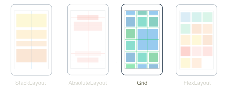
.NET Multi-Platform App UI (.NET MAUI) の Grid は、比例サイズにも絶対サイズにもできる行と列の形式に子を整理するレイアウトです。 既定では、Grid には 1 つの行と 1 つの列が含まれます。 さらに Grid は、他の子レイアウトを含む親レイアウトとして使用できます。
Grid をテーブルと混同しないでください。また、表形式のデータを表示するためのものではありません。 HTML テーブルとは異なり、Grid はコンテンツをレイアウトするためのものです。 表形式のデータを表示するには、ListView または CollectionView の使用を検討してください。
Grid クラスでは、次のプロパティが定義されます。
int型のColumnは、親の Grid 内のビューの列の配置を示す添付プロパティです。 このプロパティの既定値は 0です。 検証コールバックにより、プロパティが設定されるときに、その値が 0 以上であることが保証されます。ColumnDefinitionCollection型のColumnDefinitionsは、 グリッドの列の幅を定義するColumnDefinitionオブジェクトのリストです。double型のColumnSpacingは、グリッドの列間の距離を示します。 このプロパティの既定値は 0です。int型のColumnSpanは、ビューが親の Grid 内にまたがる列の合計数を示す添付プロパティです。 このプロパティの既定値は 1です。 検証コールバックにより、プロパティが設定されるときに、その値が 1 以上であることが保証されます。int型のRowは、親の Grid 内のビューの行の配置を示す添付プロパティです。 このプロパティの既定値は 0です。 検証コールバックにより、プロパティが設定されるときに、その値が 0 以上であることが保証されます。RowDefinitionCollection型のRowDefinitionsは、グリッドの行の高さを定義するRowDefinitionオブジェクトのリストです。double型のRowSpacingは、グリッドの行間の距離を示します。 このプロパティの既定値は 0です。int型のRowSpanは、ビューが親の Grid 内にまたがる行の合計数を示す添付プロパティです。 このプロパティの既定値は 1です。 検証コールバックにより、プロパティが設定されるときに、その値が 1 以上であることが保証されます。
これらのプロパティは、BindableProperty オブジェクトを基盤としています。つまり、プロパティをデータ バインディングの対象にして、スタイル設定することができます。
行と列
既定では、Grid には 1 つの行と 1 つの列が含まれています。
<ContentPage xmlns="http://schemas.microsoft.com/dotnet/2021/maui"
             xmlns:x="http://schemas.microsoft.com/winfx/2009/xaml"
             x:Class="GridTutorial.MainPage">
    <Grid Margin="20,35,20,20">
        <Label Text="By default, a Grid contains one row and one column." />
    </Grid>
</ContentPage>
この例では、Grid には 1 つの場所に自動的に配置される 1 つの子 Label が含まれています。

Grid のレイアウト動作は、RowDefinition オブジェクトと ColumnDefinition オブジェクトのコレクションである RowDefinitions プロパティと ColumnDefinitions プロパティで定義できます。 これらのコレクションは、Grid の行と列の特性を定義し、Grid の各行に 1 つの RowDefinition オブジェクトと、Grid の各列に 1 つの ColumnDefinition オブジェクトを含む必要があります。
RowDefinition クラスは GridLength 型の Height プロパティを定義し、ColumnDefinition クラスは GridLength 型の Width プロパティを定義します。 GridLength 構造体は、次の 3 つの要素がある GridUnitType 列挙型の行の高さまたは列の幅を指定します。
Absolute– デバイスに依存しない単位の値である、行の高さまたは列の幅です (XAML では数値)。Auto– セルの内容に基づいて自動サイズ設定される、行の高さまたは列の幅です (XAML ではAuto)。Star– 残りの行の高さまたは列の幅であり、比例的に割り当てられます (XAML では数値の後に*が続きます)。
Height プロパティが Auto である Grid 行は、垂直方向の StackLayout と同じ方法でその行のビューの高さを制限します。 同様に、Width プロパティが Auto である列は、水平方向の StackLayout と同様に機能します。
注意事項
Auto サイズに設定する行と列をできるだけ少なくしてください。 自動サイズ調整された行または列はそれぞれ、レイアウト エンジンに追加のレイアウト計算を実行させることになります。 その代わりに可能であれば、固定サイズの行と列を使用してください。 または、GridUnitType.Star 列挙値を利用し、比率によって領域を占めるように行と列を設定します。
次の XAML は、3 つの行と 2 つの列を含む Grid を作成する方法を示しています。
<ContentPage xmlns="http://schemas.microsoft.com/dotnet/2021/maui"
             xmlns:x="http://schemas.microsoft.com/winfx/2009/xaml"
             x:Class="GridDemos.Views.XAML.BasicGridPage"
             Title="Basic Grid demo">
   <Grid>
        <Grid.RowDefinitions>
            <RowDefinition Height="2*" />
            <RowDefinition Height="*" />
            <RowDefinition Height="100" />
        </Grid.RowDefinitions>
        <Grid.ColumnDefinitions>
            <ColumnDefinition Width="*" />
            <ColumnDefinition Width="*" />
        </Grid.ColumnDefinitions>
        ...
    </Grid>
</ContentPage>
この例では、Grid の全体の高さはページの高さになります。 Grid は、3 行目の高さがデバイスに依存しない 100 単位であることを認識しています。 その高さがグリッドの高さから差し引かれ、1 行目と 2 行目の間の残りの高さがアスタリスクの前の数値に基づいて比例配分されます。 この例では、1 行目の高さは 2 行目の高さの 2 倍になっています。
2 つの ColumnDefinition オブジェクトはどちらも Width を * に設定しています。これは 1* と同じで、画面の幅が 2 つの列で均等に分割されることを意味します。
重要
RowDefinition.Height プロパティの既定値は * です。 同様に、ColumnDefinition.Width プロパティの既定値は * です。 したがって、これらの既定値が使用できる場合は、これらのプロパティを設定する必要はありません。
Grid.Column 添付プロパティと Grid.Row 添付プロパティを持つ特定の Grid セルに子ビューを配置できます。 さらに、子ビューが複数の行と列に及ぶようにするには、Grid.RowSpan 添付プロパティと Grid.ColumnSpan 添付プロパティを使用します。
次の XAML は、同じ Grid 定義を示すとともに、特定の Grid セルに子ビューを配置しています。
<ContentPage xmlns="http://schemas.microsoft.com/dotnet/2021/maui"
             xmlns:x="http://schemas.microsoft.com/winfx/2009/xaml"
             x:Class="GridDemos.Views.XAML.BasicGridPage"
             Title="Basic Grid demo">
   <Grid>
        <Grid.RowDefinitions>
            <RowDefinition Height="2*" />
            <RowDefinition />
            <RowDefinition Height="100" />
        </Grid.RowDefinitions>
        <Grid.ColumnDefinitions>
            <ColumnDefinition />
            <ColumnDefinition />
        </Grid.ColumnDefinitions>
        <BoxView Color="Green" />
        <Label Text="Row 0, Column 0"
               HorizontalOptions="Center"
               VerticalOptions="Center" />
        <BoxView Grid.Column="1"
                 Color="Blue" />
        <Label Grid.Column="1"
               Text="Row 0, Column 1"
               HorizontalOptions="Center"
               VerticalOptions="Center" />
        <BoxView Grid.Row="1"
                 Color="Teal" />
        <Label Grid.Row="1"
               Text="Row 1, Column 0"
               HorizontalOptions="Center"
               VerticalOptions="Center" />
        <BoxView Grid.Row="1"
                 Grid.Column="1"
                 Color="Purple" />
        <Label Grid.Row="1"
               Grid.Column="1"
               Text="Row1, Column 1"
               HorizontalOptions="Center"
               VerticalOptions="Center" />
        <BoxView Grid.Row="2"
                 Grid.ColumnSpan="2"
                 Color="Red" />
        <Label Grid.Row="2"
               Grid.ColumnSpan="2"
               Text="Row 2, Columns 0 and 1"
               HorizontalOptions="Center"
               VerticalOptions="Center" />
    </Grid>
</ContentPage>
Note
Grid.Row プロパティと Grid.Column プロパティはどちらも 0 を起点にインデックス付けされるので、Grid.Row="2" は 3 行目を参照しているのに対して、Grid.Column="1" は 2 列目を参照しています。 さらに、これらのプロパティの既定値はどちらも 0 なので、Grid の 1 行目または 1 列目を占める子ビューで設定する必要はありません。
この例では、3 つの Grid 行はすべて BoxView ビューと Label ビューで占有されます。 3 行目の高さはデバイスに依存しない単位の 100 単位分で、最初の 2 行が残りの領域を占めます (1 行目の高さは 2 行目の 2 倍です)。 2 つの列は幅が等しく、Grid を半分に分割します。 3 行目の BoxView は両方の列に及びます。
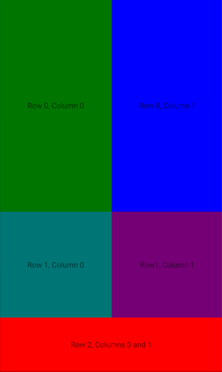
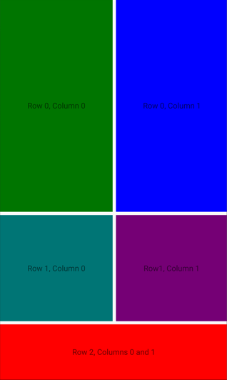
また、Grid の子ビューはセルを共有できます。 XAML に子が表示される順序は、Grid に子が配置される順序です。 前の例では、Label オブジェクトのみが表示されます。これらが BoxView オブジェクトの上にレンダリングされるからです。 Label オブジェクトは、その上に BoxView オブジェクトがレンダリングされた場合、表示されません。
同等の C# コードを次に示します。
public class BasicGridPage : ContentPage
{
    public BasicGridPage()
    {
        Grid grid = new Grid
        {
            RowDefinitions =
            {
                new RowDefinition { Height = new GridLength(2, GridUnitType.Star) },
                new RowDefinition(),
                new RowDefinition { Height = new GridLength(100) }
            },
            ColumnDefinitions =
            {
                new ColumnDefinition(),
                new ColumnDefinition()
            }
        };

        // Row 0
        // The BoxView and Label are in row 0 and column 0, and so only need to be added to the
        // Grid to obtain the default row and column settings.
        grid.Add(new BoxView
        {
            Color = Colors.Green
        });
        grid.Add(new Label
        {
            Text = "Row 0, Column 0",
            HorizontalOptions = LayoutOptions.Center,
            VerticalOptions = LayoutOptions.Center
        });

        // This BoxView and Label are in row 0 and column 1, which are specified as arguments
        // to the Add method.
        grid.Add(new BoxView
        {
            Color = Colors.Blue
        }, 1, 0);
        grid.Add(new Label
        {
            Text = "Row 0, Column 1",
            HorizontalOptions = LayoutOptions.Center,
            VerticalOptions = LayoutOptions.Center
        }, 1, 0);

        // Row 1
        // This BoxView and Label are in row 1 and column 0, which are specified as arguments
        // to the Add method overload.
        grid.Add(new BoxView
        {
            Color = Colors.Teal
        }, 0, 1);
        grid.Add(new Label
        {
            Text = "Row 1, Column 0",
            HorizontalOptions = LayoutOptions.Center,
            VerticalOptions = LayoutOptions.Center
        }, 0, 1);

        // This BoxView and Label are in row 1 and column 1, which are specified as arguments
        // to the Add method overload.
        grid.Add(new BoxView
        {
            Color = Colors.Purple
        }, 1, 1);
        grid.Add(new Label
        {
            Text = "Row1, Column 1",
            HorizontalOptions = LayoutOptions.Center,
            VerticalOptions = LayoutOptions.Center
        }, 1, 1);

        // Row 2
        // Alternatively, the BoxView and Label can be positioned in cells with the Grid.SetRow
        // and Grid.SetColumn methods. Here, the Grid.SetColumnSpan method is used to span two columns.
        BoxView boxView = new BoxView { Color = Colors.Red };
        Grid.SetRow(boxView, 2);
        Grid.SetColumnSpan(boxView, 2);
        Label label = new Label
        {
            Text = "Row 2, Column 0 and 1",
            HorizontalOptions = LayoutOptions.Center,
            VerticalOptions = LayoutOptions.Center
        };
        Grid.SetRow(label, 2);
        Grid.SetColumnSpan(label, 2);

        grid.Add(boxView);
        grid.Add(label);

        Title = "Basic Grid demo";
        Content = grid;
    }
}
コードでは、RowDefinition オブジェクトの高さと ColumnDefinition オブジェクトの幅を指定するために、GridLength 構造体の値を (多くの場合、GridUnitType 列挙型と組み合わせて) 使用します。
Note
また、Grid では、Grid の指定の行と列に指定の行および列スパンのビューを追加する AddWithSpan 拡張メソッドも定義されています。
行と列の定義を簡略化する
XAML では、行と列ごとに RowDefinition オブジェクトと ColumnDefinition オブジェクトを定義しなくてもよい簡略化された構文を使用して、Grid の行と列の特性を指定できます。 代わりに、RowDefinitions プロパティと ColumnDefinitions プロパティを、コンマ区切りの GridUnitType 値を含んだ文字列に設定でき、それらの値から、.NET MAUI に組み込まれている型コンバーターが RowDefinition オブジェクトと ColumnDefinition オブジェクトを作成します。
<Grid RowDefinitions="1*, Auto, 25, 14, 20"
      ColumnDefinitions="*, 2*, Auto, 300">
    ...
</Grid>
この例では、Grid に 5 つの行と 4 つの列があります。 3 行目、4 行目、5 行目の高さは絶対値に設定され、2 行目は内容に合わせて自動的にサイズ調整されます。 その後、残りの高さが 1 行目に配分されます。
4 列目の幅は絶対値に設定され、3 列目はその内容に合わせて自動的にサイズ調整されます。 残りの幅は、アスタリスクの前の数値に基づいて、1 列目と 2 列目の間で比例配分されます。 この例では、2 列目の幅は 1 列目の幅の 2 倍になっています (* が 1* と同じなので)。
行間と列間のスペースを設定する
既定では、Grid の行間と列間にスペースはありません。 これは、RowSpacing プロパティと ColumnSpacing プロパティを設定してそれぞれ変更できます。
<ContentPage xmlns="http://schemas.microsoft.com/dotnet/2021/maui"
             xmlns:x="http://schemas.microsoft.com/winfx/2009/xaml"
             x:Class="GridDemos.Views.XAML.GridSpacingPage"
             Title="Grid spacing demo">
    <Grid RowSpacing="6"
          ColumnSpacing="6">
        ...
    </Grid>
</ContentPage>
次の例では、デバイスに依存しない単位の 6 単位分のスペースで行と列が区切られた Grid を作成しています。
ヒント
RowSpacing プロパティと ColumnSpacing プロパティを負の値に設定すると、セルの内容をオーバーラップさせることができます。
同等の C# コードを次に示します。
public class GridSpacingPage : ContentPage
{
    public GridSpacingPage()
    {
        Grid grid = new Grid
        {
            RowSpacing = 6,
            ColumnSpacing = 6,
            ...
        };
        ...

        Content = grid;
    }
}
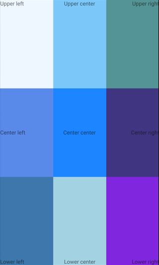
Alignment
Grid の子ビューのセル内の位置は、HorizontalOptions プロパティと VerticalOptions プロパティで設定できます。 これらのプロパティは、LayoutOptions 構造体の次のフィールドに設定できます。
StartCenterEndFill
次の XAML では、同じサイズの 9 つのセルを持つ Grid を作成し、配置の異なる Label を各セルに設定しています。
<ContentPage xmlns="http://schemas.microsoft.com/dotnet/2021/maui"
             xmlns:x="http://schemas.microsoft.com/winfx/2009/xaml"
             x:Class="GridDemos.Views.XAML.GridAlignmentPage"
             Title="Grid alignment demo">
    <Grid>
        <Grid.RowDefinitions>
            <RowDefinition />
            <RowDefinition />
            <RowDefinition />
        </Grid.RowDefinitions>
        <Grid.ColumnDefinitions>
            <ColumnDefinition />
            <ColumnDefinition />
            <ColumnDefinition />
        </Grid.ColumnDefinitions>

        <BoxView Color="AliceBlue" />
        <Label Text="Upper left"
               HorizontalOptions="Start"
               VerticalOptions="Start" />
        <BoxView Grid.Column="1"
                 Color="LightSkyBlue" />
        <Label Grid.Column="1"
               Text="Upper center"
               HorizontalOptions="Center"
               VerticalOptions="Start"/>
        <BoxView Grid.Column="2"
                 Color="CadetBlue" />
        <Label Grid.Column="2"
               Text="Upper right"
               HorizontalOptions="End"
               VerticalOptions="Start" />
        <BoxView Grid.Row="1"
                 Color="CornflowerBlue" />
        <Label Grid.Row="1"
               Text="Center left"
               HorizontalOptions="Start"
               VerticalOptions="Center" />
        <BoxView Grid.Row="1"
                 Grid.Column="1"
                 Color="DodgerBlue" />
        <Label Grid.Row="1"
               Grid.Column="1"
               Text="Center center"
               HorizontalOptions="Center"
               VerticalOptions="Center" />
        <BoxView Grid.Row="1"
                 Grid.Column="2"
                 Color="DarkSlateBlue" />
        <Label Grid.Row="1"
               Grid.Column="2"
               Text="Center right"
               HorizontalOptions="End"
               VerticalOptions="Center" />
        <BoxView Grid.Row="2"
                 Color="SteelBlue" />
        <Label Grid.Row="2"
               Text="Lower left"
               HorizontalOptions="Start"
               VerticalOptions="End" />
        <BoxView Grid.Row="2"
                 Grid.Column="1"
                 Color="LightBlue" />
        <Label Grid.Row="2"
               Grid.Column="1"
               Text="Lower center"
               HorizontalOptions="Center"
               VerticalOptions="End" />
        <BoxView Grid.Row="2"
                 Grid.Column="2"
                 Color="BlueViolet" />
        <Label Grid.Row="2"
               Grid.Column="2"
               Text="Lower right"
               HorizontalOptions="End"
               VerticalOptions="End" />
    </Grid>
</ContentPage>
この例では、各行の Label オブジェクトがすべて垂直方向には同じ配置になっていますが、水平方向の配置は異なっています。 または、各列の Label オブジェクトが水平方向には同じ配置になっているが、垂直方向には異なる配置になっていると考えることもできます。
同等の C# コードを次に示します。
public class GridAlignmentPage : ContentPage
{
    public GridAlignmentPage()
    {
        Grid grid = new Grid
        {
            RowDefinitions =
            {
                new RowDefinition(),
                new RowDefinition(),
                new RowDefinition()
            },
            ColumnDefinitions =
            {
                new ColumnDefinition(),
                new ColumnDefinition(),
                new ColumnDefinition()
            }
        };

        // Row 0
        grid.Add(new BoxView
        {
            Color = Colors.AliceBlue
        });
        grid.Add(new Label
        {
            Text = "Upper left",
            HorizontalOptions = LayoutOptions.Start,
            VerticalOptions = LayoutOptions.Start
        });

        grid.Add(new BoxView
        {
            Color = Colors.LightSkyBlue
        }, 1, 0);
        grid.Add(new Label
        {
            Text = "Upper center",
            HorizontalOptions = LayoutOptions.Center,
            VerticalOptions = LayoutOptions.Start
        }, 1, 0);

        grid.Add(new BoxView
        {
            Color = Colors.CadetBlue
        }, 2, 0);
        grid.Add(new Label
        {
            Text = "Upper right",
            HorizontalOptions = LayoutOptions.End,
            VerticalOptions = LayoutOptions.Start
        }, 2, 0);

        // Row 1
        grid.Add(new BoxView
        {
            Color = Colors.CornflowerBlue
        }, 0, 1);
        grid.Add(new Label
        {
            Text = "Center left",
            HorizontalOptions = LayoutOptions.Start,
            VerticalOptions = LayoutOptions.Center
        }, 0, 1);

        grid.Add(new BoxView
        {
            Color = Colors.DodgerBlue
        }, 1, 1);
        grid.Add(new Label
        {
            Text = "Center center",
            HorizontalOptions = LayoutOptions.Center,
            VerticalOptions = LayoutOptions.Center
        }, 1, 1);

        grid.Add(new BoxView
        {
            Color = Colors.DarkSlateBlue
        }, 2, 1);
        grid.Add(new Label
        {
            Text = "Center right",
            HorizontalOptions = LayoutOptions.End,
            VerticalOptions = LayoutOptions.Center
        }, 2, 1);

        // Row 2
        grid.Add(new BoxView
        {
            Color = Colors.SteelBlue
        }, 0, 2);
        grid.Add(new Label
        {
            Text = "Lower left",
            HorizontalOptions = LayoutOptions.Start,
            VerticalOptions = LayoutOptions.End
        }, 0, 2);

        grid.Add(new BoxView
        {
            Color = Colors.LightBlue
        }, 1, 2);
        grid.Add(new Label
        {
            Text = "Lower center",
            HorizontalOptions = LayoutOptions.Center,
            VerticalOptions = LayoutOptions.End
        }, 1, 2);

        grid.Add(new BoxView
        {
            Color = Colors.BlueViolet
        }, 2, 2);
        grid.Add(new Label
        {
            Text = "Lower right",
            HorizontalOptions = LayoutOptions.End,
            VerticalOptions = LayoutOptions.End
        }, 2, 2);

        Title = "Grid alignment demo";
        Content = grid;
    }
}
入れ子になった Grid オブジェクト
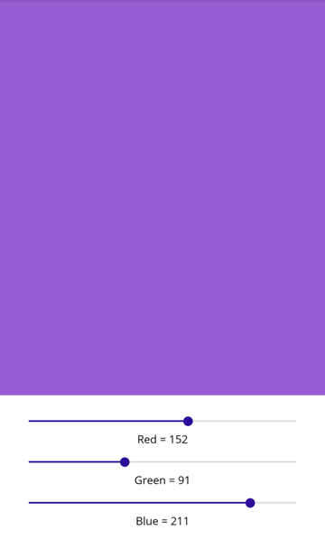
Grid は、入れ子になった子 Grid オブジェクトまたはその他の子レイアウトを含む親レイアウトとして使用できます。 Grid オブジェクトを入れ子にすると、Grid.Row、Grid.Column、Grid.RowSpan、Grid.ColumnSpan の各添付プロパティは常に、親 Grid 内のビューの位置を参照します。
次の XAML は、入れ子の Grid オブジェクトの例を示しています。
<ContentPage xmlns="http://schemas.microsoft.com/dotnet/2021/maui"
             xmlns:x="http://schemas.microsoft.com/winfx/2009/xaml"
             xmlns:converters="clr-namespace:GridDemos.Converters"
             x:Class="GridDemos.Views.XAML.ColorSlidersGridPage"
             Title="Nested Grids demo">

    <ContentPage.Resources>
        <converters:DoubleToIntConverter x:Key="doubleToInt" />

        <Style TargetType="Label">
            <Setter Property="HorizontalTextAlignment"
                    Value="Center" />
        </Style>
    </ContentPage.Resources>

    <Grid>
        <Grid.RowDefinitions>
            <RowDefinition Height="500" />
            <RowDefinition Height="Auto" />
        </Grid.RowDefinitions>

        <BoxView x:Name="boxView"
                 Color="Black" />
        <Grid Grid.Row="1"
              Margin="20">
            <Grid.RowDefinitions>
                <RowDefinition />
                <RowDefinition />
                <RowDefinition />
                <RowDefinition />
                <RowDefinition />
                <RowDefinition />
            </Grid.RowDefinitions>
            <Slider x:Name="redSlider"
                    ValueChanged="OnSliderValueChanged" />
            <Label Grid.Row="1"
                   Text="{Binding Source={x:Reference redSlider},
                                  Path=Value,
                                  Converter={StaticResource doubleToInt},
                                  ConverterParameter=255,
                                  StringFormat='Red = {0}'}" />
            <Slider x:Name="greenSlider"
                    Grid.Row="2"
                    ValueChanged="OnSliderValueChanged" />
            <Label Grid.Row="3"
                   Text="{Binding Source={x:Reference greenSlider},
                                  Path=Value,
                                  Converter={StaticResource doubleToInt},
                                  ConverterParameter=255,
                                  StringFormat='Green = {0}'}" />
            <Slider x:Name="blueSlider"
                    Grid.Row="4"
                    ValueChanged="OnSliderValueChanged" />
            <Label Grid.Row="5"
                   Text="{Binding Source={x:Reference blueSlider},
                                  Path=Value,
                                  Converter={StaticResource doubleToInt},
                                  ConverterParameter=255,
                                  StringFormat='Blue = {0}'}" />
        </Grid>
    </Grid>
</ContentPage>
この例では、ルート Grid には 1 行目に BoxView が、2 行目には子 Grid が含まれています。 子 Grid には、BoxView で表示される色を操作する Slider オブジェクトと、各 Slider の値を表示する Label オブジェクトが含まれています。
重要
Grid オブジェクトやその他のレイアウトの入れ子が深くなればそれだけ、実行されるレイアウト計算が増え、性能に影響する場合があります。 詳細については、「正しいレイアウトの選択」を参照してください。
同等の C# コードを次に示します。
public class ColorSlidersGridPage : ContentPage
{
    BoxView boxView;
    Slider redSlider;
    Slider greenSlider;
    Slider blueSlider;

    public ColorSlidersGridPage()
    {
        // Create an implicit style for the Labels
        Style labelStyle = new Style(typeof(Label))
        {
            Setters =
            {
                new Setter { Property = Label.HorizontalTextAlignmentProperty, Value = TextAlignment.Center }
            }
        };
        Resources.Add(labelStyle);

        // Root page layout
        Grid rootGrid = new Grid
        {
            RowDefinitions =
            {
                new RowDefinition { HeightRequest = 500 },
                new RowDefinition()
            }
        };

        boxView = new BoxView { Color = Colors.Black };
        rootGrid.Add(boxView);

        // Child page layout
        Grid childGrid = new Grid
        {
            Margin = new Thickness(20),
            RowDefinitions =
            {
                new RowDefinition(),
                new RowDefinition(),
                new RowDefinition(),
                new RowDefinition(),
                new RowDefinition(),
                new RowDefinition()
            }
        };

        DoubleToIntConverter doubleToInt = new DoubleToIntConverter();

        redSlider = new Slider();
        redSlider.ValueChanged += OnSliderValueChanged;
        childGrid.Add(redSlider);

        Label redLabel = new Label();
        redLabel.SetBinding(Label.TextProperty, new Binding("Value", converter: doubleToInt, converterParameter: "255", stringFormat: "Red = {0}", source: redSlider));
        Grid.SetRow(redLabel, 1);
        childGrid.Add(redLabel);

        greenSlider = new Slider();
        greenSlider.ValueChanged += OnSliderValueChanged;
        Grid.SetRow(greenSlider, 2);
        childGrid.Add(greenSlider);

        Label greenLabel = new Label();
        greenLabel.SetBinding(Label.TextProperty, new Binding("Value", converter: doubleToInt, converterParameter: "255", stringFormat: "Green = {0}", source: greenSlider));
        Grid.SetRow(greenLabel, 3);
        childGrid.Add(greenLabel);

        blueSlider = new Slider();
        blueSlider.ValueChanged += OnSliderValueChanged;
        Grid.SetRow(blueSlider, 4);
        childGrid.Add(blueSlider);

        Label blueLabel = new Label();
        blueLabel.SetBinding(Label.TextProperty, new Binding("Value", converter: doubleToInt, converterParameter: "255", stringFormat: "Blue = {0}", source: blueSlider));
        Grid.SetRow(blueLabel, 5);
        childGrid.Add(blueLabel);

        // Place the child Grid in the root Grid
        rootGrid.Add(childGrid, 0, 1);

        Title = "Nested Grids demo";
        Content = rootGrid;
    }

    void OnSliderValueChanged(object sender, ValueChangedEventArgs e)
    {
        boxView.Color = new Color(redSlider.Value, greenSlider.Value, blueSlider.Value);
    }
}
.NET MAUI
フィードバック
以下は間もなく提供いたします。2024 年を通じて、コンテンツのフィードバック メカニズムとして GitHub の issue を段階的に廃止し、新しいフィードバック システムに置き換えます。 詳細については、「https://aka.ms/ContentUserFeedback」を参照してください。
フィードバックの送信と表示