デュアルスクリーン検出のための CSS ビューポート セグメント メディア クエリ
スパニング CSSmedia機能を使用して、出力デバイスがデュアルスクリーン (または折りたたみ可能) であり、ブラウザー ビューポートが 2 つの表示領域にまたがっているかどうかをテストできます。 環境変数 は、画面上の表示領域と、それらの間のヒンジ領域 (存在する場合) を計算するためにも使用できます。
この API は、Microsoft Edge バージョン 97 以降で使用できます。
ビューポート セグメント
ブラウザーが水平方向または垂直方向のヒンジにまたがっているときのスタイルを宣言する CSS 構文:
@media (horizontal-viewport-segments: <count>) { }
@media (vertical-viewport-segments: <count>) { }
Surface Duo の場合、デュアルスクリーン ディスプレイと一致する値は次のとおりです。
horizontal-viewport-segments: 2
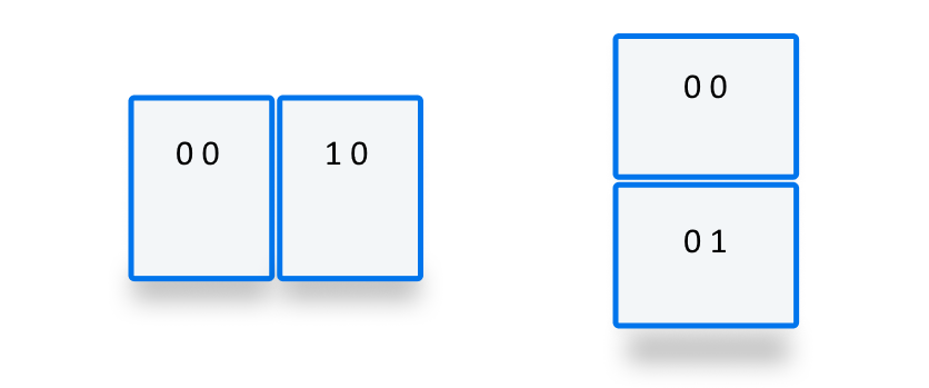
- ブラウザー ビューポートが 1 つのフォールド (2 つの表示領域) にまたがり、フォールドの姿勢が垂直である場合の状態について説明します。 この値は、ダブル縦 (ワイド) モードの Surface Duo と一致します。
vertical-viewport-segments: 2
- ブラウザー ビューポートが 1 つのフォールド (2 つの表示領域) にまたがり、折り畳み姿勢が水平である場合の状態について説明します。 この値は、ダブル ランドスケープ (高さ) モードの Surface Duo と一致します。
次の CSS スニペットの例は、メディア機能を -viewport-segments 使用して Surface Duo にスタイルを適用する方法を示しています。
@media (horizontal-viewport-segments: 2) {
   /* styles applied in double-portrait (wide) mode */
   /* matches Figure 1. below */
}
@media (vertical-viewport-segments: 2) {
   /* styles applied in double-landscape (tall) mode */
   /* matches Figure 2. below */
}

CSS 環境変数
Web 開発者は、ブラウザー定義の環境変数を使用して、表示領域 (または領域) のジオメトリを取得し、隠れたヒンジ領域のジオメトリ (存在する場合) を計算できます。 各ビューポートのプロパティは、次の環境変数定義を使用して照会できます (左上のセグメントの座標を使用)。
env(viewport-segment-width <x> <y>);
env(viewport-segment-height <x> <y>);
env(viewport-segment-top <x> <y>);
env(viewport-segment-left <x> <y>);
env(viewport-segment-bottom <x> <y>);
env(viewport-segment-right <x> <y>);
座標は、左上のセグメントから割り当てられます。
これらの値を使用して、ヒンジ領域の座標を推測できます。
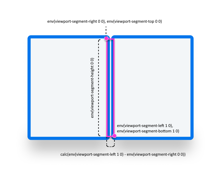
/* double-portrait */
env(viewport-segment-right 0 0);      /* hinge left */
env(viewport-segment-left 1 0);       /* hinge right*/
calc(env(viewport-segment-left 1 0) - env(viewport-segment-right 0 0))
                                      /* hinge width */
/* double-landscape */
env(viewport-segment-bottom 0 0);     /* hinge top */
env(viewport-segment-top 0 1);        /* hinge bottom */
calc(env(viewport-segment-top 0 1) - env(viewport-segment-bottom 0 0))
                                      /* hinge height */
例
Basic
任意の状態で、電話とgreenデュアルスクリーン デバイスで背景色が設定yellowされているレスポンシブ ページ<body>を作成します。
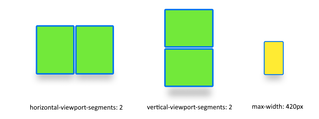
/* maximum width of our customers phones is 420px */
/* spanning: none is optional in this case */
@media (max-width: 420px) {
   body {
      background-color: yellow;
   }
}

/* Separating media features with comma `,` is equivalent to the logical operation OR  */
@media (horizontal-viewport-segments: 2), (vertical-viewport-segments: 2) {
   body {
      background-color: green;
   }
}
Flexbox
flexbox を使用して、最初の列にスクロール可能な説明が含まれており、2 番目の列に画像が含まれる、ギャップ対応の 2 つの列レイアウトを作成します。

このレイアウトを作成する HTML と CSS を次に示します。
   <body>
      <article class="article">
         ...
      </article>
      <figure class="figure">
         <img src="/sydney-opera-house.jpg"
               alt="Sydney Opera House">
      </figure>
   </body>
body {
   height: 100vh;
   display: flex;
}

.article {
   /* grow: no, shrink: no, basis: fold-left */
   flex: 0 0 env(viewport-segment-right 0 0);

   /* equals to margin-right when writing mode is left-to-right (english)  */
   /* equals to margin-left when writing mode is right-to-left (arabic, hebrew)  */
   /* this will prevent content from being rendered behind the device mask */
   margin-inline-end: calc(env(viewport-segment-left 1 0) - env(viewport-segment-right 0 0)) ; /* hinge width */

   overflow-y: scroll;
}

.figure {
   /* fill the rest of the space */
   flex: 1;

   margin: 0;
   overflow: hidden;
}

.figure img {
   height: 100%;
}