最初のコンポーネントを作成する
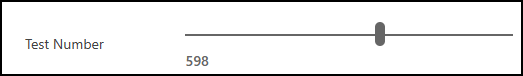
このチュートリアルでは、ユーザーが列に値を入力する代わりに、視覚的なスライダーを使用して数値を変更できるようにする線形スライダーコード コンポーネントを作成する方法を示します。
完成した線形スライダー コード コンポーネントのサンプル コードは、PowerApps-Samples/component-framework/LinearInputControl/ から入手できます
線形スライダー コード コンポーネントを構築するには、次の手順が必要です。
- 新しいコンポーネント プロジェクトを作成する
- マニフェストの実装
- TypeScript を使ってコンポーネント ロジックを実装する
- コード コンポーネントにスタイルを追加する
- コード コンポーネントを構築する
- コード コンポーネントのパッケージ化
- コード コンポーネントをアプリに追加する
前提条件
このチュートリアルでは、次のコンポーネントをインストールする必要があります。
- Visual Studio Code (VSCode) ([パスに追加] オプションが選択されていることを確認してください)
- node.js (LTS バージョンが推奨されています)
- Microsoft Power Platform CLI (Power Platform Tools for Visual Studio Code または Power Platform CLI for Windows のいずれかを使用します)
- 次のいずれかをインストールして、.NET ビルド ツールを作成します: (少なくとも、ワークロード
.NET build toolsを選択します。)- Visual Studio 2022
- Visual Studio 2019
注意
Visual Studio 用ビルド ツールの代わりに、.NET 6.x SDK を使用することもできます。 この場合、msbuild を使用する代わりに dotnet build を使用します。
ヒント
ソース管理用 git をインストールすることもお勧めします。
新しいコンポーネント プロジェクトを作成する
このチュートリアルでは、C:\repos にあるフォルダーから開始しますが、任意のフォルダーを使用することができます。 フォルダーは、コードで確認する場所を表す必要があります。
LinearInputという名前の新しいフォルダーを作成します。Visual Studio Code を使用して
LinearInputフォルダーを開きます。開始する最も簡単な方法は、コマンド プロンプト ウィンドウを使用して
LinearInputフォルダーに移動し、code .と入力することです。c:\repos\LinearInput>code .このコマンドは、 Visual Studio Code にあるコンポーネントプロジェクトを開きます。
ターミナル -> 新しいターミナル を使用して Visual Studio Code 内部に新しいターミナルを開きます。
ターミナル プロンプトで、pac pcf init コマンドを使用して基本パラメータを渡すことで新しいコンポーネントプロジェクトを作成します。
pac pcf init --namespace SampleNamespace --name LinearInputControl --template field --run-npm-install上記のコマンドは、プロジェクトのビルド ツールを設定する
npm installコマンドも実行します。Running 'npm install' for you...注意
The term 'npm' is not recognized as the name of a cmdlet, function, script file, or operable program.というエラー メッセージが表示された場合、node.js (LTS 版を推奨) とその他すべての前提条件がインストールされているかどうかを確認してください。
マニフェストの実装
コントロール マニフェストは、コード コンポーネントのメタデータを含む XML ファイルです。 また、コード コンポーネントの動作も定義します。 このチュートリアルでは、LinearInputControl サブフォルダーでマニフェスト ファイルが作成されます。 Visual Studio Code で ControlManifest.Input.xml ファイルを開く場合、マニフェストが一部のプロパティに定義済であることがわかります。 詳細: マニフェスト。
コントロール ノードは、コード コンポーネントの名前空間、バージョン、および表示名を定義します。
ツールは、コントロールの適切な出発点として control 要素を生成しました。
ヒント
属性が別々の行に表示されるように XMLをフォーマットすると、読みやすくなる場合があります。 Visual Studio Code Marketplace で選択した XML フォーマット ツールを見つけてインストールします: xml フォーマット拡張機能を検索。
以下の例は、読みやすくするために、属性を別々の行にしたフォーマットにしています。
| Attribute | Description |
|---|---|
namespace |
コード コンポーネントの名前空間。 |
constructor |
コード コンポーネントのコンストラクター。 |
version |
コンポーネントのバージョン。 コンポーネントを更新すると、実行時に変更を表示するの最新バージョンに更新する必要があります。 |
display-name-key |
UI に表示するコード コンポーネントの名前。 |
description-key |
UI に表示するコード コンポーネントの説明。 |
control-type |
コード コンポーネントの種類。 これは standard コントロールです。 |
コメント領域を無視してドキュメントをフォーマットすると、次のようなマニフェストが生成されます:
<?xml version="1.0" encoding="utf-8" ?>
<manifest>
<control namespace="SampleNamespace"
   constructor="LinearInputControl"
   version="0.0.1"
   display-name-key="LinearInputControl"
   description-key="LinearInputControl description"
   control-type="standard">
   <external-service-usage enabled="false">
   </external-service-usage>
   <property name="sampleProperty"
      display-name-key="Property_Display_Key"
      description-key="Property_Desc_Key"
      of-type="SingleLine.Text"
      usage="bound"
      required="true" />
   <resources>
      <code path="index.ts"
         order="1" />
   </resources>
</control>
</manifest>
この開始点から、次の変更を行います:
type-group 要素の追加
control 内要素に numbers という名前の type-group 要素の定義を追加します。 この要素はコンポーネント値を指定し、整数、通貨、浮動小数点、または 10 進数値を含めることができます。
external-service-usage 機能はこのコントロールでは使用されないため、external-service-usage 要素を type-group に置き換えます。
<control namespace="SampleNamespace"
   constructor="LinearInputControl"
   version="0.0.1"
   display-name-key="LinearInputControl"
   description-key="LinearInputControl description"
   control-type="standard">
   <external-service-usage enabled="false">
   </external-service-usage>
   <property name="sampleProperty"
      display-name-key="Property_Display_Key"
      description-key="Property_Desc_Key"
      of-type="SingleLine.Text"
      usage="bound"
      required="true" />
   <resources>
      <code path="index.ts"
         order="1" />
   </resources>
   </control>
property 要素の編集
control 要素内で生成された sampleProperty property 要素を編集します。 この要素は、列のデータ型の定義など、コード コンポーネントのプロパティを定義します。
| Attribute | Description |
|---|---|
name |
プロパティの名前。 |
display-name-key |
UI で表示するプロパティの表示名。 |
description-key |
UI に表示するプロパティの説明。 |
of-type-group |
特定のタイプ グループの名前を参照する場合は、of-type-group 属性を使用します。ここでは、前のステップで作成した numbers という名前の type-group を参照しています。 |
usage |
bound と input の 2 つのプロパティがあります。- バインドされたプロパティは、列の値にのみバインドされます。 - 入力プロパティは、列にバインドされるか、静的な値を許可します。 |
required |
プロパティが必須かどうかを定義します。 |
ここに示されている通り、プロパティ ノードを編集します:
<property name="sampleProperty"
   display-name-key="Property_Display_Key"
   description-key="Property_Desc_Key"
   of-type="SingleLine.Text"
   usage="bound"
   required="true" />
resources 要素の編集
リソースノードは、コード コンポーネントのビジュアル化を定義します。 これはコード コンポーネントのビジュアル化とスタイル化を構築するすべてのリソースが含まれています。 コード は、リソース要素下で子要素として指定されます。
生成されたマニフェストには、path と order の属性値が設定された code 要素 の定義がすでに含まれています。 これらを使用します。 次の コード コンポーネントにスタイルを追加する セクションでは、コントロールの CSS スタイルを追加します。 これをサポートするために、マニフェストを開いている間に、マニフェストを編集して追加しましょう。
resources ノードを編集し、以下の css 要素 を追加します:
完成したマニフェスト
完了したマニフェスト ファイルは、次のようになります:
<?xml version="1.0" encoding="utf-8" ?>
<manifest>
<control namespace="SampleNamespace"
constructor="LinearInputControl"
version="0.0.1"
display-name-key="LinearInputControl"
description-key="LinearInputControl description"
control-type="standard">
<type-group name="numbers">
<type>Whole.None</type>
<type>Currency</type>
<type>FP</type>
<type>Decimal</type>
</type-group>
<property name="controlValue"
   display-name-key="Control Value"
   description-key="Control value description."
   of-type-group="numbers"
   usage="bound"
   required="true" />
<resources>
   <code path="index.ts"
   order="1" />
   <css path="css/LinearInputControl.css"
   order="1" />
</resources>
</control>
</manifest>
ControlManifest.Input.xmlファイルに加えた変更を保存します。次のコマンドを使用して
ManifestDesignTypes.d.tsファイルを生成します。npm run refreshTypes出力は次のように表示されます。
PS C:\repos\LinearInput> npm run refreshTypes

> pcf-project@1.0.0 refreshTypes
> pcf-scripts refreshTypes

[12:38:06 PM] [refreshTypes]  Initializing...
[12:38:06 PM] [refreshTypes]  Generating manifest types...
[12:38:06 PM] [refreshTypes]  Generating design types...
[12:38:06 PM] [refreshTypes]  Succeeded
結果を確認するには、
C:\repos\LinearInput\LinearInputControl\generated\ManifestTypes.d.tsファイルを開いて、生成された型を確認します:/* *This is auto generated from the ControlManifest.Input.xml file */ // Define IInputs and IOutputs Type. They should match with ControlManifest. export interface IInputs { controlValue: ComponentFramework.PropertyTypes.NumberProperty; } export interface IOutputs { controlValue?: number; }
コンポーネント ロジックの実装
マニフェスト ファイルを実行した後の次の手順は、TypeScript を使用してマニフェスト ファイルをコンポーネントのロジックに実装することです。 コンポーネントのロジックは、index.ts ファイル内で実装する必要があります。 Visual Studio Code で index.ts ファイルを開くと、4 つの重要な関数 (init、updateView、getOutputs、destroy) が事前定義されていることがわかります。 次に、コード コンポーネントのロジックを実装します。
任意のコード エディターで index.ts ファイルを開き、次の変更を行います:
- コントロールのプロパティを追加する
refreshData関数をイベント ハンドラーとして追加するinit関数を更新するupdateView関数を編集するgetOutputs関数を編集するdestroy関数を編集する
コントロールのプロパティを追加する
export class LinearInputControl
implements ComponentFramework.StandardControl<IInputs, IOutputs>
{
/**
   * Empty constructor.
*/
constructor() {}
refreshData 関数をイベント ハンドラーとして追加する
public refreshData(evt: Event): void {
this._value = this.inputElement.value as any as number;
this.labelElement.innerHTML = this.inputElement.value;
this._notifyOutputChanged();
}
init 関数を更新する
public init(
context: ComponentFramework.Context<IInputs>,
notifyOutputChanged: () => void,
state: ComponentFramework.Dictionary,
container: HTMLDivElement
): void {
// Add control initialization code
}
updateView 関数を編集する
public updateView(context: ComponentFramework.Context<IInputs>): void {
// Add code to update control view
}
getOutputs 関数を編集する
destroy 関数を編集する
完成した index.ts ファイルは次のようになります:
import { IInputs, IOutputs } from "./generated/ManifestTypes";
export class LinearInputControl
implements ComponentFramework.StandardControl<IInputs, IOutputs>
{
private _value: number;
private _notifyOutputChanged: () => void;
private labelElement: HTMLLabelElement;
private inputElement: HTMLInputElement;
private _container: HTMLDivElement;
private _context: ComponentFramework.Context<IInputs>;
private _refreshData: EventListenerOrEventListenerObject;
/**
   * Empty constructor.
*/
constructor() {}
/**
* Used to initialize the control instance. Controls can kick off remote server calls
and other initialization actions here.
* Data-set values are not initialized here, use updateView.
* @param context The entire property bag available to control via Context Object;
It contains values as set up by the customizer mapped to property names defined
in the manifest, as well as utility functions.
* @param notifyOutputChanged A callback method to alert the framework that the
control has new outputs ready to be retrieved asynchronously.
* @param state A piece of data that persists in one session for a single user.
Can be set at any point in a controls life cycle by calling 'setControlState'
in the Mode interface.
* @param container If a control is marked control-type='standard', it will receive
an empty div element within which it can render its content.
*/
public init(
context: ComponentFramework.Context<IInputs>,
notifyOutputChanged: () => void,
state: ComponentFramework.Dictionary,
container: HTMLDivElement
): void {
// Add control initialization code
this._context = context;
this._container = document.createElement("div");
this._notifyOutputChanged = notifyOutputChanged;
this._refreshData = this.refreshData.bind(this);
// creating HTML elements for the input type range and binding it to the function which
// refreshes the control data
this.inputElement = document.createElement("input");
this.inputElement.setAttribute("type", "range");
this.inputElement.addEventListener("input", this._refreshData);
//setting the max and min values for the control.
this.inputElement.setAttribute("min", "1");
this.inputElement.setAttribute("max", "1000");
this.inputElement.setAttribute("class", "linearslider");
this.inputElement.setAttribute("id", "linearrangeinput");
// creating a HTML label element that shows the value that is set on the linear range control
this.labelElement = document.createElement("label");
this.labelElement.setAttribute("class", "LinearRangeLabel");
this.labelElement.setAttribute("id", "lrclabel");
// retrieving the latest value from the control and setting it to the HTMl elements.
this._value = context.parameters.controlValue.raw!;
this.inputElement.setAttribute(
"value",
context.parameters.controlValue.formatted
? context.parameters.controlValue.formatted
: "0"
);
this.labelElement.innerHTML = context.parameters.controlValue.formatted
? context.parameters.controlValue.formatted
: "0";
// appending the HTML elements to the control's HTML container element.
this._container.appendChild(this.inputElement);
this._container.appendChild(this.labelElement);
container.appendChild(this._container);
}
public refreshData(evt: Event): void {
   this._value = this.inputElement.value as any as number;
   this.labelElement.innerHTML = this.inputElement.value;
   this._notifyOutputChanged();
}
/**
* Called when any value in the property bag has changed. This includes field values,
data-sets, global values such as container height and width, offline status, control
metadata values such as label, visible, etc.
* @param context The entire property bag available to control via Context Object;
It contains values as set up by the customizer mapped to names defined in the manifest,
as well as utility functions
*/
public updateView(context: ComponentFramework.Context<IInputs>): void {
   // Add code to update control view
   // storing the latest context from the control.
   this._value = context.parameters.controlValue.raw!;
   this._context = context;
   this.inputElement.setAttribute(
      "value",
      context.parameters.controlValue.formatted
      ? context.parameters.controlValue.formatted
      : ""
   );
   this.labelElement.innerHTML = context.parameters.controlValue.formatted
      ? context.parameters.controlValue.formatted
      : "";
}
/**
* It is called by the framework prior to a control receiving new data.
* @returns an object based on nomenclature defined in manifest,
expecting object[s] for property marked as "bound" or "output"
*/
public getOutputs(): IOutputs {
   return {
      controlValue: this._value,
   };
}
/**
* Called when the control is to be removed from the DOM tree.
Controls should use this call for cleanup.
* i.e. cancelling any pending remote calls, removing listeners, etc.
*/
public destroy(): void {
   // Add code to cleanup control if necessary
   this.inputElement.removeEventListener("input", this._refreshData);
   }
}
終了したら、index.ts ファイルへの変更を保存します
コード コンポーネントにスタイルを追加する
開発者およびアプリ作成者は、CSS を使用してコード コンポーネントを表するためのスタイルを定義できます。 CSS は、スタイル、、色、レイアウトやフォントを含む、コード コンポーネントのプレゼンテーションを開発者が説明できるようにします。 線形入力コンポーネントの init メソッドは、入力の要素を作成し、クラス属性を linearslider に設定します。 linearslider クラスのスタイルは別に CSS ファイルで定義されます。 CSS ファイルのような追加のコンポーネント リソースをコード コンポーネントに含め、さらにカスタマイズをサポートすることができます。
重要
CSS を使用してコード コンポーネントにスタイルを実装する場合は、コンポーネントのコンテナー DIV 要素に適用される自動生成された CSS クラスを使用して、CSS がコントロールにスコープ設定されていることを確認してください。
CSS がグローバルにスコープ設定されている場合、コード コンポーネントが表示されるフォームまたは画面の既存のスタイルが損なわれる可能性があります。
サード パーティの CSS フレームワークを使用している場合は、すでに名前空間が設定されているフレームワークのバージョンを使用するか、手動で、または CSS プリプロセッサを使用して、そのフレームワークを名前空間にラップします。
LinearInputControlフォルダの下に新しいcssサブフォルダを作成します。cssサブ フォルダの中に新しいLinearInputControl.cssファイルを作成します。以下のスタイル コンテンツを
LinearInputControl.cssファイルに追加します:.SampleNamespace\.LinearInputControl input[type=range].linearslider { margin: 1px 0; background:transparent; -webkit-appearance:none; width:100%;padding:0; height:24px; -webkit-tap-highlight-color:transparent } .SampleNamespace\.LinearInputControl input[type=range].linearslider:focus { outline: none; } .SampleNamespace\.LinearInputControl input[type=range].linearslider::-webkit-slider-runnable-track { background: #666; height:2px; cursor:pointer } .SampleNamespace\.LinearInputControl input[type=range].linearslider::-webkit-slider-thumb { background: #666; border:0 solid #f00; height:24px; width:10px; border-radius:48px; cursor:pointer; opacity:1; -webkit-appearance:none; margin-top:-12px } .SampleNamespace\.LinearInputControl input[type=range].linearslider::-moz-range-track { background: #666; height:2px; cursor:pointer } .SampleNamespace\.LinearInputControl input[type=range].linearslider::-moz-range-thumb { background: #666; border:0 solid #f00; height:24px; width:10px; border-radius:48px; cursor:pointer; opacity:1; -webkit-appearance:none; margin-top:-12px } .SampleNamespace\.LinearInputControl input[type=range].linearslider::-ms-track { background: #666; height:2px; cursor:pointer } .SampleNamespace\.LinearInputControl input[type=range].linearslider::-ms-thumb { background: #666; border:0 solid #f00; height:24px; width:10px; border-radius:48px; cursor:pointer; opacity:1; -webkit-appearance:none; }LinearInputControl.cssファイルを保存します。前述した マニフェストの実装 セクションで完了しているため、
ControlManifest.Input.xmlファイルにはすでに resources 要素内にcssリソース ファイルが含まれていることに注意してください。<resources> <code path="index.ts" order="1" /> <css path="css/LinearInputControl.css" order="1" /> </resources>
注意
Power Apps component framework は、RESX ウェブ リソース を使用して、ユーザー インターフェイスに表示されるローカライズされた文字列を管理します。 resources ノードには、ローカライズをサポートするリソースも登録されています。
この最初のチュートリアルには、ローカライズ機能は含まれていません。 ローカライズは他のチュートリアルに含まれています。
resx Web リソースを使用してコード コンポーネントをローカライズする方法については、ローカライズ API サンプルを参照してください。
コード コンポーネントを構築する
マニフェスト、コンポーネント ロジック、スタイルの追加が完了したら、次のコマンドを使用してコード コンポーネントをビルドします:
npm run build
出力は次のようになります。
> pcf-project@1.0.0 build
> pcf-scripts build

[2:05:41 PM] [build]  Initializing...
[2:05:41 PM] [build]  Validating manifest...
[2:05:41 PM] [build]  Validating control...
[2:05:42 PM] [build]  Running ESLint...
[2:05:43 PM] [build]  Generating manifest types...
[2:05:43 PM] [build]  Generating design types...
[2:05:43 PM] [build]  Compiling and bundling control...
[Webpack stats]:
asset bundle.js 6.56 KiB [emitted] (name: main)
./LinearInputControl/index.ts 4.9 KiB [built] [code generated]
webpack 5.75.0 compiled successfully in 2049 ms
[2:05:45 PM] [build]  Generating build outputs...
[2:05:45 PM] [build]  Succeeded
PS C:\repos\LinearInput\LinearInputcontrol>
ビルドは、LinearInputControl/generated フォルダーの TypeScript 型の宣言ファイルを作成および更新します。
コンポーネントは out/controls/LinearInputControl フォルダにコンパイルされます。 構築アーティファクトには以下が含まれます:
bundle.js– バンドルされたコンポーネントのソース コード。ControlManifest.xml– Microsoft Dataverse 組織にアップロードされる実際のコンポーネント マニフェスト ファイル。
注意
eslint ルールは、構成方法によってはビルドに影響を与える可能性があります。 ビルド中にエラーが発生した場合:
[12:58:30 PM] [build]  Failed:
[pcf-1065] [Error] ESLint validation error:
C:\project\LinearInput\LinearInputControl\index.ts
  10:26  error  'EventListenerOrEventListenerObject' is not defined  no-undef
.eslintrc.json で eslint ルールを確認し、リンティング ルールを ["warn"] に設定します。 エラーが表示された場合など:
error 'EventListenerOrEventListenerObject' is not defined no-undef
.eslintrc.json を開いてルールを編集し、["warn"] 値をルール no-undef に追加します:
    "rules": {
      "no-unused-vars": "off",
      "no-undef": ["warn"]
    }
eslint ルールを更新すると、コントロールが正常に構築されます。
コード コンポーネントのデバッグ
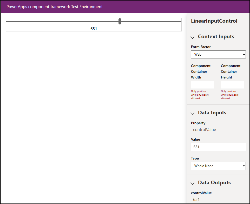
コード コンポーネント ロジックの実装が完了したら、以下のコマンドを実行してデバッグ処理を開始します。 詳細: コード コンポーネントのデバッグ
npm start watch
出力は次のようになります。
> pcf-project@1.0.0 start
> pcf-scripts start "watch"

[2:09:10 PM] [start] [watch] Initializing...
[2:09:10 PM] [start] [watch] Validating manifest...
[2:09:10 PM] [start] [watch] Validating control...
[2:09:11 PM] [start] [watch] Generating manifest types...
[2:09:11 PM] [start] [watch] Generating design types...
[2:09:11 PM] [start] [watch] Compiling and bundling control...
[Webpack stats]:
asset bundle.js 6.56 KiB [emitted] (name: main)
./LinearInputControl/index.ts 4.9 KiB [built] [code generated]
webpack 5.75.0 compiled successfully in 2060 ms
[2:09:13 PM] [start] [watch] Generating build outputs...
[2:09:13 PM] [start] [watch] Starting control harness...

Starting control harness...

[Browsersync] Access URLs:

 ----------------------------
 Local: http://localhost:8181
 ----------------------------

[Browsersync] Serving files from: C:\repos\LinearInput\out\controls\LinearInputControl

[Browsersync] Watching files...
また、PCF コントロールを表示してテストできるように、ブラウザーで コントロール サンドボックスを開く必要があります。
コード コンポーネントのパッケージ化
ソリューション ファイルを作成してインポートするには、次の手順に従います:
LinearInputControl フォルダー内に ソリューション という名前の新しいフォルダーを作成し、フォルダーに移動します。
  mkdir Solutions
  cd Solutions
pac solution init コマンドを使用して LinearInputControl フォルダに新しいソリューション プロジェクトを作成します。
pac solution init --publisher-name Samples --publisher-prefix samples注意
publisher-name と publisher-prefix の値は、既存のソリューション発行者、またはターゲット環境で作成する新しい値と同じである必要があります。
ターゲット環境で次のクエリを使用して、現在の値のリストを取得できます:
[Environment URI]/api/data/v9.2/publishers?$select=uniquename,customizationprefixpac solution init コマンドの出力は次のようになります:
Dataverse solution project with name 'solutions' created successfully in: 'C:\repos\LinearInput\linearinputcontrol\solutions'
Dataverse solution files were successfully created for this project in the sub-directory Other, using solution name solutions, publisher name Samples, and customization prefix samples.
Please verify the publisher information and solution name found in the Solution.xml file.
PS C:\repos\LinearInput\linearinputcontrol\solutions>
新しいソリューション プロジェクトを作成したら、その作成したコンポーネントが配置される場所を参照する必要があります。 以下のコマンドを使用して参照を追加できます:
pac solution add-reference --path ..\..\注意
ここで提供されるパスは、LinearInputControl フォルダー下に作成された現在のソリューション フォルダーに関連付けられています。 また、絶対パスも提供できます。
コマンドの出力は次のようになります:
Project reference successfully added to Dataverse solution project.ソリューション プロジェクトから zip ファイルを生成するには、
cdsprojソリューション プロジェクトのディレクトリ内で、以下のコマンドを使用します。msbuild /t:restoreまたは、.NET 6 SDK をインストールした場合は
dotnet build再度、次のコマンドを実行します:
msbuild注意
Missing required tool: MSBuild.exe/dotnet.exeというエラーを受け取った場合。 パス環境変数にMSBuild.exe/dotnet.exeを追加するか、Developer Command Prompt for Visual Studio Codeを使用します。 前提条件 で説明したように、.NET ビルド ツールをインストールする必要があります。ヒント
msbuildコマンドを使用したソリューション ファイルをビルドして、Dataverse にインポートしてソリューション チェッカーを実行している場合は、eval関数やその機能的に同等なものは使用しないでくださいというメッセージが表示されます。 コマンドmsbuild/property:configuration=Releaseを使用してソリューション ファイルを再構築し、ソリューションを Dataverse に再インポートして、ソリューション チェッカーを実行します。 詳細: コード コンポーネントのデバッグ。生成されたソリューションの zip ファイルは、
Solution\bin\debugフォルダーにあります。zip ファイルの準備ができたら、Power Apps を使用して、手動で ソリューションを Dataverse にインポートする か、Microsoft Power Platform Build Tools を使用して自動的にインポートします。
注意
アンマネージド ソリューションをインポートする場合は、カスタマイズを手動で公開します。
コード コンポーネントをアプリに追加する
アプリにコード コンポーネントを追加するには、次の記事の手順に従います:
参照
サンプル コンポーネントをダウンロード
Power Apps Component Framework の学習
ALM で使用されるツールとアプリの概要
Power Apps Component Framework API の参照
Power Apps Component Framework の概要
コード コンポーネントのデバッグ
注意
ドキュメントの言語設定についてお聞かせください。 簡単な調査を行います。 (この調査は英語です)
この調査には約 7 分かかります。 個人データは収集されません (プライバシー ステートメント)。
フィードバック
近日公開予定: 2024 年を通じて、コンテンツのフィードバック メカニズムとして GitHub イシューを段階的に廃止し、新しいフィードバック システムに置き換えます。 詳細については、以下を参照してください: https://aka.ms/ContentUserFeedback。
フィードバックの送信と表示