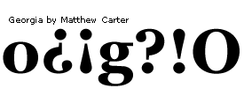
Character design standards - Punctuation for Latin 1
This section describes characters with individual design standards for punctuation. Some punctuation characters follow standard guidelines but the majority are designed specific to the typeface.
Parentheses, brackets and braces
Left parentheses
Unicode: U+0028Right parentheses
Unicode: U+0029Left bracket
Unicode: U+005BRight bracket
Unicode: U+005DLeft brace
Unicode: U+007BRight brace
Unicode: U+007DWhile these characters are related they do not all share exact standards for advance widths and exact height alignments.
Advance width rule : All may share the same advance width but this is not a requirement. The parentheses and braces are commonly on the same advance width while the braces may require a slightly larger advance width.
Height alignment : The top height of these characters should relate to the uppercase heights. The bottom does not generally descend as low as the lowercase descender value. A typical bottom height for these characters is 1/2 to 3/4 the lowercase descender value.
Spacing : Visually center between uppercase H and O.
Periods, comma, and colons
Period
Unicode: U+002EComma
Unicode: U+002CColon
Unicode: U+003ASemi colon
Unicode: U+003BAdvance width rule : All these characters should be on the same advance width. This width is similar to the thin space width but not necessarily 1/5 the em.
Spacing: Visually center between lowercase n and o.
Language note : In French typographic usage the colon (deux-points) is preceded by a non-breaking word space (espace mots insécable) and followed by a normal word space. The semi-colon (point-virgule) is preceded by a non-breaking thin space (espace fine insécable) and followed by a normal word space. In Microsoft Word 97 the non-breaking space U+00A0 is automatically inserted when the French language is selected and a colon or semi-colon are typed.
Period centered - bullet operator
Unicode: U+2219Design : Same design and size as the period.
Note : In the Latin 1 code page 1252 for Windows this is the character used for position decimal 183. This is both a centering period Math operator and a punctuation character used in the Catalan language. With Spanish and Catalan keyboards this character is commonly used as a mid dot to separate lowercase and uppercase L characters that are not part of the same syllable in a word. In many typefaces the period character maybe considered too large to be used as a mid dot in the Catalan language and a substitute glyph for the lowercase l and uppercase L would be more appropriate. OpenType fonts support glyph substitution.
Alignment : Vertically centers on the figure height.
Advance width : Advance width should be the same as the period width.
Spacing : This character should space between figure zeros.
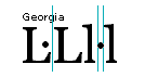
Uppercase mid dot for Catalan
Unicode: noneAlignment : Vertically centers on the uppercase L height.
Design : This glyph could be used as a substitute glyph in OpenType for the periodcentered U+2219 and or the mid dot U+00B7. Commonly the character used for the mid dot for the Catalan language is one based on the overdot diacritic U+02D9. It should be the same vertical and horizontal size as the mid dot in the lowercase l and the Ldot U+013F and ldot U+0140.
Advance width : The advance width commonly is zero units and the mid dot is centered between two uppercase L characters, and has a negative left sidebearing. The horizontal placement should be the same as the placement of the mid dot in the character Ldot U+013F.
Lowercase mid dot for Catalan
Unicode: noneAlignment : Vertically centers on the lowercase l height.
Design : This glyph could be used as a substitute glyph in OpenType for the periodcentered U+2219 and or the mid dot U+00B7. Commonly the character used for the mid dot for the Catalan language is one based on the overdot diacritic U+02D9. It should be the same vertical and horizontal size as the mid dot in the lowercase l and the Ldot U+013F and ldot U+0140.
Advance width : The advance width is visually set based on the horizontal size of the mid dot and the appropriate space needed for mid dot to comfortably center between two lowercase l characters. The advance width maybe the same as periodcenterd U+2219. The mid dot should have the same left sidebearing as the l catalan U+0140 character's left sidebearing and space the same when placed between two lowercase l characters.
Ellipsis, em leader and en leader
Ellipsis, em leader
Unicode: U+2026In the majority of modern uses these names are synonymous for a three dot leader.
Advance width rule : The advance width should be set on the em space.
Spacing : The dots should be evenly space so when this character is repeated the space between the dots and the space between each repetition is equal. Visually center between lowercase n and o.
Two dot leader - en leader
Unicode: U+2025This character is not in many code pages but is a traditional typographic leader.
Advance width rule : The advance width should be set on the en space.
Spacing : The dots should be evenly space so when this character is repeated the space between the dots and the space between each repetition is equal. Visually center between lowercase n and o.
Quotes
Single neutral quote
Unicode: U+0027Double neutral quote
Unicode: U+0022These quotes are the remnants of the dual purpose quotation marks that were used on typewriters as opening and closing quotation marks. The angles of the quotes are visually equivalent to the angle of the font. Which in roman faces is upright and italics at a visually equivalent angle to the italic slope of the font. These quotation marks are also commonly used as replacement characters for prime U+2032 and double prime U+2033 marks. Prime and double prime marks, also called minute and second, are used in the abbreviations for inches, feet, minutes and seconds.
Advance width rule : The advance width of the single quote is proportional to the design and the double quote is commonly not greater than two times the advance width of the single quote.
Typographic quotation marks
Cute nicknames like 'smart quotes', 'fancy quotes', 'curly quotes', '66 and 99' or 'duck's feet' are some of the terms used today to refer to these typographically specific characters. Fonts in early letterpress typography had no quotation marks. A typographer would use a comma, shifted or rotated as a quotation mark. It could be said these marks are traditionally based on the comma design. These methods were inadequate and design specific quotation marks were developed.
Right single quotation mark
Unicode: U+2019Advance width rule : The advance width of the right single quote is the same as the left single quote.
Height alignment : This character aligns with the uppercase height.
Single baseline quotation mark
Unicode: U+201aAdvance width rule : The advance width of the single baseline quote is the same as the left single quote.
Height alignment : This character aligns on the baseline at similar height as the comma.
Single high reversed quotation mark
Unicode: U+201bThis is the same character as Right single quote
Unicode: U+2019 mirrored in the horizontal direction.Advance width rule : The advance width of the single high reversed quote is the same as the left single quote.
Height alignment : This character aligns with the uppercase height.
Double left quotation mark
Unicode: U+201cThis character is made from the left single quote U+2018 and is equivalent to a 180 degree rotation of the double right quotation mark U+201d.
Advance width rule : The advance width of the double left quote is proportional to the design and commonly not greater than twice the advance width of the single quote.
Height alignment : This character aligns with the uppercase height.
Double right quotation mark
Unicode: U+201dThis character is made from the right single quote U+2018 and is equivalent to a 180 degree rotation of the double left quotation mark U+201c.
Advance width rule : The advance width of the double right quote is proportional to the design and commonly not greater than twice the advance width of the single quote.
Height alignment : This character aligns with the uppercase height.
Double baseline quotation mark
Unicode: U+201eThis character is commonly made by shifting the right double quote to the position of the single baseline quote U+201d.
Advance width rule : The advance width of the double low quotation mark is the same as the double right quote.
Height alignment : This character aligns on the baseline at similar height as the comma and single baseline quote.
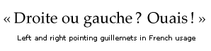
Guillemets
These quotation marks commonly called 'French quotes' or 'duck's feet' are said to have been named after a French typecutter Guillaume (William) Le Bé. Guillemets is the French word for quotation marks. The similarly named Guillemot is a narrow billed, sea auk with duck like feet found in cold northern regions of the world.
These pointing quotation marks are used in many languages and point differently dependent on the language. The German language uses these quotation marks with the right pointing guillemets as the open quotation marks and the left pointing guillemts as the close quotation marks. In French typography the left pointing quillemets are used as the open quotation marks and the right pointing quillemets are the closing quotation marks.
Traditionally in French typography the left pointing guillemets are followed by a non-breaking word space or thin space of 1/8 the em and the right proceeded by a non-breaking word space or thin space of 1/8 the em.
Single left pointing quillemet
Unicode: U+2039Advance width rule : This character's advance width is proportional and the same as the single right pointing guillemet.
Height alignment : This character aligns on the lowercase x-height at the same vertical height as the single right guillemet.
Single right pointing quillemet
Unicode: U+203aAdvance width rule : This character's advance width is proportional and the same as the single left pointing guillemet.
Height alignment : This character aligns on the lowercase x-height at the same vertical height as the single left pointing guillemet.
Left pointing quillemets - guillemet ouvrant
Unicode: U+00abAdvance width rule : This character's advance width is proportional and the same as the right pointing guillemets.
Height alignment : This character aligns on the lowercase x-height with the same vertical alignment as the right pointing guillemets.
Right pointing quillemets - guillemet fermant
Unicode: U+00bbAdvance width rule : This character's advance width is proportional and the same as the left pointing guillemets.
Height alignment : This character aligns on the lowercase x-height with the same vertical alignment as the left pointing guillemets.
Language note : In French typographic usage the left pointing guillemet - guillemet ourvant is followed by a non-breaking word space (espace mots insécable) and the right pointing guillemet - guillemet fermant is preceded by a non-breaking word space. In Microsoft Word 97 the non-breaking space U+00A0 is automatically inserted when the French language is selected and a guillemet is typed. Some French typographers prefer to use a non-breaking thin space (espace fine insécable) with the guillemets.
Question and exclamation marks
Question
Unicode: U+003FExclamation
Unicode: U+0021Advance width rule : There is no requirement for the advance width of these characters with the exception of the inverted question and inverted exclamation. _These two characters should be on the same unit value as the upright _question and exclamation, respectively and be a 180 degree rotation of the question and exclamation marks.
Height alignment : There is no absolute requirement for top alignment of the question and exclamation. They are typically the same in height as the uppercase round characters. The bottom dot aligns with the lowercase overshoot in round designs and the baseline in square designs.
Language note : In French typographic usage the question and exclamation marks (point d'exclamation et point d'interrogation) are preceded by a non-breaking thin space (espace fine insécable) and followed by a normal word space. In Microsoft Word 97 the non-breaking space U+00A0 is automatically inserted when the French language is selected and a exclamation or question mark are typed.
Inverted question
Unicode: U+00BFInverted exclamation
Unicode: U+00A1The inverted question and inverted exclamation have two possible alignments.
X-height alignment : In most text fonts the inverted question and inverted exclamation tops align with the lowercase x-height. In a round design the lowercase x-height's overshoot. The bottom should not exceed the lowercase descender value. In this case many type designers use an uppercase alignment method or shorten and redesign the glyphs.
Uppercase alignment : This is a simple 180 degree rotation with no vertical offset from the position of the question and exclamation. Used very commonly in display fonts and modern designs.
Spacing : Visually center between uppercase H and O.
Trademark symbols and copyright sign
Registered trademark
Unicode: U+00AECopyright
Unicode: U+00A9Trademark
Unicode: U+2122Trademark symbols in traditional typography were available as a separate font of many basic font styles and sizes. Common usage for logotypes and typesetting is the larger the logotype or text the smaller the trademark symbol.
In modern digital typography there are three common practices used by font suppliers. In all cases there are no italic designs only upright versions.
- One standard serif design in all font files. Spaced and aligned for the current font.
- Two standard designs, one serif for serif style fonts and one sans serif for sans serif designs. Spaced and aligned for the current font.
- Designed to match the style of the typeface.
The bottom line: What should I do? It is always best for any character to match the style of the typeface.
There are also two different styles of copyright and registered trademark symbols provided in fonts today.
Copyright and registered trademark symbol - full size
Because of the scaling ability of digital fonts and the lower resolution of most output devices, these are the style of symbols found in current digital fonts.
Advance width rule : They are commonly placed on the em space width.
Height alignment : Bottom aligns with the uppercase overshoot, top aligns with the uppercase top overshoot or visually centers on the uppercase height dependent on the typeface design.
Copyright and registered trademark symbol - superior
Typeface foundries sometimes offered a smaller raised or superior style character as an alternate to the full size copyright and trademark symbols.
Height alignment : Top aligns with the uppercase round height.
Trademark symbol
There is no rule for the advance width of this character.
Advance width rule : In practice it is commonly placed on an appropriate width for the design.
Height alignment : Aligns with the uppercase flat height in most designs.
Spacing : Visually center between uppercase H and O. These characters are almost always used at the end of a word followed by a word space. It is important that the left portion of these characters do not touch the right portion of the preceding character. Some designers and companies test these characters with the uppercase T.
Commercial at sign
Unicode: U+0040There are three common practices in supplying the commercial at character by font designers.
- One standard serif design in all font files.
- Two standard designs, one serif for serif style fonts and one sans serif for sans serif designs.
- Designed to match the style of the typeface.
The bottom line: What should I do? It is always best for any character to match the style of the typeface.
Height alignment : Visually centers on the uppercase height, dependent on the typeface design.
Spacing : Visually center between uppercase H and O.
Bullets
En bullet
This is the more commonly included bullet in most typefaces.
Advance width rule : Its advance width is generally set to the en space and is a smaller sized bullet than the em bullet.
Height alignment : Visually centers on the lowercase uppercase height.
Em bullet
This is the large bullet sometimes chosen to be included in place of the en bullet in some typefaces.
Advance width rule : Its advance width is generally set to the em space value.
Height alignment : Visually centers on the lowercase uppercase height.
Spacing : Visually center between uppercase H and O.
Hyphens, horizontal bars and dashes
Hyphen - minus
Unicode: U+002DThis character is the manually typed, always visible, hard hyphen inserted by an author of text. It is not to be confused with the soft hyphen.
Soft hyphen
Unicode: U+00ADThis character is an additional hyphen character code. An application or client determines its use and implementation. It is not the same character as a non-breaking hyphen.
The most common use of the soft hyphen is for hyphenation in an application's page layout. These applications use the soft hyphen for hyphenation when a line break occurs. It is removed by the application when the text is reformatted and the hyphenation is no longer necessary.
Currently, Web publishing is a less automated use of text layout. HTML authors are the 'typographer' and they are responsible for formatting the text. Web browsers do not automatically provide hyphenation as do page layout applications.
The W3C has defined the soft hyphen entity and its use by authors and clients of HTML as:
soft hyphen = discretionary hyphen: ENTITY shy ""
"The soft hyphen tells the user agent where a line break can occur."
In this implementation, the soft hyphen is a hidden hyphen and only displayed when a line break occurs at a soft hyphen position.
For the full W3C definition of the soft hyphen see the hyphenation section of the HTML 4.0 specification.
Because of the inconsistent use and implementation of the soft hyphen, most recommendations for manual HTML authoring are currently discouraging the use of the soft hyphen.
Non-breaking hyphen
Unicode: U+2011This character is similar to the character No-Break Space U+00A0.
The non-breaking hyphen _is the same as the _hyphen character with the added functionality of providing a way to preventing a hyphenated word from being separated by a line break.
Advance width rule : All these characters should be of the same design and on the same advance width.
Spacing : Visually center between lowercase n and o; H and O.
The en and em dash
Design: These characters are commonly straight rules that extend the full length of the advance width. Some type designers have designed these characters to not fill the advance width and have a small left and right sidebearing. The full length version is the preferred design.
The en dash is used in text solely as a replacement for a hyphen and as a replacement for the word through (Jan-Jun) The 2-em dash is used in text setting to indicate missing letters in a word. The 3-em dash is used to indicate an entire word missing. Being doubled and tripled the preferred design is one that fills the advance width and connects.
The em dash is also used in bibliographies to replace the author's name when a repeated series of works is described. The em dash is tripled as a 3-em dash.
Example of the use of the em dash in Bibliographies.
The Pointed Palominos. 1998. I can't stand up for my saddle done let me down again. Albuquerque, New Mexico: South Dusty Lung Records.
———, 1997. Songs of warm women, cold beer and rusty trucks. Albuquerque, New Mexico: South Dusty Lung Records.
———, 1997. If you ever leave the light on I'll find my way home again. Dusty, Washington: Dusty Lung Records.
———, 1962. You're rockin' my baby, so buy me a beer. Dusty, Washington: Dusty Lung Records.
En dash
Unicode: U+2013Height alignment : Visually centers on the lowercase x-height.
Advance width Rule : Placed on the en space of the typeface.Em dash
Unicode: U+2014
Height alignment : Visually centers on the lowercase x-height.
Advance width rule : Placed on the em space of the typeface.Underscore
Unicode: U+005FHeight alignment : Placed vertically to underline the uppercase characters. A good distance is 5-10% of the em square below the baseline or ~100-200 units in a 2048 unit em.
Advance width rule : Placed on the en space of the typeface.
Spacing : This character extends the length of its advance width and should be connecting in a continuous string of the character in both roman and italic designs.
Overscore
Unicode: U+00AF
Height alignment : Placed vertically to overstrike the uppercase characters. This is approximately the same position as the placement of the uppercase diacritics. This character is a copy of the underscore, commonly offset the em square value vertically. That value is 2048 in a 2048 unit em font. This is not the same character as the lowercase spacing macron - U+02C9.
Advance width rule : Placed on the en space of the typeface.
Spacing : This character extends the length of its advance width and should be connecting in a continuous string of the character.
Slashes
Slash
Unicode: U+002FHeight alignment : This character's vertical alignment is design dependent. Commonly it aligns either visually to the uppercase flat height and baseline or extends slightly above the uppercase flat height and descends to a value not greater than the lowercase descender.
Advance width rule : The advance width is proportional to the design of the slash.
Spacing : Horizontally centered between uppercase H and O.
Backslash
Unicode: U+005CIn italic fonts the backslash's angle is commonly more upright than in the roman font of the typeface.
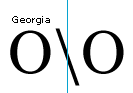
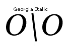
Height alignment : This character's alignment should be the same as Slash - U+007C
Advance width rule : The advance width is proportional to the design.
Spacing : Horizontally centered between uppercase H and O.
Vertical rules and bars
These characters were used on computer systems defined as, used to create vertical continuous or dashed lines. Current use is to separate text or as a computer programming operator for 'or'.
if (myFont > yourFont || (yourFont == "Courier New")
{ getNewFont() }
Vertical bar
Unicode: U+007CBroken vertical bar
Unicode: U+00A6Height alignment : There is no general rule in current usage of these characters. Common height alignments are:
- Vertically aligns with ascender and descender.
- Vertically aligns with uppercase and the baseline.
- Vertically aligns so the bar connects vertically when the document is set solid with no leading. For this character to connect when set with no leading the top would have to be equal to the highest character (often the 'Aring') and the bottom equal to the lowest character (often the 'Ccedilla'). These highest and lowest characters are used in TrueType for the WinAscent and WinDescent in the 'OS/2' table. They are also used to calculate the values in the 'VDMX' table. Both these tables in Microsoft Windows define the vertical cell height. See the TrueType Specification for more information about these tables.
The bottom line: What should I do? Modern usage of vertical rules on personal computers suggests there is no need for this character to be a connecting vertical rule character. Unicode characters U+2500..U+256C are line drawing characters and better suited for this task. Also most page layout programs provide horizontal and vertical rule capability.
The alignment for this character would be best if it is in the body height of the typeface and be approximately the height of the lowercase ascender and the depth of the lowercase descender.
Advance width rule : Placed on the en space of the typeface.
Spacing : Horizontally centered between figure zeros.
What's next
フィードバック
以下は間もなく提供いたします。2024 年を通じて、コンテンツのフィードバック メカニズムとして GitHub の issue を段階的に廃止し、新しいフィードバック システムに置き換えます。 詳細については、「https://aka.ms/ContentUserFeedback」を参照してください。
フィードバックの送信と表示