ListView セルの外観のカスタマイズ
 サンプルのダウンロード
Xamarin.FormsListView クラスは、ViewCell 要素を使用してカスタマイズできる、スクロール可能なリストを表示するために使用します。 ViewCell 要素は、テキストと画像を表示すること、true または false の状態を示すこと、ユーザー入力を受け取ることができます。
組み込みのセル
Xamarin.Forms には、多くのアプリケーションで機能する組み込みのセルが存在します。
TextCellコントロールは、オプションである詳細テキストの 2 行目を含むテキストを表示するために使用します。ImageCellコントロールはTextCells に似ていますが、テキストの左側に画像が含まれます。SwitchCellコントロールは、オン/オフまたは true/false の状態を表示および取得するために使用します。EntryCellコントロールは、ユーザーが編集できるテキスト データを表示するために使用します。
SwitchCell および EntryCell コントロールは、TableView のコンテキストにおいて、より一般的に使用されます。
TextCell
TextCell は、テキストを表示するためのセルです。必要に応じて、2 行目を詳細テキストとして使用します。 次のスクリーンショットは、iOS と Android sでの TextCell 項目を示しています。
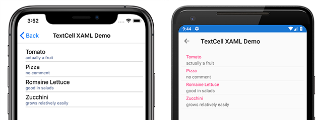
TextCells は実行時にネイティブ コントロールとしてレンダリングされるため、カスタム ViewCell と比べてパフォーマンスは非常に優れています。 TextCells はカスタマイズ可能で、次のプロパティを設定できます。
Text– 最初の行に大きいフォントで表示されるテキスト。Detail– 最初の行の下に小さいフォントで表示されるテキスト。TextColor– テキストの色。DetailColor– 詳細テキストの色
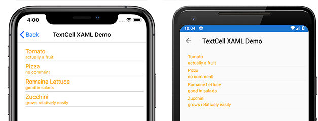
次のスクリーンショットは、カスタマイズされた色のプロパティを持つ TextCell 項目を示しています。
ImageCell
ImageCell は、TextCell のように、テキストとセカンダリの詳細テキストを表示するために使用でき、各プラットフォームのネイティブ コントロールを使用して優れたパフォーマンスを提供します。 ImageCell は、テキストの左側に画像を表示する点が TextCell と異なります。
次のスクリーンショットは、iOS と Android での ImageCell 項目を示しています。
ImageCell は、連絡先や映画のリストなど、視覚的な側面を持つデータの一覧を表示する必要がある場合に便利です。 ImageCell はカスタマイズ可能で、次のものを設定できます。
Text– 最初の行に大きいフォントで表示されるテキストDetail– 最初の行の下に小さいフォントで表示されるテキストTextColor– テキストの色DetailColor– 詳細テキストの色ImageSource– テキストの横に表示する画像
次のスクリーンショットは、カスタマイズされた色のプロパティを持つ ImageCell 項目を示しています。 
カスタム セル
カスタム セルを使用すると、組み込みのセルでサポートされていないセル レイアウトを作成できます。 たとえば、重みが等しい 2 つのラベルを持つセルを表示できます。 TextCell には小さいラベルが 1 つ存在するため、TextCell では不十分です。 ほとんどのセルのカスタマイズでは、追加の読み取り専用データ (追加のラベル、画像、その他の表示情報など) が追加されます。
すべてのカスタム セルは、すべての組み込みのセルの種類が使うのと同じ基底クラスである ViewCell から派生する必要があります。
Xamarin.Forms には、ListView コントロールのキャッシュ動作が用意されており、それによって一部の種類のカスタム セルのスクロール パフォーマンスを向上させることができます。
次のスクリーンショットは、カスタム セルの例を示しています。

XAML
前のスクリーンショットに示したカスタム セルは、次の XAML を使用して作成できます。
<?xml version="1.0" encoding="UTF-8"?>
<ContentPage xmlns="http://xamarin.com/schemas/2014/forms"
xmlns:x="http://schemas.microsoft.com/winfx/2009/xaml"
x:Class="demoListView.ImageCellPage">
    <ContentPage.Content>
        <ListView  x:Name="listView">
            <ListView.ItemTemplate>
                <DataTemplate>
                    <ViewCell>
                        <StackLayout BackgroundColor="#eee"
                        Orientation="Vertical">
                            <StackLayout Orientation="Horizontal">
                                <Image Source="{Binding image}" />
                                <Label Text="{Binding title}"
                                TextColor="#f35e20" />
                                <Label Text="{Binding subtitle}"
                                HorizontalOptions="EndAndExpand"
                                TextColor="#503026" />
                            </StackLayout>
                        </StackLayout>
                    </ViewCell>
                </DataTemplate>
            </ListView.ItemTemplate>
        </ListView>
    </ContentPage.Content>
</ContentPage>
この XAML は次のように動作します。
- カスタム セルは
DataTemplateの内側に入れ子にされています。それはListView.ItemTemplateの内側にあります。 これは、組み込みのセルを使用するのと同じプロセスです。 ViewCellはカスタム セルの種類です。DataTemplate要素の子は、ViewCellクラスの子であるか、それから派生する必要があります。ViewCell内では、任意の Xamarin.Forms レイアウトを使用してレイアウトを管理できます。 この例では、レイアウトはStackLayoutによって管理されており、背景色をカスタマイズできます。
Note
バインド可能な StackLayout の任意のプロパティを、カスタム セル内でバインドできます。 ただし、この機能は XAML の例には示されていません。
コード
カスタム セルは、コード内に作成することもできます。 まず、ViewCell から派生するカスタム クラスを作成する必要があります。
public class CustomCell : ViewCell
    {
        public CustomCell()
        {
            //instantiate each of our views
            var image = new Image ();
            StackLayout cellWrapper = new StackLayout ();
            StackLayout horizontalLayout = new StackLayout ();
            Label left = new Label ();
            Label right = new Label ();

            //set bindings
            left.SetBinding (Label.TextProperty, "title");
            right.SetBinding (Label.TextProperty, "subtitle");
            image.SetBinding (Image.SourceProperty, "image");

            //Set properties for desired design
            cellWrapper.BackgroundColor = Color.FromHex ("#eee");
            horizontalLayout.Orientation = StackOrientation.Horizontal;
            right.HorizontalOptions = LayoutOptions.EndAndExpand;
            left.TextColor = Color.FromHex ("#f35e20");
            right.TextColor = Color.FromHex ("503026");

            //add views to the view hierarchy
            horizontalLayout.Children.Add (image);
            horizontalLayout.Children.Add (left);
            horizontalLayout.Children.Add (right);
            cellWrapper.Children.Add (horizontalLayout);
            View = cellWrapper;
        }
    }
ページ コンストラクターでは、ListView の ItemTemplate プロパティは DataTemplate に設定され、CustomCell の種類が指定されています。
public partial class ImageCellPage : ContentPage
    {
        public ImageCellPage ()
        {
            InitializeComponent ();
            listView.ItemTemplate = new DataTemplate (typeof(CustomCell));
        }
    }
バインディング コンテキストの変更
カスタム セルの種類の BindableProperty インスタンスにバインドする場合、BindableProperty 値を表示する UI コントロールでは、次のコード例に示すように、セル コンストラクターではなく OnBindingContextChanged オーバーライドを使用して、各セルに表示されるデータを設定する必要があります。
public class CustomCell : ViewCell
{
    Label nameLabel, ageLabel, locationLabel;

    public static readonly BindableProperty NameProperty =
        BindableProperty.Create ("Name", typeof(string), typeof(CustomCell), "Name");
    public static readonly BindableProperty AgeProperty =
        BindableProperty.Create ("Age", typeof(int), typeof(CustomCell), 0);
    public static readonly BindableProperty LocationProperty =
        BindableProperty.Create ("Location", typeof(string), typeof(CustomCell), "Location");

    public string Name
    {
        get { return(string)GetValue (NameProperty); }
        set { SetValue (NameProperty, value); }
    }

    public int Age
    {
        get { return(int)GetValue (AgeProperty); }
        set { SetValue (AgeProperty, value); }
    }

    public string Location
    {
        get { return(string)GetValue (LocationProperty); }
        set { SetValue (LocationProperty, value); }
    }
    ...

    protected override void OnBindingContextChanged ()
    {
        base.OnBindingContextChanged ();

        if (BindingContext != null)
        {
            nameLabel.Text = Name;
            ageLabel.Text = Age.ToString ();
            locationLabel.Text = Location;
        }
    }
}
OnBindingContextChanged オーバーライドは、BindingContextChanged イベントが BindingContext プロパティの値の変更に応じて発生したときに呼び出されます。 したがって、BindingContext が変更されたときは、BindableProperty の値を表示する UI コントロールでデータを設定する必要があります。 BindingContext を null 値についてチェックする必要があることに注意してください。これはガベージ コレクションのために Xamarin.Forms によって設定でき、それによって OnBindingContextChanged オーバーライドが呼び出されます。
または、UI コントロールを BindableProperty インスタンスにバインドして値を表示できます。そうすると、OnBindingContextChanged メソッドをオーバーライドする必要がなくなります。
Note
OnBindingContextChanged をオーバーライドする場合は、基底クラスの OnBindingContextChanged メソッドが呼び出されることを確認します。これにより、登録されているデリゲートが BindingContextChanged イベントを受け取ります。
XAML では、次のコード例に示すように、カスタム セルの種類をデータにバインドできます。
<ListView x:Name="listView">
    <ListView.ItemTemplate>
        <DataTemplate>
            <local:CustomCell Name="{Binding Name}" Age="{Binding Age}" Location="{Binding Location}" />
        </DataTemplate>
    </ListView.ItemTemplate>
</ListView>
これにより、CustomCell インスタンス内のバインド可能なプロパティ Name、Age、Location が、基になるコレクション内の各オブジェクトの Name、Age、Location プロパティにバインドされます。
C# での同等のバインドを次のコード例に示します。
var customCell = new DataTemplate (typeof(CustomCell));
customCell.SetBinding (CustomCell.NameProperty, "Name");
customCell.SetBinding (CustomCell.AgeProperty, "Age");
customCell.SetBinding (CustomCell.LocationProperty, "Location");

var listView = new ListView
{
    ItemsSource = people,
    ItemTemplate = customCell
};
iOS と Android では、ListView で要素がリサイクルされ、カスタム セルでカスタム レンダラーを使用している場合、カスタム レンダラーはプロパティ変更通知を正しく実装する必要があります。 セルが再利用される場合、バインディング コンテキストが使用可能なセルのコンテキストに更新されると、セルのプロパティ値が変更され、PropertyChanged イベントが発生します。 詳細については、「ViewCell のカスタマイズ」を参照してください。 セルのリサイクルの詳細については、「キャッシュ戦略」を参照してください。