Power BI 시각적 개체의 데이터 뷰 매핑 이해
이 문서에서는 데이터 뷰 매핑에 관해 설명하고 데이터 역할을 사용하여 다양한 형식의 시각적 개체를 만드는 방법에 관해 설명합니다. 데이터 역할 및 다양한 dataMappings 형식에 대한 조건부 요구 사항을 지정하는 방법을 설명합니다.
유효한 매핑마다 하나의 데이터 뷰를 생성합니다. 특정 조건에서는 여러 데이터 매핑을 제공할 수 있습니다. 지원되는 매핑 옵션은 다음과 같습니다.
"dataViewMappings": [
    {
        "conditions": [ ... ],
        "categorical": { ... },
        "single": { ... },
        "table": { ... },
        "matrix": { ... }
    }
]
Power BI 유효한 매핑이 dataViewMappings에 정의된 경우에만 데이터 뷰에 대한 매핑을 만듭니다.
즉, dataViewMappings에 categorical만 정의되어 있고 table, single 등의 다른 매핑은 정의되지 않았을 수 있습니다. 이 경우 Power BI는 단일 categorical 매핑이 있는 데이터 뷰를 생성하지만 table 및 다른 매핑은 정의되지 않은 상태로 유지됩니다. 예시:
"dataViewMappings": [
    {
    "categorical": {
        "categories": [ ... ],
        "values": [ ... ]
    },
    "metadata": { ... }
    }
]
조건
conditions 섹션에서는 특정 데이터 매핑에 대한 규칙을 설정합니다. 데이터가 설명된 조건 세트 중 하나와 일치하는 경우 시각적 개체는 데이터를 유효한 것으로 허용합니다.
각 필드에 대해 최솟값과 최댓값을 지정할 수 있습니다. 값은 해당 데이터 역할에 바인딩할 수 있는 필드 수를 나타냅니다.
참고 항목
조건에서 데이터 역할을 생략하면 필드를 원하는 개수만큼 포함할 수 있습니다.
다음 예제에서 category는 하나의 데이터 필드로 제한하고 measure는 두 개의 데이터 필드로 제한합니다.
"conditions": [
    { "category": { "max": 1 }, "measure": { "max": 2 } },
]
데이터 역할에 대해 여러 조건을 설정할 수도 있습니다. 이 경우 조건 중 하나가 충족되면 데이터가 유효합니다.
"conditions": [
    { "category": { "min": 1, "max": 1 }, "measure": { "min": 2, "max": 2 } },
    { "category": { "min": 2, "max": 2 }, "measure": { "min": 1, "max": 1 } }
]
이전 예제에서는 다음 두 조건 중 하나가 필요합니다.
- 정확히 하나의 범주 필드와 정확히 두 개의 측정값
- 정확히 두 개의 범주와 정확히 하나의 측정값
단일 데이터 매핑
단일 데이터 매핑은 가장 간단한 형태의 데이터 매핑입니다. 단일 측정값 필드를 허용하며 합계를 제공합니다. 필드가 숫자이면 합계를 반환하고, 숫자가 아니면 고유 값 개수를 반환합니다.
단일 데이터 매핑을 사용하려면 매핑할 데이터 역할의 이름을 정의합니다. 이 매핑은 단일 측정값 필드에만 적용됩니다. 두 번째 필드를 할당하면 데이터 뷰가 생성되지 않으므로, 데이터를 단일 필드로 제한하는 조건을 포함하는 것이 좋은 방법입니다.
참고 항목
이 데이터 매핑은 다른 데이터 매핑과 함께 사용할 수 없습니다. 이는 데이터를 단일 숫자 값으로 줄이기 위한 것입니다.
예시:
{
    "dataRoles": [
        {
            "displayName": "Y",
            "name": "Y",
            "kind": "Measure"
        }
    ],
    "dataViewMappings": [
        {
            "conditions": [
                {
                    "Y": {
                        "max": 1
                    }
                }
            ],
            "single": {
                "role": "Y"
            }
        }
    ]
}
결과 데이터 뷰에는 테이블 또는 범주와 같은 다른 형식의 매핑이 포함될 수 있지만 각 매핑에는 단일 값만 포함됩니다. 단일 매핑에서만 값에 액세스하는 것이 가장 좋습니다.
{
    "dataView": [
        {
            "metadata": null,
            "categorical": null,
            "matrix": null,
            "table": null,
            "tree": null,
            "single": {
                "value": 94163140.3560001
            }
        }
    ]
}
다음 코드 샘플에서는 간단한 데이터 뷰 매핑을 처리합니다.
"use strict";
import powerbi from "powerbi-visuals-api";
import DataView = powerbi.DataView;
import DataViewSingle = powerbi.DataViewSingle;
// standard imports
// ...

export class Visual implements IVisual {
    private target: HTMLElement;
    private host: IVisualHost;
    private valueText: HTMLParagraphElement;

    constructor(options: VisualConstructorOptions) {
        // constructor body
        this.target = options.element;
        this.host = options.host;
        this.valueText = document.createElement("p");
        this.target.appendChild(this.valueText);
        // ...
    }

    public update(options: VisualUpdateOptions) {
        const dataView: DataView = options.dataViews[0];
        const singleDataView: DataViewSingle = dataView.single;

        if (!singleDataView ||
            !singleDataView.value ) {
            return
        }

        this.valueText.innerText = singleDataView.value.toString();
    }
}
이전 코드 샘플에서는 Power BI의 단일 값을 표시합니다.

범주 데이터 매핑
범주 데이터 매핑은 데이터의 독립적인 그룹화 또는 범주를 가져오는 데 사용됩니다. 범주는 데이터 매핑에서 “그룹화 기준”을 사용하여 그룹화할 수도 있습니다.
기본 범주 데이터 매핑
다음 데이터 역할 및 매핑을 살펴보세요.
"dataRoles":[
    {
        "displayName": "Category",
        "name": "category",
        "kind": "Grouping"
    },
    {
        "displayName": "Y Axis",
        "name": "measure",
        "kind": "Measure"
    }
],
"dataViewMappings": {
    "categorical": {
        "categories": {
            "for": { "in": "category" }
        },
        "values": {
            "select": [
                { "bind": { "to": "measure" } }
            ]
        }
    }
}
앞의 예제는 “category로 끌어온 모든 필드에 대해 해당 데이터가 categorical.categories에 매핑되도록 내 category 데이터 역할을 매핑합니다. 또한 내 measure 데이터 역할을 categorical.values에 매핑합니다.”로 해석됩니다.
- for...in: 데이터 쿼리에서 모든 항목을 이 데이터 역할에 포함합니다.
- bind...to: for...in과 동일한 결과를 생성하지만 데이터 역할에 단일 필드로 제한하는 조건이 있다고 예상합니다.
범주 데이터 그룹화
다음 예제에서는 이전 예제와 동일한 두 개의 데이터 역할을 사용하고 grouping과 measure2라는 데이터 역할을 더 추가합니다.
"dataRole":[
    {
        "displayName": "Category",
        "name": "category",
        "kind": "Grouping"
    },
    {
        "displayName": "Y Axis",
        "name": "measure",
        "kind": "Measure"
    },
    {
        "displayName": "Grouping with",
        "name": "grouping",
        "kind": "Grouping"
    },
    {
        "displayName": "X Axis",
        "name": "measure2",
        "kind": "Grouping"
    }
],
"dataViewMappings":{
    "categorical": {
        "categories": {
            "for": { "in": "category" }
        },
        "values": {
            "group": {
                "by": "grouping",
                "select":[
                    { "bind": { "to": "measure" } },
                    { "bind": { "to": "measure2" } }
                ]
            }
        }
    }
}
이 매핑과 기본 매핑의 차이점은 categorical.values를 매핑하는 방법에 있습니다. measure 및 measure2 데이터 역할을 데이터 역할 grouping에 매핑하면 x축과 y축 크기를 그에 따라 조정할 수 있습니다.
계층적 데이터 그룹화
다음 예제에서는 범주 데이터를 사용하여 드릴다운 작업을 지원하는 데 사용할 수 있는 계층 구조를 만듭니다.
다음 예제에서는 데이터 역할 및 매핑을 보여 줍니다.
"dataRoles": [
    {
        "displayName": "Categories",
        "name": "category",
        "kind": "Grouping"
    },
    {
        "displayName": "Measures",
        "name": "measure",
        "kind": "Measure"
    },
    {
        "displayName": "Series",
        "name": "series",
        "kind": "Measure"
    }
],
"dataViewMappings": [
    {
        "categorical": {
            "categories": {
                "for": {
                    "in": "category"
                }
            },
            "values": {
                "group": {
                    "by": "series",
                    "select": [{
                            "for": {
                                "in": "measure"
                            }
                        }
                    ]
                }
            }
        }
    }
]
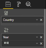
다음 범주 데이터를 살펴보세요.
| 국가/지역 | 2013 | 2014 | 2015 | 2016 |
|---|---|---|---|---|
| 미국 | x | x | 650 | 350 |
| 캐나다 | x | 630 | 490 | x |
| 멕시코 | 645 | x | x | x |
| 영국 | x | x | 831 | x |
Power BI는 다음 범주 세트가 있는 범주 데이터 뷰를 생성합니다.
{
    "categorical": {
        "categories": [
            {
                "source": {...},
                "values": [
                    "Canada",
                    "USA",
                    "UK",
                    "Mexico"
                ],
                "identity": [...],
                "identityFields": [...],
            }
        ]
    }
}
각 category는 values 세트에 매핑됩니다. 이러한 각 values는 연도로 표현되는 series로 그룹화됩니다.
예를 들어 각 values 배열은 1년을 나타냅니다.
또한 각 values 배열에는 캐나다, 미국, 영국, 멕시코의 네 가지 값이 있습니다.
{
    "values": [
        // Values for year 2013
        {
            "source": {...},
            "values": [
                null, // Value for `Canada` category
                null, // Value for `USA` category
                null, // Value for `UK` category
                645 // Value for `Mexico` category
            ],
            "identity": [...],
        },
        // Values for year 2014
        {
            "source": {...},
            "values": [
                630, // Value for `Canada` category
                null, // Value for `USA` category
                null, // Value for `UK` category
                null // Value for `Mexico` category
            ],
            "identity": [...],
        },
        // Values for year 2015
        {
            "source": {...},
            "values": [
                490, // Value for `Canada` category
                650, // Value for `USA` category
                831, // Value for `UK` category
                null // Value for `Mexico` category
            ],
            "identity": [...],
        },
        // Values for year 2016
        {
            "source": {...},
            "values": [
                null, // Value for `Canada` category
                350, // Value for `USA` category
                null, // Value for `UK` category
                null // Value for `Mexico` category
            ],
            "identity": [...],
        }
    ]
}
다음 코드 샘플은 범주 데이터 뷰 매핑을 처리하기 위한 것입니다. 이 샘플에서는 국가/지역 > 연도 > 값 계층 구조를 만듭니다.
"use strict";
import powerbi from "powerbi-visuals-api";
import DataView = powerbi.DataView;
import DataViewCategorical = powerbi.DataViewCategorical;
import DataViewValueColumnGroup = powerbi.DataViewValueColumnGroup;
import PrimitiveValue = powerbi.PrimitiveValue;
// standard imports
// ...

export class Visual implements IVisual {
    private target: HTMLElement;
    private host: IVisualHost;
    private categories: HTMLElement;

    constructor(options: VisualConstructorOptions) {
        // constructor body
        this.target = options.element;
        this.host = options.host;
        this.categories = document.createElement("pre");
        this.target.appendChild(this.categories);
        // ...
    }

    public update(options: VisualUpdateOptions) {
        const dataView: DataView = options.dataViews[0];
        const categoricalDataView: DataViewCategorical = dataView.categorical;

        if (!categoricalDataView ||
            !categoricalDataView.categories ||
            !categoricalDataView.categories[0] ||
            !categoricalDataView.values) {
            return;
        }

        // Categories have only one column in data buckets
        // To support several columns of categories data bucket, iterate categoricalDataView.categories array.
        const categoryFieldIndex = 0;
        // Measure has only one column in data buckets.
        // To support several columns on data bucket, iterate years.values array in map function
        const measureFieldIndex = 0;
        let categories: PrimitiveValue[] = categoricalDataView.categories[categoryFieldIndex].values;
        let values: DataViewValueColumnGroup[] = categoricalDataView.values.grouped();

        let data = {};
        // iterate categories/countries-regions
        categories.map((category: PrimitiveValue, categoryIndex: number) => {
            data[category.toString()] = {};
            // iterate series/years
            values.map((years: DataViewValueColumnGroup) => {
                if (!data[category.toString()][years.name] && years.values[measureFieldIndex].values[categoryIndex]) {
                    data[category.toString()][years.name] = []
                }
                if (years.values[0].values[categoryIndex]) {
                    data[category.toString()][years.name].push(years.values[measureFieldIndex].values[categoryIndex]);
                }
            });
        });

        this.categories.innerText = JSON.stringify(data, null, 6);
        console.log(data);
    }
}
결과 시각적 개체는 다음과 같습니다.

테이블 매핑
테이블 데이터 뷰는 기본적으로 숫자 데이터 요소를 집계할 수 있는 데이터 요소 목록입니다.
예를 들어 이전 섹션과 동일한 데이터를 사용하지만 다음과 같은 기능이 있습니다.
"dataRoles": [
    {
        "displayName": "Column",
        "name": "column",
        "kind": "Grouping"
    },
    {
        "displayName": "Value",
        "name": "value",
        "kind": "Measure"
    }
],
"dataViewMappings": [
    {
        "table": {
            "rows": {
                "select": [
                    {
                        "for": {
                            "in": "column"
                        }
                    },
                    {
                        "for": {
                            "in": "value"
                        }
                    }
                ]
            }
        }
    }
]
다음 예제와 같이 테이블 데이터 뷰를 시각화합니다.
| 국가/지역 | Year | Sales |
|---|---|---|
| 미국 | 2016 | 100 |
| 미국 | 2015 | 50 |
| 캐나다 | 2015 | 200 |
| Canada | 2015 | 50 |
| 멕시코 | 2013 | 300 |
| 영국 | 2014 | 150 |
| 미국 | 2015 | 75 |
데이터 바인딩:
Power BI는 데이터를 테이블 데이터 뷰로 표시합니다. ‘데이터가 정렬되었다고 가정하지 않습니다.’
{
    "table" : {
        "columns": [...],
        "rows": [
            [
                "Canada",
                2014,
                630
            ],
            [
                "Canada",
                2015,
                490
            ],
            [
                "Mexico",
                2013,
                645
            ],
            [
                "UK",
                2014,
                831
            ],
            [
                "USA",
                2015,
                650
            ],
            [
                "USA",
                2016,
                350
            ]
        ]
    }
}
데이터를 집계하려면 원하는 필드를 선택하고 합계를 선택합니다.

테이블 데이터 뷰 매핑을 처리하기 위한 코드 샘플입니다.
"use strict";
import "./../style/visual.less";
import powerbi from "powerbi-visuals-api";
// ...
import DataViewMetadataColumn = powerbi.DataViewMetadataColumn;
import DataViewTable = powerbi.DataViewTable;
import DataViewTableRow = powerbi.DataViewTableRow;
import PrimitiveValue = powerbi.PrimitiveValue;
// standard imports
// ...

export class Visual implements IVisual {
    private target: HTMLElement;
    private host: IVisualHost;
    private table: HTMLParagraphElement;

    constructor(options: VisualConstructorOptions) {
        // constructor body
        this.target = options.element;
        this.host = options.host;
        this.table = document.createElement("table");
        this.target.appendChild(this.table);
        // ...
    }

    public update(options: VisualUpdateOptions) {
        const dataView: DataView = options.dataViews[0];
        const tableDataView: DataViewTable = dataView.table;

        if (!tableDataView) {
            return
        }
        while(this.table.firstChild) {
            this.table.removeChild(this.table.firstChild);
        }

        //draw header
        const tableHeader = document.createElement("th");
        tableDataView.columns.forEach((column: DataViewMetadataColumn) => {
            const tableHeaderColumn = document.createElement("td");
            tableHeaderColumn.innerText = column.displayName
            tableHeader.appendChild(tableHeaderColumn);
        });
        this.table.appendChild(tableHeader);

        //draw rows
        tableDataView.rows.forEach((row: DataViewTableRow) => {
            const tableRow = document.createElement("tr");
            row.forEach((columnValue: PrimitiveValue) => {
                const cell = document.createElement("td");
                cell.innerText = columnValue.toString();
                tableRow.appendChild(cell);
            })
            this.table.appendChild(tableRow);
        });
    }
}
시각적 스타일 파일 style/visual.less에 테이블의 레이아웃이 포함되어 있습니다.
table {
    display: flex;
    flex-direction: column;
}

tr, th {
    display: flex;
    flex: 1;
}

td {
    flex: 1;
    border: 1px solid black;
}
결과 시각적 개체는 다음과 같이 표시됩니다.

행렬 데이터 매핑
‘행렬’ 데이터 매핑은 테이블 데이터 매핑과 유사하지만 행이 계층 구조적으로 표시됩니다. 모든 데이터 역할 값을 열 머리글 값으로 사용할 수 있습니다.
{
    "dataRoles": [
        {
            "name": "Category",
            "displayName": "Category",
            "displayNameKey": "Visual_Category",
            "kind": "Grouping"
        },
        {
            "name": "Column",
            "displayName": "Column",
            "displayNameKey": "Visual_Column",
            "kind": "Grouping"
        },
        {
            "name": "Measure",
            "displayName": "Measure",
            "displayNameKey": "Visual_Values",
            "kind": "Measure"
        }
    ],
    "dataViewMappings": [
        {
            "matrix": {
                "rows": {
                    "for": {
                        "in": "Category"
                    }
                },
                "columns": {
                    "for": {
                        "in": "Column"
                    }
                },
                "values": {
                    "select": [
                        {
                            "for": {
                                "in": "Measure"
                            }
                        }
                    ]
                }
            }
        }
    ]
}
행렬 데이터의 계층적 구조
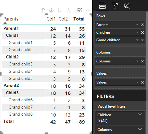
Power BI는 계층적 데이터 구조를 만듭니다. 트리 계층 구조의 루트에는 Category 데이터 역할의 Parents 열에 있는 데이터가 포함되고, 데이터 역할 테이블의 Children 열에 있는 자식이 있습니다.
의미 체계 모델:
| 부모 | Children | 손자 | 열 | 값 |
|---|---|---|---|---|
| 부모 1 | 자식 1 | 손자 1 | Col1 | 5 |
| 부모 1 | 자식 1 | 손자 1 | Col2 | 6 |
| 부모 1 | 자식 1 | 손자 2 | Col1 | 7 |
| 부모 1 | 자식 1 | 손자 2 | Col2 | 8 |
| 부모 1 | 자식 2 | 손자 3 | Col1 | 5 |
| 부모 1 | 자식 2 | 손자 3 | Col2 | 3 |
| 부모 1 | 자식 2 | 손자 4 | Col1 | 4 |
| 부모 1 | 자식 2 | 손자 4 | Col2 | 9 |
| 부모 1 | 자식 2 | 손자 5 | Col1 | 3 |
| 부모 1 | 자식 2 | 손자 5 | Col2 | 5 |
| 부모 2 | 자식 3 | 손자 6 | Col1 | 1 |
| 부모 2 | 자식 3 | 손자 6 | Col2 | 2 |
| 부모 2 | 자식 3 | 손자 7 | Col1 | 7 |
| 부모 2 | 자식 3 | 손자 7 | Col2 | 1 |
| 부모 2 | 자식 3 | 손자 8 | Col1 | 10 |
| 부모 2 | 자식 3 | 손자 8 | Col2 | 13 |
Power BI의 핵심 행렬 시각적 개체는 데이터를 테이블로 렌더링합니다.
시각적 개체는 다음 코드에 설명된 대로 데이터 구조를 가져옵니다. 여기에는 처음 두 개의 테이블 행만 나와 있습니다.
{
    "metadata": {...},
    "matrix": {
        "rows": {
            "levels": [...],
            "root": {
                "childIdentityFields": [...],
                "children": [
                    {
                        "level": 0,
                        "levelValues": [...],
                        "value": "Parent1",
                        "identity": {...},
                        "childIdentityFields": [...],
                        "children": [
                            {
                                "level": 1,
                                "levelValues": [...],
                                "value": "Child1",
                                "identity": {...},
                                "childIdentityFields": [...],
                                "children": [
                                    {
                                        "level": 2,
                                        "levelValues": [...],
                                        "value": "Grand child1",
                                        "identity": {...},
                                        "values": {
                                            "0": {
                                                "value": 5 // value for Col1
                                            },
                                            "1": {
                                                "value": 6 // value for Col2
                                            }
                                        }
                                    },
                                    ...
                                ]
                            },
                            ...
                        ]
                    },
                    ...
                ]
            }
        },
        "columns": {
            "levels": [...],
            "root": {
                "childIdentityFields": [...],
                "children": [
                    {
                        "level": 0,
                        "levelValues": [...],
                        "value": "Col1",
                        "identity": {...}
                    },
                    {
                        "level": 0,
                        "levelValues": [...],
                        "value": "Col2",
                        "identity": {...}
                    },
                    ...
                ]
            }
        },
        "valueSources": [...]
    }
}
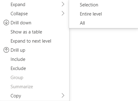
행 머리글 확장 및 축소
API 4.1.0 이상의 경우 행렬 데이터는 행 머리글 확장 및 축소를 지원합니다. API 4.2에서 전체 수준을 프로그래밍 방식으로 확장/축소할 수 있습니다. 확장 및 축소 기능은 사용자가 다음 수준에 대한 모든 데이터를 가져오지 않고도 행을 확장하거나 축소할 수 있도록 하여 dataView로의 데이터 가져오기를 최적화합니다. 선택한 행에 대한 데이터만 가져옵니다. 행 머리글’의 확장 상태는 책갈피 및 저장된 보고서에서도 일관되게 유지됩니다. 각 시각적 개체에만 적용되는 것은 아닙니다.
showContextMenu 메서드에 dataRoles 매개 변수를 제공하여 확장 및 축소 명령을 상황에 맞는 메뉴에 추가할 수 있습니다.
많은 수의 데이터 요소를 확장하려면 확장/축소 API와 함께 더 많은 데이터 API 가져오기를 사용합니다.
API 기능
행 머리글을 확장하고 축소할 수 있도록 다음 요소가 API 버전 4.1.0에 추가되었습니다.
DataViewTreeNode의isCollapsed플래그:interface DataViewTreeNode { //... /** * TRUE if the node is Collapsed * FALSE if it is Expanded * Undefined if it cannot be Expanded (e.g. subtotal) */ isCollapsed?: boolean; }ISelectionManger인터페이스의toggleExpandCollapse메서드:interface ISelectionManager { //... showContextMenu(selectionId: ISelectionId, position: IPoint, dataRoles?: string): IPromise<{}>; // dataRoles is the name of the role of the selected data point toggleExpandCollapse(selectionId: ISelectionId, entireLevel?: boolean): IPromise<{}>; // Expand/Collapse an entire level will be available from API 4.2.0 //... }DataViewHierarchyLevel의
canBeExpanded플래그:interface DataViewHierarchyLevel { //... /** If TRUE, this level can be expanded/collapsed */ canBeExpanded?: boolean; }
시각적 개체 요구 사항
행렬 데이터 보기를 사용하여 시각적 개체에 대한 확장 축소 기능을 사용하도록 설정하려면 다음을 수행합니다.
다음 코드를 capabilities.json 파일에 추가합니다.
   "expandCollapse": {
    "roles": ["Rows"], //”Rows” is the name of rows data role
    "addDataViewFlags": {
        "defaultValue": true //indicates if the DataViewTreeNode will get the isCollapsed flag by default
    }
},
역할을 드릴할 수 있는지 확인합니다.
    "drilldown": {
    "roles": ["Rows"]
},
각 노드에 대해 선택 작성기의 인스턴스를 만들고 선택한 노드 계층 구조 수준에서
withMatrixNode메서드를 호출한 후selectionId를 만듭니다. 예시:let nodeSelectionBuilder: ISelectionIdBuilder = visualHost.createSelectionIdBuilder(); // parantNodes is a list of the parents of the selected node. // node is the current node which the selectionId is created for. parentNodes.push(node); for (let i = 0; i < parentNodes.length; i++) { nodeSelectionBuilder = nodeSelectionBuilder.withMatrixNode(parentNodes[i], levels); } const nodeSelectionId: ISelectionId = nodeSelectionBuilder.createSelectionId();선택 관리자의 인스턴스를 만들고 선택한 노드에 대해 만든
selectionManager.toggleExpandCollapse()의 매개 변수와 함께selectionId메서드를 사용합니다. 예시:// handle click events to apply expand\collapse action for the selected node button.addEventListener("click", () => { this.selectionManager.toggleExpandCollapse(nodeSelectionId); });
참고 항목
- 선택한 노드가 행 노드가 아닌 경우 PowerBI는 확장 및 축소 호출을 무시하고 상황에 맞는 메뉴에서 확장 및 축소 명령이 제거됩니다.
dataRoles매개 변수는 시각적 개체가drilldown또는expandCollapse기능을 지원하는 경우에만 메서드에showContextMenu필요합니다. 시각적 개체가 이러한 기능을 지원하지만 dataRoles가 제공되지 않은 경우 개발자 시각적 개체를 사용하거나 디버그 모드를 사용하도록 설정한 퍼블릭 시각적 개체를 디버깅할 때 오류가 콘솔에 출력됩니다.
고려 사항 및 제한 사항
- 노드를 확장하면 새 데이터 제한이 DataView에 적용됩니다. 새 DataView에 이전 DataView에 제공된 일부 노드가 포함되지 않을 수 있습니다.
- 확장 또는 축소를 사용하는 경우 시각적 개체가 요청하지 않은 경우에도 합계가 추가됩니다.
- 열 확장 및 축소는 지원되지 않습니다.
모든 메타데이터 열 유지
API 5.1.0 이상에서는 모든 메타데이터 열을 유지하는 것이 지원됩니다. 이 기능을 사용하면 시각적 개체가 활성 프로젝션에 관계없이 모든 열에 대한 메타데이터를 받을 수 있습니다.
capabilities.json 파일에 다음을 추가합니다.
"keepAllMetadataColumns": {
    "type": "boolean",
    "description": "Indicates that visual is going to receive all metadata columns, no matter what the active projections are"
}
이 속성을 true로 설정하면 축소된 열을 비롯한 모든 메타데이터가 수신됩니다. false로 설정하거나 정의되지 않은 상태로 두면 활성 프로젝션이 있는 열에서만 메타데이터가 수신됩니다(예: 확장됨).
데이터 감소 알고리즘
데이터 감소 알고리즘은 데이터 뷰에서 수신되는 데이터와 데이터의 양을 제어합니다.
count는 데이터 뷰에서 수락할 수 있는 값의 최대 개수로 설정됩니다. count 값보다 많은 경우 데이터 감소 알고리즘에서 수신해야 하는 값을 결정합니다.
데이터 감소 알고리즘 유형
데이터 감소 알고리즘 설정에는 다음 네 가지 유형이 있습니다.
top: 의미 체계 모델에서 첫 번째 count 값을 가져옵니다.bottom: 의미 체계 모델에서 마지막 count 값을 가져옵니다.sample: 첫 번째 항목과 마지막 항목이 포함되며, 그 사이에 동일한 간격으로 count 개수의 항목이 포함됩니다. 예를 들어 의미 체계 모델 [0, 1, 2, ... 100]이 있고 count가 9이면 값 [0, 10, 20 ... 100]이 표시됩니다.window: count개의 요소를 포함하는 데이터 포인트 창을 한 번에 하나씩 로드합니다. 현재top과window는 동일합니다. 향후에는 창 설정이 완전히 지원될 예정입니다.
기본적으로 모든 Power BI 시각적 개체에는 count가 1000개 데이터 요소로 설정된 top 데이터 감소 알고리즘이 적용되어 있습니다. 이 기본값은 capabilities.json 파일에서 다음 속성을 설정하는 것과 동일합니다.
"dataReductionAlgorithm": {
    "top": {
        "count": 1000
    }
}
count 값을 최대 30000까지 임의의 정수 값으로 수정할 수 있습니다. R 기반 Power BI 시각적 개체는 최대 150000개의 행을 지원할 수 있습니다.
데이터 감소 알고리즘 사용
데이터 감소 알고리즘은 범주, 테이블 또는 행렬 데이터 뷰 매핑에서 사용할 수 있습니다.
범주 데이터 매핑에서는 범주 데이터 매핑에 대한 values의 “범주” 및/또는 “그룹” 섹션에 알고리즘을 추가할 수 있습니다.
"dataViewMappings": {
    "categorical": {
        "categories": {
            "for": { "in": "category" },
            "dataReductionAlgorithm": {
                "window": {
                    "count": 300
                }
            }
        },
        "values": {
            "group": {
                "by": "series",
                "select": [{
                        "for": {
                            "in": "measure"
                        }
                    }
                ],
                "dataReductionAlgorithm": {
                    "top": {
                        "count": 100
                    }
                }
            }
        }
    }
}
테이블 데이터 뷰 매핑에서는 데이터 뷰 매핑 테이블의 rows 섹션에 데이터 감소 알고리즘을 적용합니다.
"dataViewMappings": [
    {
        "table": {
            "rows": {
                "for": {
                    "in": "values"
                },
                "dataReductionAlgorithm": {
                    "top": {
                        "count": 2000
                    }
                }
            }
        }
    }
]
데이터 뷰 매핑 행렬의 rows 및 columns 섹션에 데이터 감소 알고리즘을 적용할 수 있습니다.
다음 단계
피드백
출시 예정: 2024년 내내 콘텐츠에 대한 피드백 메커니즘으로 GitHub 문제를 단계적으로 폐지하고 이를 새로운 피드백 시스템으로 바꿀 예정입니다. 자세한 내용은 다음을 참조하세요. https://aka.ms/ContentUserFeedback
다음에 대한 사용자 의견 제출 및 보기