ViewCell 사용자 지정
 샘플 다운로드
Xamarin.Forms ViewCell은 ListView 또는 TableView에 추가할 수 있는 셀이며, 개발자 정의 보기를 포함하고 있습니다. 이 문서에서는 Xamarin.Forms ListView 컨트롤 내부에 호스팅되는 ViewCell에 대한 사용자 지정 렌더러를 만드는 방법을 보여 줍니다. Xamarin.Forms 그러면 ListView 스크롤 중에 레이아웃 계산이 반복적으로 호출되지 않습니다.
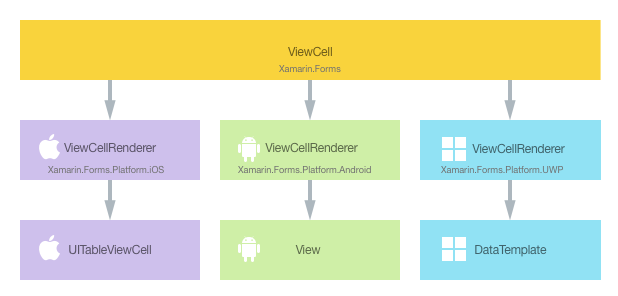
모든 Xamarin.Forms 셀에는 네이티브 컨트롤의 인스턴스를 만드는 각 플랫폼에 함께 제공되는 렌더러가 있습니다. Xamarin.Forms 애플리케이션에서 ViewCell를 렌더링하는 경우 iOS에서 ViewCellRenderer 클래스가 인스턴스화되며, 차례로 네이티브 UITableViewCell 컨트롤이 인스턴스화됩니다. Android 플랫폼에서 ViewCellRenderer 클래스는 네이티브 View 컨트롤을 인스턴스화합니다. UWP(유니버설 Windows 플랫폼)에서 ViewCellRenderer 클래스는 네이티브 DataTemplate을 인스턴스화합니다. Xamarin.Forms 컨트롤에 매핑되는 렌더러 및 네이티브 컨트롤 클래스에 대한 자세한 내용은 렌더러 기본 클래스 및 네이티브 컨트롤을 참조하세요.
다음 다이어그램은 ViewCell 및 이를 구현하는 해당 네이티브 컨트롤 간의 관계를 보여줍니다.
렌더링 프로세스는 각 플랫폼에서 ViewCell에 대한 사용자 지정 렌더러를 만들어 플랫폼별 사용자 지정을 구현하는 데 활용할 수 있습니다. 이 작업을 수행하는 프로세스는 다음과 같습니다.
이제 각 항목이 차례로 논의되어 컨트롤 내에서 호스트되는 각 셀에 대해 플랫폼별 레이아웃을 활용하는 렌더러를 Xamarin.FormsListView 구현 NativeCell 합니다. 이렇게 하면 ListView를 스크롤하는 동안 Xamarin.Forms 레이아웃 계산이 반복적으로 호출되지 않습니다.
사용자 지정 셀 만들기
다음 코드 예제와 같이 ViewCell 클래스를 서브클래싱하여 사용자 지정 셀 컨트롤을 만들 수 있습니다.
public class NativeCell : ViewCell
{
  public static readonly BindableProperty NameProperty =
    BindableProperty.Create ("Name", typeof(string), typeof(NativeCell), "");

  public string Name {
    get { return (string)GetValue (NameProperty); }
    set { SetValue (NameProperty, value); }
  }

  public static readonly BindableProperty CategoryProperty =
    BindableProperty.Create ("Category", typeof(string), typeof(NativeCell), "");

  public string Category {
    get { return (string)GetValue (CategoryProperty); }
    set { SetValue (CategoryProperty, value); }
  }

  public static readonly BindableProperty ImageFilenameProperty =
    BindableProperty.Create ("ImageFilename", typeof(string), typeof(NativeCell), "");

  public string ImageFilename {
    get { return (string)GetValue (ImageFilenameProperty); }
    set { SetValue (ImageFilenameProperty, value); }
  }
}
NativeCell 클래스는 .NET Standard 라이브러리 프로젝트에서 생성되고 사용자 지정 셀에 대한 API를 정의합니다. 사용자 지정 셀은 데이터 바인딩을 통해 표시할 수 있는 Name, Category 및 ImageFilename 속성을 공개합니다. 데이터 바인딩에 대한 자세한 내용은 데이터 바인딩 기본을 참조하세요.
사용자 지정 셀 사용
NativeCell 사용자 지정 셀은 해당 위치의 네임스페이스를 선언하고 사용자 지정 셀 요소의 네임스페이스 접두사를 사용하여 .NET 표준 라이브러리 프로젝트를 Xaml로 참조할 수 있습니다. 다음 코드 예제에서는 NativeCell 사용자 지정 셀을 XAML 페이지에서 사용하는 방법을 보여줍니다.
<ContentPage ...
    xmlns:local="clr-namespace:CustomRenderer;assembly=CustomRenderer"
    ...>
    ...
    <ContentPage.Content>
          <StackLayout>
              <Label Text="Xamarin.Forms native cell" HorizontalTextAlignment="Center" />
              <ListView x:Name="listView" CachingStrategy="RecycleElement" ItemSelected="OnItemSelected">
                  <ListView.ItemTemplate>
                      <DataTemplate>
                          <local:NativeCell Name="{Binding Name}" Category="{Binding Category}" ImageFilename="{Binding ImageFilename}" />
                      </DataTemplate>
                  </ListView.ItemTemplate>
              </ListView>
          </StackLayout>
      </ContentPage.Content>
</ContentPage>
local 네임스페이스 접두사는 원하는 이름으로 지정할 수 있습니다. 그러나 clr-namespace 및 assembly 값은 사용자 지정 컨트롤의 세부 정보와 일치해야 합니다. 네임스페이스가 선언되면 사용자 지정 셀을 참조하는 데 사용됩니다.
다음 코드 예제에서는 NativeCell 사용자 지정 셀을 C# 페이지에서 사용하는 방법을 보여줍니다.
public class NativeCellPageCS : ContentPage
{
    ListView listView;

    public NativeCellPageCS()
    {
        listView = new ListView(ListViewCachingStrategy.RecycleElement)
        {
            ItemsSource = DataSource.GetList(),
            ItemTemplate = new DataTemplate(() =>
            {
                var nativeCell = new NativeCell();
                nativeCell.SetBinding(NativeCell.NameProperty, "Name");
                nativeCell.SetBinding(NativeCell.CategoryProperty, "Category");
                nativeCell.SetBinding(NativeCell.ImageFilenameProperty, "ImageFilename");

                return nativeCell;
            })
        };

        switch (Device.RuntimePlatform)
        {
            case Device.iOS:
                Padding = new Thickness(0, 20, 0, 0);
                break;
            case Device.Android:
            case Device.UWP:
                Padding = new Thickness(0);
                break;
        }

        Content = new StackLayout
        {
            Children = {
                new Label { Text = "Xamarin.Forms native cell", HorizontalTextAlignment = TextAlignment.Center },
                listView
            }
        };
        listView.ItemSelected += OnItemSelected;
    }
    ...
}
Xamarin.FormsListView 컨트롤은 속성을 통해 ItemSource 채워지는 데이터 목록을 표시하는 데 사용됩니다. RecycleElement 캐싱 전략은 목록 셀을 재활용하여 ListView 메모리 공간 및 실행 속도를 최소화하려고 시도합니다. 자세한 내용은 캐싱 전략을 참조하세요.
목록의 각 행에는 이름, 범주 및 이미지 파일 이름의 세 가지 데이터 항목이 있습니다. 목록의 각 행 레이아웃은 ListView.ItemTemplate 바인딩 가능 속성을 통해 참조되는 DataTemplate에서 정의됩니다. DataTemplate은 목록의 각 데이터 행이 데이터 바인딩을 통해 Name, Category 및 ImageFilename 속성을 표시하는 NativeCell이 되도록 정의합니다. ListView 컨트롤에 대한 자세한 내용은 ListView를 참조하세요.
이제 각 애플리케이션 프로젝트에 사용자 지정 렌더러를 추가하여 각 셀의 플랫폼별 레이아웃을 사용자 지정할 수 있습니다.
각 플랫폼에서 사용자 지정 렌더러 만들기
사용자 지정 렌더러 클래스를 만드는 프로세스는 다음과 같습니다.
- 사용자 지정 셀을 렌더링하는
ViewCellRenderer클래스의 서브클래스를 만듭니다. - 사용자 지정 셀을 렌더링하는 플랫폼별 메서드를 재정의하고, 이 메서드를 사용자 지정하는 논리를 작성합니다.
- 사용자 지정 렌더러 클래스에
ExportRenderer특성을 추가하여 Xamarin.Forms 사용자 지정 셀을 렌더링하는 데 사용하도록 지정합니다. 이 특성은 사용자 지정 렌더러를 Xamarin.Forms에 등록하는 데 사용됩니다.
참고 항목
대부분의 Xamarin.Forms 요소의 경우 각 플랫폼 프로젝트에서 사용자 지정 렌더러를 제공하는 것은 선택 사항입니다. 사용자 지정 렌더러가 등록되지 않은 경우 컨트롤의 기본 클래스에 대한 기본 렌더러가 사용됩니다. 그러나 ViewCell 요소를 렌더링하는 경우 각 플랫폼 프로젝트에 사용자 지정 렌더러가 필요합니다.
다음 다이어그램은 샘플 애플리케이션에서 각 프로젝트의 책임과 이들 간의 관계를 보여줍니다.
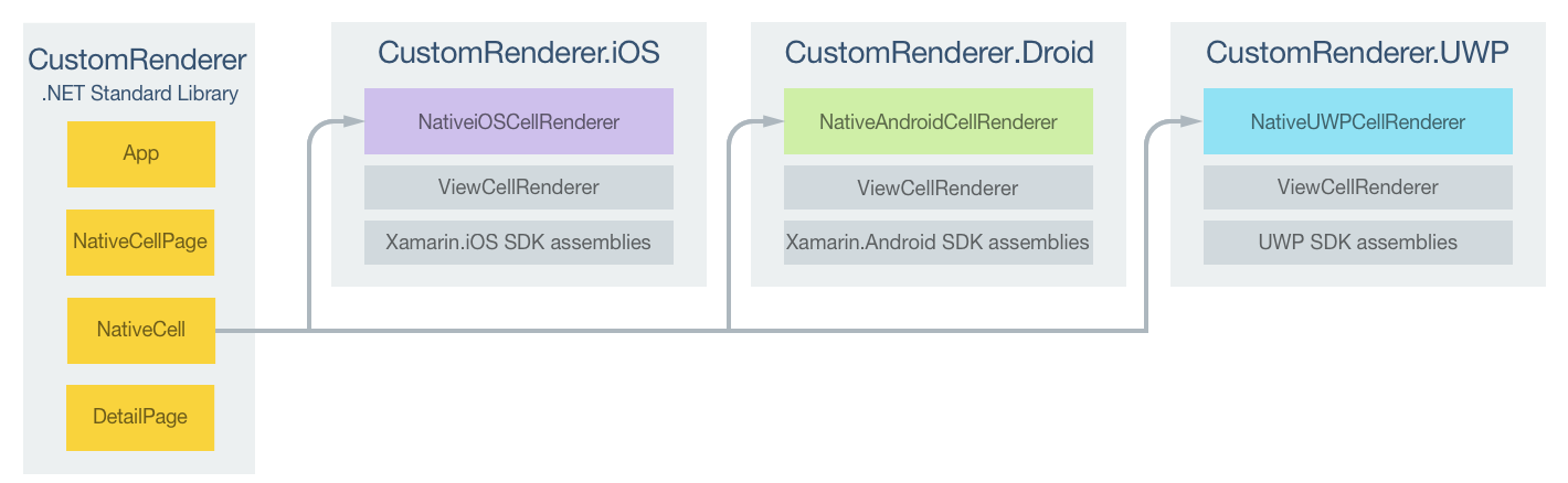
NativeCell 사용자 지정 셀은 각 플랫폼의 ViewCellRenderer 클래스에서 모두 파생되는 플랫폼별 렌더러 클래스에 의해 렌더링됩니다. 그러면 다음 스크린샷과 같이 각 NativeCell 사용자 지정 셀이 플랫폼별 레이아웃을 사용하여 렌더링됩니다.

ViewCellRenderer 클래스는 사용자 지정 셀을 렌더링하기 위한 플랫폼별 메서드를 공개합니다. iOS 플랫폼의 GetCell 메서드, Android 플랫폼의 GetCellCore 메서드, UWP의 GetTemplate 메서드가 여기에 해당합니다.
각 사용자 지정 렌더러 클래스는 렌더러를 Xamarin.Forms에 등록하는 ExportRenderer 특성으로 데코레이트됩니다. 이 특성은 렌더링되는 Xamarin.Forms 셀의 형식 이름과 사용자 지정 렌더러의 형식 이름이라는 두 가지 매개 변수를 사용합니다. 특성의 assembly 접두사는 특성이 전체 어셈블리에 적용되도록 지정합니다.
다음 섹션에서는 각 플랫폼별 사용자 지정 렌더러 클래스의 구현을 설명합니다.
iOS에서 사용자 지정 렌더러 만들기
다음 코드 예제에서는 iOS 플랫폼용 사용자 지정 렌더러를 보여줍니다.
[assembly: ExportRenderer(typeof(NativeCell), typeof(NativeiOSCellRenderer))]
namespace CustomRenderer.iOS
{
    public class NativeiOSCellRenderer : ViewCellRenderer
    {
        NativeiOSCell cell;

        public override UITableViewCell GetCell(Cell item, UITableViewCell reusableCell, UITableView tv)
        {
            var nativeCell = (NativeCell)item;

            cell = reusableCell as NativeiOSCell;
            if (cell == null)
                cell = new NativeiOSCell(item.GetType().FullName, nativeCell);
            else
                cell.NativeCell.PropertyChanged -= OnNativeCellPropertyChanged;

            nativeCell.PropertyChanged += OnNativeCellPropertyChanged;
            cell.UpdateCell(nativeCell);
            return cell;
        }
        ...
    }
}
GetCell 메서드는 표시할 각 셀을 빌드하기 위해 호출됩니다. 각 셀은 셀과 해당 데이터의 레이아웃을 정의하는 NativeiOSCell 인스턴스입니다. GetCell 메서드의 작업은 ListView 캐싱 전략에 따라 달라집니다.
ListView캐싱 전략이RetainElement이면GetCell메서드가 각 셀에 대해 호출됩니다. 화면에 처음으로 표시되는 각NativeCell인스턴스에 대해NativeiOSCell인스턴스가 만들어집니다. 사용자가ListView를 스크롤하면NativeiOSCell인스턴스가 다시 사용됩니다. iOS 셀 재사용에 대한 자세한 내용은 셀 재사용을 참조하세요.참고 항목
이 사용자 지정 렌더러 코드는
ListView가 셀을 유지하도록 설정되더라도 일부 셀 재사용을 수행합니다.각
NativeiOSCell인스턴스가 표시하는 데이터는 새로 생성되든 재사용되든 관계없이UpdateCell메서드에 의해 각NativeCell인스턴스의 데이터로 업데이트됩니다.참고 항목
셀을 유지하도록
ListView캐싱 전략이 설정되면OnNativeCellPropertyChanged메서드가 절대 호출되지 않습니다.ListView캐싱 전략이RecycleElement이면 화면에 처음으로 표시되는 각 셀에 대해GetCell메서드가 호출됩니다. 화면에 처음으로 표시되는 각NativeCell인스턴스에 대해NativeiOSCell인스턴스가 만들어집니다. 각NativeiOSCell인스턴스가 표시하는 데이터는UpdateCell메서드에 의해NativeCell인스턴스의 데이터로 업데이트됩니다. 그러나GetCell메서드는 사용자가ListView를 스크롤할 때 호출되지 않습니다. 대신NativeiOSCell인스턴스가 재사용됩니다.NativeCell인스턴스의 데이터가 변경되면 이 인스턴스에서PropertyChanged이벤트가 발생하고,OnNativeCellPropertyChanged이벤트 처리기는 재사용되는 각NativeiOSCell인스턴스의 데이터를 업데이트합니다.
다음 코드 예제는 PropertyChanged 이벤트가 발생하면 호출되는 OnNativeCellPropertyChanged 메서드를 보여줍니다.
namespace CustomRenderer.iOS
{
    public class NativeiOSCellRenderer : ViewCellRenderer
    {
        ...

        void OnNativeCellPropertyChanged(object sender, PropertyChangedEventArgs e)
        {
            var nativeCell = (NativeCell)sender;
            if (e.PropertyName == NativeCell.NameProperty.PropertyName)
            {
                cell.HeadingLabel.Text = nativeCell.Name;
            }
            else if (e.PropertyName == NativeCell.CategoryProperty.PropertyName)
            {
                cell.SubheadingLabel.Text = nativeCell.Category;
            }
            else if (e.PropertyName == NativeCell.ImageFilenameProperty.PropertyName)
            {
                cell.CellImageView.Image = cell.GetImage(nativeCell.ImageFilename);
            }
        }
    }
}
이 메서드는 재사용되는 NativeiOSCell 인스턴스가 표시하는 데이터를 업데이트합니다. 메서드를 여러 번 호출할 수 있으므로 변경된 속성에 대한 검사가 수행됩니다.
NativeiOSCell 클래스는 각 셀에 대한 레이아웃을 정의하며, 다음 코드 예제에 표시됩니다.
internal class NativeiOSCell : UITableViewCell, INativeElementView
{
  public UILabel HeadingLabel { get; set; }
  public UILabel SubheadingLabel { get; set; }
  public UIImageView CellImageView { get; set; }

  public NativeCell NativeCell { get; private set; }
  public Element Element => NativeCell;

  public NativeiOSCell(string cellId, NativeCell cell) : base(UITableViewCellStyle.Default, cellId)
  {
    NativeCell = cell;

    SelectionStyle = UITableViewCellSelectionStyle.Gray;
    ContentView.BackgroundColor = UIColor.FromRGB(255, 255, 224);
    CellImageView = new UIImageView();

    HeadingLabel = new UILabel()
    {
      Font = UIFont.FromName("Cochin-BoldItalic", 22f),
      TextColor = UIColor.FromRGB(127, 51, 0),
      BackgroundColor = UIColor.Clear
    };

    SubheadingLabel = new UILabel()
    {
      Font = UIFont.FromName("AmericanTypewriter", 12f),
      TextColor = UIColor.FromRGB(38, 127, 0),
      TextAlignment = UITextAlignment.Center,
      BackgroundColor = UIColor.Clear
    };

    ContentView.Add(HeadingLabel);
    ContentView.Add(SubheadingLabel);
    ContentView.Add(CellImageView);
  }

  public void UpdateCell(NativeCell cell)
  {
    HeadingLabel.Text = cell.Name;
    SubheadingLabel.Text = cell.Category;
    CellImageView.Image = GetImage(cell.ImageFilename);
  }

  public UIImage GetImage(string filename)
  {
    return (!string.IsNullOrWhiteSpace(filename)) ? UIImage.FromFile("Images/" + filename + ".jpg") : null;
  }

  public override void LayoutSubviews()
  {
    base.LayoutSubviews();

    HeadingLabel.Frame = new CGRect(5, 4, ContentView.Bounds.Width - 63, 25);
    SubheadingLabel.Frame = new CGRect(100, 18, 100, 20);
    CellImageView.Frame = new CGRect(ContentView.Bounds.Width - 63, 5, 33, 33);
  }
}
이 클래스는 셀의 콘텐츠 및 해당 레이아웃을 렌더링하는 데 사용하는 컨트롤을 정의합니다. 이 클래스는 ListView에서 RecycleElement 캐싱 전략을 사용할 때 필요한 INativeElementView 인터페이스를 구현합니다. 이 인터페이스는 클래스가 Element 속성을 구현해야 한다고 지정하며, 이 속성은 재활용된 셀의 사용자 지정 셀 데이터를 반환해야 합니다.
NativeiOSCell 생성자는 HeadingLabel, SubheadingLabel 및 CellImageView의 모양을 초기화합니다. 이러한 속성은 NativeCell 인스턴스에 저장된 데이터를 표시하는 데 사용되며, UpdateCell 메서드는 각 속성의 값을 설정하기 위해 호출됩니다. 또한 ListView가 RecycleElement 캐싱 전략을 사용하는 경우 HeadingLabel, SubheadingLabel 및 CellImageView 속성이 표시하는 데이터를 사용자 지정 렌더러의 OnNativeCellPropertyChanged 메서드를 통해 업데이트할 수 있습니다.
셀 레이아웃은 LayoutSubviews 재정의를 통해 수행되며, 셀 내부의 HeadingLabel, SubheadingLabel 및 CellImageView 좌표를 설정합니다.
Android에서 사용자 지정 렌더러 만들기
다음 코드 예제에서는 Android 플랫폼용 사용자 지정 렌더러를 보여줍니다.
[assembly: ExportRenderer(typeof(NativeCell), typeof(NativeAndroidCellRenderer))]
namespace CustomRenderer.Droid
{
    public class NativeAndroidCellRenderer : ViewCellRenderer
    {
        NativeAndroidCell cell;

        protected override Android.Views.View GetCellCore(Cell item, Android.Views.View convertView, ViewGroup parent, Context context)
        {
            var nativeCell = (NativeCell)item;
            Console.WriteLine("\t\t" + nativeCell.Name);

            cell = convertView as NativeAndroidCell;
            if (cell == null)
            {
                cell = new NativeAndroidCell(context, nativeCell);
            }
            else
            {
                cell.NativeCell.PropertyChanged -= OnNativeCellPropertyChanged;
            }

            nativeCell.PropertyChanged += OnNativeCellPropertyChanged;

            cell.UpdateCell(nativeCell);
            return cell;
        }
        ...
    }
}
GetCellCore 메서드는 표시할 각 셀을 빌드하기 위해 호출됩니다. 각 셀은 셀과 해당 데이터의 레이아웃을 정의하는 NativeAndroidCell 인스턴스입니다. GetCellCore 메서드의 작업은 ListView 캐싱 전략에 따라 달라집니다.
ListView캐싱 전략이RetainElement이면GetCellCore메서드가 각 셀에 대해 호출됩니다. 화면에 처음으로 표시되는 각NativeCell인스턴스에 대해NativeAndroidCell이 만들어집니다. 사용자가ListView를 스크롤하면NativeAndroidCell인스턴스가 다시 사용됩니다. Android 셀 재사용에 대한 자세한 내용은 행 보기 재사용을 참조하세요.참고 항목
이 사용자 지정 렌더러 코드는
ListView가 셀을 유지하도록 설정되더라도 일부 셀 재사용을 수행합니다.각
NativeAndroidCell인스턴스가 표시하는 데이터는 새로 생성되든 재사용되든 관계없이UpdateCell메서드에 의해 각NativeCell인스턴스의 데이터로 업데이트됩니다.참고 항목
ListView가 셀을 유지하도록 설정되면OnNativeCellPropertyChanged메서드가 호출되지만,NativeAndroidCell속성 값을 업데이트하지는 않습니다.ListView캐싱 전략이RecycleElement이면 화면에 처음으로 표시되는 각 셀에 대해GetCellCore메서드가 호출됩니다. 화면에 처음으로 표시되는 각NativeCell인스턴스에 대해NativeAndroidCell인스턴스가 만들어집니다. 각NativeAndroidCell인스턴스가 표시하는 데이터는UpdateCell메서드에 의해NativeCell인스턴스의 데이터로 업데이트됩니다. 그러나GetCellCore메서드는 사용자가ListView를 스크롤할 때 호출되지 않습니다. 대신NativeAndroidCell인스턴스가 재사용됩니다.NativeCell인스턴스의 데이터가 변경되면 이 인스턴스에서PropertyChanged이벤트가 발생하고,OnNativeCellPropertyChanged이벤트 처리기는 재사용되는 각NativeAndroidCell인스턴스의 데이터를 업데이트합니다.
다음 코드 예제는 PropertyChanged 이벤트가 발생하면 호출되는 OnNativeCellPropertyChanged 메서드를 보여줍니다.
namespace CustomRenderer.Droid
{
    public class NativeAndroidCellRenderer : ViewCellRenderer
    {
        ...

        void OnNativeCellPropertyChanged(object sender, PropertyChangedEventArgs e)
        {
            var nativeCell = (NativeCell)sender;
            if (e.PropertyName == NativeCell.NameProperty.PropertyName)
            {
                cell.HeadingTextView.Text = nativeCell.Name;
            }
            else if (e.PropertyName == NativeCell.CategoryProperty.PropertyName)
            {
                cell.SubheadingTextView.Text = nativeCell.Category;
            }
            else if (e.PropertyName == NativeCell.ImageFilenameProperty.PropertyName)
            {
                cell.SetImage(nativeCell.ImageFilename);
            }
        }
    }
}
이 메서드는 재사용되는 NativeAndroidCell 인스턴스가 표시하는 데이터를 업데이트합니다. 메서드를 여러 번 호출할 수 있으므로 변경된 속성에 대한 검사가 수행됩니다.
NativeAndroidCell 클래스는 각 셀에 대한 레이아웃을 정의하며, 다음 코드 예제에 표시됩니다.
internal class NativeAndroidCell : LinearLayout, INativeElementView
{
  public TextView HeadingTextView { get; set; }
  public TextView SubheadingTextView { get; set; }
  public ImageView ImageView { get; set; }

  public NativeCell NativeCell { get; private set; }
  public Element Element => NativeCell;

  public NativeAndroidCell(Context context, NativeCell cell) : base(context)
  {
    NativeCell = cell;

    var view = (context as Activity).LayoutInflater.Inflate(Resource.Layout.NativeAndroidCell, null);
    HeadingTextView = view.FindViewById<TextView>(Resource.Id.HeadingText);
    SubheadingTextView = view.FindViewById<TextView>(Resource.Id.SubheadingText);
    ImageView = view.FindViewById<ImageView>(Resource.Id.Image);

    AddView(view);
  }

  public void UpdateCell(NativeCell cell)
  {
    HeadingTextView.Text = cell.Name;
    SubheadingTextView.Text = cell.Category;

    // Dispose of the old image
    if (ImageView.Drawable != null)
    {
      using (var image = ImageView.Drawable as BitmapDrawable)
      {
        if (image != null)
        {
          if (image.Bitmap != null)
          {
            image.Bitmap.Dispose();
          }
        }
      }
    }

    SetImage(cell.ImageFilename);
  }

  public void SetImage(string filename)
  {
    if (!string.IsNullOrWhiteSpace(filename))
    {
      // Display new image
      Context.Resources.GetBitmapAsync(filename).ContinueWith((t) =>
      {
        var bitmap = t.Result;
        if (bitmap != null)
        {
          ImageView.SetImageBitmap(bitmap);
          bitmap.Dispose();
        }
      }, TaskScheduler.FromCurrentSynchronizationContext());
    }
    else
    {
      // Clear the image
      ImageView.SetImageBitmap(null);
    }
  }
}
이 클래스는 셀의 콘텐츠 및 해당 레이아웃을 렌더링하는 데 사용하는 컨트롤을 정의합니다. 이 클래스는 ListView에서 RecycleElement 캐싱 전략을 사용할 때 필요한 INativeElementView 인터페이스를 구현합니다. 이 인터페이스는 클래스가 Element 속성을 구현해야 한다고 지정하며, 이 속성은 재활용된 셀의 사용자 지정 셀 데이터를 반환해야 합니다.
NativeAndroidCell 생성자는 NativeAndroidCell 레이아웃을 확장하고, HeadingTextView, SubheadingTextView 및 ImageView 속성을 확장된 레이아웃의 컨트롤에 초기화합니다. 이러한 속성은 NativeCell 인스턴스에 저장된 데이터를 표시하는 데 사용되며, UpdateCell 메서드는 각 속성의 값을 설정하기 위해 호출됩니다. 또한 ListView가 RecycleElement 캐싱 전략을 사용하는 경우 HeadingTextView, SubheadingTextView 및 ImageView 속성이 표시하는 데이터를 사용자 지정 렌더러의 OnNativeCellPropertyChanged 메서드를 통해 업데이트할 수 있습니다.
다음 코드 예제는 NativeAndroidCell.axml 레이아웃 파일의 레이아웃 정의를 보여줍니다.
<?xml version="1.0" encoding="utf-8"?>
<RelativeLayout xmlns:android="http://schemas.android.com/apk/res/android"
    android:layout_width="fill_parent"
    android:layout_height="wrap_content"
    android:padding="8dp"
    android:background="@drawable/CustomSelector">
    <LinearLayout
        android:id="@+id/Text"
        android:orientation="vertical"
        android:layout_width="wrap_content"
        android:layout_height="wrap_content"
        android:paddingLeft="10dip">
        <TextView
            android:id="@+id/HeadingText"
            android:layout_width="wrap_content"
            android:layout_height="wrap_content"
            android:textColor="#FF7F3300"
            android:textSize="20dip"
            android:textStyle="italic" />
        <TextView
            android:id="@+id/SubheadingText"
            android:layout_width="wrap_content"
            android:layout_height="wrap_content"
            android:textSize="14dip"
            android:textColor="#FF267F00"
            android:paddingLeft="100dip" />
    </LinearLayout>
    <ImageView
        android:id="@+id/Image"
        android:layout_width="48dp"
        android:layout_height="48dp"
        android:padding="5dp"
        android:src="@drawable/icon"
        android:layout_alignParentRight="true" />
</RelativeLayout>
이 레이아웃은 두 개의 TextView 컨트롤 및 ImageView 컨트롤이 셀의 콘텐츠를 표시하는 데 사용되도록 지정합니다. 두 개의 TextView 컨트롤은 RelativeLayout 내에 포함되는 모든 컨트롤을 사용하여 LinearLayout 컨트롤 내에서 세로 방향으로 설정됩니다.
UWP에서 사용자 지정 렌더러 만들기
다음 코드 예제는 UWP용 사용자 지정 렌더러를 보여줍니다.
[assembly: ExportRenderer(typeof(NativeCell), typeof(NativeUWPCellRenderer))]
namespace CustomRenderer.UWP
{
    public class NativeUWPCellRenderer : ViewCellRenderer
    {
        public override Windows.UI.Xaml.DataTemplate GetTemplate(Cell cell)
        {
            return App.Current.Resources["ListViewItemTemplate"] as Windows.UI.Xaml.DataTemplate;
        }
    }
}
GetTemplate 메서드는 목록의 각 데이터 행에 대해 렌더링할 셀을 반환하기 위해 호출됩니다. 이 메서드는 화면에 표시할 각 NativeCell 인스턴스에 대한 DataTemplate을 만들고, DataTemplate은 셀의 모양과 콘텐츠를 정의합니다.
DataTemplate은 애플리케이션 수준 리소스 사전에 저장되며, 다음 코드 예제에 표시됩니다.
<DataTemplate x:Key="ListViewItemTemplate">
    <Grid Background="LightYellow">
        <Grid.Resources>
            <local:ConcatImageExtensionConverter x:Name="ConcatImageExtensionConverter" />
        </Grid.Resources>
        <Grid.RowDefinitions>
            <RowDefinition Height="Auto" />
            <RowDefinition Height="Auto" />
        </Grid.RowDefinitions>
        <Grid.ColumnDefinitions>
            <ColumnDefinition Width="0.40*" />
            <ColumnDefinition Width="0.40*"/>
            <ColumnDefinition Width="0.20*" />
        </Grid.ColumnDefinitions>
        <TextBlock Grid.ColumnSpan="2" Foreground="#7F3300" FontStyle="Italic" FontSize="22" VerticalAlignment="Top" Text="{Binding Name}" />
        <TextBlock Grid.RowSpan="2" Grid.Column="1" Foreground="#267F00" FontWeight="Bold" FontSize="12" VerticalAlignment="Bottom" Text="{Binding Category}" />
        <Image Grid.RowSpan="2" Grid.Column="2" HorizontalAlignment="Left" VerticalAlignment="Center" Source="{Binding ImageFilename, Converter={StaticResource ConcatImageExtensionConverter}}" Width="50" Height="50" />
        <Line Grid.Row="1" Grid.ColumnSpan="3" X1="0" X2="1" Margin="30,20,0,0" StrokeThickness="1" Stroke="LightGray" Stretch="Fill" VerticalAlignment="Bottom" />
    </Grid>
</DataTemplate>
DataTemplate은 셀의 콘텐츠, 해당 레이아웃 및 모양을 표시하는 데 사용되는 컨트롤을 지정합니다. 두 개의 TextBlock 컨트롤 및 Image 컨트롤은 데이터 바인딩을 통해 셀의 콘텐츠를 표시하는 데 사용됩니다. 또한 ConcatImageExtensionConverter의 인스턴스는 각 이미지 파일 이름에 .jpg 파일 확장을 연결하는 데 사용됩니다. 이렇게 하면 Image 컨트롤은 해당 Source 속성이 설정될 때 이미지를 로드하고 렌더링할 수 있습니다.
요약
이 문서에서는 컨트롤 내에서 호스트되는 사용자 지정 렌더러를 ViewCell 만드는 방법을 설명했습니다 Xamarin.FormsListView . 이렇게 하면 ListView를 스크롤하는 동안 Xamarin.Forms 레이아웃 계산이 반복적으로 호출되지 않습니다.