Tutorial: Analyze sales data from Excel and an OData feed
It's common to have data in multiple data sources. For example, you could have two databases, one for product information, and another for sales information. With Power BI Desktop, you can combine data from different sources to create interesting, compelling data analyses and visualizations.
In this tutorial, you combine data from two data sources:
- An Excel workbook with product information
- An OData feed containing orders data
You're going to import each semantic model and do transformation and aggregation operations. Then, you can use the two source's data to produce a sales analysis report with interactive visualizations. Later, apply these techniques to SQL Server queries, CSV files, and other data sources in Power BI Desktop.
Note
In Power BI Desktop, there are often a few ways to accomplish a task. For example, you can right-click or use a More options menu on a column or cell to see more ribbon selections. Several alternate methods are described in the following steps.
Import Excel product data
First, import product data from the Products.xlsx Excel workbook into Power BI Desktop.
Download the Products.xlsx Excel workbook and save it as Products.xlsx.
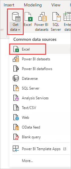
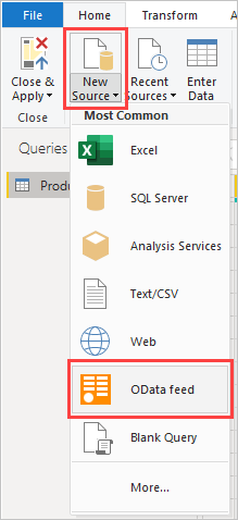
Select the arrow next to Get data in the Power BI Desktop ribbon's Home tab, and then select Excel from the Common data sources menu.
Note
You can also select the Get data item itself, or select Get data from the Power BI Get started dialog box, then select Excel or File > Excel in the Get Data dialog box, and then select Connect.
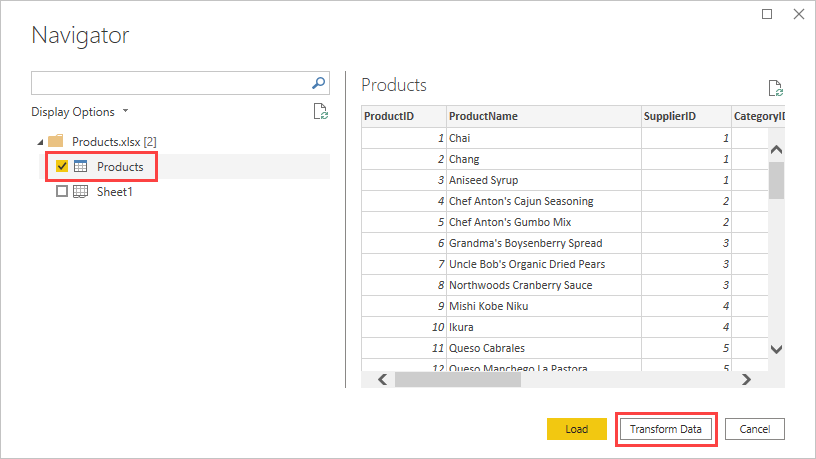
In the Open dialog box, navigate to and select the Products.xlsx file, and then select Open.
In the Navigator, select the Products table and then select Transform Data.
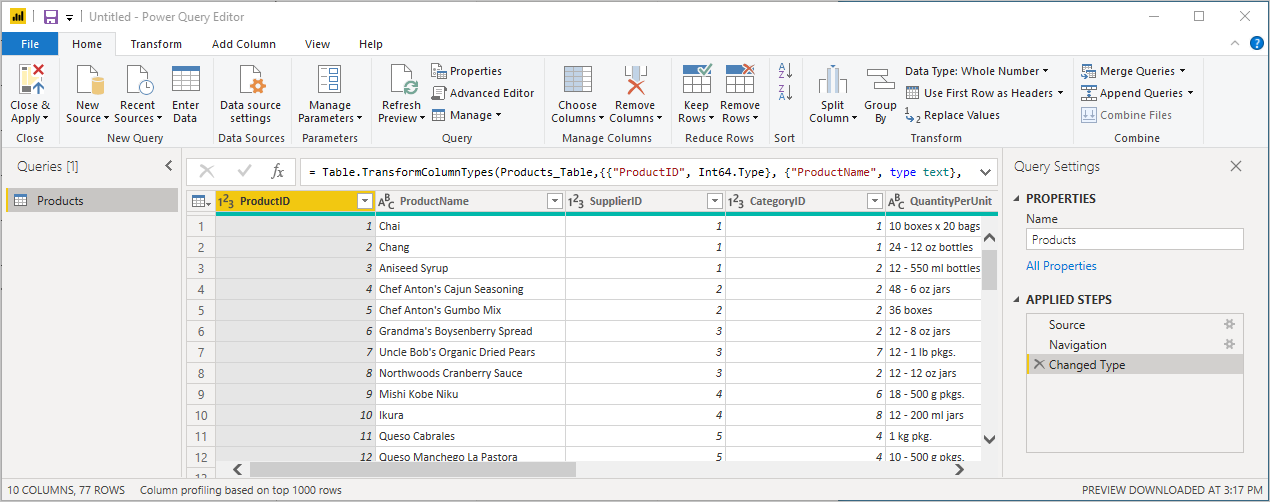
A table preview opens in the Power Query Editor, where you can apply transformations to clean up the data.
Note
You can also open the Power Query Editor by selecting Transform data from the Home ribbon in Power BI Desktop, or by right-clicking or choosing More options next to any query in the Report view, and selecting Transform data.
Clean up the columns
Your combined report uses the Excel workbook's ProductID, ProductName, QuantityPerUnit, and UnitsInStock columns. You can remove the other columns.
In Power Query Editor, select the ProductID, ProductName, QuantityPerUnit, and UnitsInStock columns. You can use Ctrl to select more than one column, or Shift to select columns next to each other.
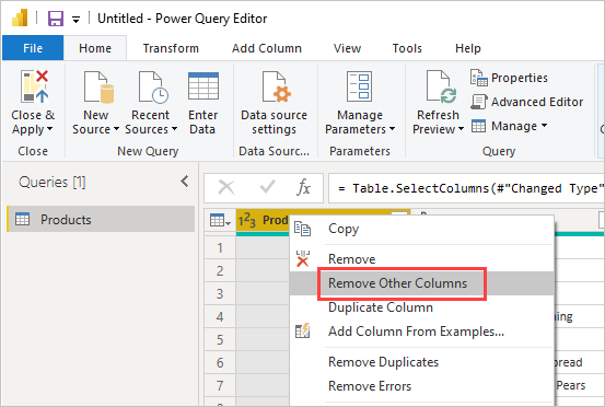
Right-click any of the selected headers. Select Remove Other Columns from the dropdown menu. You can also select Remove Columns > Remove Other Columns from the Manage Columns group in the Home ribbon tab.
Import the OData feed's order data
Next, import the order data from the sample Northwind sales system OData feed.
In Power Query Editor, select New Source and then, from the Most Common menu, select OData feed.
In the OData feed dialog box, paste the Northwind OData feed URL,
https://services.odata.org/V3/Northwind/Northwind.svc/. Select OK.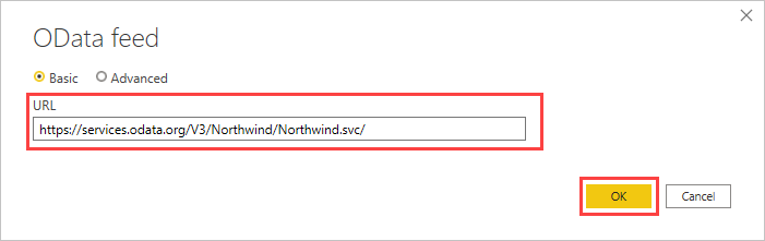
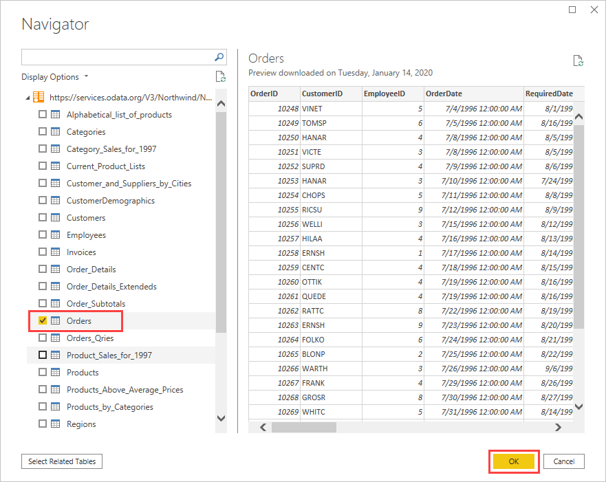
In Navigator, select the Orders table, and then select OK to load the data into Power Query Editor.
Note
In Navigator, you can select any table name, without selecting the checkbox, to see a preview.
Expand the order data
You can use table references to build queries when connecting to data sources with multiple tables, such as relational databases or the Northwind OData feed. The Orders table contains references to several related tables. You can use the expand operation to add the ProductID, UnitPrice, and Quantity columns from the related Order_Details table into the subject (Orders) table.
Scroll to the right in the Orders table until you see the Order_Details column. It contains references to another table and not data.
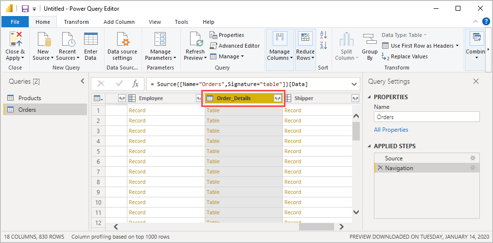
Select the Expand icon (
 ) in the Order_Details column header.
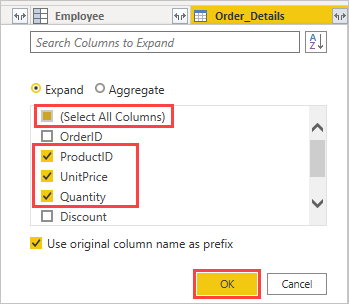
In the dropdown menu:
Select (Select All Columns) to clear all columns.
Select ProductID, UnitPrice, and Quantity, and then select OK.
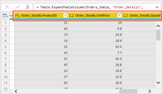
After you expand the Order_Details table, three new nested table columns replace the Order_Details column. There are new rows in the table for each order's added data.
Create a custom calculated column
Power Query Editor lets you create calculations and custom fields to enrich your data. You can create a custom column that multiplies the unit price by item quantity to calculate the total price for each order's line item.
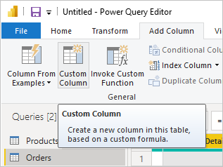
In the Power Query Editor's Add Column ribbon tab, select Custom Column.
In the Custom Column dialog box, type LineTotal in the New column name field.
In the Custom column formula field after the =, enter [Order_Details.UnitPrice] * [Order_Details.Quantity]. You can also select the field names from the Available columns scroll box and select << Insert, instead of typing them.
Select OK.
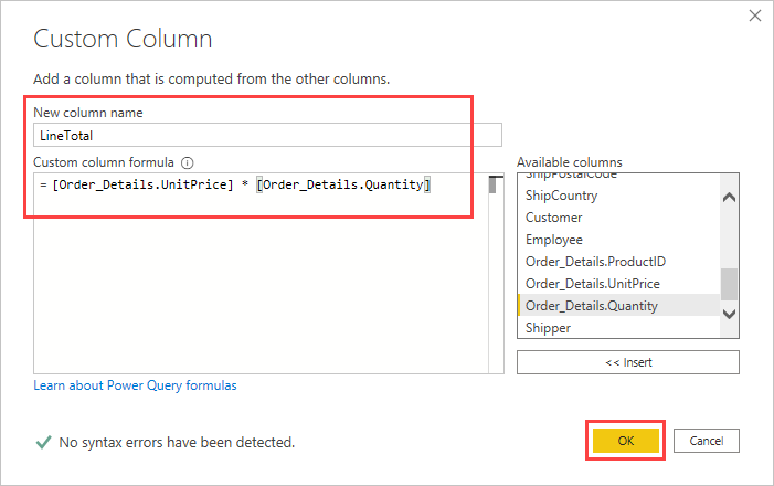
The new LineTotal field appears as the last column in the Orders table.
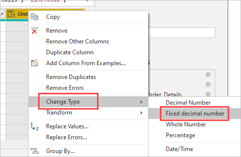
Set the new field's data type
When Power Query Editor connects to data, it makes a best guess as to each field's data type for display purposes. A header icon indicates each field's assigned data type. You can also look under Data Type in the Home ribbon tab's Transform group.
Your new LineTotal column has an Any data type, but it has currency values. To assign a data type, right-click the LineTotal column header, select Change Type from the dropdown menu, and then select Fixed decimal number.
Note
You can also select the LineTotal column, then select the arrow next to Data Type in the Transform area of the Home ribbon tab, and then select Fixed decimal number.
Clean up the orders columns
To make your model easier to work with in reports, you can delete, rename, and reorder some columns.
Your report is going to use the following columns:
- OrderDate
- ShipCity
- ShipCountry
- Order_Details.ProductID
- Order_Details.UnitPrice
- Order_Details.Quantity
- LineTotal
Select these columns and use Remove Other Columns as you did with the Excel data. Or, you can select the non-listed columns, right-click on one of them, and select Remove Columns.
You can rename the columns prefixed with "Order_Details." to make them easier to read:
Double-click or tap and hold each column header, or right-click the column header, and select Rename from the dropdown menu.
Delete the Order_Details. prefix from each name.
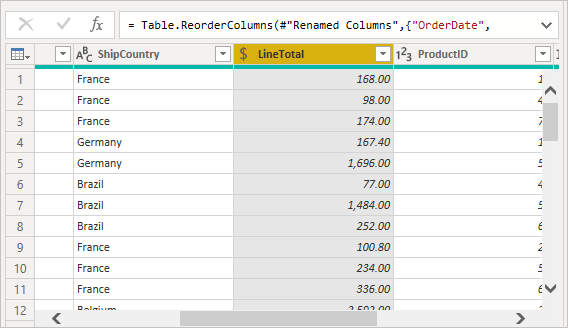
Finally, to make the LineTotal column easier to access, drag and drop it to the left, just to the right of the ShipCountry column.
Review the query steps
Your Power Query Editor actions to shape and transform data are recorded. Each action appears on the right in the Query Settings pane under APPLIED STEPS. You can step back through the APPLIED STEPS to review your steps, and edit, delete, or rearrange them if necessary. However, changing preceding steps is risky as that can break later steps.
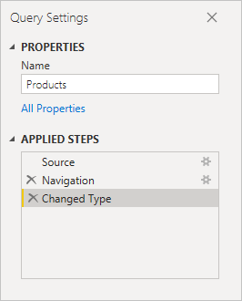
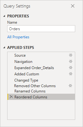
Select each of your queries in the Queries list on the left side of Power Query Editor, and review the APPLIED STEPS in Query Settings. After you apply the previous data transformations, the APPLIED STEPS for your two queries should look like this:
Products query
Orders query
Tip
Underlying the applied steps are formulas written in the Power Query Language, also known as the M language. To see and edit the formulas, select Advanced Editor in the Query group of the Home tab of the ribbon.
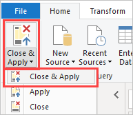
Import the transformed queries
When you're satisfied with your transformed data and ready to import it into Power BI Desktop Report view, select Close & Apply > Close & Apply in the Home ribbon tab's Close group.
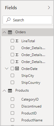
Once the data is loaded, the queries appear in the Fields list in the Power BI Desktop Report view.
Manage the relationship between the semantic models
Power BI Desktop doesn't require you to combine queries to report on them. However, you can use the relationships between semantic models, based on common fields, to extend, and enrich your reports. Power BI Desktop may detect relationships automatically, or you can create them in the Power BI Desktop Manage Relationships dialog box. For more information, see Create and manage relationships in Power BI Desktop.
The shared ProductID field creates a relationship between this tutorial's Orders and Products semantic models.
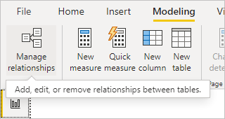
In Power BI Desktop Report view, select Manage relationships in the Modeling ribbon tab's Relationships area.
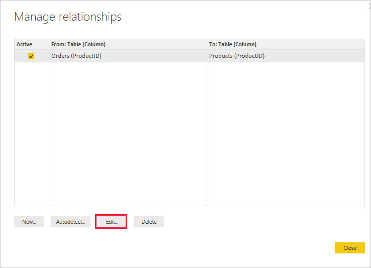
In the Manage relationships dialog box, you can see that Power BI Desktop has already detected and listed an active relationship between the Products and Orders tables. To view the relationship, select Edit.
Edit relationship opens, showing details about the relationship.
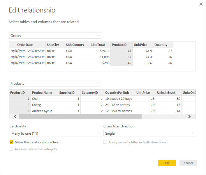
Power BI Desktop has auto-detected the relationship correctly, so you can select Cancel and then Close.
In Power BI Desktop, on the left side, select Model to view and manage query relationships. Double-click the arrow on the line connecting the two queries to open the Edit relationship dialog and view or change the relationship.

To get back to Report view from Model view, select the Report icon.
Create visualizations using your data
You can create different visualizations in Power BI Desktop Review View to gain data insights. Reports can have multiple pages, and each page can have multiple visuals. You and others can interact with your visualizations to help analyze and understand data. For more information, see Interact with a report in Editing view in Power BI service.
You can use both of your data sets, and the relationship between them, to help visualize and analyze your sales data.
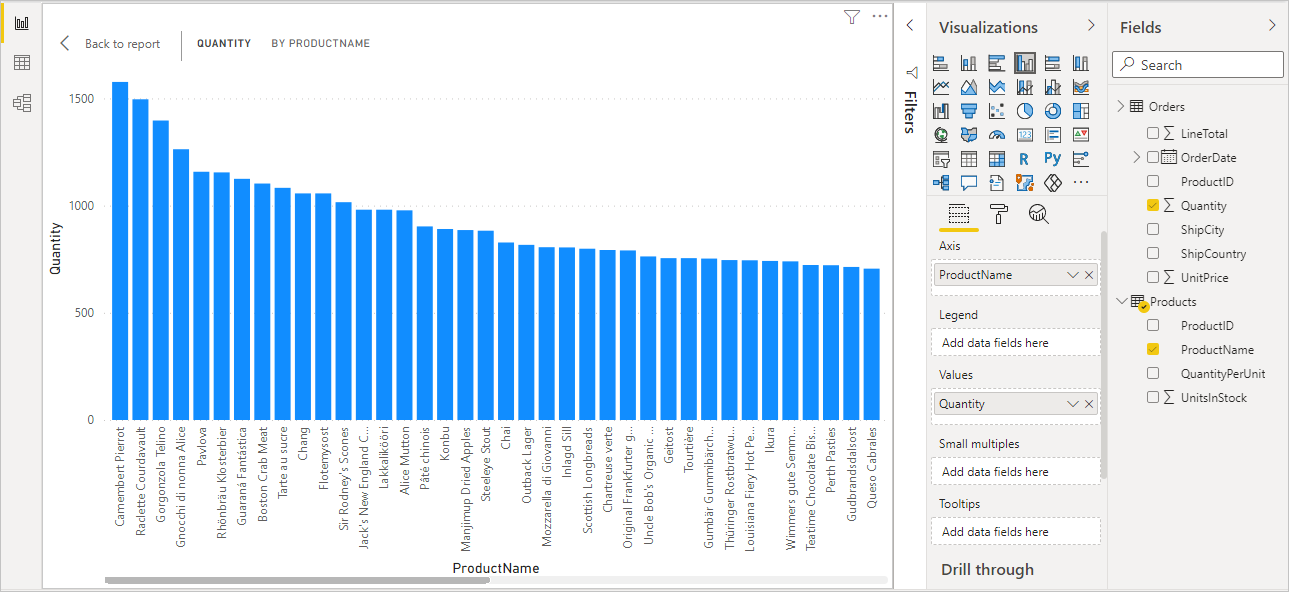
First, create a stacked column chart that uses fields from both queries to show the quantity of each product ordered.
Select the Quantity field from Orders in the Fields pane at the right, or drag it onto a blank space on the canvas. A stacked column chart is created showing the total quantity of all products ordered.
To show the quantity of each product ordered, select ProductName from Products in the Fields pane, or drag it onto the chart.
To sort the products by most to least ordered, select the More options ellipsis (...) at the visualization's upper right, and then select Sort By > Quantity.
Use the handles at the corners of the chart to enlarge it so more product names are visible.
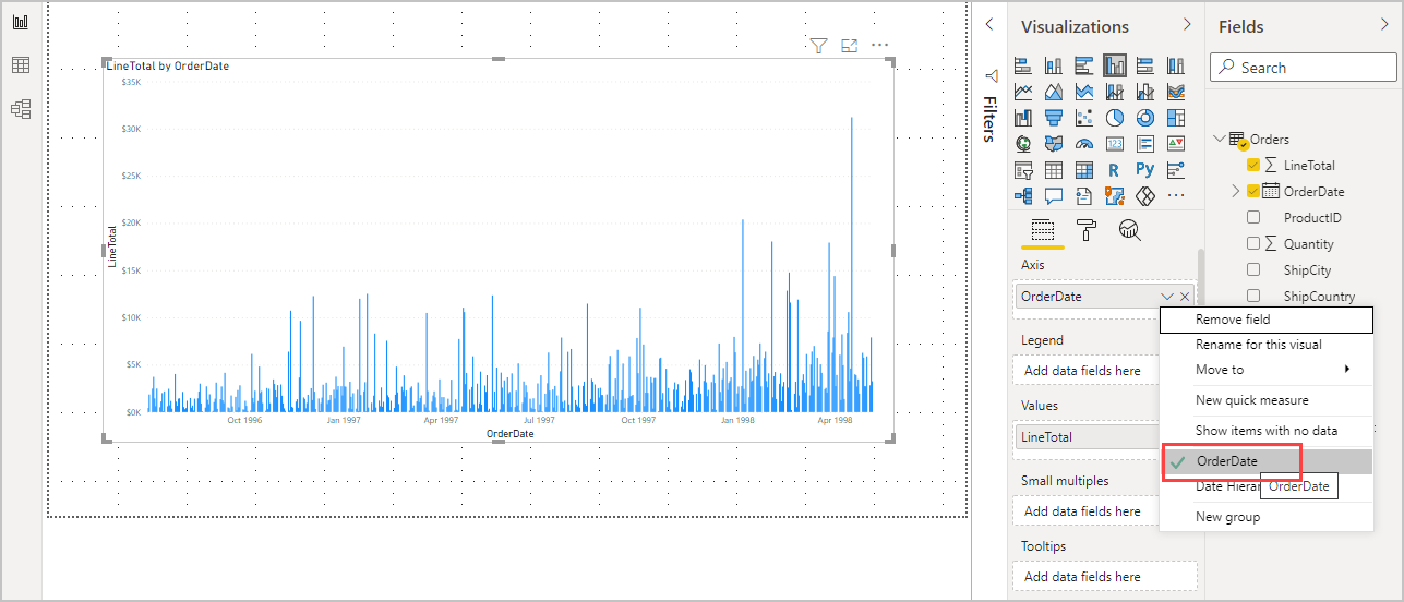
Next, create a chart showing order dollar amounts (LineTotal) over time (OrderDate).
With nothing selected on the canvas, select LineTotal from Orders in the Fields pane, or drag it to a blank space on the canvas. The stacked column chart shows the total dollar amount of all orders.
Select the stacked chart, then select OrderDate from Orders, or drag it onto the chart. The chart now shows line totals for each order date.
Drag the corners to resize the visualization and see more data.
Tip
If you only see Years on the chart and only three data points, select the arrow next to OrderDate in the Axis field of the Visualizations pane, and select OrderDate instead of Date Hierarchy. Alternatively, you might need to select Options and settings > Options from the File menu, and under Data Load, clear the Auto date/time for new files option.
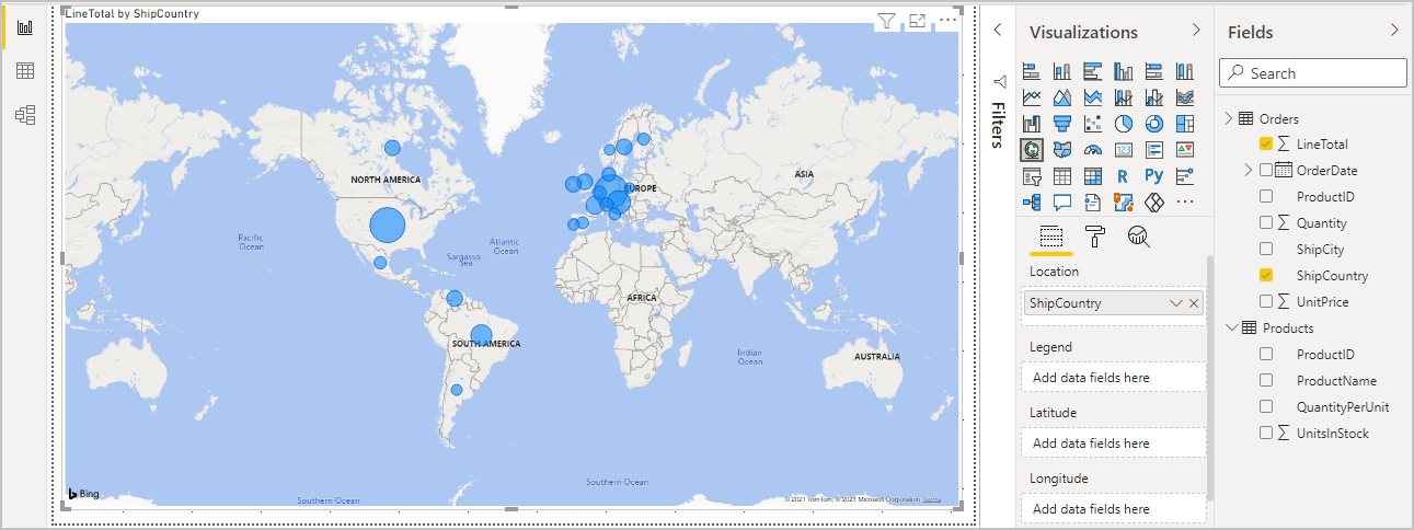
Finally, create a map visualization showing order amounts from each country or region.
With nothing selected on the canvas, select ShipCountry from Orders in the Fields pane, or drag it to a blank space on the canvas. Power BI Desktop detects that the data is country or region names. It then automatically creates a map visualization, with a data point for each country or region with orders.
To make the data point sizes reflect each country's/region's order amounts, drag the LineTotal field onto the map. You can also drag it to Add data fields here under Size in the Visualizations pane. The sizes of the circles on the map now reflect the dollar amounts of the orders from each country or region.
Interact with your report visuals to analyze further
In Power BI Desktop, you can interact with visuals that cross-highlight and filter each other to uncover further trends. For more information, see Filters and highlighting in Power BI reports.
Because of the relationship between your queries, interactions with one visualization affect all the other visualizations on the page.
On the map visualization, select the circle centered in Canada. The other two visualizations filter to highlight the Canadian line totals and order quantities.
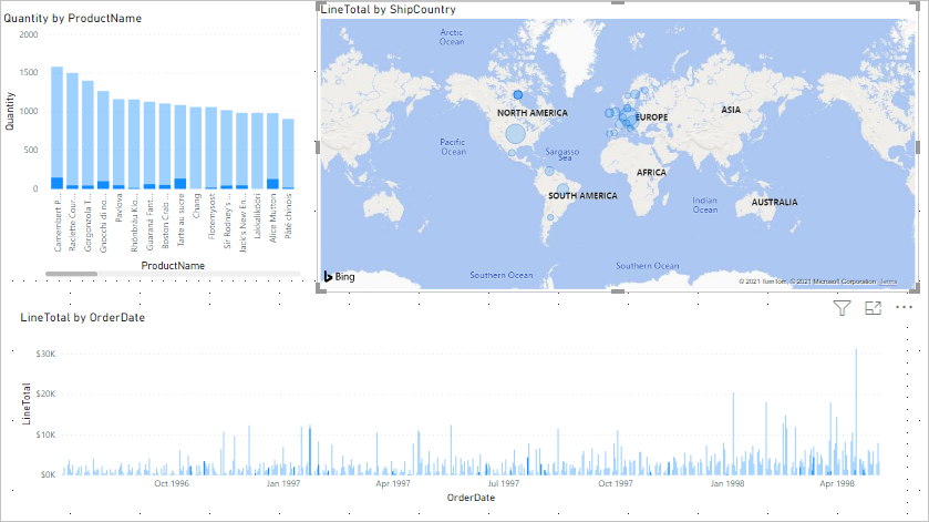
Select a Quantity by ProductName chart product to see the map and the date chart filter to reflect that product's data. Select a LineTotal by OrderDate chart date to see the map and the product chart filter to show that date's data.
Tip
To clear a selection, select it again, or select one of the other visualizations.
Complete the sales analysis report
Your completed report combines data from the Products.xlsx Excel file and the Northwind OData feed in visuals that help you analyze different countries' or regions' order information, time frames, and products. When your report is ready, you can upload it to the Power BI service to share it with other Power BI users.
Related content
Feedback
Coming soon: Throughout 2024 we will be phasing out GitHub Issues as the feedback mechanism for content and replacing it with a new feedback system. For more information see: https://aka.ms/ContentUserFeedback.
Submit and view feedback for