AutoWidthLabel control
A control used to display data.
Note
Full documentation and source code found in the GitHub code components repository.
Description
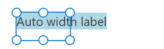
The behavior of this code component is similar to that of the standard canvas app label, but it expands dynamically in width to accommodate the text and return the new width.
Go to Fluent UI Label control for best practices.
Properties
Key properties
| Property | Description |
|---|---|
Text |
The text value of the label. |
Output properties
| Property | Description |
|---|---|
AutoWidth |
Width set by the component to accommodate the text |
Style properties
| Property | Description |
|---|---|
PaddingLeft |
The padding to add inside the label. |
PaddingRight |
The padding to add inside the label. |
PaddingTop |
The padding to add inside the label. |
PaddingBottom |
The padding to add inside the label. |
Not all combinations of style/state are implemented by every component. See more details in the state dependent style properties section of the GitHub documentation.
Limitations
This code component can only be used in canvas apps and custom pages.
See more limitation notes in the design challenges section of the GitHub documentation.
Feedback
Coming soon: Throughout 2024 we will be phasing out GitHub Issues as the feedback mechanism for content and replacing it with a new feedback system. For more information see: https://aka.ms/ContentUserFeedback.
Submit and view feedback for