Elevation control
A control used to construct cards and flyout menus.
Description
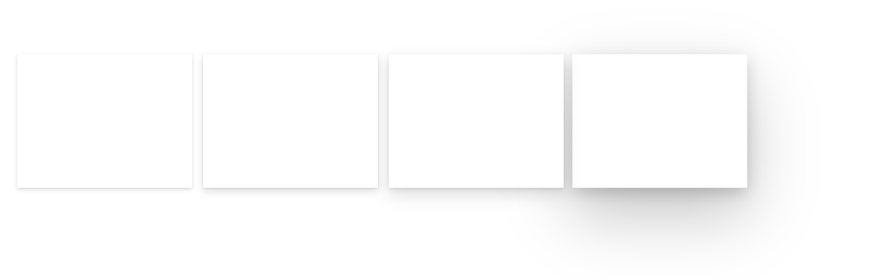
Elevation is used to draw focus to an experience and add a physical materiality to the app. Shallow levels are reserved for items that are closely connected to the canvas or view, such as tiles. Deeper levels create a prominent frame around the surface, drawing strong focus to self-contained experiences like dialogs. Supports mouse hover events.
Go to Fluent UI Elevation style page for best practices.
Properties
Key properties
| Property | Description |
|---|---|
Depth |
The depth of the shadow. |
HoverDepth |
The depth of the shadow that appears on hover. |
Style properties
| Property | Description |
|---|---|
FillColor |
The background color of the Elevation control. |
HoverFillColor |
The background color of the Elevation control that appears on hover. |
PaddingLeft |
Left edge gap between card and control boundary |
PaddingRight |
Right edge gap between card and control boundary |
PaddingTop |
Top edge gap between card and control boundary |
PaddingBottom |
Bottom edge gap between card and control boundary |
DarkOverlay |
When enabled, displays a dark overlay effect in the padded area. |
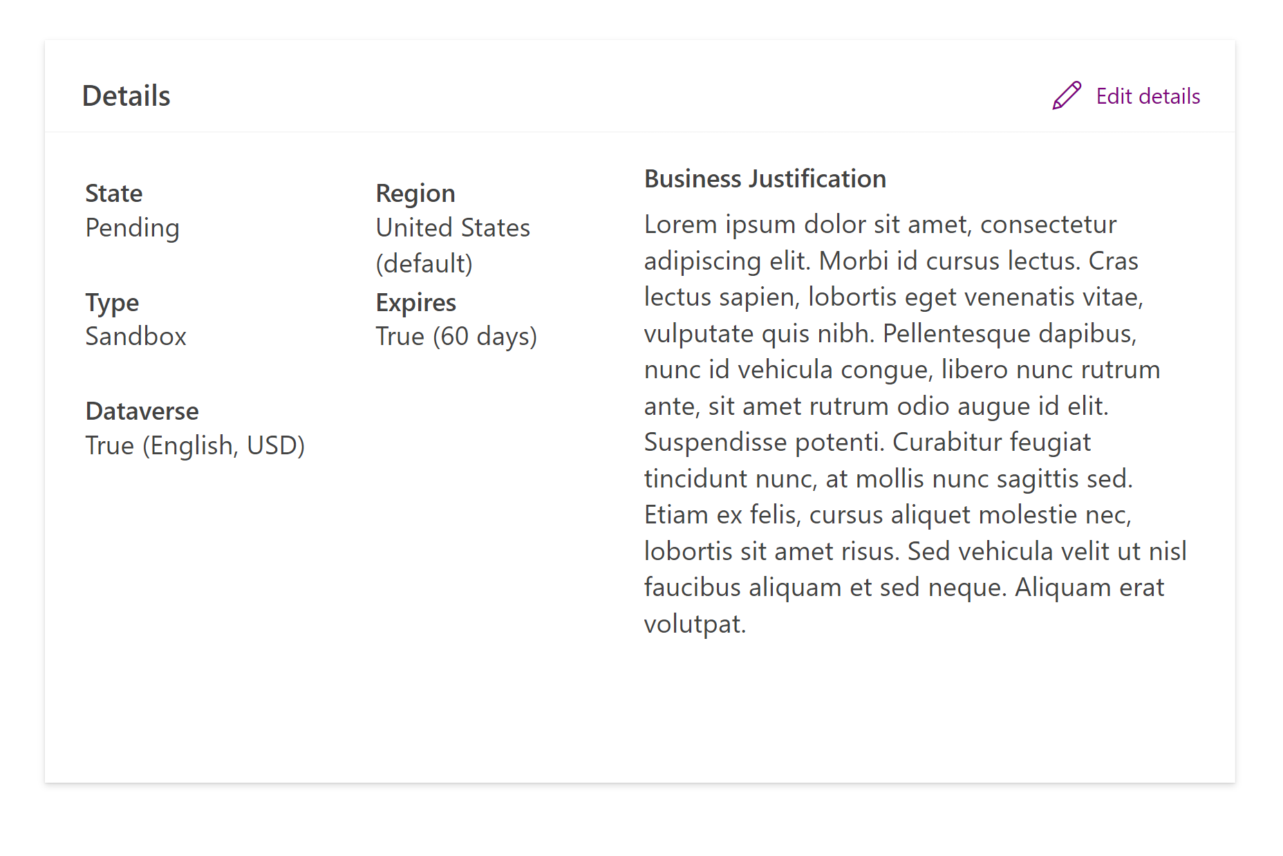
Formatting content over Elevation with layout containers
Add a
Containercontrol to the screen (notHorizontal containerorVertical container).Add an
Elevationcomponent in the containerSet
Elevationproperties to fit it's parentContainer:Property Value X0Y0WidthParent.WidthHeightParent.HeightSet
PaddingRight,PaddingTopandPaddingBottomproperties to referenceSelf.PaddingLeftChoose desired
Depthand adjust the value ofPaddingLeftto provide enough gap for the shadow not to get cut off.Insert a
Vertical containerinto the same parentContainer. This is used to host the content of the card.Set the
Vertical containerproperties to visually align to theElevationcomponent's edges:Property Value XElevation.PaddingLeftYElevation.PaddingLeftWidthParent.Width - Elevation.PaddingLeft * 2HeightParent.Height - Elevation.PaddingLeft * 2Add contents into the
Vertical containerto populate the card.
Limitations
This code component can only be used in canvas apps and custom pages.
Feedback
Coming soon: Throughout 2024 we will be phasing out GitHub Issues as the feedback mechanism for content and replacing it with a new feedback system. For more information see: https://aka.ms/ContentUserFeedback.
Submit and view feedback for