Registered features - definitions and implementations (u – z) (OpenType 1.8)
a - e | f - j | k - o | p - t | u - z
Tag: 'unic'
Friendly name: Unicase
Registered by: Tiro Typeworks / Emigre
Function: This feature maps upper- and lowercase letters to a mixed set of lowercase and small capital forms, resulting in a single case alphabet (for an example of unicase, see the Emigre type family Filosofia). The letters substituted may vary from font to font, as appropriate to the design. If aligning to the x-height, smallcap glyphs may be substituted, or specially designed unicase forms might be used. Substitutions might also include specially designed figures.
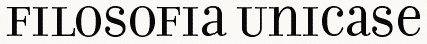
Example: The user enters text as uppercase, lowercase or mixed case, and gets unicase text.
Recommended implementation: The unic table maps some uppercase and lowercase glyphs to corresponding unicase forms (GSUB lookup type 1).
Application interface: For GIDs found in the unic coverage table, the application passes GIDs to the unic table, and gets back new GIDs.
UI suggestion: This feature should be off by default.
Script/language sensitivity: Applies only to scripts with both upper- and lowercase forms (e.g. Latin, Cyrillic, Greek).
Feature interaction: This feature may be used in combination with other substitution (GSUB) features, whose results it may override.
Tag: 'valt'
Friendly name: Alternate Vertical Metrics
Registered by: Adobe (Modified by Adobe, this is the newer description)
Function: Repositions glyphs to visually center them within full-height metrics, for use in vertical setting. Typically applies to full-width Latin glyphs, which are aligned on a common horizontal baseline and not rotated when set vertically in CJKV fonts.
Example: Applying this feature would shift a Roman h down, or y up, from their default full-width positions.
Recommended implementation: The font specifies alternate metrics for the original glyphs (GPOS lookup type 1).
Application interface: For GIDs found in the valt coverage table, the application passes the GIDs to the table and gets back positional adjustments (YPlacement).
UI suggestion: This feature should be active by default in vertical-setting contexts.
Script/language sensitivity: Applies only to scripts with vertical writing modes.
Feature interaction: This feature is mutually exclusive with all other glyph-height features (e.g. vhal and vpal), which should be turned off when it’s applied. It deactivates the kern feature.
Tag: “vatu”
Friendly name: Vattu Variants
Registered by: Microsoft
Function: : In an Indic consonant conjunct, substitutes a ligature glyph for a base consonant and a following vattu (below-base) form of a conjoining consonant, or for a half form of a consonant and a following vattu form.
Example: In the Devanagari (Indic) script, the consonant Ra takes a vattu form, when it is not the syllable initial consonant in a conjunct. This vattu form ligates with the base consonant as well as half forms of consonants.
Recommended implementation: The vatu table maps consonant and vattu form combinations to their respective ligatures (GSUB lookup type 4).
Lookups associated with the Vattu Variants feature apply to glyphs derived using the Below-base Forms feature and (for half-form plus vattu ligatures) the Half Forms features. The Below-base Forms feature should be used to derive the nominal vattu form of a consonant; the Vattu Variants feature should only be used to substitute the nominal vattu form and a base consonant or half form with a ligature glyph. If the Rakar Forms feature is used, the Vattu Variants feature is not required.
Application interface: For substitutions defined in the vatu table, the application passes the sequence of GIDs to the table, and gets back the GID for the vattu variant ligature.
UI suggestion: In recommended usage, this feature triggers substitutions that are required for correct display of the given script. It should be applied in the appropriate contexts, as determined by script-specific processing. Control of the feature should not generally be exposed to the user.
Script/language sensitivity: Used for Indic scripts. eg: Devanagari.
Feature interaction: This feature may be used in conjunction with certain other features to derive required forms of Indic scripts. For Indic script implementations that use the Vattu Variants feature, the application is expected to process this feature and certain other features in an appropriate order to obtain the correct set of basic forms: nukt, akhn, rphf, rkrf, pref, blwf, half, pstf, cjct. Other discretionary features for optional typographic effects may also be applied. Lookups for such discretionary features should be processed after lookups for this feature have been processed.
Tag: 'vert'
Friendly name: Vertical Alternates
Registered by: Microsoft/Adobe
Function: Transforms default glyphs into glyphs that are appropriate for upright presentation in vertical writing mode.While the glyphs for most characters in East Asian writing systems remain upright when set in vertical writing mode, some must be transformed — usually by rotation, shifting, or different component ordering — for vertical writing mode.
Example: In vertical writing mode, the opening parenthesis (U+FF08) is replaced by the rotated form (U+FE35).
In vertical writing mode, the glyph for HIRAGANA LETTER SMALL A (U+3041 “ぁ”) is transformed into a glyph that is shifted up and to the right, which is properly positioned for upright presentation in vertical writing mode.
In vertical writing mode, the glyph for SQUARE MAIKURO (U+3343 “㍃”), whose component katakana characters are ordered from left to right then top to bottom (like horizontal writing mode), is transformed into a glyph whose component katakana characters are ordered from top to bottom then right to left (like vertical writing mode line progression).
Recommended implementation: The font includes versions of the glyphs covered by this feature that differ in some visual way from the default glyphs, such as by rotation, shifting, or different component ordering. The 'vert' feature maps the default glyphs to the corresponding, alternate glyphs for vertical writing mode using a type 1 (single substitution) GSUB lookup.
Application interface: For GIDs found in the 'vert' coverage table, the application passes GIDs to the lookup tables associated with the feature, then gets back new GIDs.
UI suggestion: This feature should be active by default in vertical writing mode.
Script/language sensitivity: Applies only to scripts with vertical writing capability.
Feature interaction: The 'vert' and 'vrtr' features are intended to be used in conjunction: 'vert' for glyphs to be presented upright in vertical writing, and 'vrtr' for glyphs intended to be presented sideways. Since they must never be activated simultaneously for a given glyph, there should be no interaction between the two features. These features are intended for layout engines that graphically rotate glyphs for sideways runs in vertical writing mode, such as those conforming to Unicode Technical Report #50: Unicode Vertical Text Layout.
Note that layout engines that instead depend on the font to supply pre-rotated glyphs for all sideways glyphs should use the 'vrt2' feature in lieu of 'vert' and 'vrtr'. Because 'vrt2' supplies pre-rotated glyphs, the 'vert' feature should never be used with 'vrt2', but it may be used in addition to any other feature.
Tag: 'vhal'
Friendly name: Alternate Vertical Half Metrics
Registered by: Adobe
Function: Respaces glyphs designed to be set on full-em heights, fitting them onto half-em heights.
Example: The user may invoke this feature in a CJKV font to get better fit for punctuation or symbol glyphs without disrupting the monospaced alignment.
Recommended implementation: The font specifies alternate metrics for the full-height glyphs (GPOS lookup type 1).
Application interface: For GIDs found in the vhal coverage table, the application passes the GIDs to the table and gets back positional adjustments (XPlacement, XAdvance, YPlacement and YAdvance).
UI suggestion: In general, this feature should be off by default. Different behavior should be used, however, in applications that conform to Requirements for Japanese Text Layout (JLREQ) or similar CJK text-layout specifications that expect half-width forms of characters whose default glyphs are full-width. Such implementations should turn this feature on by default, or should selectively apply this feature to particular characters that require special treatment for CJK text-layout purposes, such as brackets, punctuation, and quotation marks.
Script/language sensitivity: Used only in CJKV fonts.
Feature interaction: This feature is mutually exclusive with all other glyph-height features (e.g., 'valt' and 'vpal'), which should be turned off when this feature is applied. It deactivates the 'kern' feature. See also 'halt'.
Tag: “vjmo”
Friendly name: Vowel Jamo Forms
Registered by: Microsoft
Function: Substitutes the vowel jamo form of a cluster.
Example: In Hangul script, the jamo cluster is composed of three parts (leading consonant, vowel, and trailing consonant). When a sequence of vowel class jamos are found, their combined vowel jamo form is substituted.
Recommended implementation: The vjmo table maps the sequence required to convert a series of jamos into its vowel jamo form (GSUB lookup type 4).
Application interface: For substitutions defined in the vjmo table, the application passes the sequence of GIDs to the feature, and gets back the GID for the vowel jamo form.
UI suggestion: This feature should be on by default.
Script/language sensitivity: Required for Hangul script when Ancient Hangul writing system is supported.
Feature interaction: This feature overrides the results of all other features.
Tag: 'vkna'
Friendly name: Vertical Kana Alternates
Registered by: Adobe
Function: Replaces standard kana with forms that have been specially designed for only vertical writing. This is a typographic optimization for improved fit and more even color. Also see hkna.
Example: Standard full-width kana (hiragana and katakana) are replaced by forms that are designed for vertical use.
Recommended implementation: The font includes a set of specially-designed glyphs, listed in the vkna coverage table. The vkna feature maps the standard full-width forms to the corresponding special vertical forms (GSUB lookup type 1).
Application interface: For GIDs found in the vkna coverage table, the application passes GIDs to the feature, and gets back new GIDs.
UI suggestion: This feature would be off by default.
Script/language sensitivity: Applies only to fonts that support kana (hiragana and katakana).
Feature interaction: Since this feature is only for vertical use, features applying to horizontal behaviors (e.g. kern) do not apply.
Tag: 'vkrn'
Friendly name: Vertical Kerning
Registered by: Adobe
Function: Adjusts amount of space between glyphs, generally to provide optically consistent spacing between glyphs. Although a well-designed typeface has consistent inter-glyph spacing overall, some glyph combinations require adjustment for improved legibility. Besides standard adjustment in the vertical direction, this feature can supply size-dependent kerning data via device tables, “cross-stream” kerning in the X text direction, and adjustment of glyph placement independent of the advance adjustment. Note that this feature may apply to runs of more than two glyphs, and would not be used in monospaced fonts. Also note that this feature applies only to text set vertically.
Example: When the katakana character U+30B9 or U+30D8 is followed by U+30C8 in a vertical setting, U+30C8 is shifted up to fit more evenly.
Recommended implementation: The font stores a set of adjustments for pairs of glyphs (GPOS lookup type 2 or 8). These may be stored as one or more tables matching left and right classes, &/or as individual pairs. Additional adjustments may be provided for larger sets of glyphs (e.g. triplets, quadruplets, etc.) to overwrite the results of pair kerns in particular combinations.
Application interface: The application passes a sequence of GIDs to the kern table, and gets back adjusted positions (XPlacement, XAdvance, YPlacement and YAdvance) for those GIDs. When using the type 2 lookup on a run of glyphs, it’s critical to remember to not consume the last glyph, but to keep it available as the first glyph in a subsequent run (this is a departure from normal lookup behavior).
UI suggestion: This feature should be active by default for vertical text setting. Applications may wish to allow users to add further manually-specified adjustments to suit specific needs and tastes.
Script/language sensitivity: None
Feature interaction: If vkrn is activated, vpal must also be activated if it exists. If vpal is activated, there is no requirement that vkrn must also be activated. May be used in addition to any other feature except those which result in fixed (uniform) advance heights.
Tag: 'vpal'
Friendly name: Proportional Alternate Vertical Metrics
Registered by: Adobe
Function: Respaces glyphs designed to be set on full-em heights, fitting them onto individual (more or less proportional) vertical heights. This differs from valt in that it does not substitute new glyphs (GPOS, not GSUB feature). The user may prefer the monospaced form, or may simply want to ensure that the glyph is well-fit.
Example: The user may invoke this feature in a Japanese font to get Latin, Kanji, Kana or Symbol glyphs with the full-height design but individual metrics.
Recommended implementation: The font specifies alternate heights for the full-height glyphs (GPOS lookup type 1).
Application interface: For GIDs found in the vpal coverage table, the application passes the GIDs to the table and gets back positional adjustments (XPlacement, XAdvance, YPlacement and YAdvance).
UI suggestion: This feature would be off by default.
Script/language sensitivity: Used mostly in CJKV fonts.
Feature interaction: This feature is mutually exclusive with all other glyph-height features (e.g. valt and vhal), which should be turned off when it’s applied. If vpal is activated, there is no requirement that vkrn must also be activated. If vkrn is activated, vpal must also be activated if it exists. See also palt.
Tag: 'vrt2'
Friendly name: Vertical Alternates and Rotation
Registered by: Adobe
Function: Replaces some fixed-width (half-, third- or quarter-width) or proportional-width glyphs (mostly Latin or katakana) with forms suitable for vertical writing (that is, rotated 90 degrees clockwise). Note that these are a superset of the glyphs covered in the vert table.
ATM/NT 4.1 and the Windows 2000 OTF driver impose the following requirements for an OpenType font with CFF outlines to be used for vertical writing: the vrt2 feature must be present in the GSUB table, it must comprises a single lookup of LookupType 1 and LookupFlag 0, and the lookup must have a single subtable. The predecessor feature, vert, is ignored.
A rotated glyph must be designed such that its top side bearing and vertical advance as recorded in the Vertical Metrics ('vmtx') table are identical to the left side bearing and horizontal advance, respectively, of the corresponding upright glyph as recorded in the Horizontal Metrics ('hmtx') table. (The horizontal advance of the rotated glyph may be set to any value, since the glyph is intended only for vertical writing use. The vendor may however set it to head.unitsPerEm, to prevent overlap during font proofing tests, for example.)
Thus, proportional-width glyphs with rotated forms in the vrt2 feature will appear identically spaced in both vertical and horizontal writing. In order for kerning to produce identical results as well, developers must ensure that the Vertical Kerning (vkrn) feature record kern values between the rotated glyphs that are the same as kern values between their corresponding upright glyphs in the Kerning (kern) feature.
Example: Proportional- or half-width Latin and half-width katakana characters are rotated 90 degrees clockwise for vertical writing.
Recommended implementation: The font includes rotated versions of the glyphs covered by this feature. The vrt2 table maps the standard (horizontal) forms to the corresponding vertical (rotated) forms (GSUB lookup type 1). This feature should be the last substitution in the font, and take input from other features.
Application interface: For GIDs found in the vrt2 coverage table, the application passes GIDs to the feature, and gets back new GIDs.
UI suggestion: This feature should be active by default when vertical writing mode is on, although the user must be able to override it.
Script/language sensitivity: Applies only to scripts with vertical writing capability.
Feature interaction: Overrides the vert (Vertical Writing) feature, which is a subset of this one. May be used in addition to any other feature.
Tag: 'vrtr'
Friendly name: Vertical Alternates for Rotation
Registered by: Adobe/Microsoft/W3C
Function: Transforms default glyphs into glyphs that are appropriate for sideways presentation in vertical writing mode. While the glyphs for most characters in East Asian writing systems remain upright when set in vertical writing mode, glyphs for other characters — such as those of other scripts or for particular Western-style punctuation — are expected to be presented sideways in vertical writing.
Example: As a first example, the glyphs for FULLWIDTH LESS-THAN SIGN (U+FF1C “<”) and FULLWIDTH GREATER-THAN SIGN (U+FF1E “>”) in a font with a non-square em-box are transformed into glyphs whose aspect ratio differs from the default glyphs, which are properly sized for sideways presentation in vertical writing mode. As a second example, the glyph for LEFT SQUARE BRACKET (U+005B, “[”) in a brush-script font that exhibits slightly rising horizontal strokes may use an obtuse angle for its upper-left corner when in horizontal writing mode, but an alternate glyph with an acute angle for that corner is supplied for vertical writing mode.
Recommended implementation: The font includes versions of the glyphs covered by this feature that, when rotated 90 degrees clockwise by the layout engine for sideways presentation in vertical writing, differ in some visual way from rotated versions of the default glyphs, such as by shifting or shape. The 'vrtr' feature maps the default glyphs to the corresponding to-be-rotated glyphs (GSUB lookup type 1).
Application interface: For GIDs found in the 'vrtr' coverage table, the application passes GIDs to the lookup tables associated with the feature, then gets back new GIDs.
UI suggestion: This feature should always be active by default for sideways runs in vertical writing mode.
Script/language sensitivity: Applies to any script when set in vertical writing mode.
Feature interaction: The 'vrtr' and 'vert' features are intended to be used in conjunction: 'vrtr' for glyphs intended to be presented sideways in vertical writing, and 'vert' for glyphs to be presented upright. Since they must never be activated simultaneously for a given glyph, there should be no interaction between the two features. These features are intended for layout engines that graphically rotate glyphs for sideways runs in vertical writing mode, such as those conforming to Unicode Technical Report #50: Unicode Vertical Text Layout.
Note that layout engines that instead depend on the font to supply pre-rotated glyphs for all sideways glyphs should use the 'vrt2' feature in lieu of 'vrtr' and 'vert'. Because 'vrt2' supplies pre-rotated glyphs, the 'vrtr' feature should never be used with 'vrt2', but it may be used in addition to any other feature.
Tag: 'zero'
Friendly name: Slashed Zero
Registered by: Adobe
Function: Some fonts contain both a default form of zero, and an alternative form which uses a diagonal slash through the counter. Especially in condensed designs, it can be difficult to distinguish between 0 and O (zero and capital O) in any situation where capitals and lining figures may be arbitrarily mixed. This feature allows the user to change from the default 0 to a slashed form.
Example: When setting labels, the user applies this feature to get the slashed 0.
Recommended implementation: The zero table maps the GIDs for the lining forms of zero to corresponding slashed forms (GSUB lookup type 1).
Application interface: For GIDs in the zero coverage table, the application passes a GID to the zero table and gets back a new GID.
UI suggestion: Optimally, the application would store this as a preference setting, and the user could use the feature to toggle back and forth between the two forms. Most applications will want the default setting to disable this feature.
Script/language sensitivity: Does not apply to scripts which use forms other than 0 for zero.
Feature interaction: Applies only to lining figures, so is inactivated by oldstyle figure features (e.g. onum).
Обратная связь
Ожидается в ближайшее время: в течение 2024 года мы постепенно откажемся от GitHub Issues как механизма обратной связи для контента и заменим его новой системой обратной связи. Дополнительные сведения см. в разделе https://aka.ms/ContentUserFeedback.
Отправить и просмотреть отзыв по