Windows UI Library 2.5
WinUI 2.5 is the December 2020 release of the Windows UI Library (WinUI).
The Windows UI Library (WinUI) is hosted on GitHub where we encourage you to file bug reports, feature requests and community code contributions.
WinUI Releases: GitHub release page
WinUI packages can be added to Visual Studio projects through the NuGet package manager. For more information, see Getting Started with the Windows UI Library.
NuGet package download: Microsoft.UI.Xaml
New Features
InfoBar
The InfoBar control is used to display app-wide status messages that are highly visible to users, yet are also non-intrusive. The control includes a Severity property to indicate the type of message shown, and an option to specify your own call to action or hyperlink button. As the InfoBar is inline with other UI content, you can also specify whether the control is always visible or if it can be dismissed by the user.
This example shows an InfoBar in the default state with a close button and message.

This animated example shows an InfoBar with various severity states and custom messages.

Determinate ProgressRing
The determinate state for ProgressRing shows the percentage completed of a task. This should be used during an operation where the duration is known and where the operation's progress should not block user interaction with the app.
The following animated image demonstrates a determinate ProgressRing control.

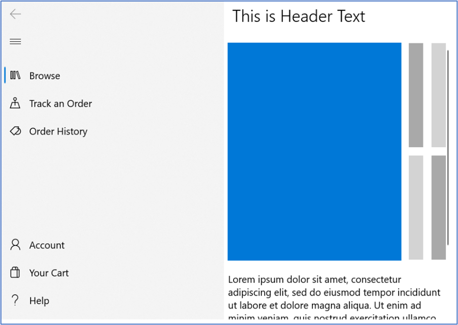
NavigationView FooterMenuItems
Use the FooterMenuItems property of the NavigationView control to place navigation items at the end of the navigation pane (compared to the MenuItems property, which places items at the beginning of the pane).
The following image shows a NavigationView with Account, Your Cart, and Help navigation items in the footer menu.
Samples
Tip
For more info, design guidance, and code examples, see Design and code Windows apps.
The WinUI 3 Gallery and WinUI 2 Gallery apps include interactive examples of most WinUI 3 and WinUI 2 controls, features, and functionality.
If installed already, open them by clicking the following links: WinUI 3 Gallery or WinUI 2 Gallery.
If they are not installed, you can download the WinUI 3 Gallery and the WinUI 2 Gallery from the Microsoft Store.
You can also get the source code for both from GitHub (use the main branch for WinUI 3 and the winui2 branch for WinUI 2).
Other updates
See our Notable Changes list for many of the GitHub issues addressed in this release.

Windows developer
Feedback
Coming soon: Throughout 2024 we will be phasing out GitHub Issues as the feedback mechanism for content and replacing it with a new feedback system. For more information see: https://aka.ms/ContentUserFeedback.
Submit and view feedback for