RadialProgressBar
Warning
This control has been deprecated in the Windows Community Toolkit. Please use the ProgressRing control from WinUI instead with IsIndeterminate set to false.
The Radial Progress Bar control displays a value in a certain range using a cicular sector that grows clockwise until it becomes a full ring.
The control uses the same dependency properties as the standard Progress Bar, with the addition of:
- A Thickness parameter, which sets the thickness of the circular sector and the outline it's drawn on
- An Outline property, which sets the brush of the circular outline
Syntax
<Page ...
     xmlns:controls="using:Microsoft.Toolkit.Uwp.UI.Controls"/>

<controls:RadialProgressBar x:Name="RadialProgressBarControl"
    Value="70" Minimum="0" Maximum="180"
    Thickness="4" Outline="Gray" Foreground="Red">
</controls:RadialProgressBar>
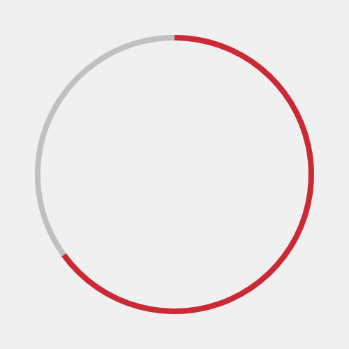
Sample Output
Properties
| Property | Type | Description |
|---|---|---|
| Outline | Brush | Gets or sets the color of the circular ouline on which the segment is drawn |
| Thickness | double | Gets or sets the thickness of the circular ouline and segment |
Sample Project
RadialProgressBar Sample Page Source. You can see this in action in the Windows Community Toolkit Sample App.
Default Template
RadialProgressBar XAML File is the XAML template used in the toolkit for the default styling.
Requirements
| Device family | Universal, 10.0.16299.0 or higher |
|---|---|
| Namespace | Microsoft.Toolkit.Uwp.UI.Controls |
| NuGet package | Microsoft.Toolkit.Uwp.UI.Controls |
API
Feedback
Coming soon: Throughout 2024 we will be phasing out GitHub Issues as the feedback mechanism for content and replacing it with a new feedback system. For more information see: https://aka.ms/ContentUserFeedback.
Submit and view feedback for