TabbedCommandBar XAML Control
The TabbedCommandBar displays a set of TabbedCommandBarItem in a shared container found in many productivity type apps. It is based off of NavigationView.
Remarks
The TabbedCommandBar automatically applies styles to known common controls inside an AppBarElementContainer. The following elements have styles:
- ComboBox
- SplitButton
Note
The ComboBox does not allow changing its selection while it is in the overflow flyout.
Syntax
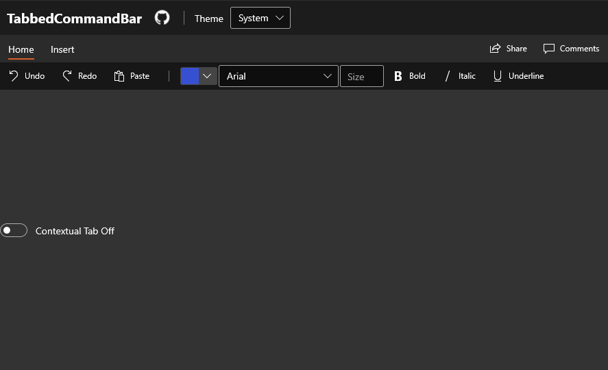
<controls:TabbedCommandBar>
<controls:TabbedCommandBar.PaneFooter>
<CommandBar Background="Transparent" DefaultLabelPosition="Right">
<AppBarButton Label="Share" Icon="Share"/>
<AppBarButton Label="Comments" Icon="Message"/>
</CommandBar>
</controls:TabbedCommandBar.PaneFooter>
<controls:TabbedCommandBar.MenuItems>
<controls:TabbedCommandBarItem Header="Home">
<AppBarButton Icon="Undo" Label="Undo"/>
<AppBarButton Icon="Redo" Label="Redo"/>
<AppBarButton Icon="Paste" Label="Paste"/>
<AppBarSeparator />
<AppBarElementContainer>
<SplitButton>
<FontIcon FontFamily="{ThemeResource SymbolThemeFontFamily}" Glyph="" />
<SplitButton.Flyout>
<Flyout>
<controls:ColorPicker Margin="-10" Color="{ThemeResource Brand-Color}"/>
</Flyout>
</SplitButton.Flyout>
</SplitButton>
</AppBarElementContainer>
<AppBarElementContainer>
<ComboBox SelectedIndex="0" MinWidth="175">
<ComboBoxItem Content="Arial" />
<ComboBoxItem Content="Calibri" />
<ComboBoxItem Content="JetBrains Mono" />
<ComboBoxItem Content="Roboto" />
<ComboBoxItem Content="Sergio UI" />
<ComboBoxItem Content="Sergio UI Semibold" />
</ComboBox>
</AppBarElementContainer>
<AppBarElementContainer>
<TextBox PlaceholderText="Size"/>
</AppBarElementContainer>
<AppBarToggleButton Icon="Bold" Label="Bold" />
<AppBarToggleButton Icon="Italic" Label="Italic" />
<AppBarToggleButton Icon="Underline" Label="Underline" />
</controls:TabbedCommandBarItem>
<controls:TabbedCommandBarItem Header="Insert">
<AppBarButton Icon="Pictures" Label="Pictures">
<AppBarButton.Flyout>
<MenuFlyout Placement="BottomEdgeAlignedLeft">
<MenuFlyoutItem Text="This Device">
<MenuFlyoutItem.Icon>
<FontIcon FontFamily="Segoe MDL2 Assets" Glyph="" />
</MenuFlyoutItem.Icon>
</MenuFlyoutItem>
<MenuFlyoutItem Text="Stock Images">
<MenuFlyoutItem.Icon>
<FontIcon FontFamily="Segoe MDL2 Assets" Glyph="" />
</MenuFlyoutItem.Icon>
</MenuFlyoutItem>
<MenuFlyoutItem Icon="Globe" Text="Online Pictures" />
</MenuFlyout>
</AppBarButton.Flyout>
</AppBarButton>
<AppBarButton Label="Shapes">
<AppBarButton.Icon>
<FontIcon FontFamily="Segoe UI Symbol" Glyph="□" />
</AppBarButton.Icon>
</AppBarButton>
<AppBarButton Label="Icons">
<AppBarButton.Icon>
<FontIcon FontFamily="Segoe MDL2 Assets" Glyph="" />
</AppBarButton.Icon>
</AppBarButton>
<AppBarButton Label="3D Models">
<AppBarButton.Icon>
<FontIcon FontFamily="Segoe MDL2 Assets" Glyph="" />
</AppBarButton.Icon>
</AppBarButton>
<AppBarSeparator/>
<AppBarButton Label="Add-ins">
<AppBarButton.Icon>
<FontIcon FontFamily="Segoe MDL2 Assets" Glyph="" />
</AppBarButton.Icon>
</AppBarButton>
<controls:TabbedCommandBarItem.SecondaryCommands>
<AppBarButton Icon="Add" Label="New item" />
</controls:TabbedCommandBarItem.SecondaryCommands>
</controls:TabbedCommandBarItem>
<controls:TabbedCommandBarItem Header="Shape Format" IsContextual="True" Visibility="{Binding ElementName=ContextualToggle, Path=IsOn}">
<AppBarButton Label="Shape Fill">
<AppBarButton.Icon>
<FontIcon FontFamily="{ThemeResource SymbolThemeFontFamily}" Glyph="" />
</AppBarButton.Icon>
</AppBarButton>
<AppBarButton Label="Shape Outline">
<AppBarButton.Icon>
<FontIcon FontFamily="{ThemeResource SymbolThemeFontFamily}" Glyph="" />
</AppBarButton.Icon>
</AppBarButton>
</controls:TabbedCommandBarItem>
</controls:TabbedCommandBar.MenuItems>
</controls:TabbedCommandBar>
Sample Output
Properties
TabbedCommandBar Properties
The TabbedCommandBar does not add any of its own properties. See NavigationView for a list of accessible properties.
TabbedCommandBarItem Properties
| Property | Type | Description |
|---|---|---|
| Header | object | Header Content of the Tab. |
| IsContextual | bool | Set to true for the TabbedCommandBarItem to be styled as a contextual Tab. |
| OverflowButtonAlignment | HorizontalAlignment | Indicates the alignment of the command overflow button. |
| CommandAlignment | HorizontalAlignment | Indicates the alignment of this Tab's commands. |
Events
TabbedCommandBar Events
| Events | Description |
|---|---|
| SelectionChanged | Fires when a different Tab is selected. |
Examples
The following setup demos contextual tabs, and binding to their visibility:
<controls:TabbedCommandBar>
  <controls:TabbedCommandBar.MenuItems>
    <controls:TabbedCommandBarItem Header="Home">
      <AppBarButton Icon="Undo" Label="Undo"/>
      <AppBarButton Icon="Redo" Label="Redo"/>
      <AppBarButton Icon="Paste" Label="Paste"/>
    </controls:TabbedCommandBarItem>
    <controls:TabbedCommandBarItem x:Name="PictureFormat" Header="Picture Format"
                                   IsContextual="True" Visibility="Collapsed">
      <AppBarButton Label="Left" Icon="DockLeft"/>
      <AppBarButton Label="Right" Icon="DockRight"/>
      <AppBarButton Label="Bottom" Icon="DockBottom"/>
    </controls:TabbedCommandBarItem>
  </controls:TabbedCommandBar.MenuItems>
</controls:TabbedCommandBar>

...

<ToggleSwitch x:Name="ContextualToggle"
              IsOn="{Binding Visibility, ElementName=PictureFormat, Converter={StaticResource VisBoolConverter}, Mode=TwoWay}"
              OffContent="Contextual Tab Off" OnContent="Contextual Tab On"/>
ComboBox, TextBox, and SplitButton do not have "AppBar" variants. Below is how to use those controls in a TabbedCommandBarItem:
<controls:TabbedCommandBar>
<controls:TabbedCommandBar.MenuItems>
<controls:TabbedCommandBarItem Header="Home">
<!-- SplitButton -->
<AppBarElementContainer>
<SplitButton>
<FontIcon Glyph="" FontSize="18" />
<SplitButton.Flyout>
<Flyout>
<controls:ColorPicker Margin="-10" Color="{ThemeResource Brand-Color}"/>
</Flyout>
</SplitButton.Flyout>
</SplitButton>
</AppBarElementContainer>
<!-- ComboBox -->
<AppBarElementContainer>
<ComboBox SelectedIndex="0" MinWidth="175">
<ComboBoxItem Content="Arial" />
<ComboBoxItem Content="Calibri" />
<ComboBoxItem Content="JetBrains Mono" />
<ComboBoxItem Content="Roboto" />
<ComboBoxItem Content="Sergio UI" />
<ComboBoxItem Content="Sergio UI Semibold" />
</ComboBox>
</AppBarElementContainer>
<!-- TextBox -->
<AppBarElementContainer>
<TextBox PlaceholderText="Size"/>
</AppBarElementContainer>
</controls:TabbedCommandBarItem>
</controls:TabbedCommandBar.MenuItems>
</controls:TabbedCommandBar>
Sample Project
TabbedCommandBar Sample Page Source. You can see this in action in the Windows Community Toolkit Sample App.
Default Template
TabbedCommandBar XAML File is the XAML template used in the toolkit for the default styling.
Requirements
| Device family | Universal, 10.0.17763.0 or higher |
|---|---|
| Namespace | Microsoft.Toolkit.Uwp.UI.Controls |
| NuGet package | Microsoft.Toolkit.Uwp.UI.Controls |
API
Related Topics
Feedback
Coming soon: Throughout 2024 we will be phasing out GitHub Issues as the feedback mechanism for content and replacing it with a new feedback system. For more information see: https://aka.ms/ContentUserFeedback.
Submit and view feedback for