Xamarin.Forms Picker
The Picker view is a control for selecting a text item from a list of data.
The Xamarin.Forms Picker displays a short list of items, from which the user can select an item. Picker defines the following properties:
CharacterSpacing, of typedouble, is the spacing between characters of the item displayed by thePicker.FontAttributesof typeFontAttributes, which defaults toFontAtributes.None.FontFamilyof typestring, which defaults tonull.FontSizeof typedouble, which defaults to -1.0.HorizontalTextAlignment, of typeTextAlignment, is the horizontal alignment of the text displayed by thePicker.ItemsSourceof typeIList, the source list of items to display, which defaults tonull.SelectedIndexof typeint, the index of the selected item, which defaults to -1.SelectedItemof typeobject, the selected item, which defaults tonull.TextColorof typeColor, the color used to display the text, which defaults toColor.Default.Titleof typestring, which defaults tonull.TitleColorof typeColor, the color used to display theTitletext.VerticalTextAlignment, of typeTextAlignment, is the vertical alignment of the text displayed by thePicker.
All of the properties are backed by BindableProperty objects, which means that they can be styled, and the properties can be targets of data bindings. The SelectedIndex and SelectedItem properties have a default binding mode of BindingMode.TwoWay, which means that they can be targets of data bindings in an application that uses the Model-View-ViewModel (MVVM) architecture. For information about setting font properties, see Fonts.
A Picker doesn't show any data when it's first displayed. Instead, the value of its Title property is shown as a placeholder on the iOS and Android platforms:

When the Picker gains focus, its data is displayed and the user can select an item:

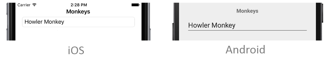
The Picker fires a SelectedIndexChanged event when the user selects an item. Following selection, the selected item is displayed by the Picker:
There are two techniques for populating a Picker with data:
- Setting the
ItemsSourceproperty to the data to be displayed. This is the recommended technique. For more information, see Setting a Picker's ItemsSource Property. - Adding the data to be displayed to the
Itemscollection. This technique was the original process for populating aPickerwith data. For more information, see Adding Data to a Picker's Items Collection.