ItemsControl.ItemContainerStyle 属性
定义
重要
一些信息与预发行产品相关,相应产品在发行之前可能会进行重大修改。 对于此处提供的信息,Microsoft 不作任何明示或暗示的担保。
获取或设置呈现 ItemsControl 的项容器时使用的样式。
public:
 property Style ^ ItemContainerStyle { Style ^ get(); void set(Style ^ value); };
Style ItemContainerStyle();
void ItemContainerStyle(Style value);public Style ItemContainerStyle { get; set; }var style = itemsControl.itemContainerStyle;
itemsControl.itemContainerStyle = style;Public Property ItemContainerStyle As Style<ItemsControl>
<ItemsControl.ItemContainerStyle>
inlineStyle
</ItemsControl.ItemContainerStyle>
</ItemsControl>
- or -
<ItemsControl ItemContainerStyle="resourceReferenceToStyle"/>
属性值
应用于项容器的样式。 默认值为 NULL。
示例
此示例演示如何创建包含对象列表的 String ListView。 使用 ItemContainerStyle 类时, String 对象具有自己的边框和样式, ListViewItem 而对象具有自己的样式和属性集。 请注意,ListView 中的项容器类型是 ListViewItem,因此用作样式的 TargetType。
 <ListView ItemsSource="{x:Bind tempList}" Height="500">
    <ListView.ItemTemplate>
        <DataTemplate x:DataType="x:String">
            <Border BorderBrush="Crimson" BorderThickness="2" CornerRadius="25" Margin="10">
            <TextBlock Text="{x:Bind}"
                       FontSize="24"
                       FontFamily="Arial"
                       FontWeight="Bold"
                       Foreground="Crimson"
                       Margin="10"
                       Padding="5"/>
            </Border>
        </DataTemplate>
    </ListView.ItemTemplate>

    <ListView.ItemContainerStyle>
        <Style TargetType="ListViewItem">
            <Setter Property="HorizontalAlignment" Value="Right"/>
            <Setter Property="Margin" Value="15"/>
            <Setter Property="BorderBrush" Value="CornflowerBlue"/>
            <Setter Property="BorderThickness" Value="5"/>
        </Style>
    </ListView.ItemContainerStyle>
</ListView>
上述代码生成以下内容: 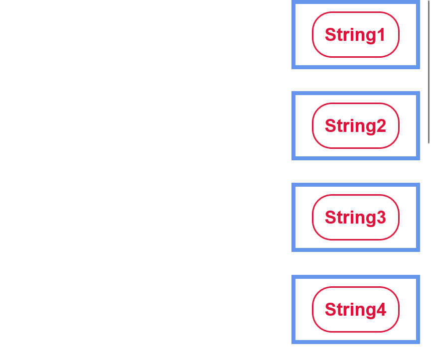
如上例所示,数据对象 (字符串) 在 DataTemplate 中提供自己的样式 - 此样式包括其圆角深红色边框、其深红色字体颜色、字号和外部元素的边距。
由 (每个) 生成的 ListView 每个 ListViewItem 元素都与右水平对齐,具有粗蓝色边框,并具有较大边距,以将其与其他元素分开。 尽管 ListViewItems 中的数据对象居中,但项本身可以右对齐。 而且,尽管数据对象 (字符串) 只有少量的空间将其与其他元素分开,但每个 ListViewItem 元素都可以用大量空间分隔。
这些自定义是通过创建 ListViewItem 样式来执行的,如上所示。 style 元素以类型元素为目标 ListViewItem ,并将应用于该样式定义范围内的该类型的所有元素-在本例中,仅 ListView 显示 。 然后,使用 Setter 为每个样式属性指定一个值 - 即将 HorizontalAlignment 设置为 Right。 这些属性和值会影响外部 ListViewItem 元素。
此示例演示如何在简单的 ItemsControl 上使用 ItemContainerStyle 属性。 请注意,在这种情况下,项容器类型为 ContentPresenter。
<ItemsControl>
    <ItemsControl.ItemContainerStyle>
        <Style TargetType="ContentPresenter">
            <Setter Property="FontSize" Value="42" />
        </Style>
    </ItemsControl.ItemContainerStyle>

    <x:String>Hello</x:String>
    <x:String>World</x:String>
</ItemsControl>
注解
的 ItemsControl 派生类包括 Selector 和 MenuFlyoutPresenter。 来自选择器的派生类包括 ComboBox、 FlipView、 ListBox 和 ListViewBase (ListView 和 GridView 派生自) 。 因此, ItemContainerStyle 类可用于编辑 、 GridViewItem等的ListViewItem样式。
对于 中的每个 ItemsControl项,项容器元素都用于显示项。 默认情况下,项容器为 ContentPresenter。 但 的 ItemsControl 子类可以替代此类型,例如 ListView 中的容器类型是 ListViewItem。 的值 ItemContainerStyle 设置为容器的 FrameworkElement.Style 属性。
ItemContainerStyle 然后,可以使用 更改 ItemsControl 生成的每个元素的样式,并在该区域中提供许多灵活性和自定义选项。 尽管 类中 ItemContainerStyle 提供了许多样式选项,但尝试编辑 包含数据的元素 彼此比较的显示方式(更改其间距、水平对齐等)时,它最有用。若要更改 数据对象本身的可视化效果,例如其背景色或字号,请使用 ItemTemplate。 若要更改 ItemsControl/其项的总体布局或方向,请查看编辑其 ItemsPanel。
适用于
另请参阅
反馈
即将发布:在整个 2024 年,我们将逐步淘汰作为内容反馈机制的“GitHub 问题”,并将其取代为新的反馈系统。 有关详细信息,请参阅:https://aka.ms/ContentUserFeedback。
提交和查看相关反馈