使用自动布局概述
本主题介绍开发人员有关如何使用可本地化用户界面 (UI) 编写 Windows Presentation Foundation (WPF) 应用程序的指南。 过去,UI 的本地化是一个十分耗时的过程。 UI 所需适应的每种语言都需要按像素逐一调整。 如今,可以利用适当的设计和编码标准构造 UI,从而减少本地化人员重设大小和重新定位的工作量。 编写更易于重设大小和重新定位的应用程序的方法称为自动布局,可以使用 WPF 应用程序设计来实现此方法。
使用自动布局的优点
由于 WPF 演示系统非常强大、灵活,可以利用它布局应用程序中的元素,这些元素可进行调整以适应不同语言的要求。 下面列出自动布局的部分优点。
UI 可通过任意语言正常显示。
减少了文本转换完后重新调整控件位置和大小的需要。
减少了重新调整窗口大小的需要。
UI 布局可通过任意语言正确呈现。
本地化过程可缩减为与进行字符串转换差不多。
自动布局和控件
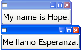
利用自动布局,应用程序可以自动调整控件大小。 例如,控件可按字符串长度相应改变。 利用此功能,本地化人员可转换字符串,而无需再调整控件大小以适应转换后的文本。 下面的示例创建一个带有英文内容的按钮。
<Window
    xmlns="http://schemas.microsoft.com/winfx/2006/xaml/presentation"
    xmlns:x="http://schemas.microsoft.com/winfx/2006/xaml"
    x:Class="ButtonLoc.Pane1"
    Name="myWindow"
    SizeToContent="WidthAndHeight"
    >

<DockPanel>
    <Button FontSize="28" Height="50">My name is Hope.</Button>
</DockPanel>
</Window>
在此示例中,只需更改文本即可生成一个西班牙文按钮。 例如,
<Window
    xmlns="http://schemas.microsoft.com/winfx/2006/xaml/presentation"
    xmlns:x="http://schemas.microsoft.com/winfx/2006/xaml"
    x:Class="ButtonLoc.Pane1"
    Name="myWindow"
    SizeToContent="WidthAndHeight"
    >

 <DockPanel>
    <Button FontSize="28" Height="50">Me llamo Esperanza.</Button>
  </DockPanel>
</Window>
下图显示代码示例的输出:
自动布局和编码标准
使用自动布局方法需要一组用于生成可完全本地化的 UI 的编码及设计标准和规则。 下列准则可帮助完成自动布局编码。
不使用绝对位置
不使用 Canvas,因为它会以绝对方式定位元素。
使用 DockPanel、StackPanel 和 Grid 定位控件。
有关各种面板类型的介绍,请参阅面板概述。
不设定固定的窗口大小
使用 Window.SizeToContent。 例如:
<StackPanel
    xmlns="http://schemas.microsoft.com/winfx/2006/xaml/presentation"
    xmlns:x="http://schemas.microsoft.com/winfx/2006/xaml"
    x:Class="GridLoc.Pane1"
>
将 FlowDirection 添加到应用程序的根元素中。
WPF 提供一种支持水平、双向和垂直布局的简便方式。 在呈现框架中,FlowDirection 属性可用于定义布局。 流方向模式包括:
FlowDirection.LeftToRight (LrTb) - 适用于拉丁语和东亚语等语言的水平布局。
FlowDirection.RightToLeft (RlTb) - 适用于阿拉伯语和希伯来语等语言的双向布局。
使用复合字体而不是实体字体
使用复合字体,则无需本地化 FontFamily 属性。
开发人员可以使用以下字体之一,也可以创建自己的字体。
- Global User Interface
- Global San Serif
- Global Serif
添加 xml:lang
在 UI 的根元素中添加
xml:lang特性,如用于英文应用程序的xml:lang="en-US"。因为复合字体使用
xml:lang来确定要使用的字体,请将此属性设置为支持多语言方案。
自动布局和网格
Grid 元素对于自动布局很有用,因为开发人员可以利用它来定位元素。 Grid 控件可以使用列和行排列方式在其子元素中分发可用空间。 UI 元素可跨多个单元格,并且可在网格内再设网格。 由于可以通过网格创建和定位复杂的 UI,因此网格很有用。 下面的 示例演示如何使用网格来定位某些按钮和文本。 请注意,单元格的高度和宽度设置为 Auto;因此,包含带图像按钮的单元格会调整为适应该图像。
<Grid Name="grid" ShowGridLines ="false">
<Grid.ColumnDefinitions>
<ColumnDefinition Width="Auto"/>
<ColumnDefinition Width="*"/>
</Grid.ColumnDefinitions>
<Grid.RowDefinitions>
<RowDefinition Height="Auto"/>
<RowDefinition Height="Auto"/>
<RowDefinition Height="Auto"/>
<RowDefinition Height="Auto"/>
<RowDefinition Height="Auto"/>
</Grid.RowDefinitions>

<TextBlock Margin="10, 10, 5, 5" Grid.Column="0" Grid.Row="0" FontSize="24">Grid
</TextBlock>
<TextBlock Margin="10, 10, 5, 5" Grid.Column="0" Grid.Row="1" FontSize="12"
    Grid.ColumnSpan="2">The following buttons and text are positioned using a Grid.
</TextBlock>
<Button Margin="10, 10, 5, 5" Grid.Column="0" Grid.Row="2" Background="Pink"
    BorderBrush="Black" BorderThickness="10">Button 1
</Button>
<TextBlock Margin="10, 10, 5, 5" Grid.Column="1" Grid.Row="2" FontSize="12"
   VerticalAlignment="Center" TextWrapping="WrapWithOverflow">Sets the background
   color.
</TextBlock>
<Button Margin="10, 10, 5, 5" Grid.Column="0" Grid.Row="3" Foreground="Red">
   Button 2
</Button>
<TextBlock Margin="10, 10, 5, 5" Grid.Column="1" Grid.Row="3" FontSize="12"
   VerticalAlignment="Center" TextWrapping="WrapWithOverflow">Sets the foreground
   color.
</TextBlock>
<Button Margin="10, 10, 5, 5" Grid.Column="0" Grid.Row="4">
   <Image Source="data\flower.jpg"></Image>
</Button>
<TextBlock Margin="10, 10, 5, 5" Grid.Column="1" Grid.Row="4" FontSize="12"
   VerticalAlignment="Center" TextWrapping="WrapWithOverflow">Adds an image as
   the button's content.
</TextBlock>
</Grid>
下图显示了以上代码生成的网格。
 网格
网格
使用 IsSharedSizeScope 属性的自动布局和网格
Grid 可用于在可本地化的应用程序中创建可根据内容进行调整的控件。 不过,有时可能希望控件无论包含什么内容都可以保持特定大小。 例如,对于“确定”、“取消”和“浏览”按钮,可能不希望按钮根据内容调整大小。 在这种情况下,Grid.IsSharedSizeScope 附加属性对于在多个网格元素中共享同样的大小很有用。 下面的示例演示如何在多个 Grid 元素中共享列和行的大小数据。
   <StackPanel Orientation="Horizontal" DockPanel.Dock="Top">
       <Button Click="setTrue" Margin="0,0,10,10">Set IsSharedSizeScope="True"</Button>
       <Button Click="setFalse" Margin="0,0,10,10">Set IsSharedSizeScope="False"</Button>
   </StackPanel>

   <StackPanel Orientation="Horizontal" DockPanel.Dock="Top">

   <Grid ShowGridLines="True" Margin="0,0,10,0">
     <Grid.ColumnDefinitions>
       <ColumnDefinition SharedSizeGroup="FirstColumn"/>
       <ColumnDefinition SharedSizeGroup="SecondColumn"/>
     </Grid.ColumnDefinitions>
     <Grid.RowDefinitions>
       <RowDefinition Height="Auto" SharedSizeGroup="FirstRow"/>
     </Grid.RowDefinitions>

       <Rectangle Fill="Silver" Grid.Column="0" Grid.Row="0" Width="200" Height="100"/>
       <Rectangle Fill="Blue" Grid.Column="1" Grid.Row="0" Width="150" Height="100"/>

       <TextBlock Grid.Column="0" Grid.Row="0" FontWeight="Bold">First Column</TextBlock>
       <TextBlock Grid.Column="1" Grid.Row="0" FontWeight="Bold">Second Column</TextBlock>
   </Grid>

   <Grid ShowGridLines="True">
     <Grid.ColumnDefinitions>
       <ColumnDefinition SharedSizeGroup="FirstColumn"/>
       <ColumnDefinition SharedSizeGroup="SecondColumn"/>
     </Grid.ColumnDefinitions>
     <Grid.RowDefinitions>
       <RowDefinition Height="Auto" SharedSizeGroup="FirstRow"/>
     </Grid.RowDefinitions>

       <Rectangle Fill="Silver" Grid.Column="0" Grid.Row="0"/>
       <Rectangle Fill="Blue" Grid.Column="1" Grid.Row="0"/>

       <TextBlock Grid.Column="0" Grid.Row="0" FontWeight="Bold">First Column</TextBlock>
       <TextBlock Grid.Column="1" Grid.Row="0" FontWeight="Bold">Second Column</TextBlock>
   </Grid>

   </StackPanel>

   <TextBlock Margin="10" DockPanel.Dock="Top" Name="txt1"/>
注意
有关完整的代码示例,请参阅在网格之间共享大小调整属性。
另请参阅
反馈
即将发布:在整个 2024 年,我们将逐步淘汰作为内容反馈机制的“GitHub 问题”,并将其取代为新的反馈系统。 有关详细信息,请参阅:https://aka.ms/ContentUserFeedback。
提交和查看相关反馈