CheckBox
 Browse the sample
The .NET Multi-platform App UI (.NET MAUI) CheckBox is a type of button that can either be checked or empty. When a checkbox is checked, it's considered to be on. When a checkbox is empty, it's considered to be off.
CheckBox defines the following properties:
IsChecked, of typebool, which indicates whether the CheckBox is checked. This property has a default binding mode ofTwoWay.Color, of type Color, which indicates the color of the CheckBox.
These properties are backed by BindableProperty objects, which means that they can be styled, and be the target of data bindings.
CheckBox defines a CheckedChanged event that's raised when the IsChecked property changes, either through user manipulation or when an application sets the IsChecked property. The CheckedChangedEventArgs object that accompanies the CheckedChanged event has a single property named Value, of type bool. When the event is raised, the value of the Value property is set to the new value of the IsChecked property.
Create a CheckBox
The following example shows how to instantiate a CheckBox in XAML:
<CheckBox />
This XAML results in the appearance shown in the following screenshot:

By default, the CheckBox is empty. The CheckBox can be checked by user manipulation, or by setting the IsChecked property to true:
<CheckBox IsChecked="true" />
This XAML results in the appearance shown in the following screenshot:

Alternatively, a CheckBox can be created in code:
CheckBox checkBox = new CheckBox { IsChecked = true };
Respond to a CheckBox changing state
When the IsChecked property changes, either through user manipulation or when an application sets the IsChecked property, the CheckedChanged event fires. An event handler for this event can be registered to respond to the change:
<CheckBox CheckedChanged="OnCheckBoxCheckedChanged" />
The code-behind file contains the handler for the CheckedChanged event:
void OnCheckBoxCheckedChanged(object sender, CheckedChangedEventArgs e)
{
    // Perform required operation after examining e.Value
}
The sender argument is the CheckBox responsible for this event. You can use this to access the CheckBox object, or to distinguish between multiple CheckBox objects sharing the same CheckedChanged event handler.
Alternatively, an event handler for the CheckedChanged event can be registered in code:
CheckBox checkBox = new CheckBox { ... };
checkBox.CheckedChanged += (sender, e) =>
{
    // Perform required operation after examining e.Value
};
Data bind a CheckBox
The CheckedChanged event handler can be eliminated by using data binding and triggers to respond to a CheckBox being checked or empty:
<CheckBox x:Name="checkBox" />
<Label Text="Lorem ipsum dolor sit amet, elit rutrum, enim hendrerit augue vitae praesent sed non, lorem aenean quis praesent pede.">
    <Label.Triggers>
        <DataTrigger TargetType="Label"
                     Binding="{Binding Source={x:Reference checkBox}, Path=IsChecked}"
                     Value="true">
            <Setter Property="FontAttributes"
                    Value="Italic, Bold" />
            <Setter Property="FontSize"
                    Value="18" />
        </DataTrigger>
    </Label.Triggers>
</Label>
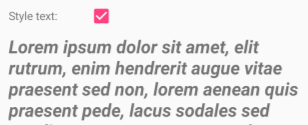
In this example, the Label uses a binding expression in a data trigger to monitor the IsChecked property of the CheckBox. When this property becomes true, the FontAttributes and FontSize properties of the Label change. When the IsChecked property returns to false, the FontAttributes and FontSize properties of the Label are reset to their initial state.
The following screenshot shows the Label formatting when the CheckBox is checked:
For more information about triggers, see Triggers.
Disable a Checkbox
Sometimes an application enters a state where a CheckBox being checked is not a valid operation. In such cases, the CheckBox can be disabled by setting its IsEnabled property to false.
CheckBox appearance
In addition to the properties that CheckBox inherits from the View class, CheckBox also defines a Color property that sets its color to a Color:
<CheckBox Color="Red" />
The following screenshot shows a series of checked CheckBox objects, where each object has its Color property set to a different Color:
CheckBox visual states
CheckBox has an IsChecked VisualState that can be used to initiate a visual change to the CheckBox when it becomes checked.
The following XAML example shows how to define a visual state for the IsChecked state:
<CheckBox ...>
    <VisualStateManager.VisualStateGroups>
        <VisualStateGroup x:Name="CommonStates">
            <VisualState x:Name="Normal">
                <VisualState.Setters>
                    <Setter Property="Color"
                            Value="Red" />
                </VisualState.Setters>
            </VisualState>

            <VisualState x:Name="IsChecked">
                <VisualState.Setters>
                    <Setter Property="Color"
                            Value="Green" />
                </VisualState.Setters>
            </VisualState>
        </VisualStateGroup>
    </VisualStateManager.VisualStateGroups>
</CheckBox>
In this example, the IsChecked VisualState specifies that when the CheckBox is checked, its Color property will be set to green. The Normal VisualState specifies that when the CheckBox is in a normal state, its Color property will be set to red. Therefore, the overall effect is that the CheckBox is red when it's empty, and green when it's checked.
For more information about visual states, see Visual states.
反馈
即将发布:在整个 2024 年,我们将逐步淘汰作为内容反馈机制的“GitHub 问题”,并将其取代为新的反馈系统。 有关详细信息,请参阅:https://aka.ms/ContentUserFeedback。
提交和查看相关反馈