BindableLayout
 浏览示例
浏览示例.NET Multi-platform App UI (.NET MAUI) 可绑定布局支持派生自 Layout 类的任何布局类通过绑定到项集合来生成其内容,并可以选择使用 DataTemplate 来设置每个项的外观。
可绑定布局由 BindableLayout 类提供,该类公开以下附加属性:
ItemsSource– 指定要由布局显示的IEnumerable项的集合。ItemTemplate– 指定要应用于由布局显示的项集合中每个项的 DataTemplate。ItemTemplateSelector– 指定要用于在运行时为项选择 DataTemplate 的 DataTemplateSelector。
注意
同时设置 ItemTemplate 和 ItemTemplateSelector 属性时,ItemTemplate 属性将优先。
此外,BindableLayout 类还公开以下可绑定属性:
EmptyView– 指定当ItemsSource属性为null,或ItemsSource属性指定的集合为null或为空时将显示的string或视图。 默认值为null。EmptyViewTemplate– 指定当ItemsSource属性为null,或ItemsSource属性指定的集合为null或为空时将显示的 DataTemplate。 默认值为null。
注意
同时设置 EmptyView 和 EmptyViewTemplate 属性时,EmptyViewTemplate 属性将优先。
所有这些属性都可以附加到派生自 Layout 类的 AbsoluteLayout、FlexLayout、Grid、HorizontalStackLayout、StackLayout 和 VerticalStackLayout 类。
将 BindableLayout.ItemsSource 属性设置为项的集合并附加到 Layout 派生类时,集合中的每个项都将添加到 Layout 派生类进行显示。 然后,Layout 派生类将在基础集合发生更改时更新其子视图。
仅当要显示的项集合较小且不需要滚动和选择时,才应使用可绑定布局。 虽然可以通过将可绑定布局包装在 ScrollView 中来提供滚动,但不建议这样做,因为可绑定布局缺乏 UI 虚拟化。 需要滚动时,应使用包含 UI 虚拟化的可滚动视图,例如 ListView 或 CollectionView。 未采纳此建议可能会导致性能问题。
重要
虽然从技术上讲,可以将可绑定布局附加到派生自 Layout 类的任何布局类,但这样做并不总是可行,尤其是对于 AbsoluteLayout 类和 Grid 类。 例如,考虑要使用可绑定布局在 Grid 中显示数据集合的方案,其中集合中的每个项都是包含多个属性的对象。 Grid 中的每一行都应显示集合中的一个对象,其中,Grid 中的每一列都显示该对象的一个属性。 由于可绑定布局的 DataTemplate 只能包含单个对象,因此该对象必须是包含多个视图的布局类,每个视图在特定 Grid 列中显示对象的其中一个属性。 虽然可以使用可绑定布局实现此方案,但会导致父级 Grid 包含绑定集合中每个项的子级 Grid,以这种方式使用 Grid 布局效率极其低下,并且存在问题。
使用数据填充可绑定布局
可绑定布局通过将其 ItemsSource 属性设置为实现 IEnumerable 的任何集合,并将其附加到 Layout 派生类来填充数据:
<Grid BindableLayout.ItemsSource="{Binding Items}" />
等效 C# 代码如下:
IEnumerable<string> items = ...;
Grid grid = new Grid();
BindableLayout.SetItemsSource(grid, items);
如果在布局上已设置 BindableLayout.ItemsSource 附加属性但未设置 BindableLayout.ItemTemplate 附加属性,则 IEnumerable 集合中的每个项都将由 BindableLayout 类创建的 Label 来显示。
定义项外观
可以通过将 BindableLayout.ItemTemplate 附加属性设置为 DataTemplate 来定义可绑定布局中每个项的外观:
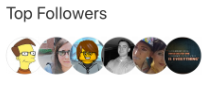
<StackLayout BindableLayout.ItemsSource="{Binding User.TopFollowers}"
             Orientation="Horizontal"
             ...>
    <BindableLayout.ItemTemplate>
        <DataTemplate>
            <Image Source="{Binding}"
                   Aspect="AspectFill"
                   WidthRequest="44"
                   HeightRequest="44"
                   ... />
        </DataTemplate>
    </BindableLayout.ItemTemplate>
</StackLayout>
等效 C# 代码如下:
DataTemplate imageTemplate = ...;
StackLayout stackLayout = new StackLayout();
BindableLayout.SetItemsSource(stackLayout, viewModel.User.TopFollowers);
BindableLayout.SetItemTemplate(stackLayout, imageTemplate);
在此示例中,TopFollowers 集合中的每个项都将由 DataTemplate 中定义的 Image 视图显示:
要详细了解数据模板,请参阅数据模板。
在运行时选择项外观
可以通过将 BindableLayout.ItemTemplateSelector 附加属性设置为 DataTemplateSelector,在运行时根据项值选择可绑定布局中每个项的外观:
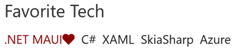
<FlexLayout BindableLayout.ItemsSource="{Binding User.FavoriteTech}"
            BindableLayout.ItemTemplateSelector="{StaticResource TechItemTemplateSelector}"
            ... />
等效 C# 代码如下:
DataTemplateSelector dataTemplateSelector = new TechItemTemplateSelector { ... };
FlexLayout flexLayout = new FlexLayout();
BindableLayout.SetItemsSource(flexLayout, viewModel.User.FavoriteTech);
BindableLayout.SetItemTemplateSelector(flexLayout, dataTemplateSelector);
以下示例显示了 TechItemTemplateSelector 类:
public class TechItemTemplateSelector : DataTemplateSelector
{
    public DataTemplate DefaultTemplate { get; set; }
    public DataTemplate MAUITemplate { get; set; }

    protected override DataTemplate OnSelectTemplate(object item, BindableObject container)
    {
        return (string)item == ".NET MAUI" ? MAUITemplate : DefaultTemplate;
    }
}
TechItemTemplateSelector 类定义设置为不同数据模板的 DefaultTemplate 和 MAUITemplateDataTemplate 属性。 OnSelectTemplate 方法返回 MAUITemplate,后者将项显示为深红色,旁边有一个心形,此时该项等于“.NET MAUI”。 如果项不等于“.NET MAUI”,则 OnSelectTemplate 方法将返回 DefaultTemplate,后者使用 Label 的默认颜色显示项:
要详细了解数据模板选择器,请参阅创建 DataTemplateSelector。
当数据不可用时显示字符串
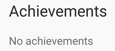
可以将 EmptyView 属性设置为字符串,当 ItemsSource 属性为 null 或 ItemsSource 属性指定的集合为 null 或为空时,Label 将显示该字符串。 以下 XAML 显示了此方案的示例:
<StackLayout BindableLayout.ItemsSource="{Binding UserWithoutAchievements.Achievements}"
             BindableLayout.EmptyView="No achievements">
    ...
</StackLayout>
结果是,当数据绑定集合为 null 时,将显示设置为 EmptyView 属性值的字符串:
当数据不可用时显示视图
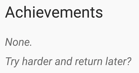
EmptyView 属性可设置为视图,当 ItemsSource 属性为 null 时,或 ItemsSource 属性指定的集合为 null 或为空时,将显示该视图。 这可以是单个视图,也可以是包含多个子视图的视图。 以下 XAML 示例显示设置为包含多个子视图的视图的 EmptyView 属性:
<StackLayout BindableLayout.ItemsSource="{Binding UserWithoutAchievements.Achievements}">
    <BindableLayout.EmptyView>
        <StackLayout>
            <Label Text="None."
                   FontAttributes="Italic"
                   FontSize="{StaticResource smallTextSize}" />
            <Label Text="Try harder and return later?"
                   FontAttributes="Italic"
                   FontSize="{StaticResource smallTextSize}" />
        </StackLayout>
    </BindableLayout.EmptyView>
    ...
</StackLayout>
结果是,当数据绑定集合为 null 时,将显示 StackLayout 及其子视图。
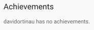
同样,可以将 EmptyViewTemplate 设置为 DataTemplate,当 ItemsSource 属性为 null 或 ItemsSource 属性指定的集合为 null 或为空时,将显示该模板。 DataTemplate 可以包含单个视图,也可以包含有多个子视图的视图。 此外,将从 BindableLayout 的 BindingContext 继承 EmptyViewTemplate 的 BindingContext。 以下 XAML 示例显示设置为包含单个视图的 DataTemplate 的 EmptyViewTemplate 属性:
<StackLayout BindableLayout.ItemsSource="{Binding UserWithoutAchievements.Achievements}">
    <BindableLayout.EmptyViewTemplate>
        <DataTemplate>
            <Label Text="{Binding Source={x:Reference usernameLabel}, Path=Text, StringFormat='{0} has no achievements.'}" />
        </DataTemplate>
    </BindableLayout.EmptyViewTemplate>
    ...
</StackLayout>
结果是,当数据绑定集合为 null 时,将显示 DataTemplate 中的 Label:
注意
不能通过 DataTemplateSelector 设置 EmptyViewTemplate 属性。
在运行时选择 EmptyView
当数据不可用时将以 EmptyView 显示的视图,可在 ResourceDictionary 中定义为 ContentView 对象。 然后,可以在运行时根据某些业务逻辑将 EmptyView 属性设置为特定的 ContentView。 以下 XAML 显示了此方案的示例:
<ContentPage ...>
    <ContentPage.Resources>
        ...
        <ContentView x:Key="BasicEmptyView">
            <StackLayout>
                <Label Text="No achievements."
                       FontSize="14" />
            </StackLayout>
        </ContentView>
        <ContentView x:Key="AdvancedEmptyView">
            <StackLayout>
                <Label Text="None."
                       FontAttributes="Italic"
                       FontSize="14" />
                <Label Text="Try harder and return later?"
                       FontAttributes="Italic"
                       FontSize="14" />
            </StackLayout>
        </ContentView>
    </ContentPage.Resources>

    <StackLayout>
        ...
        <Switch Toggled="OnEmptyViewSwitchToggled" />

        <StackLayout x:Name="stackLayout"
                     BindableLayout.ItemsSource="{Binding UserWithoutAchievements.Achievements}">
            ...
        </StackLayout>
    </StackLayout>
</ContentPage>
XAML 在页面级 ResourceDictionary 中定义两个 ContentView 对象,其中 Switch 对象控制将哪个 ContentView 对象设置为 EmptyView 属性值。 切换 Switch 时,OnEmptyViewSwitchToggled 事件处理程序将执行 ToggleEmptyView 方法:
void ToggleEmptyView(bool isToggled)
{
    object view = isToggled ? Resources["BasicEmptyView"] : Resources["AdvancedEmptyView"];
    BindableLayout.SetEmptyView(stackLayout, view);
}
ToggleEmptyView 方法根据 Switch.IsToggled 属性的值,将 StackLayout 对象的 EmptyView 属性设置为存储在 ResourceDictionary 中两个 ContentView 对象中的一个。 然后,当数据绑定集合为 null 时,将显示设置为 EmptyView 属性的 ContentView 对象。
反馈
即将发布:在整个 2024 年,我们将逐步淘汰作为内容反馈机制的“GitHub 问题”,并将其取代为新的反馈系统。 有关详细信息,请参阅:https://aka.ms/ContentUserFeedback。
提交和查看相关反馈