AlignmentGrid XAML Control
The AlignmentGrid Control can be used to display a grid to help with aligning controls.
You can control the grid's steps with HorizontalStep and VerticalStep properties. Line color can be defined with LineBrush property.
Syntax
<developerTools:AlignmentGrid Opacity="1" LineBrush="Black"
                    HorizontalStep="20" VerticalStep="20"/>
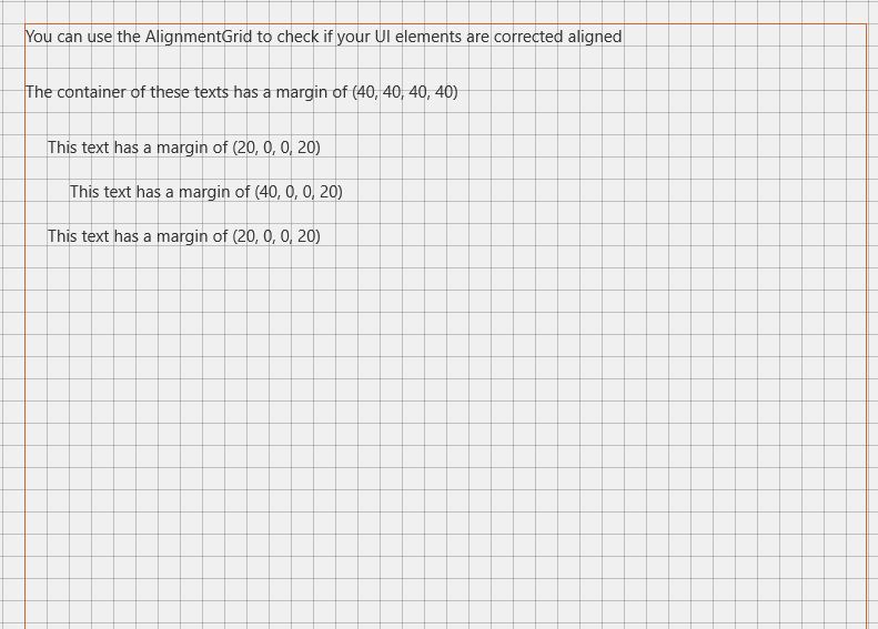
Sample Output
Properties
| Property | Type | Description |
|---|---|---|
| HorizontalStep | double | Gets or sets the step to use horizontally |
| LineBrush | Brush | Gets or sets line Brush |
| VerticalStep | double | Gets or sets the step to use vertically |
Sample Project
AlignmentGrid Sample Page Source. You can see this in action in the Windows Community Toolkit Sample App.
Requirements
| Device family | Universal, 10.0.16299.0 or higher |
|---|---|
| Namespace | Microsoft.Toolkit.Uwp.DeveloperTools |
| NuGet package | Microsoft.Toolkit.Uwp.DeveloperTools |
API
反馈
即将发布:在整个 2024 年,我们将逐步淘汰作为内容反馈机制的“GitHub 问题”,并将其取代为新的反馈系统。 有关详细信息,请参阅:https://aka.ms/ContentUserFeedback。
提交和查看相关反馈