舊版視覺效果
本文說明舊版 Azure Databricks 視覺效果。 如需目前的視覺效果支援,請參閱 Databricks 筆記本中的視覺效果。
Azure Databricks 也原生支援 Python 和 R 中的視覺效果連結庫,並可讓您安裝和使用第三方連結庫。
建立舊版視覺效果
若要從結果數據格建立舊版視覺效果,請按兩下 + 並選取 [舊版視覺效果]。
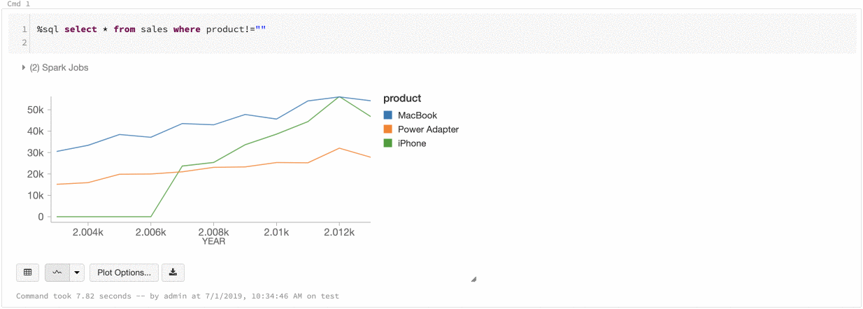
舊版視覺效果支援一組豐富的繪圖類型:
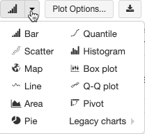
選擇及設定舊版圖表類型
若要選擇條形圖,請按下條形圖圖示  :
:
若要選擇另一個繪圖類型,請按下 ![]() 條形圖 右邊,然後選擇繪圖類型。
條形圖 右邊,然後選擇繪圖類型。
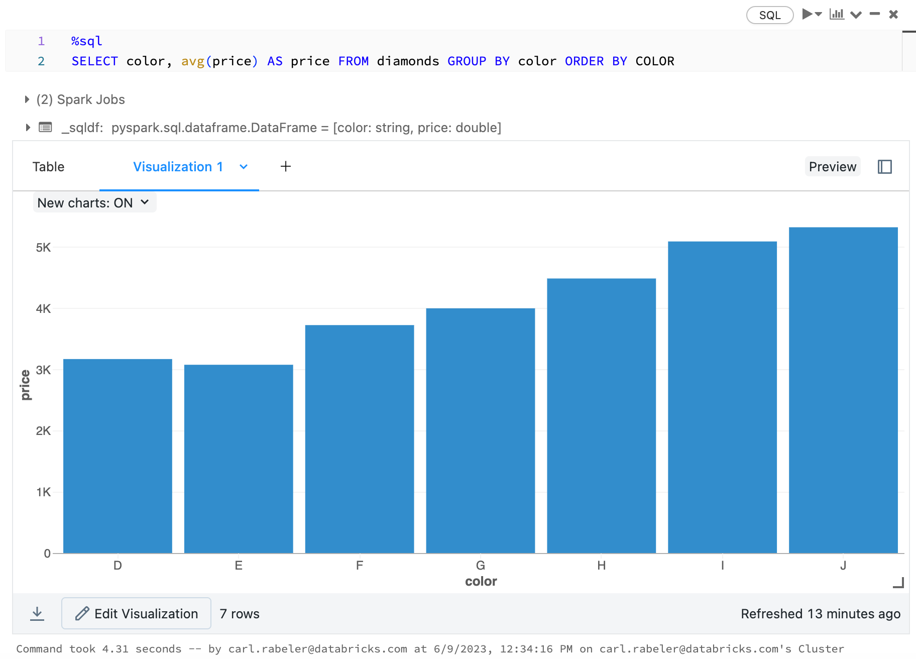
舊版圖表工具列
折線圖和條形圖都有內建工具列,可支援一組豐富的客戶端互動。
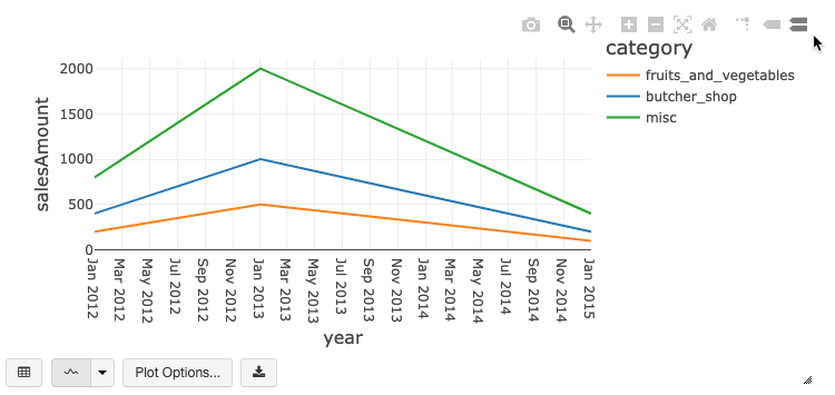
若要設定圖表,請按兩下 [ 繪圖選項...]。
折線圖有一些自定義圖表選項:設定 Y 軸範圍、顯示和隱藏點,以及顯示具有記錄尺規的 Y 軸。
如需舊版圖表類型的相關信息,請參閱:
圖表之間的色彩一致性
Azure Databricks 支援舊版圖表的兩種色彩一致性:數列集和全域。
如果您的數位具有相同值,但順序不同,則數列集 色彩一致性會將相同的色彩指派給相同的值(例如,A = ["Apple", "Orange", "Banana"] 和 B = ["Orange", "Banana", "Apple"])。 這些值會在繪製之前排序,因此兩個圖例的排序方式相同(["Apple", "Banana", "Orange"]),而且相同的值會得到相同的色彩。 不過,如果您有 C = ["Orange", "Banana"]數列,則不會與 set A 一致,因為該集合不相同。 排序演算法會將第一個色彩指派給集合 C 中的 「Banana」 ,但第二個色彩會指派給 set A 中的 「Banana」。如果您想要讓這些數列的色彩一致,您可以指定圖表應具有全域色彩一致性。
在 全域 色彩一致性中,不論數列具有的值為何,每個值一律對應到相同的色彩。 若要為每個圖表啟用此功能,請選取 [ 全域色彩一致性] 複選框。
注意
為了達到此一致性,Azure Databricks 會直接從值哈希到色彩。 為了避免衝突(其中兩個值移至完全相同的色彩),哈希是一組大色彩,其副作用是,無法保證美觀或容易辨別的色彩:有許多色彩必然會有一些看起來非常類似的色彩。
機器學習視覺效果
除了標準圖表類型之外,舊版視覺效果還支援下列機器學習訓練參數和結果:
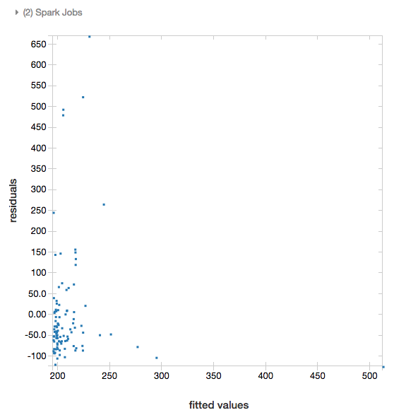
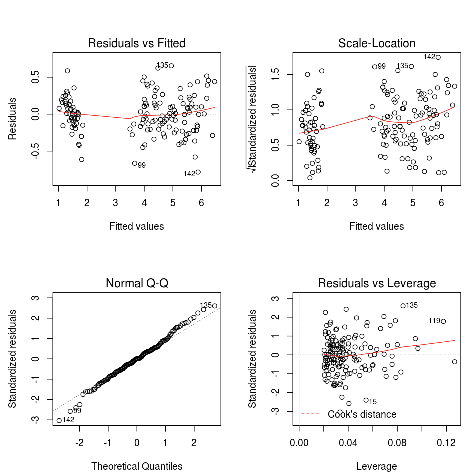
殘差
針對線性和羅吉斯回歸,您可以轉譯 適合與殘差 繪圖。 若要取得此繪圖,請提供模型和數據框架。
下列範例會針對城市人口對房屋銷售價格數據執行線性回歸,然後顯示殘差與配適的數據。
# Load data
pop_df = spark.read.csv("/databricks-datasets/samples/population-vs-price/data_geo.csv", header="true", inferSchema="true")

# Drop rows with missing values and rename the feature and label columns, replacing spaces with _
from pyspark.sql.functions import col
pop_df = pop_df.dropna() # drop rows with missing values
exprs = [col(column).alias(column.replace(' ', '_')) for column in pop_df.columns]

# Register a UDF to convert the feature (2014_Population_estimate) column vector to a VectorUDT type and apply it to the column.
from pyspark.ml.linalg import Vectors, VectorUDT

spark.udf.register("oneElementVec", lambda d: Vectors.dense([d]), returnType=VectorUDT())
tdata = pop_df.select(*exprs).selectExpr("oneElementVec(2014_Population_estimate) as features", "2015_median_sales_price as label")

# Run a linear regression
from pyspark.ml.regression import LinearRegression

lr = LinearRegression()
modelA = lr.fit(tdata, {lr.regParam:0.0})

# Plot residuals versus fitted data
display(modelA, tdata)
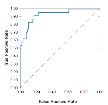
接收者運算子特性曲線
針對羅吉斯回歸,您可以轉譯 ROC 曲線。 若要取得此繪圖,請提供模型、輸入方法 fit 的預先準備資料,以及參數 "ROC"。
下列範例會開發分類器,以預測個人是否從個人的各種屬性中賺取 <=50K 或 >每年 50k。 成人數據集衍生自人口普查數據,由 48842 個人及其年收入的相關信息組成。
本節中的範例程式代碼會使用單熱編碼。
# This code uses one-hot encoding to convert all categorical variables into binary vectors.

schema = """`age` DOUBLE,
`workclass` STRING,
`fnlwgt` DOUBLE,
`education` STRING,
`education_num` DOUBLE,
`marital_status` STRING,
`occupation` STRING,
`relationship` STRING,
`race` STRING,
`sex` STRING,
`capital_gain` DOUBLE,
`capital_loss` DOUBLE,
`hours_per_week` DOUBLE,
`native_country` STRING,
`income` STRING"""

dataset = spark.read.csv("/databricks-datasets/adult/adult.data", schema=schema)

from pyspark.ml import Pipeline
from pyspark.ml.feature import OneHotEncoder, StringIndexer, VectorAssembler

categoricalColumns = ["workclass", "education", "marital_status", "occupation", "relationship", "race", "sex", "native_country"]

stages = [] # stages in the Pipeline
for categoricalCol in categoricalColumns:
    # Category indexing with StringIndexer
    stringIndexer = StringIndexer(inputCol=categoricalCol, outputCol=categoricalCol + "Index")
    # Use OneHotEncoder to convert categorical variables into binary SparseVectors
    encoder = OneHotEncoder(inputCols=[stringIndexer.getOutputCol()], outputCols=[categoricalCol + "classVec"])
    # Add stages.  These are not run here, but will run all at once later on.
    stages += [stringIndexer, encoder]

# Convert label into label indices using the StringIndexer
label_stringIdx = StringIndexer(inputCol="income", outputCol="label")
stages += [label_stringIdx]

# Transform all features into a vector using VectorAssembler
numericCols = ["age", "fnlwgt", "education_num", "capital_gain", "capital_loss", "hours_per_week"]
assemblerInputs = [c + "classVec" for c in categoricalColumns] + numericCols
assembler = VectorAssembler(inputCols=assemblerInputs, outputCol="features")
stages += [assembler]

# Run the stages as a Pipeline. This puts the data through all of the feature transformations in a single call.

partialPipeline = Pipeline().setStages(stages)
pipelineModel = partialPipeline.fit(dataset)
preppedDataDF = pipelineModel.transform(dataset)

# Fit logistic regression model

from pyspark.ml.classification import LogisticRegression
lrModel = LogisticRegression().fit(preppedDataDF)

# ROC for data
display(lrModel, preppedDataDF, "ROC")
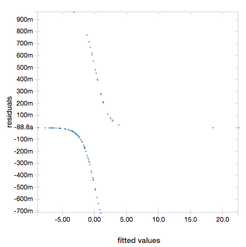
若要顯示殘差,請省略 "ROC" 參數:
display(lrModel, preppedDataDF)
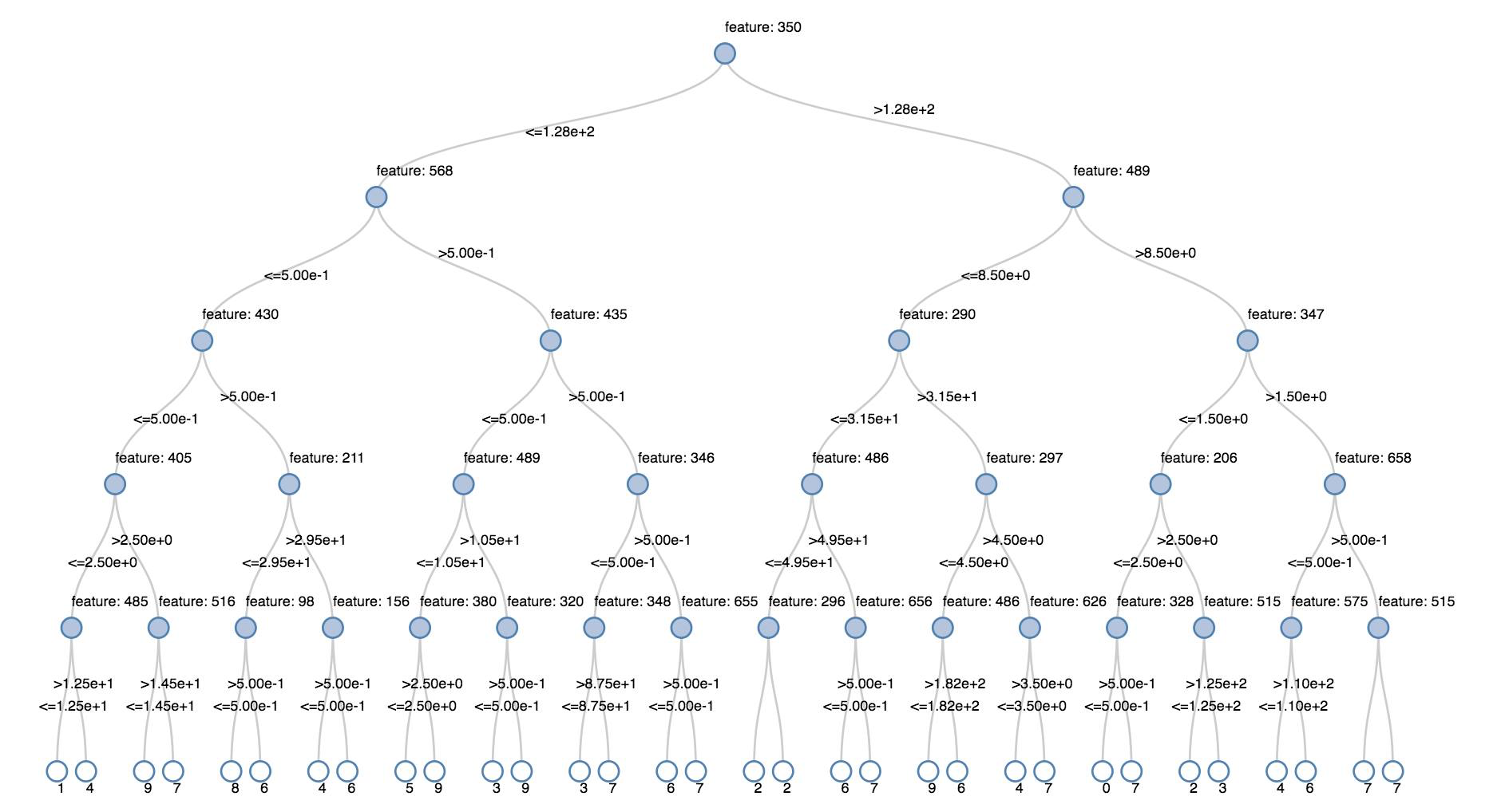
決策樹
舊版視覺效果支持轉譯判定樹。
若要取得此視覺效果,請提供判定樹模型。
下列範例會定型樹狀結構,以從手寫數位影像的 MNIST 數據集辨識數位(0 - 9),然後顯示樹狀結構。
Python
trainingDF = spark.read.format("libsvm").load("/databricks-datasets/mnist-digits/data-001/mnist-digits-train.txt").cache()
testDF = spark.read.format("libsvm").load("/databricks-datasets/mnist-digits/data-001/mnist-digits-test.txt").cache()

from pyspark.ml.classification import DecisionTreeClassifier
from pyspark.ml.feature import StringIndexer
from pyspark.ml import Pipeline

indexer = StringIndexer().setInputCol("label").setOutputCol("indexedLabel")

dtc = DecisionTreeClassifier().setLabelCol("indexedLabel")

# Chain indexer + dtc together into a single ML Pipeline.
pipeline = Pipeline().setStages([indexer, dtc])

model = pipeline.fit(trainingDF)
display(model.stages[-1])
Scala
val trainingDF = spark.read.format("libsvm").load("/databricks-datasets/mnist-digits/data-001/mnist-digits-train.txt").cache
val testDF = spark.read.format("libsvm").load("/databricks-datasets/mnist-digits/data-001/mnist-digits-test.txt").cache

import org.apache.spark.ml.classification.{DecisionTreeClassifier, DecisionTreeClassificationModel}
import org.apache.spark.ml.feature.StringIndexer
import org.apache.spark.ml.Pipeline

val indexer = new StringIndexer().setInputCol("label").setOutputCol("indexedLabel")
val dtc = new DecisionTreeClassifier().setLabelCol("indexedLabel")
val pipeline = new Pipeline().setStages(Array(indexer, dtc))

val model = pipeline.fit(trainingDF)
val tree = model.stages.last.asInstanceOf[DecisionTreeClassificationModel]

display(tree)
結構化串流數據框架
若要即時可視化串流查詢的結果,您可以在 Scala 和 Python 中建立 display 結構化串流數據框架。
Python
streaming_df = spark.readStream.format("rate").load()
display(streaming_df.groupBy().count())
Scala
val streaming_df = spark.readStream.format("rate").load()
display(streaming_df.groupBy().count())
display 支援下列選擇性參數:
streamName:串流查詢名稱。trigger(Scala) 和processingTime(Python):定義串流查詢的執行頻率。 如果未指定,系統會在先前的處理完成時檢查新數據的可用性。 為了降低生產成本,Databricks 建議您 一律 設定觸發間隔。 默認觸發程式間隔為500毫秒。checkpointLocation:系統寫入所有檢查點資訊的位置。 如果未指定,系統會自動在 DBFS 上產生暫存檢查點位置。 為了讓數據流繼續處理數據離開的位置,您必須提供檢查點位置。 Databricks 建議您在生產 環境中一律 指定checkpointLocation選項。
Python
streaming_df = spark.readStream.format("rate").load()
display(streaming_df.groupBy().count(), processingTime = "5 seconds", checkpointLocation = "dbfs:/<checkpoint-path>")
Scala
import org.apache.spark.sql.streaming.Trigger

val streaming_df = spark.readStream.format("rate").load()
display(streaming_df.groupBy().count(), trigger = Trigger.ProcessingTime("5 seconds"), checkpointLocation = "dbfs:/<checkpoint-path>")
如需這些參數的詳細資訊,請參閱 啟動串流查詢。
displayHTML 函式
Azure Databricks 程式設計語言筆記本(Python、R 和 Scala)支援使用 displayHTML 函式的 HTML 圖形;您可以傳遞任何 HTML、CSS 或 JavaScript 程式代碼。 此函式支援使用 JavaScript 連結庫的互動式圖形,例如 D3。
如需使用 displayHTML的範例,請參閱:
注意
iframe displayHTML 會從網域 databricksusercontent.com提供,而 iframe 沙盒包含 allow-same-origin 屬性。 databricksusercontent.com 必須可從瀏覽器存取。 如果公司網路目前遭到封鎖,則必須將其新增至允許清單。
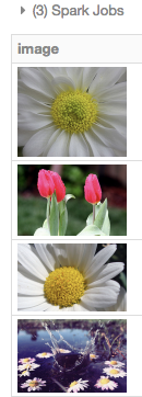
圖像
包含影像數據類型的數據行會轉譯為豐富的 HTML。 Azure Databricks 會嘗試轉 DataFrame 譯符合 Spark ImageSchema 之數據行的影像縮圖。
縮圖轉譯適用於透過函 spark.read.format('image') 式成功讀取的任何影像。 針對透過其他方法產生的影像值,Azure Databricks 支持轉譯 1、3 或 4 個通道影像(其中每個通道包含單一位元節),並具有下列條件約束:
- 單通道影像:
mode欄位必須等於0。height、width和nChannels欄位必須準確地描述欄位中的二進位影像數據data。 - 三通道影像:
mode欄位必須等於16。height、width和nChannels欄位必須準確地描述欄位中的二進位影像數據data。 欄位data必須包含三個字節區塊中的像素數據,且每個圖元的通道順序(blue, green, red)。 - 四通道影像:
mode欄位必須等於24。height、width和nChannels欄位必須準確地描述欄位中的二進位影像數據data。 欄位data必須包含四位元組區塊中的像素數據,且每個圖元的通道順序(blue, green, red, alpha)。
範例
假設您有包含一些影像的資料夾:
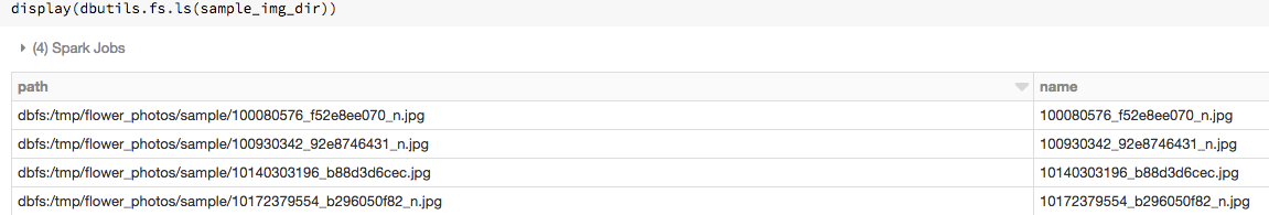
如果您將影像讀入 DataFrame,然後顯示 DataFrame,Azure Databricks 會轉譯影像的縮圖:
image_df = spark.read.format("image").load(sample_img_dir)
display(image_df)
Python 中的視覺效果
本節內容:
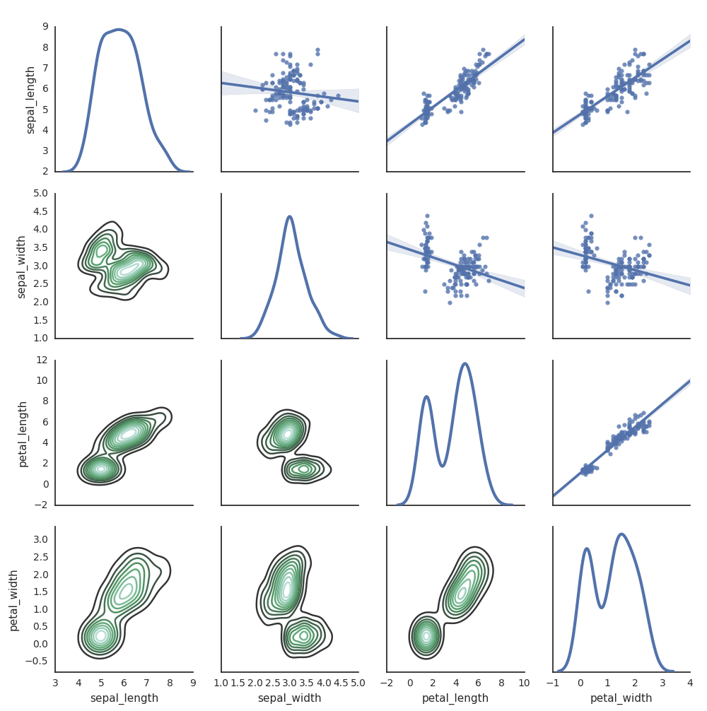
Seaborn
您也可以使用其他 Python 連結庫來產生繪圖。 Databricks Runtime 包含 seaborn 視覺效果連結庫。 若要建立 seaborn 繪圖,請匯入連結庫、建立繪圖,並將繪圖傳遞至函 display 式。
import seaborn as sns
sns.set(style="white")

df = sns.load_dataset("iris")
g = sns.PairGrid(df, diag_sharey=False)
g.map_lower(sns.kdeplot)
g.map_diag(sns.kdeplot, lw=3)

g.map_upper(sns.regplot)

display(g.fig)
其他 Python 連結庫
R 中的視覺效果
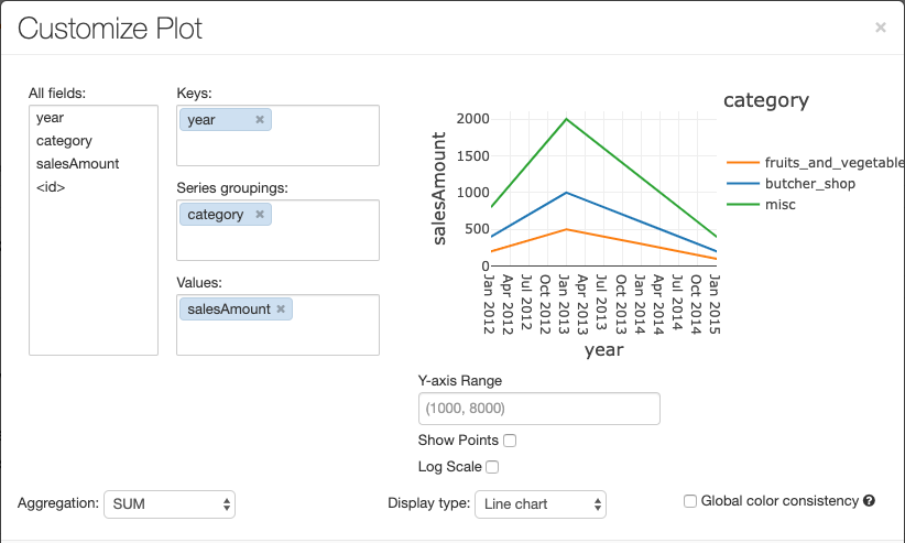
若要在 R 中繪製數據,請使用 display 函式,如下所示:
library(SparkR)
diamonds_df <- read.df("/databricks-datasets/Rdatasets/data-001/csv/ggplot2/diamonds.csv", source = "csv", header="true", inferSchema = "true")

display(arrange(agg(groupBy(diamonds_df, "color"), "price" = "avg"), "color"))
您可以使用預設 R 繪圖 函式。
fit <- lm(Petal.Length ~., data = iris)
layout(matrix(c(1,2,3,4),2,2)) # optional 4 graphs/page
plot(fit)
您也可以使用任何 R 視覺效果套件。 R 筆記本會將產生的繪圖擷取為 , .png 並內嵌顯示。
本節內容:
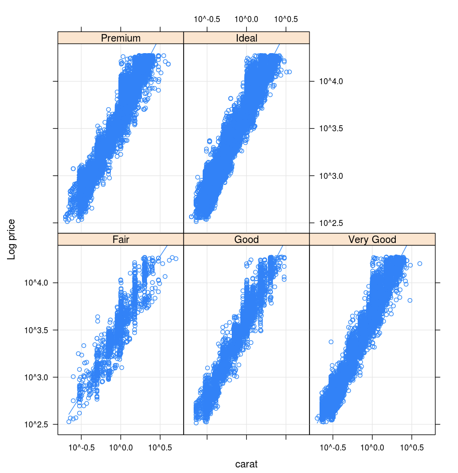
格
Lattice 套件支援 trellis 圖形,這些圖形會顯示變數或變數之間的關聯性,以一或多個其他變數為條件。
library(lattice)
xyplot(price ~ carat | cut, diamonds, scales = list(log = TRUE), type = c("p", "g", "smooth"), ylab = "Log price")
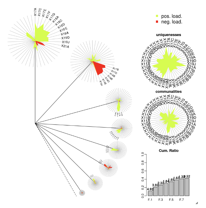
DandEFA
DandEFA 套件支援丹公英繪圖。
install.packages("DandEFA", repos = "https://cran.us.r-project.org")
library(DandEFA)
data(timss2011)
timss2011 <- na.omit(timss2011)
dandpal <- rev(rainbow(100, start = 0, end = 0.2))
facl <- factload(timss2011,nfac=5,method="prax",cormeth="spearman")
dandelion(facl,bound=0,mcex=c(1,1.2),palet=dandpal)
facl <- factload(timss2011,nfac=8,method="mle",cormeth="pearson")
dandelion(facl,bound=0,mcex=c(1,1.2),palet=dandpal)
Plotly
Plotly R 套件依賴 R 的 htmlwidgets。如需安裝指示和筆記本,請參閱 htmlwidgets。
其他 R 連結庫
Scala 中的視覺效果
若要在 Scala 中繪製數據,請使用 函 display 式,如下所示:
val diamonds_df = spark.read.format("csv").option("header","true").option("inferSchema","true").load("/databricks-datasets/Rdatasets/data-001/csv/ggplot2/diamonds.csv")

display(diamonds_df.groupBy("color").avg("price").orderBy("color"))
適用於 Python 和 Scala 的深入探討筆記本
如需 Python 視覺效果的深入探討,請參閱筆記本:
如需深入探討 Scala 視覺效果,請參閱筆記本: