PipsPager
PipsPager 控制項可協助使用者透過可設定的字符集合來瀏覽線性分頁的內容,每個字符都代表無限範圍內的單一「頁面」。 圖像會醒目提示目前頁面,並指出先前和後續頁面的可用性。 控制項依賴目前的內容,不支援明確的頁碼或非線性組織。
什麼是 pip?
Pip 代表一種數值單位,通常會顯示為點。 不過,您可以將它們自訂為使用其他字符,例如虛線或方形。
根據預設,PipsPager 控制項中的每個實心點都代表內容版面配置的頁面。 使用者可以選取一個點來前往內容中的對應頁面。
這是正確的控制項嗎?
如果內容的組織為線性結構、未明確編號,或需要以字符來表示編號頁面,請使用 PipsPager。
此 UI 通常用於相片檢視器和應用程式清單這類顯示空間有限,且潛在頁面數量無限的應用程式。
建議
- PipsPager 的常見 UI 模式包括相片檢視器、應用程式清單、浮動切換,以及顯示空間有限的版面配置。
- 如果想最佳化遊戲控制器的輸入體驗,建議不要將 UI 直接放在水平 PipsPager 的左邊或右邊,以及垂直向 PipsPager 的上方或下方。
- 如果想最佳化觸控輸入的體驗,建議您整合 PipsPager 與檢視控制項,例如 FlipView,以便讓內容分頁發揮結合觸控後的效果 (使用者也可以透過觸控來選取個別 pip)。
UWP 和 WinUI 2
重要
本文中的資訊和範例針對使用 Windows App SDK 和 WinUI 3 的應用程式進行了最佳化,但通常適用於使用 WinUI 2 的 UWP 應用程式。 如需平台特定資訊和範例,請參閱 UWP API 參考。
本節包含您在 UWP 或 WinUI 2 應用程式中使用控制項所需的資訊。
UWP 應用程式的 PipsPager 需要 Windows UI 程式庫 2。 如需詳細資訊 (包括安裝指示),請參閱 Windows UI 程式庫。 此控制項的 API 位在 Microsoft.UI.Xaml.Controls 命名空間中。
- WinUI 2 API:PipsPager 類別
- 開啟 WinUI 2 程式庫應用程式,並查看 PipsPager 運作情形。 WinUI 2 資源庫應用程式包含大部分 WinUI 2 控制項、特性和功能的互動式範例。 從 Microsoft Store 取得應用程式,或在 Github 上取得原始程式碼。
若要在 WinUI 2 中使用本文中的程式碼,請在 XAML 中使用別名 (我們使用 muxc) 來表示專案中包含的 Windows UI 程式庫 API。 如需詳細資訊,請參閱開始使用 WinUI 2。
xmlns:muxc="using:Microsoft.UI.Xaml.Controls"

<muxc:PipsPager />
建立 PipsPager
- 重要 API:PipsPager 類別
WinUI 3 資源庫應用程式包含大多數 WinUI 3 控制項和功能的互動式範例。 從 Microsoft Store 取得應用程式,或在 GitHub 上取得原始程式碼
預設的 PipsPager 包含五個可見的 pip,可調整為水平方向 (預設) 或垂直方向。
PipsPager 也支援透過導覽按紐 (上一頁、下一頁) 前往累進的相鄰頁面。 根據預設,導覽按紐可摺疊,不會佔用版面配置空間。
不支援在第一個項目和最後一個項目之間換行。

<PipsPager x:Name="DefaultPipsPager" />
具有導覽按紐的水平 PipsPager
導覽按紐 (上一頁、下一頁) 可讓使用者移至累進的相鄰頁面。
根據預設,導覽按紐會摺疊。 您可以透過 PreviousButtonVisibility 和 NextButtonVisibility 屬性來控制此行為。
這類屬性可能的值為:
- Collapsed:使用者看不到按鈕,而且不會佔用版面配置空間。 (預設值)
- Visible:按鈕為可見且已啟用。 如果 PipsPager 位於內容的最小或最大位置,個別按鈕會自動隱藏。 舉例來說,如果目前的頁面是第一頁,則「上一頁」按鈕就會隱藏;如果目前的頁面是最後一頁,則「下一頁」按鈕就會隱藏。 隱藏時,按鈕不會顯示,但會佔用版面配置空間。
- VisibleOnPointerOver:行為與 Visible 相同,不同之處在於只有使用者將指標游標暫留在 PipsPager UI 上,或使用者將鍵盤焦點設在 PipsPager 上,按鈕才會顯示。

<PipsPager x:Name="VisibleButtonPipsPager"
    NumberOfPages="5"
    PreviousButtonVisibility="Visible"
    NextButtonVisibility="Visible" />
指標暫留在導覽按紐上時,按鈕就會顯示的垂直 PipsPager
PipsPager 可以設為垂直方向,且行為或互動體驗也不會改變。
頂端按鈕會對應第一個按鈕,而底部按鈕則會對應至水平檢視的最後一個按鈕。
下列範例示範導覽按紐的 VisibleOnPointerOver 設定。

<PipsPager x:Name="VerticalPipsPager"
    NumberOfPages="5"
    Orientation="Vertical"
    PreviousButtonVisibility="VisibleOnPointerOver"
    NextButtonVisibility="VisibleOnPointerOver" />
捲動 pip
如果內容包含大量頁面 (NumberOfPages),則可以使用 MaxVisiblePips 屬性來設定可見的互動式 pip 數量。
如果 NumberOfPages 的值大於 MaxVisiblePips 的值,pip 會自動捲動,以便使所選頁面在控制項置中。 如果 NumberOfPages 等於或小於 MaxVisiblePips,捲動就不會發生,且顯示的 pip 數量與 NumberOfPages 的值相同。
如果 MaxVisiblePips 的值大於可用的版面配置空間,則顯示的 pip 會經過裁剪。 pip 的顯示數量是 MaxVisiblePips 和 NumberOfPages 中數值較小者。
根據預設,pip 的顯示上限是五個。

<PipsPager x:Name="ScrollingPipsPager"
    NumberOfPages="20"
    MaxVisiblePips="10" />
整合 PipsPager 與集合控制項
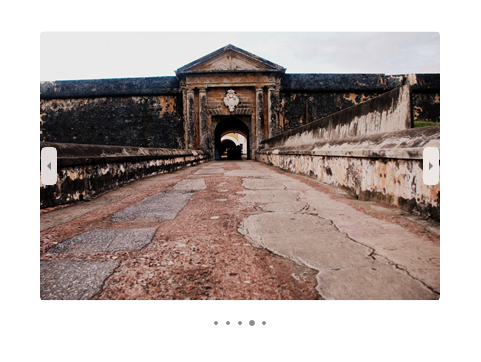
PipsPager 通常會與集合控制項搭配使用。
下列範例示範如何使用 FlipView 來繫結 PipsPager,藉此提供另一種瀏覽內容與指出目前頁面的方式。
注意
如果只想將 PipsPager 當作頁面指標並停用使用者互動,請將控制項的 IsEnabled 屬性設為 false。
<StackPanel>
  <FlipView x:Name="Gallery" MaxWidth="400" Height="270" ItemsSource="{x:Bind Pictures}">
      <FlipView.ItemTemplate>
          <DataTemplate x:DataType="x:String">
              <Image Source="{x:Bind Mode=OneWay}"/>
          </DataTemplate>
      </FlipView.ItemTemplate>
  </FlipView>

  <!-- The SelectedPageIndex is bound to the FlipView to keep the two in sync -->
  <PipsPager x:Name="FlipViewPipsPager"
      HorizontalAlignment="Center"
      Margin="0, 10, 0, 0"
      NumberOfPages="{x:Bind Pictures.Count}"
      SelectedPageIndex="{x:Bind Path=Gallery.SelectedIndex, Mode=TwoWay}" />
</StackPanel>
Pip 和導覽按鈕自訂
導覽按鈕和 pip 可以透過 PreviousButtonStyle、NextButtonStyle、SelectedPipStyle 和 NormalPipStyle 屬性來自訂。
如果您透過 PreviousButtonStyle 或 NextButtonStyle 屬性來設定可見性,這些設定會分別優先於 PreviousButtonVisibility 或 NextButtonVisibility 屬性 (除非將 PipsPagerButtonVisibility 值設為 Collapsed。

<Page.Resources>
<Style x:Key="NavButtonBaseStyle" TargetType="Button" BasedOn="{StaticResource PipsPagerNavigationButtonBaseStyle}">
<Setter Property="Width" Value="30" />
<Setter Property="Height" Value="30" />
<Setter Property="FontSize" Value="12" />
</Style>
<Style x:Key="PreviousButtonStyle" BasedOn="{StaticResource NavButtonBaseStyle}" TargetType="Button">
<Setter Property="Content" Value="" />
</Style>
<Style x:Key="NextButtonStyle" BasedOn="{StaticResource NavButtonBaseStyle}" TargetType="Button">
<Setter Property="Content" Value="" />
</Style>
</Page.Resources>
<PipsPager x:Name="CustomNavButtonPipsPager"
PreviousButtonStyle="{StaticResource PreviousButtonStyle}"
NextButtonStyle="{StaticResource NextButtonStyle}"
PreviousButtonVisibility="VisibleOnPointerOver"
NextButtonVisibility="VisibleOnPointerOver" />
相關文章

意見反應
即將登場:在 2024 年,我們將逐步淘汰 GitHub 問題作為內容的意見反應機制,並將它取代為新的意見反應系統。 如需詳細資訊,請參閱:https://aka.ms/ContentUserFeedback。
提交並檢視相關的意見反應