Assess errors in machine learning models
One of the biggest challenges with current model-debugging practices is using aggregate metrics to score models on a benchmark dataset. Model accuracy might not be uniform across subgroups of data, and there might be input cohorts for which the model fails more often. The direct consequences of these failures are a lack of reliability and safety, the appearance of fairness issues, and a loss of trust in machine learning altogether.
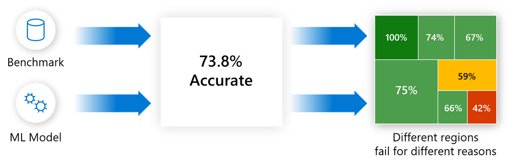
Error analysis moves away from aggregate accuracy metrics. It exposes the distribution of errors to developers in a transparent way, and it enables them to identify and diagnose errors efficiently.
The error analysis component of the Responsible AI dashboard provides machine learning practitioners with a deeper understanding of model failure distribution and helps them quickly identify erroneous cohorts of data. This component identifies the cohorts of data with a higher error rate versus the overall benchmark error rate. It contributes to the identification stage of the model lifecycle workflow through:
- A decision tree that reveals cohorts with high error rates.
- A heatmap that visualizes how input features affect the error rate across cohorts.
Discrepancies in errors might occur when the system underperforms for specific demographic groups or infrequently observed input cohorts in the training data.
The capabilities of this component come from the Error Analysis package, which generates model error profiles.
Use error analysis when you need to:
- Gain a deep understanding of how model failures are distributed across a dataset and across several input and feature dimensions.
- Break down the aggregate performance metrics to automatically discover erroneous cohorts in order to inform your targeted mitigation steps.
Error tree
Often, error patterns are complex and involve more than one or two features. Developers might have difficulty exploring all possible combinations of features to discover hidden data pockets with critical failures.
To alleviate the burden, the binary tree visualization automatically partitions the benchmark data into interpretable subgroups that have unexpectedly high or low error rates. In other words, the tree uses the input features to maximally separate model error from success. For each node that defines a data subgroup, users can investigate the following information:
- Error rate: A portion of instances in the node for which the model is incorrect. It's shown through the intensity of the red color.
- Error coverage: A portion of all errors that fall into the node. It's shown through the fill rate of the node.
- Data representation: The number of instances in each node of the error tree. It's shown through the thickness of the incoming edge to the node, along with the total number of instances in the node.

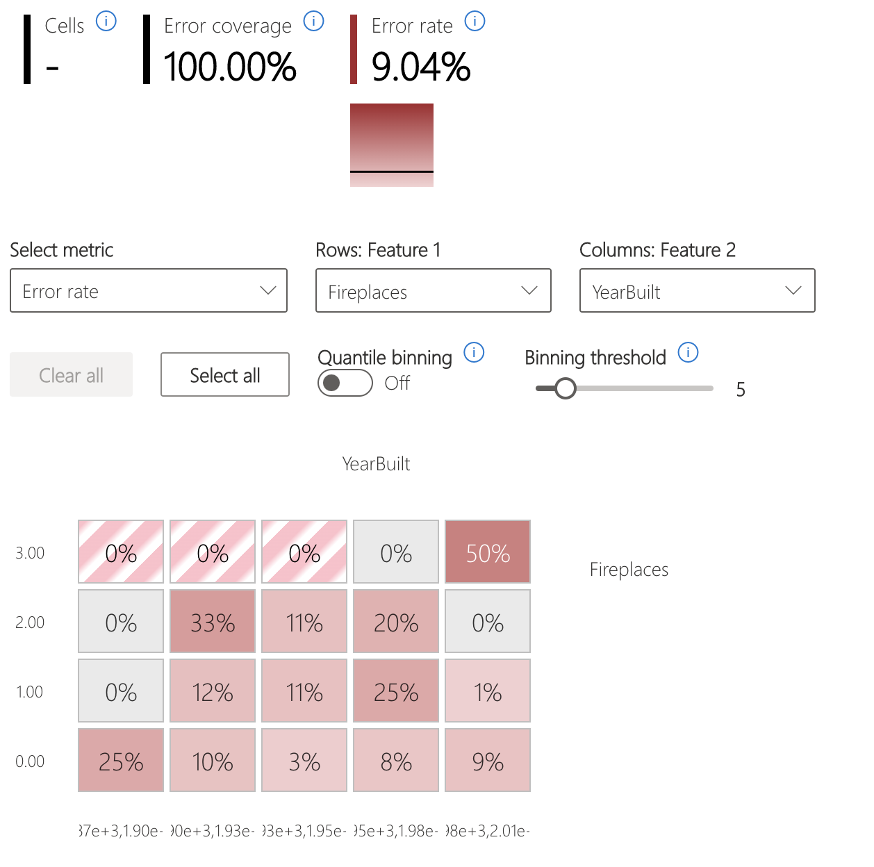
Error heatmap
The view slices the data based on a one-dimensional or two-dimensional grid of input features. Users can choose the input features of interest for analysis.
The heatmap visualizes cells with high error by using a darker red color to bring the user's attention to those regions. This feature is especially beneficial when the error themes are different across partitions, which happens often in practice. In this error identification view, the analysis is highly guided by the users and their knowledge or hypotheses of what features might be most important for understanding failures.
Next steps
- Learn how to generate the Responsible AI dashboard via CLI and SDK or Azure Machine Learning studio UI.
- Explore the supported error analysis visualizations.
- Learn how to generate a Responsible AI scorecard based on the insights observed in the Responsible AI dashboard.
Feedback
Coming soon: Throughout 2024 we will be phasing out GitHub Issues as the feedback mechanism for content and replacing it with a new feedback system. For more information see: https://aka.ms/ContentUserFeedback.
Submit and view feedback for