Azure Data Explorer Clusters Insights
Azure Data Explorer Clusters Insights provides comprehensive monitoring of your clusters by delivering a unified view of your cluster performance, operations, usage, and failures.
It offers:
- At-scale perspective. A snapshot view of your clusters' primary metrics helps you track performance of queries, ingestion, and export operations.
- Drill-down analysis. You can drill down into a particular Azure Data Explorer cluster to perform detailed analysis.
- Customization. You can change which metrics you want to see, modify or set thresholds that align with your limits, and save your own custom workbooks. Charts in a workbook can be pinned to Azure dashboards.
This article will help you understand how to onboard and use Azure Data Explorer Clusters Insights.
View from Azure Monitor (at-scale perspective)
From Azure Monitor, you can view the main performance metrics for the cluster. These metrics include information about queries, ingestion, and export operations from multiple clusters in your subscription. They can help you identify performance problems.
To view the performance of your clusters across all your subscriptions:
Sign in to the Azure portal.
Select Monitor from the left pane. In the Insights Hub section, select Azure Data Explorer Clusters.

Subscription overview tab
On the Overview tab for the selected subscription, the table displays interactive metrics for the Azure Data Explorer clusters grouped within the subscription. You can filter results based on the options that you select from the following dropdown lists:
Subscriptions: Only subscriptions that have Azure Data Explorer clusters are listed.
Azure Data Explorer clusters: By default, up to five clusters are pre-selected. If you select all or multiple clusters in the scope selector, up to 200 clusters will be returned.
Time Range: By default, the table displays the last 24 hours of information based on the corresponding selections made.
The counter tile, under the dropdown list, gives the total number of Azure Data Explorer clusters in the selected subscriptions and shows how many are selected. There are conditional color codings for the columns: Keep alive, CPU, Ingestion Utilization, and Cache Utilization. Orange-coded cells have values that aren't sustainable for the cluster.
To better understand what each of the metrics represent, we recommend reading through the documentation on Azure Data Explorer metrics.
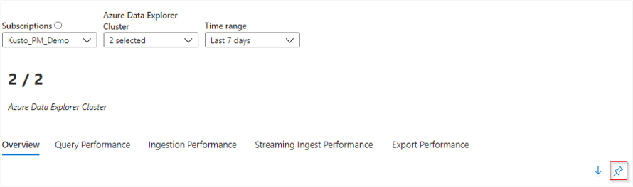
Query Performance tab
The Query Performance tab shows the query duration, the total number of concurrent queries, and the total number of throttled queries.

Ingestion Performance tab
The Ingestion Performance tab shows the ingestion latency, succeeded ingestion results, failed ingestion results, ingestion volume, and events processed for event hubs and IoT hubs.

Streaming Ingest Performance tab
The Streaming Ingest Performance tab provides information on the average data rate, average duration, and request rate.
Export Performance tab
The Export Performance tab provides information on exported records, lateness, pending count, and utilization percentage for continuous export operations.
View from an Azure Data Explorer Cluster resource (drill-down analysis)
To access Azure Data Explorer Clusters Insights directly from an Azure Data Explorer cluster:
In the Azure portal, select Azure Data Explorer Clusters.
From the list, choose an Azure Data Explorer cluster. In the monitoring section, select Insights.
You can also access these views by selecting the resource name of an Azure Data Explorer cluster from within the Azure Monitor Insights view.
Note
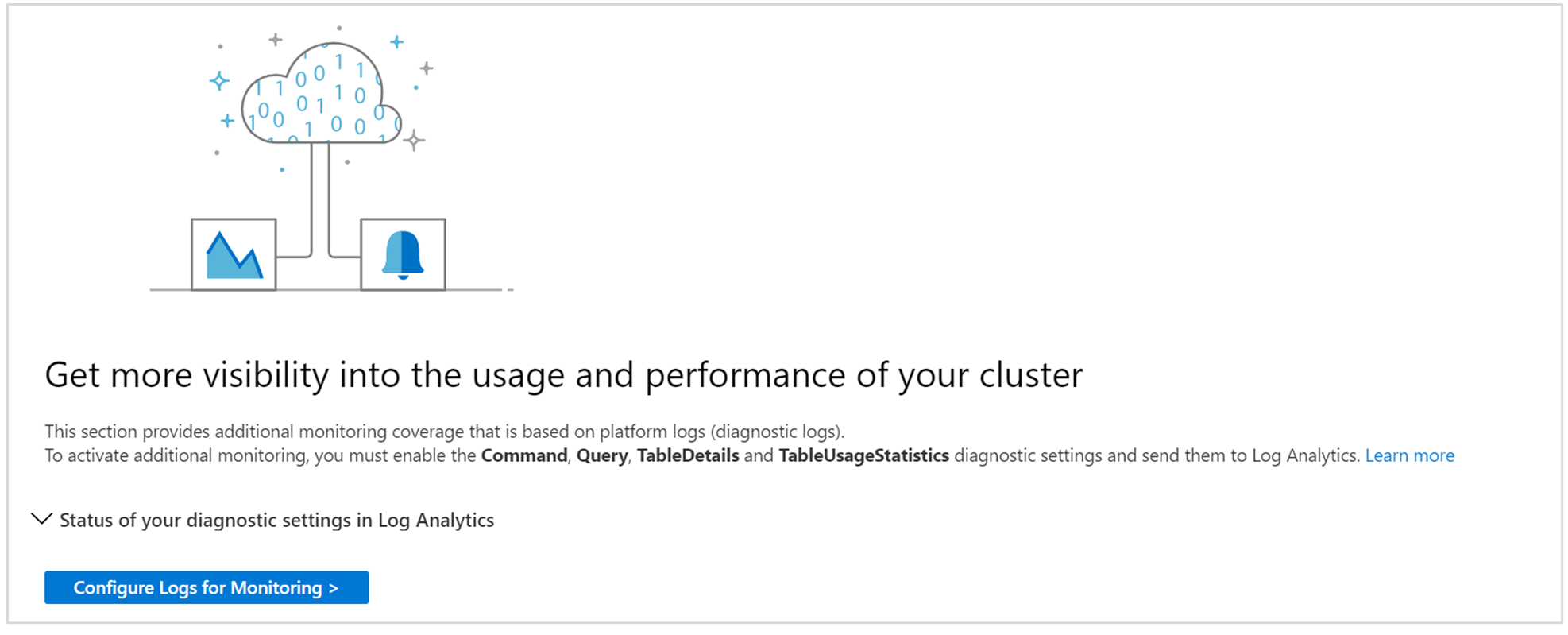
Azure Data Explorer Clusters Insights combines both logs and metrics to provide a global monitoring solution. The inclusion of logs-based visualizations requires users to enable diagnostic logging of their Azure Data Explorer cluster and send them to a Log Analytics workspace. The diagnostic logs that should be enabled are Command, Query, SucceededIngestion, FailedIngestion, IngestionBatching, TableDetails, and TableUsageStatistics. (Enabling SucceededIngestion logs might be costly. Enable them only if you need to monitor successful ingestions.)
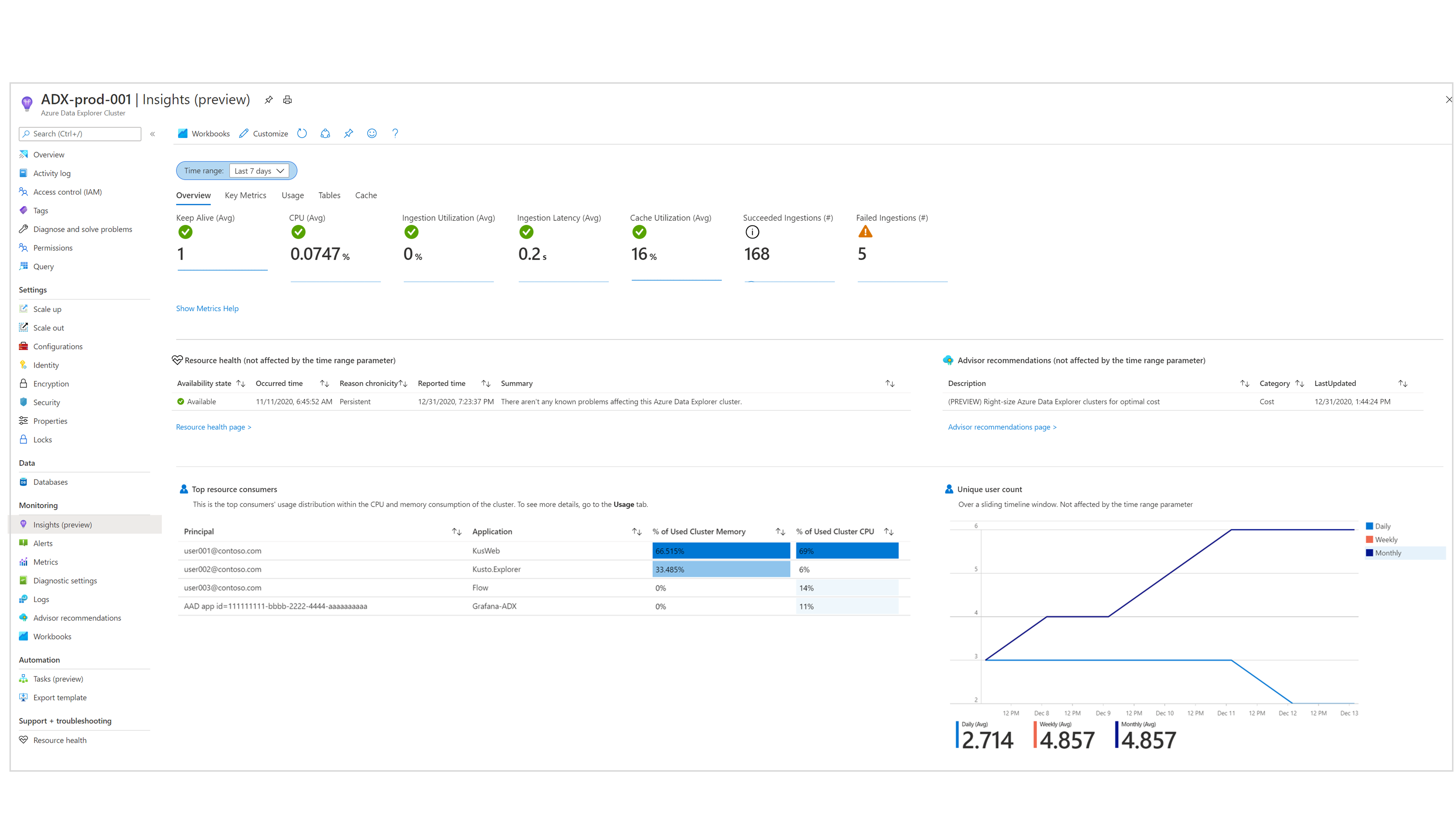
Overview tab
The Overview tab shows:
Metrics tiles that highlight the availability and overall status of the cluster for quick health assessment.
A summary of active Azure Advisor recommendations and resource health status.
Charts that show the top CPU and memory consumers and the number of unique users over time.
Key Metrics tab
The Key Metrics tab shows a unified view of some of the cluster's metrics. They're grouped into general metrics, query-related metrics, ingestion-related metrics, and streaming ingestion-related metrics.

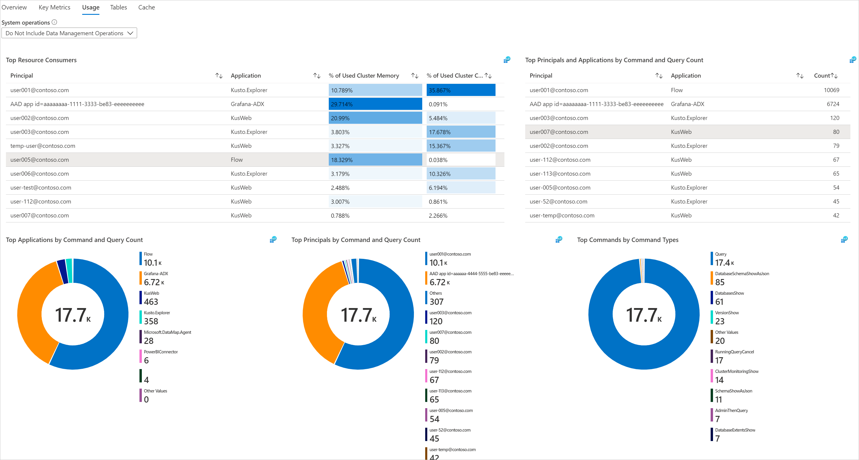
Usage tab
The Usage tab allows users to deep dive into the performance of the cluster's commands and queries. On this tab, you can:
- See which workload groups, users, and applications are sending the most queries or consuming the most CPU and memory. You can then understand which workloads are submitting the heaviest queries for the cluster to process.
- Identify top workload groups, users, and applications by failed queries.
- Identify recent changes in the number of queries, compared to the historical daily average (over the past 16 days), by workload group, user, and application.
- Identify trends and peaks in the number of queries, memory, and CPU consumption by workload group, user, application, and command type.
The Usage tab includes actions that are performed directly by users. Internal cluster operations aren't included in this tab.

Tables tab
The Tables tab shows the latest and historical properties of tables in the cluster. You can see which tables are consuming the most space. You can also track growth history by table size, hot data, and the number of rows over time.
Cache tab
The Cache tab allows users to analyze their actual queries' lookback window patterns and compare them to the configured cache policy (for each table). You can identify tables used by the most queries and tables that aren't queried at all, and adapt the cache policy accordingly.
You might get cache policy recommendations on specific tables in Azure Advisor. Currently, cache recommendations are available only from the main Azure Advisor dashboard. They're based on actual queries' lookback window in the past 30 days and an unoptimized cache policy for at least 95 percent of the queries.
Cache reduction recommendations in Azure Advisor are available for clusters that are "bounded by data." That means the cluster has low CPU and low ingestion utilization, but because of high data capacity, the cluster can't scale in or scale down.

Cluster Boundaries tab
The Cluster Boundaries tab displays the cluster boundaries based on your usage. On this tab, you can inspect the CPU, ingestion, and cache utilization. These metrics are scored as Low, Medium, or High. These metrics and scores are important when you're deciding on the optimal SKU and instance count for your cluster. They're taken into account in Azure Advisor SKU/size recommendations.
On this tab, you can select a metric tile and deep dive to understand its trend and how its score is decided. You can also view the Azure Advisor SKU/size recommendation for your cluster. For example, in the following image, you can see that all metrics are scored as Low. The cluster receives a cost recommendation that will allow it to scale in/down and save cost.

Ingestion tab (preview tab)
The Ingestion tab allows you to monitor the status of queued ingestion operations to the cluster.
In the queued ingestion process, data ingestion is optimized for high throughput. This is done by grouping small chunks of incoming data into batches based on a configurable ingestion batching policy.
The Ingestion tab gives you detailed information about the following:
- The result of the queued ingestion, by database or table granularity.
- Ingestion error details by table.
- The amount of ingested data.
- The latency of the queued ingestion and where it occurs.
- The batching process itself, including monitoring information about the ingestion batching policy and how the batches were sealed.
- For Event Hubs, Event Grid, and IoT Hub ingestions: The number of events received into the cluster and the number of events sent for actual ingestion.
Pin to an Azure dashboard
You can pin any one of the metric sections (of the "at-scale" perspective) to an Azure dashboard by selecting the pushpin icon at the upper right of the section.
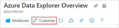
Customize Azure Data Explorer Clusters Insights
You can edit the workbook to customize it in support of your data analytics needs:
- Scope the workbook to always select a particular subscription or Azure Data Explorer clusters.
- Change metrics in the grid.
- Change thresholds or color rendering/coding.
You can begin customizations by selecting the Customize button on the top toolbar.
Customizations are saved to a custom workbook to prevent overwriting the default configuration in a published workbook. Workbooks are saved within a resource group, either in the My Reports section that's private to you or in the Shared Reports section that's accessible to everyone with access to the resource group. After you save the custom workbook, go to the workbook gallery to open it.
Troubleshooting
For general troubleshooting guidance, see Troubleshooting workbook-based insights.
The following sections will help you diagnose and troubleshoot of some of the common problems that you might encounter when using Azure Data Explorer Clusters Insights.
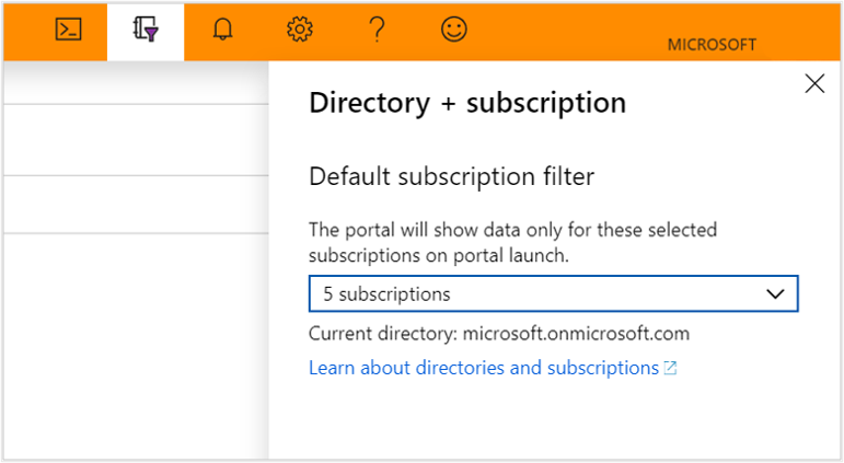
Why don't I see all my subscriptions in the subscription picker?
shows only subscriptions that contain Azure Data Explorer clusters chosen from the selected subscription filter. You select a subscription filter under Directory + subscription in the Azure portal.
Why don't I see any data for my Azure Data Explorer cluster under the Usage, Tables, or Cache section?
To view your logs-based data, you need to enable diagnostic logs for each Azure Data Explorer cluster that you want to monitor. You can do this under the diagnostic settings for each cluster. You'll need to send your data to a Log Analytics workspace. The diagnostic logs that should be enabled are Command, Query, TableDetails, and TableUsageStatistics.
I've already enabled logs for my Azure Data Explorer cluster. Why am I still unable to see my data under Commands and Queries?
Currently, diagnostic logs don't work retroactively. The data will start appearing after actions have been taken in Azure Data Explorer. It might take some time, ranging from hours to a day, depending on how active your Azure Data Explorer cluster is.
Note
In the Azure portal, the raw metrics data for the Metrics and Insights pages are stored in Azure Monitor. The queries on these pages query the raw metrics data directly to provide the most accurate results. When using the diagnostics settings feature, you can migrate the raw metrics data to the Log Analytics workspace. During the migration, some data precision may be lost due to rounding; hence, query results may vary slightly from the original data. The margin for error is less than one percent.
Related content
Обратна връзка
Очаквайте скоро: През цялата 2024 г. постепенно ще отстраняваме проблемите в GitHub като механизъм за обратна връзка за съдържание и ще го заменим с нова система за обратна връзка. За повече информация вижте: https://aka.ms/ContentUserFeedback.
Подаване и преглед на обратна връзка за