Two page design pattern
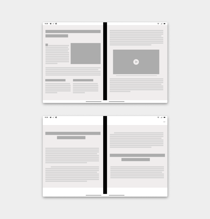
Leveraging the metaphor of a book, the two page pattern naturally tends to provide a book-like paging experience. You can use the natural boundary to show several items from a collection — like pages or pictures — which otherwise might have required the user to view one at a time.
Depending on your app, you could decide to paginate for two pages at once or advance one page at a time.
Best practices
Here are some scenarios to help guide you when applying this design pattern:

| Do | Don't |
|---|---|
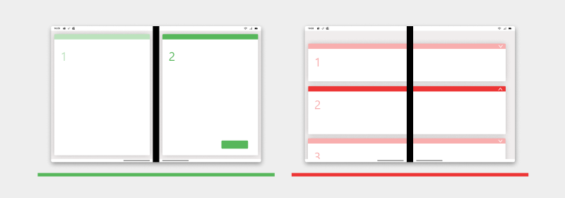
| Use two screens to have two completely separate page views. | Don't display the page across two screens passing under the hinge. |
| Do | Don't |
|---|---|
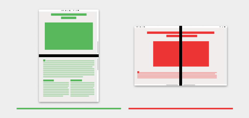
| Use two-page format to display actionable items for your onboarding/instructional content. | Don't display actionable items across two screens passing under the hinge. |
| Do | Don't |
|---|---|
| Display your content as a single page when the device is rotated into a double landscape. | Don't lock the orientation of the device. Allow the user to rotate the device to view content with a larger screen. |
| Do | Don't |
|---|---|
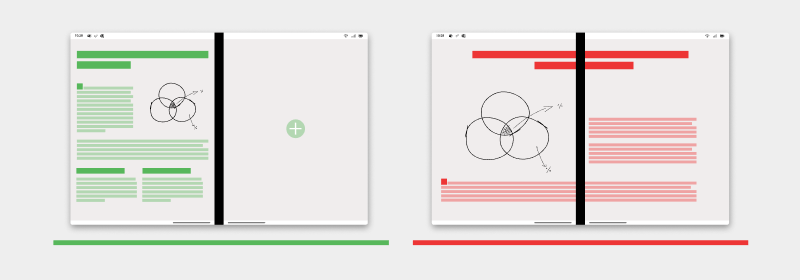
| Use an illustration or visual indicator on the second screen if your content only needs one screen. | Don't span a single page across two screens to fill up the space. |
Types of apps that may benefit from this pattern
- Document oriented app
- Apps with contents that are paginated
- Apps made for reading
- Apps with an itemized canvas, for example, notes, and art boards
Code examples
These projects show a simple implementation of the two page design pattern that you can use in your apps:
Next steps
Consider these other design patterns: