IoT Project for Anyone – Designing IoT Microsoft Power BI Dashboard
IoT Project for Anyone Blog Series:
This is one of a series of blogs developed as part of an overall IoT implementation project for beginners. The project will walk through the hardware needed, operating system installation, data collection and a Power BI dashboard to view the data. These blogs can be reviewed in sequence as part of the overall project or on their own if looking for information on a particular IoT topic.
Project Blog Index:
IoT for Anyone - Materials and Connections
IoT for Anyone - Windows 10 IoT Core Operating System Installation
IoT for Anyone - Raspbian Operating System Installation
IoT for Anyone - Power BI Streaming Dataset Setup
IoT for Anyone - Collecting and Streaming Data from Windows 10 IoT (coming soon)
IoT for Anyone - Collecting and Streaming Data from Raspbian Operating System
IoT for Anyone - Designing IoT Microsoft Power BI Dashboard (this blog)
Introduction:
Power Business Intelligence (Power BI) is an amazing product that enables those of us who are not data scientists and those of us who are perhaps graphically challenged to do many amazing things with data. The instructions below will walk you through one way to graphically represent the data being streamed. However, think about how you can change it to what you want. Keep in mind that you cannot break the dashboard, so after you get the data initially displayed play with the many settings offered. See what you can come up with!
Continuing with the articles in this blog series, we now have temperature and humidity data being collected by our Raspberry Pi running either the Windows 10 IoT Core or Raspbian operating system. So now, how do we graphically display this data in a Power BI dashboard? For some readers of this blog series you may be new to Power BI and looking for more information. Below are several overview references:
Several of the steps below were originally published in Sirui Sun's blog called "Building a Real-Time IoT Dashboard with Power BI: A Step-by-Step Tutorial." I have added additional instructions for readers who may unfamiliar with the Power BI interface and provided a few additional ways to display the data.
Logon to the Power BI account you used in an earlier blog to create the streaming dataset at powerbi.microsoft.com.
Expand the workspace on the left side of the screens by clicking on the three lined icon.

Click on the My Workspace area. Because this is a new workspace, no Dashboards should be seen.

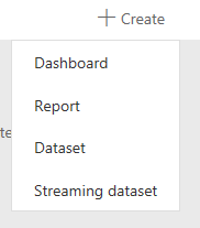
Click on the +Create option on the upper right to being the creation of a new PowerBI dashboard. In the drop down window, select Dashboard.
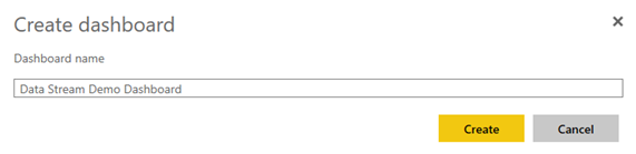
Give your new dashboard a name.
With the dashboard now created, we can start to define the display of our data. On the top of the new dashboard, click + Add tile.

Select the Real-Time Data option for Custom Streaming Data.

Click Next.
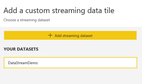
On the next screen to Add a custom streaming data tile, select the dataset shown and then click Next at the bottom of the screen.
Under Visualization Type, choose "Card." Under the "Fields" area, select temperature.
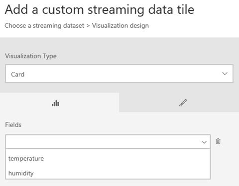
Provide a Title and Subtitle for the new Tile. I supplied the values below. When done, click "Apply."
Title: Temperature
Subtitle: Fahrenheit

The result is the tile below:

Next, we'll create a few live data streaming areas for a more active view of the data being collected. Begin again by clicking +Add tile.

Select the Real-Time Data option for Custom Streaming Data.
On the next screen to Add a custom streaming data tile, select the dataset shown and then click Next at the bottom of the screen.

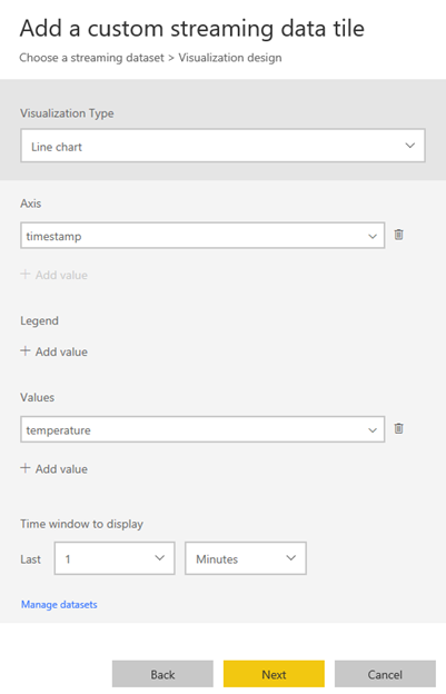
Under Visualization Type, this time choose the "Line Chart" option. Also choose the Axis, Values and Time options according to the screen options below. Click Next when complete.
Axis: timestamp
Values: temperature
Time window to display: 1 minute
Repeat the steps above starting with step 15. Use the same values except for the Time Window to Display. Instead of using the default of one minute, choose the time frame of 60 minutes as shown in the picture below.
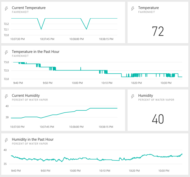
When complete, you will now have three tiles on your screen, each with streaming data from your Raspberry Pi. Using the drag and drop capabilities within the Power BI Dashboard Designer, rearrange the data sets to your preference. Below is my display of the unit running in my climate controlled home office.

Repeat the steps above starting with Step 7, but instead of using Temperature, use the Humidity field for each item. Below is my new view that includes Temperature readings as well as my new Humidity data view.
As a test of your live data stream, cup your hands over the sensor and breath onto it. The humidity and temperature should increase rapidly. Below is the impact on my sensor data, displaying the spike.
