Top 10 Windows 8 App Mistakes
This is a talk I have given internally at Microsoft for people building apps on their own, and training external developers on building Windows 8 apps. I talk with a lot of developers who are building apps, many have already published and are not happy with their app response in the market. Most of them are making a lot of simple mistakes. This list is against general apps, not games specifically. I have entire discussion for game developers as well, maybe I will do that as a post later.
Universal Mistakes cause users to be unhappy
Apps may survive having a few of these problems, but maybe they are getting 2 star reviews or poor user engagement. Users don’t know why they are not happy in most cases, but the result is that they are leaving bad reviews and not engaging with the developer.
Passing certification is not enough
There are a number of small things that don’t cost much in terms of time or effort. You will spend far less time than you did building your app, and will help get more people to be happy with your application. Spending some time polishing your app goes a long way for customer satisfaction.
 Windows 8 App Mistake #10
Default Splash screen and icon should never be left at the default.
Even most users know this is the default icon by now. It will actually fail certification now, but it was allowed for a long time.
Establish a brand through color and iconography. The start of the app, and the way it looks on the start screen, are important ways to establish a color theme and brand with the user. They need to start to identify your brand when using your products.
Don’t include your app name in the icon, Windows already has a great display of the text name for the package. It is ok to include your app name or company logo on the splash screen, but really try to showcase the app.
 Windows 8 App Mistake #9
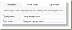
DeveloperAppNameDoesntWork
End users don’t want to read camel cased naming, and it also makes it impossible for search engines to get the individual words out of that mess. You want to make it easy for people to find your app, not hard.
Here are some quick tips for your app naming:
- Make sure the name fits under a small tile.
- Make sure you modify the app properties to include a nice name – takes a few minutes
- Abbreviations are ok, as long as the user learns them. This is how they will search for the app from the start screen, so make it memorable.
- Don’t use another apps name in yours (Flappy Bird, Clash of Clans, etc). Don’t get a takedown notice because of your name.
Windows 8 App Mistake #8
Keywords are precious. Don’t use your app name as a keyword in the app store. The name is already included in the text results, and has a heavier result weight than the keywords.
Additional hints for keywords:
- Use phrases if users are likely to search on them (Doesn’t have to be a single word)
- App marketing around chosen keywords
- Use those same keywords in tweets, blog posts, etc about the app
- For the app shown I would put a tweet that says Disney Family Trivia app. People will search on different parts of phrases they might remember
Windows 8 App Mistake #7
First user experience is key. You have 30 seconds to grab that user. Adding an application walk through is a great way to get people over that initial 30 seconds. Long boring tutorial is NOT the answer. Allow users to drop out quickly, and then resume the tutorial when they hit a new area of the application.
Hidden features will never be found. If you have an advanced feature that most users are not finding (see the mistake about analytics, you should know which features are being used!), add a guide to show it to users. Don’t be afraid to ask the user if they would like to learn more about something in the app. These type of just in time training within the application allows users to expand their knowledge of your application over time.
Seriously consider adding a what’s new guide for each new release. Especially if you have added new features that may not be obvious to the user. You need to guide them to find the features you work so hard on implementing. Don’t assume users will read the update notes in the store description. Most never go back to the store and view your app once they have it installed.
Additional tip for the first 30 second experience
Hand your app to someone who knows nothing about it. Watch them for the first 30 seconds (no talking, no pointing, nothing!). It will be painful to watch them explore the app and wander around, but you will learn a lot about how users experience your app for the first time.
 Windows 8 App Mistake #6
In app advertising should appear to be a part of the application experience, not a banner ad!
Users do not like ads, especially banner ads. Don’t put them in as banners or users will ignore them. Remember that Bing Ads for Windows 8 do NOT pay per click, so just showing them on the screen is enough.
Look at the Bing Sports, and Bing Finance apps that ship with Windows 8 for good example of how to make the ad a part of the content without being obtrusive.
Additional thoughts around advertising
- Never put an ad where users can accidentally click on it (makes them mad)
- Give a way for users to buy their way out of ads
- $1.99 to remove ads will make more money than you would off showing them ads
- Consider using multiple ad networks to rotate through ads and avoid low fill rate issues
- Create ads for your other apps to show when offline or no ads returned from ad network
- Always have something to show, and highlight your other apps!
 Windows 8 App Mistake #5
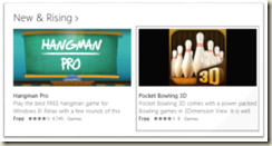
Ship regular updates to your apps. This is your chance to engage the users, provide feedback to them on progress, and just let them know the app is alive and well.
After shipping an update with lots of user downloads you may see yourself in the “New & Rising” category of the store. It is not automatic, but based upon the number of users who download and run the update.
Users get bored with perfectly working apps that are never updated. How else do you explain so many Twitter clients? Users are always returning to the store looking for new clients to their favorite services.
Update your store screenshots
Would you use a sports app for your favorite team that shows a season two years old in the screen shot? Update those screen shots if you have time sensitive content in them as well.
 Windows 8 App Mistake #4
Capture user feedback. If you don’t give users a way to interact with you they will choose your marketplace reviews to do it. That is not where you want to get negative suggestions or feedback. Always give users a way to reach out and interact with you. They will feel more empowered and a part of the community for the app.
I always create a twitter account for each of my apps (or group of apps in the case of sports apps). That allows me to interact with users, and I put it the handle in the splash screen. I get tweets from users, followers, and most important thing to me is the community it gives to the app. I have tried using twitter as a way to broadcast to users (show them at app startup) with mixed success. It really depends on the type of app you are building. But always give a way to get feedback, even if it is just a launch to the mail client using a generic app email address.
Windows 8 App Mistake #3
Paid app, with a free trial that never expires. This has to be one of the worst strategies to monetize your app. You want to get free users, then put the app in the free section. If you want people to pay only when they like it, add an in app purchase to “support the developer” or something like that. You will get 10x or more downloads from the free section of the store, and that larger base of users will mean you make a lot more money. Free apps with ads, and an in app purchase to remove them will make more money than a free trial of a paid app.
A paid app without a trial will never succeed. But a trial should be just that, somehow limited or expiring at some point. Free trial forever just makes no sense. Trial apps are unique to the Windows platforms, and they do have their place, but not without limits.
Build a minimum viable product
Imagine instead you have a free app that includes basic functionality, this is your minimum viable product. Maybe it doesn’t support live tiles, or notifications, social features, or online backup. These are all things you can charge for outside the base functionality.
Then app four or five features that not everyone will use, but they have to pay for individually. A few users will buy them all, but most will only buy what they want. This gives you a huge base of free users, and you will make more from those who are willing to pay for features. Three $1.99 purchases are worth more than a single app purchase as well. You can then also engage the users and add features they request, for a fee of course.
I have much, much more to say about monetization, but I will save that for a future blog post.
 Windows 8 App Mistake #2
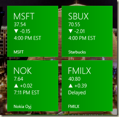
Live tiles should be… well, alive!
Never include a tile to the app that does nothing. Make users want to launch the app! Give them a call to action. New news is available, your friend replied to you, come see the latest sales, etc. All of these call to actions make a user want to launch the app
Notice the image here is all tiles for Bing Finance to different stocks. Each has information that is valuable without launching the app, but clicking on it takes you directly to that stock, not the general finance start screen. This is known as deep linking.
Deep linking
The stock tiles are a good example of this in action, but there are many others. If there is a feature that users use frequently and it is not on the launch page of the app you should include a way for users to launch directly to it. Think about 4 square as an example. Most frequently users are checking in places. If you had to launch the app, navigate to check in, and then press the location that is too many steps. Create a tile called check in and let the user get straight to that spot in the app. These type of interactions are also unique to Windows devices, take advantage of them!
Tile Sizes
Never create a double wide tile without having some sort of dynamic content. You are just wasting users screen space. Leave a single width tile for static content. Also don’t forget that the extra small tiles can only show little badges, no content.
 Windows 8 App Mistake #1
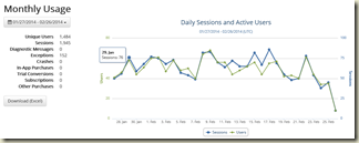
In App Analytics are not optional. There are truly free options available for any size developer up until you get millions of users. So there is no excuse not to use one of these services.
Example of questions you should always be able to answer:
- How many users are still running version 1.0?
- Do users use feature X?
- How many users run the app in snapped mode?
- Does anyone create secondary live tiles?
- How long does the average user spend in your app?
- Do you have any unhandled exceptions in your app?
- How many users have actually run your app this month?
I have articles on the blog covering how to add these types of services to your apps with services like MarkedUp. A basic version checker and number of users can be done in minutes. Getting features and screens instrumented can take a little longer, but more less than it took to build those features.
Thank you
Thanks for reading this far down the list! Hope this was super useful to you and you will take some of these suggestions to heart. I have seen apps that implemented all of these go from being 1 and 2 stars apps to 4 stars. The app was solid to begin with, it just needed some polish to make it more engaging to the users.