The Start of something new
By Rotimi Olumide, Business Group Director, Windows Division at Microsoft
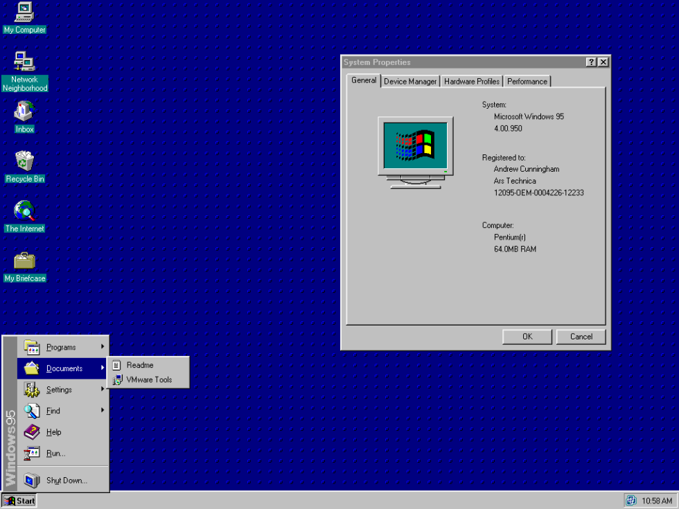 The year was 1995 and a whole new world had opened up for Windows 95 users with the introduction of the Start menu. I’m sure I’m not the only one who remembers the sequence: Start > Programs > Accessories > Games > Solitaire; the ultimate distraction on a slow afternoon at the office. More seriously though, it made finding and opening programs (for work or play) much simpler and it represented Microsoft’s forward thinking.
In the past 20 years, the Start menu has gone through several facelifts and even had its day as a full screen with the launch of Windows 8. Now, with the recent launch of Windows 10, we have created a Start menu that will feel familiar, and yet embraces the touch experience along with the feedback we have received from you over the years.
But let’s take a few steps back to where it all started…
After the Start menu made its debut with Windows 95, at a time when the Web was still an experiment and you had to drive to a store to buy software. You no longer needed to use Program Manager to find what you were looking for, as the menu was an obvious and quick place for people to start their computing tasks. The feature became synonymous with Windows, and all through the eras of Windows NT 4.x, Windows 98, Windows 98 SE, Windows Me and Windows 2000, we took the stance, “If it ain’t broke, don’t fix it”.
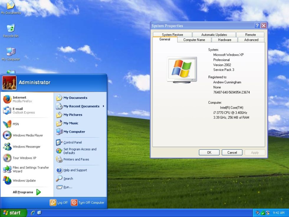
With the debut of Windows XP, it was time for a Start makeover, and the menu was revamped to include two columns and more customisation options, as well as quick access to documents, pictures and personal files. Again, with Vista and Windows 7, Start remained mostly the same other than a few minor fixes to improve its functionality, as well as the introduction of instant search to find what you wanted even more quickly.
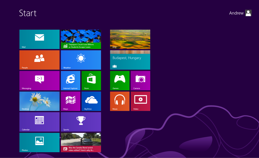
The biggest change came in 2012 with the birth of Windows 8 and our plans to unify tablets and desktops. The Start menu became the Start screen and used live tiles instead of the familiar bars and columns. This gave us room to improve search and customisation, but perhaps this was a little too far off from the Start menu you were all so accustomed to. Since we released Windows 8.1 we have overhauled our approach to development, focusing on your feedback.
Starting with what works
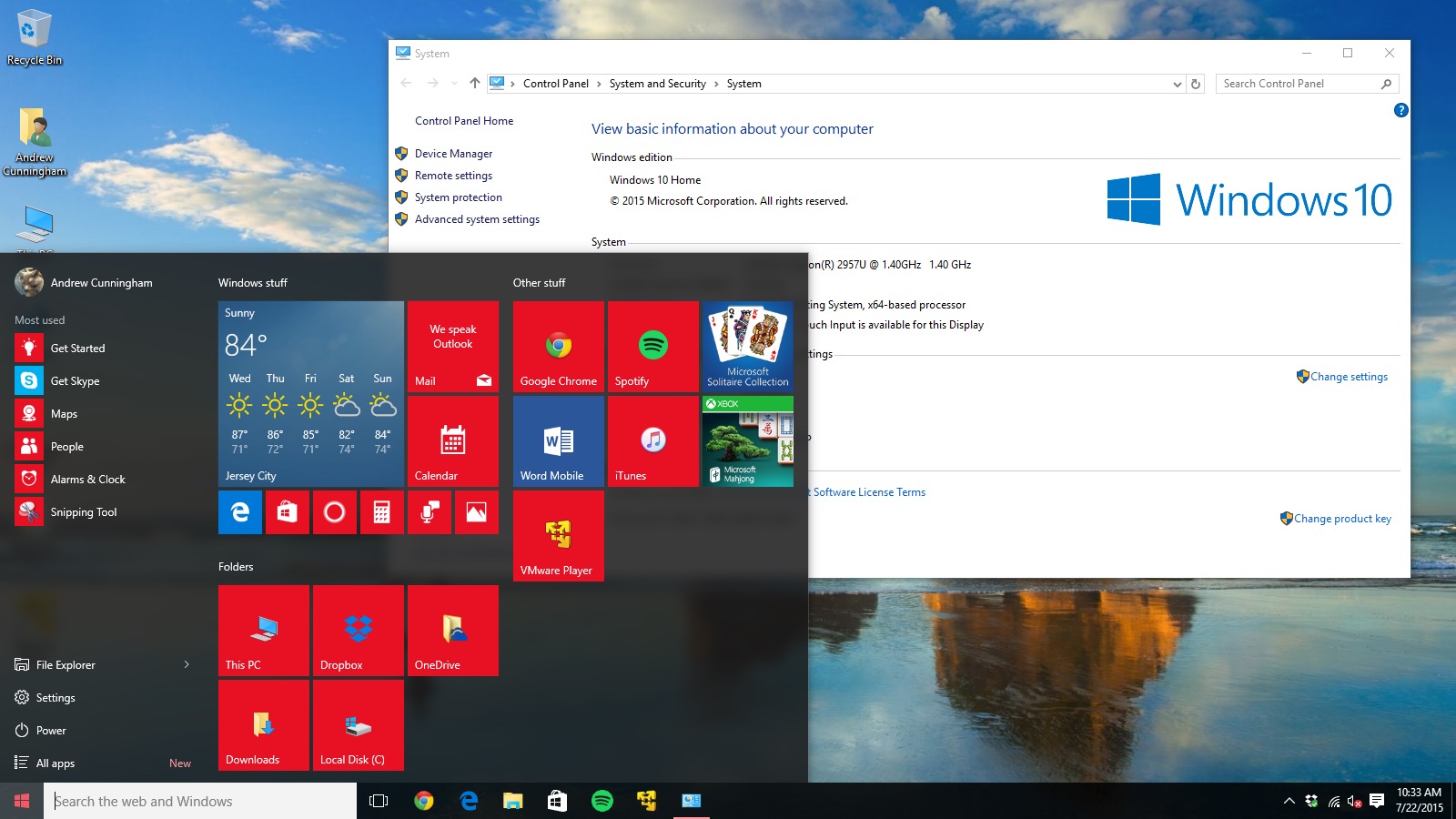 So now with Windows 10 we’ve gone back to a proper Start menu. Our new operating system combines the basic efficiency that you loved about the very first Start menu (you’ll see the similarity to the Windows 7 days), but it also incorporates live tiles in a less offensive way – and you can still go full screen if you choose. In the age of personalisation, you can also expect more customisation than ever before, from changing the background colour of the menu, to choosing which “system” (Control Panel, Documents) items appear, and how many live tiles there are. Our goal was to make working on the desktop much easier with a mouse and keyboard, as well as when you use a touch device.
The environment around Windows has changed a lot since we first introduced Start and we want to make sure we’re still delivering an experience that is dynamic and relevant to your needs. The Start menu is one of the most visible and iconic parts of Windows, so we don’t take any changes to it lightly – and in many ways we’ve come full circle with the launch of Windows 10.