Considerations around the accessibility of a WinForms Store app
This post describes considerations around the accessibility of an app, including where the app is accessible by default, what important gaps in its accessibility need to be addressed, and how the experience can be elevated from being technically accessible to being more intuitive and efficient. While the particular app discussed is a Windows Forms (WinForms) app, the principles around accessibility apply to any type of app.
Apology up-front: When I uploaded this post to the blog site, the images did not get uploaded with the alt text that I'd set on them. So far, I've not been able to fix that. In the meantime, all images are followed by a title.
Introduction
Some time back I was contacted by an organization in the Netherlands who work with people who have low vision, and they were interested in finding an app which could help spotlight were keyboard focus is. As a result, I built a WinForms app, (called Herbi HocusFocus,) which renders a configurable rectangle around the control with keyboard focus. I described my experiences building the app at A real-world example of quickly building a simple assistive technology app with Windows UI Automation. The app has some limitations today, (such as not working at menus, including the Start menu,) but overall it seemed fairly useful. My hope is that I'll be able to prioritize addressing some of its current limitations based on feedback from people using it.
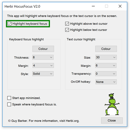
Figure 1: The Herbi HocusFocus app for highlighting keyboard focus and the text cursor.
I specifically built the app as a desktop app rather than a Store app, because at the time, a Store app couldn't access the UI Automation (UIA) client API. My app depends on UIA to learn when keyboard focus moves from one control to another, and to determine what the bounding rectangle is for the control that gains keyboard focus. (As far as I know, a Store app still can't use the UIA client API.) I had hoped that one day, I'd be able to upload the app to the Microsoft Store, and that would mean that a lot more people could try it out and let me know how I could make it more useful to them. So it was of great interest to me to learn about the Desktop Bridge, which apparently can help make a desktop app available at the Store.
So I downloaded version 15.4 of the free Visual Studio Community Edition, and followed the instructions at Package an app by using Visual Studio (Desktop Bridge). I created a Windows Application Packaging Project which referenced my WinForms app project, and created an appx package. This was all pretty straightforward really. I've not actually been able to upload the appx package to the Store yet, as I keep getting told I don't have permissions, so I'm looking into that.
In parallel to doing the above, I registered the app at the Store, and went through some of the steps relating to providing information about the app. On the "Product declarations" page, I reached the following very interesting checkbox.

Figure 2: A checkbox labelled "This product has been tested to meet accessibility guidelines".
When I reached that checkbox, my first thought was "Yeah, I'm using standard WinForms controls, with no customizations – my app's accessible". But then, with my finger hovering over the checkbox, I paused for a moment and wondered – is there any way I can improve the accessibility of the app? Even if the app is largely accessible by default, are there any gaps in its accessibility which I can address, or opportunities where I can elevate the experience from being technically accessible, to being more intuitive and efficient to use? If I can make the app more usable through a few simple steps, why on earth wouldn't I?
That sounded like an interesting exploration to me.
The considerations fall into the following four areas:
1. Considerations which don't currently impact my app.
2. Considerations around the default accessibility of the app.
3. Considerations around functionality where I must take action.
4. Considerations where I can elevate the default experience.
For anyone wanting to learn more about exactly how the app achieves its results, visit Herbi HocusFocus V2.0 source code to download the full Visual Studio project.
Narrator is one of many assistive technology (AT) solutions for Windows
While I often refer to the Narrator screen reader in this post, it is one of a number of AT solutions available for Windows which use UIA. Different solutions have their own specific ways of reacting to UIA data. And even within Narrator itself, it might choose to announce two pieces of UI in a different way, despite them having some logical similarity. For example, today Narrator will announce things like "1 of 3", "2 of 3" etc when moving through items in a list, but not when moving through items in a menu.
When considering how Narrator reacts to our UI, we must stay focused on the UIA representation of the UI. Our goal is to deliver a UIA interface that matches the semantics of the app as closely as possible, and we'd never change the UI in such a way that the Narrator experience is apparently enhanced, but the UIA representation is degraded. To do so could have a severe impact on other AT which leverage the UIA data, and also potentially impact the experience with some future version of Narrator.
How do I know all the ways in which my customer will interact with the app?
I don't.
Every now and again, people might ask you how many people will be interacting with your app in some specific way, along with a suggestion that maybe the work to add some related functionality to the app isn't justified. For example, how many people will be using keyboard input, and customizing some of the visuals shown on the screen, and using a screen reader, and using some other functionality in the app? Well, I don't know the answer to that, and I don't care. As far as I'm concerned, my app should be usable to all my customers regardless of what combinations of interaction methods they use. A customer who's blind and is using Narrator might be setting up the app for someone else, and so that customer needs to know what color the keyboard focus feedback is, regardless of whether they consume those visuals themselves. I'm sure there's a whole host of real-world scenarios that I'm not aware of, and I'm not going to let my limited experience limit what my app enables.
Considerations which don't currently impact my app
The following are some considerations which for this particular app, didn't impact my customers due to the specifics of what the app currently does. But as the app evolves over time, I must keep these in mind, as they could have an extremely important impact on the customer experience.
Audio
If the app generates any audio, (for example, speech output from video or from text-to-speech, or notifications of events,) my customers who are deaf or hard of hearing must be able to fully leverage the information associated with that audio.
Conveying information through the use of color
If the app conveys important information through the use of color, then color must never be the only way that that information is conveyed. My customers who are color blind might require that information is also conveyed through the use of text or shapes. My post at Considerations around the accessibility of a calendar control gives one example of how I managed the use of color in another app.
Zoom
I expect the app to be fully functional when my customer has zoomed the display to be twice as large as the default size. No content should be clipped at that increased zoom level unless there's an intuitive and efficient way to bring the clipped content into view. Given that my Surface Book uses a default display scaling of 200%, I set a custom scaling level of 400%, and verified that no UI was clipped as a result.
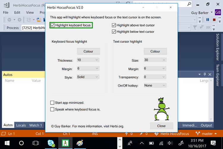
Figure 3: The Herbi HocusFocus app shown completely in view when the machine's display scaling is set to 400%.
Personal note: A few years ago, I helped a family member to scale up everything shown on their laptop, and this really helped her leverage all that the apps she used had to offer. We both thought this scaling feature was great until she invoked a dialog with its OK and Cancel buttons clipped off the bottom of the screen, with no way to access those buttons. Hopefully Windows doesn't contain any UI like that now.
Timeouts for transient visuals
If the app presents transient UI, (for example, a notification popup which may or may not have interactable controls in it,) my customers might require that the UI remains available for a specific minimum time. So if my customers have selected a specific time period at the "Show notifications for" setting in the Ease of Access Settings app, then I must respect that.
Animations
If the app presents any animated visuals, then it must respect my customers choice at the "Play animations in Windows" setting in the Ease of Access Settings app.
Note: Interop code for accessing the "Show notifications for" and "Play animations in Windows" settings is included in the source code for the Herbi HocusFocus app, even though the app doesn't call it today.
Flashing
If the app contains flashing visuals, then there's a seizure risk for my customers. In order to reduce that risk, I'd follow the general guidelines of not presenting UI which flashes more than three times per second. As it happens, today my app shows no flashing visuals.
Change notifications
Some apps show static text labels which get updated to reflect some important current information, and if the information is not conveyed to the customer at the time it becomes available, that would significantly degrade the experience. (One approach for addressing that is described at Let your customers know of important status changes in your WinForms app.) Today my app doesn't show any changing static text labels.
Considerations around the default accessibility of the app
The following are some considerations around the default accessibility of the app. This level of "accessible by default" is all made possible thanks to the huge amount of work that the WinForms framework automatically does on my behalf, based on my use of standard WinForms controls in the app.
Default contrast of text against its background
By default, I want the text shown in the app to be as efficient to consume as possible. If a customer has to scrutinize text because its contrast against its background is low, then that disrupts the experience – and no-one wants that. I like to present visuals that follow the W3C web standard that text should have a contrast of at least 4.5:1. That value is far from arbitrary, and much research has gone into it. If for some reason I start customizing the colors shown in the app, then there are free tools for determining the contrast of text against its background. But for this app, I don't have to get involved with any of that, because I know the WinForms framework will render the text shown in my app with a sufficient contrast against its background.
The following screenshot shows demonstration custom colors being used on a button. In that case, the button text has a contrast against its background of 3.3:1, and I consider that quite insufficient for my customers.
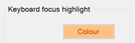
Figure 4: A button showing demonstration colors resulting in insufficient contrast between the text shown on the button and its background.
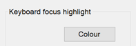
Figure 5: Default colors being used for a static text label and an enabled button, providing sufficient contrast for my customers.
Support for high contrast themes
When a high contrast theme is active, WinForms will automatically render the controls in my app using colors appropriate to the active high contrast theme. So regardless of whether that theme is High Contrast Black or High Contrast White, or has been customized to show specific colors that work best for the customer, I can feel confident that my app is as usable as possible to my customer.
Keyboard accessibility
With the exception of the color picker control, (which will be discussed later,) all interactable controls are fully accessible to my customers who only use the keyboard. Three of the fundamental aspects of keyboard accessibility are met automatically for all controls in my app. These being: (i) my customer can use the keyboard to move keyboard focus to all interactable controls, (ii) visual keyboard focus feedback is shown to indicate which control has keyboard focus, and (iii) all functionality associated with the control can be accessed through the keyboard once it has keyboard focus.
Note that by default those three requirements must be met, but there are some uncommon cases where a piece of interactable UI doesn't need to be able to get keyboard focus, so long as there's an intuitive and efficient alternate way to access the functionality associated with the UI. For example, a 'X' at the right end of a search field might not be tabbable, if a press of the Escape key in the search field achieves the same effect.
All controls in my app can be reached through use of the Tab key, (and keyboard focus never gets stuck anywhere,) and the tabbing experience is symmetric such that the order of controls reached through Shift+Tab is the reverse of the Tab order. This symmetric nature of the tab order really helps with predictability.
I also get support for standard keyboard methods of interacting with controls. For example, a Button is invoked through a press of the Space key or Enter key, a Checkbox is toggled through a press of the Space key, and a ComboBox has its dropdown shown through a press of Alt+DownArrow.
Note: Sometimes I find it interesting to compare how a desktop app control reacts with keyboard input, to the spec'd behaviors described for web UI at the working draft WAI-ARIA Authoring Practices 1.1. (While ARIA doesn't affect keyboard behaviors, that site does contain some keyboard-related information.) In the ideal world, a customer would have the same experience at a control, regardless of whether it's defined with (say) Win32, WinForms, WPF, UWP XAML or HTML. As far as I can tell, the keyboard experience at my WinForms app's Buttons and Checkboxes exactly matches that described for web UI at Button and Checkbox.
And don't forget, when we're thinking about keyboard accessibility, that includes both physical and on-screen keyboards. Given that the app worked fine with a physical keyboard, I could feel confident that it would work fine with the Windows On-Screen Keyboard too.
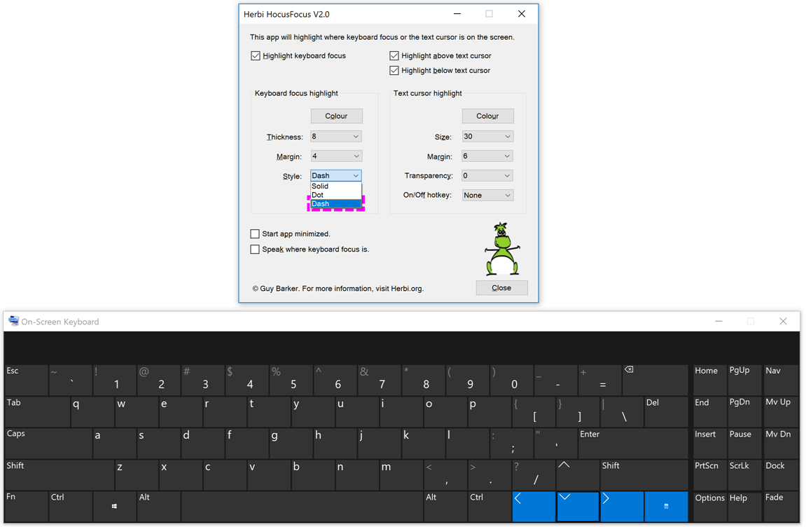
Figure 6: The Windows On-Screen Keyboard being used in its Scan mode to move through a ComboBox's dropdown list in the Herbi HocusFocus app.
Programmatic accessibility
Again, with the exception of the color picker control, WinForms will automatically expose information about the app's UI through the UIA API, and will enable assistive technology apps such as screen readers to control the UI through that API.
I can't overstress the importance here of all the work that the WinForms framework has done for me and my customers. It's exposed a large set of UIA properties, whose values are appropriately based on the definition and state of the controls, and exposed various UIA patterns, based on the behaviors supported by the controls.
For example, the screenshot below shows the Inspect SDK tool reporting UIA properties associated with a Checkbox in the app, and that the Checkbox supports the UIA Toggle pattern, and that the ToggleState property accessed through the Toggle pattern has a value of "On". That value means that the Checkbox is checked in the app.
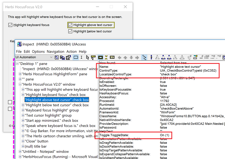
Figure 7: The Inspect SDK tool reporting the UIA ToggleState property of a checked Checkbox in the app.
Another important aspect of programmatic accessibility that WinForms takes care of for me relates to the structure of the UI. Visually my UI can show a GroupBox, which contains a ComboBox, which contains a dropdown list of items. My customers using Narrator should expect that structure to be conveyed to them. If the GroupBox, ComboBox and items were all exposed as siblings of each other, that structural information is lost.
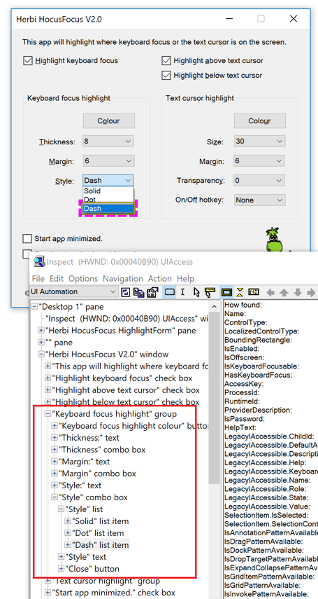
Figure 8: The Inspect SDK tool reporting the structure of UI, with a hierarchy of a Group, ComboBox, List, and set of List Items.
And yet one more aspect of programmatic accessibility which WinForms takes care of for me, relates to UIA events. UIA events are raised by UI when something changes in the app, and assistive technology tools such as screen readers need to have an opportunity to react. For example, if a Checkbox's state changes, then WinForms would raise a UIA ToggleStatePropertyChanged event. Another example relates to when keyboard focus moves from one control to another in the app. When focus moves, Windows Magnifier needs to be notified so that the magnified view can be updated to bring the control gaining focus into view. So as my customer tabs from one control to another, WinForms automatically raises a UIA FocusChanged event, and Magnifier reacts accordingly. And this means that because I'm using standard WinForms controls, I can feel confident that the experience is as it needs to be for my customers using Windows Magnifier.
Figure 9: A checkbox is brought into the magnified view as keyboard focus moves to the checkbox.
Important: WinForms apps built on the latest version of the .NET Framework, (version 4.7.1,) are more accessible than ever by default. This includes enhanced support for UIA, which leads to a fuller experience with any assistive technology UIA client app such as Narrator, and also enhanced support for high contrast themes. For specific examples of accessibility improvements to the WinForms framework, visit the "Windows Forms Accessibility improvements" section at Announcing the .NET Framework 4.7.1. For details on how your WinForms app can leverage all these new accessibility improvements, visit Accessibility improvements in Windows Forms controls.
Considerations around functionality where I must take action
While the WinForms framework did provide a great deal of accessibility by default, the following are considerations where I felt I needed to take additional action before I could declare the app to be accessible.
Tab order
Visual Studio makes it really easy for me to rearrange the controls on a form, and I always take advantage of that. As the app evolves and I add more functionality to it, I'll move controls around until I arrive at what I feel is an intuitively grouped and ordered layout. But often, "grouped and ordered" here tends to unintentionally apply only to some of my customers; those who are sighted and interact with the app via touch or mouse. It's essential that I also provide a logical order of controls for my customers who use the keyboard.
And as it happens, Visual Studio makes it easy for me to define the path that keyboard focus will take as my customers tab through the UI. I go to the View menu, select Tab Order, and click on the controls in the order my customers need keyboard focus to flow through the app. (In addition to clicking with the mouse, the order can also be specified by tabbing through the controls in the designer, and pressing Enter when at the control of interest.)
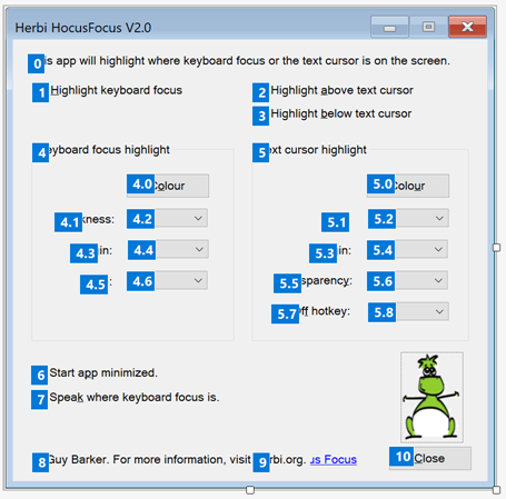
Figure 10: Visual Studio reporting the tab order for the controls shown in the app.
While I always include static text labels when defining the logical path through the UI, WinForms will not include labels in the tab order. This is appropriate, as by default a customer will not expect keyboard focus to move to a control, unless the control is interactable. If my customer can tab to a static label, they'll wonder why they've been taken there.
Important: Do not force a static label to be in the tab order, simply in order to have a screen reader announce it as your customer tabs through your UI. That will lead to confusion, given that in almost all cases, a static label does not get keyboard focus. Screen readers provide specific methods of accessing static labels which do not involve tabbing to move keyboard focus to the label. For example, when my app's main window appears, my customer using Narrator could do CapsLock+W to have the full contents of the window announced, or could use Narrator's Scan mode to move through the UI, including through the static labels.
Order of elements in the UIA tree
We ship all apps with two interfaces that our customers leverage. One of those interfaces is the visual one, where traditionally most devs spent so much time tuning to a very high quality. There's no way we'd ship two adjacent buttons that are misaligned by a pixel! There's also the programmatic interface exposed through the UIA API, which historically has been neglected, but which is increasingly getting more and more attention these days. Why would we not want to deliver a high-quality experience to all our customers, regardless of which app interface they leverage?
So just as the visual order and the tab order of controls are critically important to our customers, so is the order of elements exposed programmatically through UIA. And just as there's a good chance that the tab order is broken by default and needs attention, there's a very good chance that the programmatic order is also broken by default and needs attention. Fixing the tab order through the Tab Order action mentioned above, does not fix the programmatic order.
The UIA programmatic order is based on the order in which the controls are added to the form in the designer file, and that's based on the order in which the dev added the controls to the form. So to change the programmatic order, the designer C# needs to be manually edited, and the lines of code which add the controls to the form reordered. (This applies to adding the controls which are direct children of the form, and also the order in which controls are added to groups on the form.) By the way, I mentioned this topic recently at Common approaches for enhancing the programmatic accessibility of your Win32, WinForms and WPF apps: Part 3 – WinForms.
The screenshot below shows the calls to add the controls to the form in the designer C# file, and the Inspect SDK tool reporting the UIA tree of elements associated with the running app. The order of the elements shown in Inspect matches the order in which the controls are added to the form.
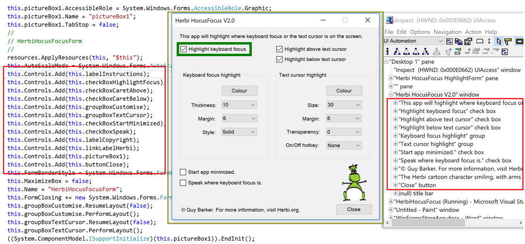
Figure 11: The Inspect SDK tool showing that the order of the elements being exposed through UIA matches the order in which the controls are added to the form.
It might seem a tad tedious to have to manually edit the form like this, but in my experience, the main challenge is just remembering to do it. Even with my background, I completely forgot to do this for the first version of the app. This meant that the app was badly broken. Any customer which navigated through the controls based on the order of the elements in the UIA tree would move unexpectedly from a label to a control not logically related to the label at all. Their navigation path bounced around the form all over the place. I can't believe any customer provided with this experience would actually continue to use the app.
So I need to make sure the step of verifying the order of elements exposed through UIA is on my checklist of things to verify before a release of the app, along with such things as verifying the tab order. If I've added any controls, or done such things as "Bring to Front" or "Send to Back" on any of the controls, then there's probably some tweaking I need to do. For this particular app, it's actually pretty quick to do this. And if I don't do it, I really can't claim my app is accessible.
An accessible color picker
An important feature in the app is to provide a way to customize the color in which the custom keyboard focus visuals are rendered. So my first version of the app used the standard WinForms ColorDialog. This worked great for me initially, when I was using touch or the mouse to interact with it. But I then discovered that I couldn't use the keyboard to select a color, and I also found that the UIA representation of the dialog didn't expose information about all the important aspects of the UI. So this meant I couldn't use this dialog, and still claim my app is accessible.
Important: Now some might say, "I don't get what the problem is. A customer can still use Narrator with the keyboard to select a color". Indeed. The customer can't arrow through the grid of colors and quickly pick the color they want, but they can invoke the "Define custom colors" button, move to the Red edit control, type in the red RGB value, move to the Green edit control, type in the green RGB value, move to the Blue edit control, type in the blue RGB value, invoke the "Add to custom colors" button, and invoke the OK button. Really? This is one of those situations where I'd say if it's not efficient for my customers to use my app, then it's not accessible.
So I then wondered if I could use interop to call Win32's ChooseColor(), and have the Win32 color picker dialog shown. But it turns out that that's not fully accessible either. And that's not too surprising given that the WinForms ColorDialog is mostly a wrapper around the Win32 color picker. If the Win32 dialog isn't accessible, then the WinForms dialog won't be accessible either.
As a result of all this, I decided to create my own color picker UI. I felt a fixed set of colors would be sufficient for current versions of the app, and if I get feedback to the contrary, I'd continue working on it. I'd need a set of colors with accessible names to base my custom UI on, and decided to model it on WordPad's color dropdown. That has fifteen colors, and I could use the Inspect SDK tool to access the UIA Name properties of the colors. For my color picker, I also added a "White" item, given that that might be preferred by some customers who use a light-on-dark high contrast theme.
The screenshot below shows my color picker UI, with the Inspect SDK tool reporting the accessible names of the items in the list of colors. My customers using the keyboard can arrow around until they reach their preferred color, and then press Enter to select it.
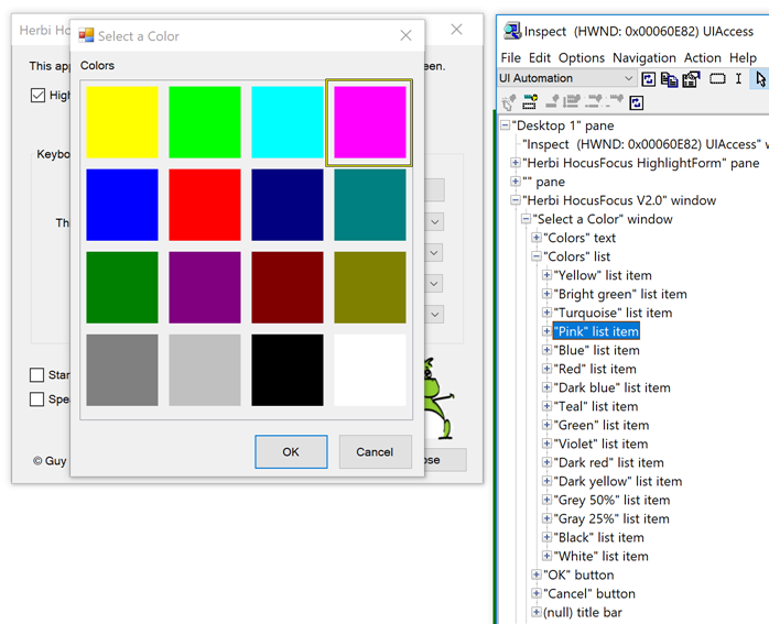
Figure 12: The Inspect SDK tool reporting the accessible names of the items shown in the app's custom color picker UI.
The following is the text that Narrator sends to the text-to-speech engine as I tab to the Color button, invoke it, and then arrow around the list of colors. During this I issued the Narrator command to turn off its scan mode navigation, and when I reached the Pink color, I pressed CapsLock+D to learn where this item was in the list.
Scan Off
Tab
Keyboard focus highlight, Keyboard focus highlight colour, button, Alt+ o,
Space
Select a Color, Green, <spell>9</spell> of 16, selected,
Scan Off
Up Arrow
Blue, selected,
Up Arrow
Yellow, selected,
Right Arrow
Bright green, selected,
Turquoise, selected,
Pink, selected,
Caps Lock
Pink, <spell>4</spell> of 16, selected,
Enter
Note that whenever there's custom rendering going on, we need to consider the experience when customers have specifically changed their display scaling. For this app, this affects the rendering of the tiles in the custom color picker. I render the colored rectangle based on the tile size, but this needs to account for the size of the UI at run-time, not design-time. So rather than using a hard-coded tile size, using whatever display scaling was active when I built the app, I calculate the tile size based on the size of the ListView at run-time. That ListView's reported size changes depending on my customer's choice of display scaling.
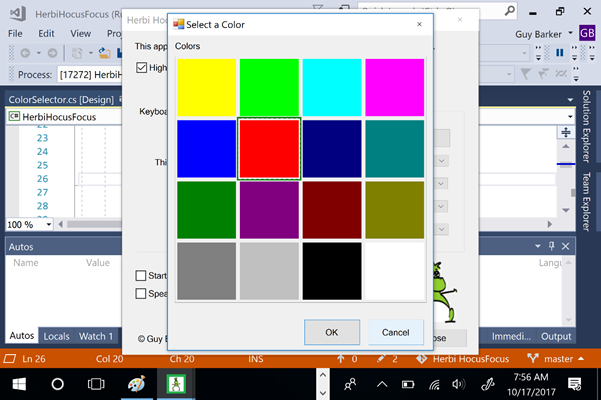
Figure 13: The custom-rendered tiles in the color picker UI appear as expected when the display scaling is set to 400%.
Considerations where I can elevate the default experience
Technically, I'd imagine that the previously described changes to set the tab order and order of elements in the UIA tree, and to add a fully accessible color picker, would be enough for me to declare the app as accessible. But I'm always interested in opportunities to elevate the experience beyond being technically accessible, such that it's as intuitive and efficient as it's practical for me to make it. The considerations below are an attempt to achieve that.
Important: As I was considering enhancements which would lead to a change in the default UIA representation of the app, I stopped to consider what impact this might have on all assistive technology solutions that use UIA. That is, is the experience I'm after not being provided by default because the UIA data isn't as I feel it needs to be, or because Narrator happens to behave in some particular way today? For the two relevant topics discussed below, (that is, multiple buttons with the same UIA Name property, and an image being exposed with a ControlType property of something other than Image,) I felt that it was appropriate to take action which would lead to the UIA representation changing. Customers interacting with my app using any AT that uses UIA would benefit from that.
Add access keys to all controls
Just because all controls in an app are in the tab order, doesn't mean that the app provides a good keyboard experience. If my customer needs to press Tab (say) twenty times to reach a commonly used control, then that'll get very irritating very quick. While the Herbi HocusFocus app doesn't have a great many controls in its UI, I was still interested in providing a more efficient way to access all the controls. As such, I added access keys to all controls, by including ampersands in the text associated with each control. This simple step makes all the app's functionality really quick to access via the keyboard. Few things in a dev's life have such a great effort-to-benefit ratio.
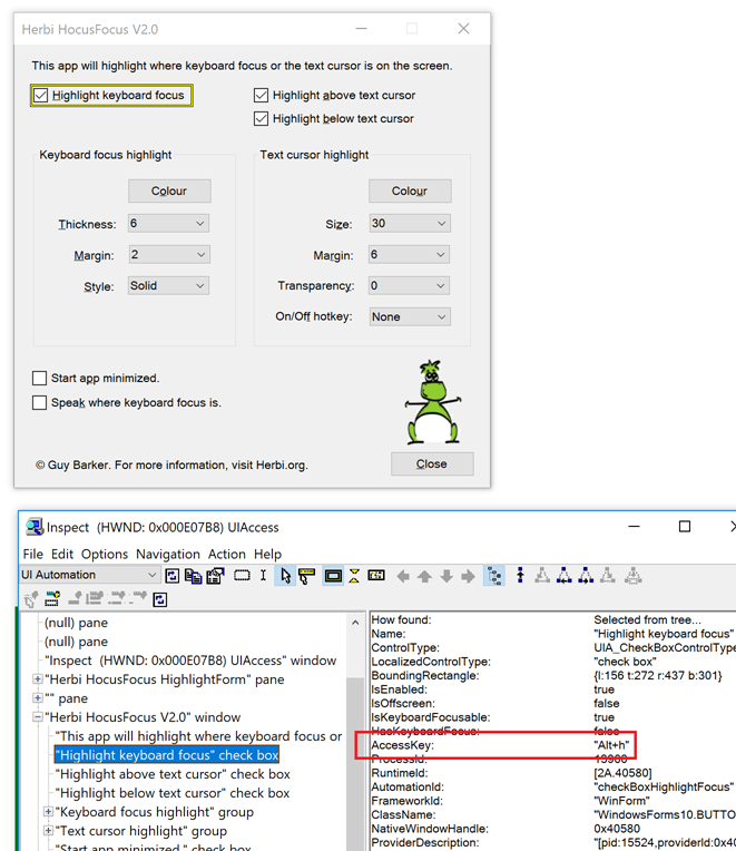
Figure 14: The app showing access keys with underlines in control text, and the Inspect SDK tool reporting that information through the UIA AccessKey property.
Unique names for controls
Your customer needs the UIA Name property of your controls to be accurate, concise, localized, and unique. A classic problem for the customer is when they encounter a page which contains multiple links, all named "Learn more". If they issue a screen reader command to get a list of all links in the page, they get presented with a bunch of links called "Learn more" and no additional context, and they can't know what each link relates to. This really isn't a good experience.
So I always consider whether any of the UIA Names of my controls aren't unique, and sure enough, I had two buttons called "Colour". If my customer were to encounter a "Color" button in a list of controls in the UI, they won't know what the color relates to. To address this, I set unique accessible names on those two buttons.
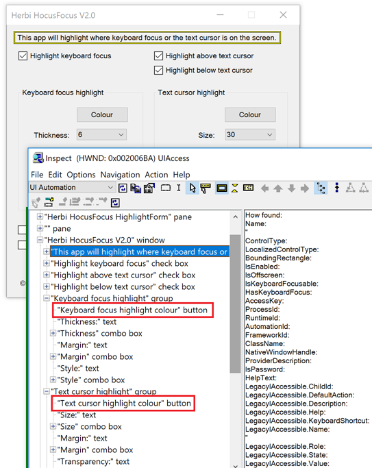
Figure 15: The Inspect SDK tool reporting the unique accessible names of the two buttons which both visually show the text "Colour".
Note: Depending on Narrator's current context verbosity setting, when my customer tabs to a control inside a WinForms Group control, Narrator might announce both the name of the control and the name of the Group. So with the change I'd made to the accessible names of the buttons in the app, there can now be duplication in the Narrator announcement. Despite this possibility, I still felt it was really important that the buttons have unique names, and tried to achieve this while keeping the names concise.
Bonus tip: Regarding the point on providing unique accessible names for a collection of "Learn more" links on a page, as far as I know, this isn't a straightforward as it might seem. If the LinkLabel's AccessibleName or AccessibilityObject.Name is set, that doesn't affect the element that receives keyboard focus when your customer tabs to it. The only way I know of to set the accessible name of the element that does get focus, is to create a new class, derived from LinkLabel. Give that class a custom AccessibleObject derived from ControlAccessibleObject, and override the Name property. The challenge is that I think it also requires the Role, State and DoDefaultAction() to be overridden. I've done this in tests, and it seems to work ok. I hope to share that source at some point.
Narrator access to an image in the app
If an image conveys important information, then that information must be accessible to customers using Narrator. But if an image is purely decorative, then it might only serve to be a distraction if the customer encounters it, and so it's preferable in that case if the image isn't exposed through UIA. So when I considered the image shown in the Herbi HocusFocus app, I had to ask myself whether the image is purely decorative or not. In the end, I decided that I did want the image to be exposed to customers using Narrator.
This required two steps on my part. By default, a WinForms PictureBox control is exposed through UIA with a ControlType of Pane. Given that I've decided that I do want my customers to learn of the image, I need to make sure that it gets exposed through UIA with the most appropriate ControlType. So in Visual Studio's Properties pane, I changed the AccessibleRole of the PictureBox to be Graphic. By doing so, the element gets exposed through UIA as having a ControlType of Image. An additional consequence of doing this is that my customers using Narrator can navigate to the image. (Today a customer using Narrator can't reach a Pane element, regardless of Narrator's navigation mode, but Narrator's Item and Scan navigation modes can reach an element whose ControlType is Image.) The next step was to make sure the image had an accurate and concise accessible name, which I also set through Visual Studio's Properties pane for the image.
Presenting an image using colors appropriate for the active high contrast themes
By default, if my app shows an image, I'd like the image to be as useful as possible when a high contrast theme is active. This means that when the app starts, and when the state of high contrast changes while the app's running, the app always presents a light-on-dark or dark-on-light image if appropriate. This is made practical by checking SystemInformation.HighContrast, and the brightness of the system's control background color relative to the control foreground color, and also to set up a UserPreferenceChanged event handler.
The screenshot below shows a light-on-dark image has been set on the Image control in response to the High Contrast #1 theme being made active. Inspect is reporting the accessible name of the Image control.
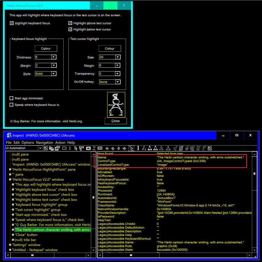
Figure 16: The Inspect SDK tool reporting the UIA Name and ControlType on a WinForms PictureBox control, with everything shown in high contrast.
Summary
Whatever type of app I'm building, I always want to take advantage of all the work that the UI framework can do for me, to make my app as usable as possible for all my customers by default. And I do that by using standard controls and widgets that come with the framework. So whether I use a PUSHBUTTON, System.Windows.Forms.Button, System.Windows.Controls.Button, Windows.UI.Xaml.Controls.Button, or <button>, I can feel confident that the framework will take a lot of action relating to colors, keyboard accessibility and programmatic accessibility, such that in many ways the UI is accessible by default.
In addition, it is my responsibility as the app developer to understand where there may be gaps in the accessibility of the app, and if at all practical plug those gaps. In the case of the Herbi HocusFocus app, one such area is to make sure the controls in the app provide both a tab order and a programmatic order that are intuitive for my customers. That step is straightforward for me, so long as I make sure to include it on my pre-release checklist. The other issue I needed to address was to provide a fully accessible color picker. While that feature was rather more work than I'd originally hoped, I'm pleased with the results, and all being well, I won't spend any more time on that in the future.
Perhaps the most interesting part of this exploration, was considering how the experience can be elevated beyond being technically accessible. We take pride in the quality of the experience that we deliver for all our customers, and we strive for the most intuitive, productive and efficient experience for everyone.
That said, I'm sure I'll have missed some opportunities to enhance the experience. I'm always learning from others on how technology can be used, or should be usable, in a variety of ways. So if I am successful in getting the Herbi HocusFocus app to the Microsoft Store at some point, please do let me know how it can be made more usable to you.
I'll look forward to hearing from you!
Guy