Filled map in Azure Maps Power BI visual
Filled maps use varying degrees of shading, tinting or different patterns to provide a visual display that quickly shows differences in values across a geography or region. Showing these relative differences with shading that ranges from light (less-frequent/lower) to dark (more-frequent/more) is a useful way to quickly convey pertinent information to viewers.

This image shows an example of a filled map. The map of America shows each state with a different shade that represents the sales by state. A viewer can immediately see that California has the most sales followed by Texas, then Florida.
When to use a filled map
Filled maps can be a great choice:
- To display quantitative information on a map.
- To show spatial patterns and relationships.
- When your data is standardized.
- When working with socioeconomic data.
- When defined regions are important.
- To get an overview of the distribution across geographic locations.
Some common uses for filled maps include:
- Visualize sales or revenue results by country/region or state.
- Visualize election results where the color represents the party that won and the shading represent the margin of victory.
- Visualize unemployment rates by region, state or county.
Prerequisites
This article uses Sales and Marketing Sample PBIX as the data source for demonstration purposes. You can create a new report using this data before continuing if you wish to follow along.
Filled map settings
There are two places where you can adjust filled maps settings: Build and format visuals. Both are located in the Visualizations pane.
Build visuals
| Setting Name | Description | Setting values |
|---|---|---|
| Shape | Configure fill transparency in a geometry on the map | 0-100% |
| Colors | Use meters or pixels as unit to visualize the data. Default: Pixels | Set colors for different data category or gradient for numeric data. |
| Border | Sets the border color, width and transparency | Color picker Width 1-10 pixels Transparency 0-100% |
| Min zoom | Minimum zoom level the layer is visible at. Default: 0 | Integer (0 - 22) |
| Max zoom | Maximum zoom level the layer is visible at. Default: 22 | Integer (0 - 22) |
| Options | Specify the position of the layer relative to other map layers | Drop down menu: Above labels Below labels Below roads |
Tip
You can use Conditional formatting in the Colors setting to set the field that your map is based on, as demonstrated in the Create a filled map section.
Format visuals
| Bucket | Description |
|---|---|
| Location | Geospatial area with a boundary, such as country/region, state, city, county or postal code. Street and address aren't supported in filled map. |
| Legend | Categorical data that is used to shade the map. |
| Tool Tips (optional) | Determined the data/columns that would be shown in tool tips. |
Create a filled map
From the Fields pane, select the Geo > State field. Notice that it populates the Location field in the Visualizations pane.
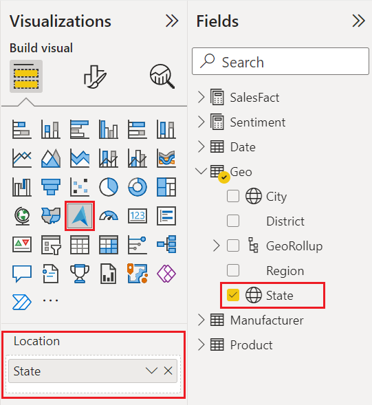
Select Sales $ from the SalesFact table and drag it to the Tooltips field in the Visualizations pane.
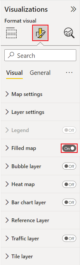
In the Visualizations pane, select Format your visual
Set Filled map to On
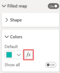
Select Filled maps to expand that section then select Colors.
Select Conditional formatting.
The Default color - Filled map dialog should appear, select the What field should we base this on? Drop down, then select Sales $ from the SalesFact table.
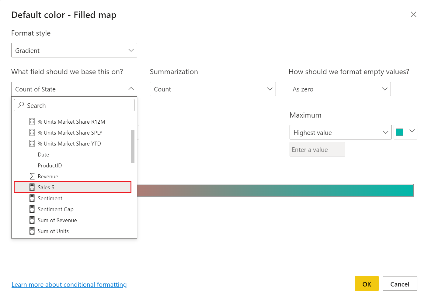
Set the Minimum color to white then select the OK button.
The map should appear with varying degrees of shading depicting the relative sales. Since this data only includes numbers for the continental United States, you can filter out Alaska if you wish.
Filter the map to display only the continental United States.
a. To the left of the "Visualizations" pane, look for the "Filters" pane. Expand it if it's minimized.
b. Hover over State and select the expand chevron.
c. Place a check mark next to Select all and remove the check mark next to AK.


Next steps
Change how your data is displayed on the map:
Add more context to the map:
Customize the visual:
Feedback
Coming soon: Throughout 2024 we will be phasing out GitHub Issues as the feedback mechanism for content and replacing it with a new feedback system. For more information see: https://aka.ms/ContentUserFeedback.
Submit and view feedback for