Visualize data
Azure Synapse is an integrated analytics service that accelerates time to insight, across data warehouses and big data analytics systems. Data visualization is a key component in being able to gain insight into your data. It helps make big and small data easier for humans to understand. It also makes it easier to detect patterns, trends, and outliers in groups of data.
When using Apache Spark in Azure Synapse Analytics, there are various built-in options to help you visualize your data, including Synapse notebook chart options, access to popular open-source libraries, and integration with Synapse SQL and Power BI.
Notebook chart options
When using an Azure Synapse notebook, you can turn your tabular results view into a customized chart using chart options. Here, you can visualize your data without having to write any code.
display(df) function
The display function allows you to turn SQL queries and Apache Spark dataframes and RDDs into rich data visualizations. The display function can be used on dataframes or RDDs created in PySpark, Scala, Java, R, and .NET.
To access the chart options:
The output of
%%sqlmagic commands appear in the rendered table view by default. You can also calldisplay(df)on Spark DataFrames or Resilient Distributed Datasets (RDD) function to produce the rendered table view.Once you have a rendered table view, switch to the Chart View.

You can now customize your visualization by specifying the following values:
Configuration Description Chart Type The displayfunction supports a wide range of chart types, including bar charts, scatter plots, line graphs, and moreKey Specify the range of values for the x-axis Value Specify the range of values for the y-axis values Series Group Used to determine the groups for the aggregation Aggregation Method to aggregate data in your visualization Note
By default the
display(df)function will only take the first 1000 rows of the data to render the charts. Check the Aggregation over all results and click the Apply button, you will apply the chart generation from the whole dataset. A Spark job will be triggered when the chart setting changes. Please note that it may take several minutes to complete the calculation and render the chart.Once done, you can view and interact with your final visualization!
display(df) statistic details
You can use display(df, summary = true) to check the statistics summary of a given Apache Spark DataFrame that include the column name, column type, unique values, and missing values for each column. You can also select on specific column to see its minimum value, maximum value, mean value and standard deviation.

displayHTML() option
Azure Synapse Analytics notebooks support HTML graphics using the displayHTML function.
The following image is an example of creating visualizations using D3.js.
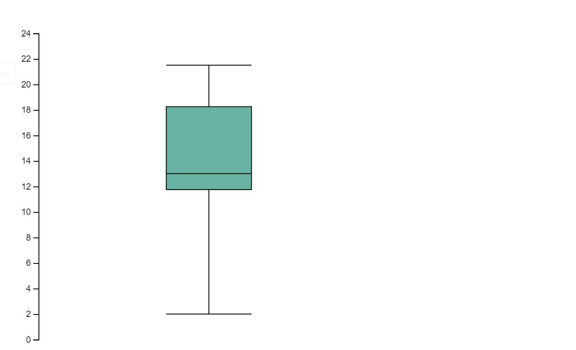
Run the following code to create the visualization above.
displayHTML("""<!DOCTYPE html>
<meta charset="utf-8">

<!-- Load d3.js -->
<script src="https://d3js.org/d3.v4.js"></script>

<!-- Create a div where the graph will take place -->
<div id="my_dataviz"></div>
<script>

// set the dimensions and margins of the graph
var margin = {top: 10, right: 30, bottom: 30, left: 40},
  width = 400 - margin.left - margin.right,
  height = 400 - margin.top - margin.bottom;

// append the svg object to the body of the page
var svg = d3.select("#my_dataviz")
.append("svg")
  .attr("width", width + margin.left + margin.right)
  .attr("height", height + margin.top + margin.bottom)
.append("g")
  .attr("transform",
        "translate(" + margin.left + "," + margin.top + ")");

// Create Data
var data = [12,19,11,13,12,22,13,4,15,16,18,19,20,12,11,9]

// Compute summary statistics used for the box:
var data_sorted = data.sort(d3.ascending)
var q1 = d3.quantile(data_sorted, .25)
var median = d3.quantile(data_sorted, .5)
var q3 = d3.quantile(data_sorted, .75)
var interQuantileRange = q3 - q1
var min = q1 - 1.5 * interQuantileRange
var max = q1 + 1.5 * interQuantileRange

// Show the Y scale
var y = d3.scaleLinear()
  .domain([0,24])
  .range([height, 0]);
svg.call(d3.axisLeft(y))

// a few features for the box
var center = 200
var width = 100

// Show the main vertical line
svg
.append("line")
  .attr("x1", center)
  .attr("x2", center)
  .attr("y1", y(min) )
  .attr("y2", y(max) )
  .attr("stroke", "black")

// Show the box
svg
.append("rect")
  .attr("x", center - width/2)
  .attr("y", y(q3) )
  .attr("height", (y(q1)-y(q3)) )
  .attr("width", width )
  .attr("stroke", "black")
  .style("fill", "#69b3a2")

// show median, min and max horizontal lines
svg
.selectAll("toto")
.data([min, median, max])
.enter()
.append("line")
  .attr("x1", center-width/2)
  .attr("x2", center+width/2)
  .attr("y1", function(d){ return(y(d))} )
  .attr("y2", function(d){ return(y(d))} )
  .attr("stroke", "black")
</script>

"""
)
Python Libraries
When it comes to data visualization, Python offers multiple graphing libraries that come packed with many different features. By default, every Apache Spark Pool in Azure Synapse Analytics contains a set of curated and popular open-source libraries. You can also add or manage additional libraries & versions by using the Azure Synapse Analytics library management capabilities.
Matplotlib
You can render standard plotting libraries, like Matplotlib, using the built-in rendering functions for each library.
The following image is an example of creating a bar chart using Matplotlib.

Run the following sample code to draw the image above.
# Bar chart

import matplotlib.pyplot as plt

x1 = [1, 3, 4, 5, 6, 7, 9]
y1 = [4, 7, 2, 4, 7, 8, 3]

x2 = [2, 4, 6, 8, 10]
y2 = [5, 6, 2, 6, 2]

plt.bar(x1, y1, label="Blue Bar", color='b')
plt.bar(x2, y2, label="Green Bar", color='g')
plt.plot()

plt.xlabel("bar number")
plt.ylabel("bar height")
plt.title("Bar Chart Example")
plt.legend()
plt.show()
Bokeh
You can render HTML or interactive libraries, like bokeh, using the displayHTML(df).
The following image is an example of plotting glyphs over a map using bokeh.

Run the following sample code to draw the image above.
from bokeh.plotting import figure, output_file
from bokeh.tile_providers import get_provider, Vendors
from bokeh.embed import file_html
from bokeh.resources import CDN
from bokeh.models import ColumnDataSource

tile_provider = get_provider(Vendors.CARTODBPOSITRON)

# range bounds supplied in web mercator coordinates
p = figure(x_range=(-9000000,-8000000), y_range=(4000000,5000000),
           x_axis_type="mercator", y_axis_type="mercator")
p.add_tile(tile_provider)

# plot datapoints on the map
source = ColumnDataSource(
    data=dict(x=[ -8800000, -8500000 , -8800000],
              y=[4200000, 4500000, 4900000])
)

p.circle(x="x", y="y", size=15, fill_color="blue", fill_alpha=0.8, source=source)

# create an html document that embeds the Bokeh plot
html = file_html(p, CDN, "my plot1")

# display this html
displayHTML(html)
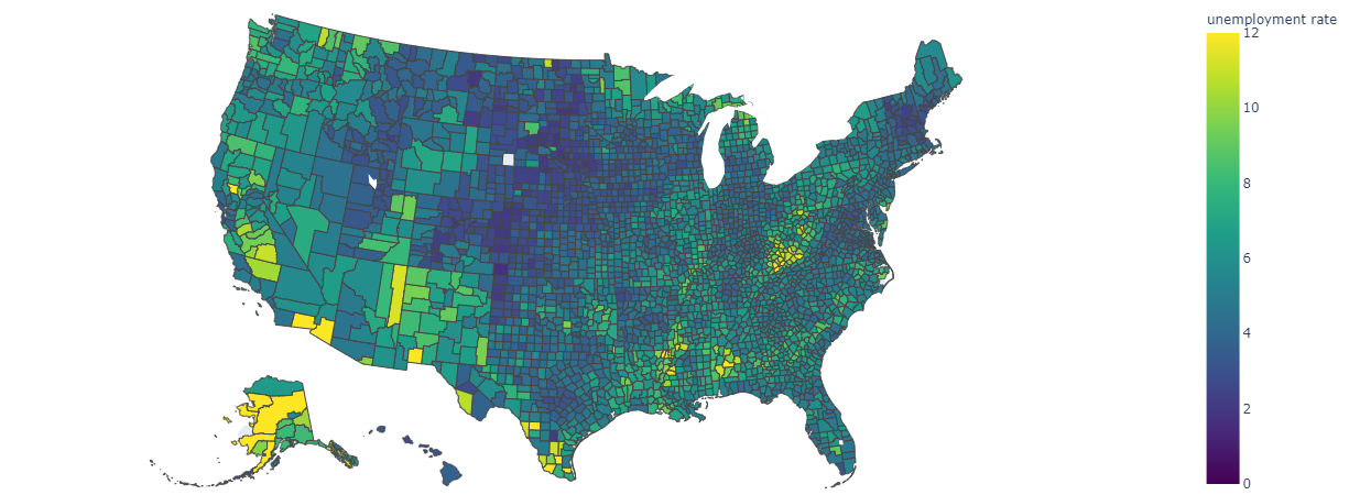
Plotly
You can render HTML or interactive libraries like Plotly, using the displayHTML().
Run the following sample code to draw the image below.
from urllib.request import urlopen
import json
with urlopen('https://raw.githubusercontent.com/plotly/datasets/master/geojson-counties-fips.json') as response:
    counties = json.load(response)

import pandas as pd
df = pd.read_csv("https://raw.githubusercontent.com/plotly/datasets/master/fips-unemp-16.csv",
                   dtype={"fips": str})

import plotly
import plotly.express as px

fig = px.choropleth(df, geojson=counties, locations='fips', color='unemp',
                           color_continuous_scale="Viridis",
                           range_color=(0, 12),
                           scope="usa",
                           labels={'unemp':'unemployment rate'}
                          )
fig.update_layout(margin={"r":0,"t":0,"l":0,"b":0})

# create an html document that embeds the Plotly plot
h = plotly.offline.plot(fig, output_type='div')

# display this html
displayHTML(h)
Pandas
You can view html output of pandas dataframe as the default output, notebook will automatically show the styled html content.
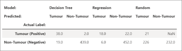
import pandas as pd
import numpy as np

df = pd.DataFrame([[38.0, 2.0, 18.0, 22.0, 21, np.nan],[19, 439, 6, 452, 226,232]],

                  index=pd.Index(['Tumour (Positive)', 'Non-Tumour (Negative)'], name='Actual Label:'),

                  columns=pd.MultiIndex.from_product([['Decision Tree', 'Regression', 'Random'],['Tumour', 'Non-Tumour']], names=['Model:', 'Predicted:']))

df
Additional libraries
Beyond these libraries, the Azure Synapse Analytics Runtime also includes the following set of libraries that are often used for data visualization:
You can visit the Azure Synapse Analytics Runtime documentation for the most up to date information about the available libraries and versions.
R Libraries (Preview)
The R ecosystem offers multiple graphing libraries that come packed with many different features. By default, every Apache Spark Pool in Azure Synapse Analytics contains a set of curated and popular open-source libraries. You can also add or manage additional libraries & versions by using the Azure Synapse Analytics library management capabilities.
ggplot2
The ggplot2 library is popular for data visualization and exploratory data analysis.

library(ggplot2)
data(mpg, package="ggplot2")
theme_set(theme_bw())

g <- ggplot(mpg, aes(cty, hwy))

# Scatterplot
g + geom_point() +
  geom_smooth(method="lm", se=F) +
  labs(subtitle="mpg: city vs highway mileage",
       y="hwy",
       x="cty",
       title="Scatterplot with overlapping points",
       caption="Source: midwest")
rBokeh
rBokeh is a native R plotting library for creating interactive graphics which are backed by the Bokeh visualization library.
To install rBokeh, you can use the following command:
install.packages("rbokeh")
Once installed, you can leverage rBokeh to create interactive visualizations.

library(rbokeh)
p <- figure() %>%
  ly_points(Sepal.Length, Sepal.Width, data = iris,
    color = Species, glyph = Species,
    hover = list(Sepal.Length, Sepal.Width))
R Plotly
Plotly's R graphing library makes interactive, publication-quality graphs.
To install Plotly, you can use the following command:
install.packages("plotly")
Once installed, you can leverage Plotly to create interactive visualizations.

library(plotly)

fig <- plot_ly() %>%
  add_lines(x = c("a","b","c"), y = c(1,3,2))%>%
  layout(title="sample figure", xaxis = list(title = 'x'), yaxis = list(title = 'y'), plot_bgcolor = "#c7daec")

fig
Highcharter
Highcharter is a R wrapper for Highcharts JavaScript library and its modules.
To install Highcharter, you can use the following command:
install.packages("highcharter")
Once installed, you can leverage Highcharter to create interactive visualizations.

library(magrittr)
library(highcharter)
hchart(mtcars, "scatter", hcaes(wt, mpg, z = drat, color = hp)) %>%
  hc_title(text = "Scatter chart with size and color")
Connect to Power BI using Apache Spark & SQL On-Demand
Azure Synapse Analytics integrates deeply with Power BI allowing data engineers to build analytics solutions.
Azure Synapse Analytics allows the different workspace computational engines to share databases and tables between its Spark pools and serverless SQL pool. Using the shared metadata model,you can query your Apache Spark tables using SQL on-demand. Once done, you can connect your SQL on-demand endpoint to Power BI to easily query your synced Spark tables.
Next steps
- For more information on how to set up the Spark SQL DW Connector: Synapse SQL connector
- View the default libraries: Azure Synapse Analytics runtime
Feedback
Coming soon: Throughout 2024 we will be phasing out GitHub Issues as the feedback mechanism for content and replacing it with a new feedback system. For more information see: https://aka.ms/ContentUserFeedback.
Submit and view feedback for