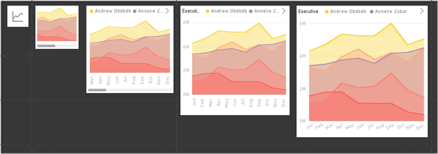
Responsive Visualization optimized for phone layout
Important
This content is archived and is not being updated. For the latest documentation, see Microsoft Dynamics 365 product documentation. For the latest release plans, see Dynamics 365 and Microsoft Power Platform release plans.
Note
These release notes describe functionality that may not have been released yet. To see when this functionality is planned to release, please review Summary of what’s new. Delivery timelines and projected functionality may change or may not ship (see Microsoft policy).
Power BI is providing more ways to create experiences optimized for devices of all sizes, delivering a rich visualization on a large screen and then preserving that richness in a small screen using responsive visualizations.
Power BI responsive visualizations dynamically change to display the maximum amount of data and insight, no matter the screen size. As a visualization changes its size, Power BI prioritizes the data view, for example removing padding and legend tweaks such as moving the legend to the top of the visualization—automatically, so the visualization remains informative and beautiful even as it gets smaller.
A responsive visualization optimizes across Power BI platforms, whether in a report, a dashboard, a phone report, a mobile dashboard, or even in embedded Power BI visuals that use the Power BI API.

Example of responsive visualizations