Frame
The .NET Multi-platform App UI (.NET MAUI) Frame is used to wrap a view or layout with a border that can be configured with color, shadow, and other options. Frames can be used to create borders around controls but can also be used to create more complex UI.
The Frame class defines the following properties:
BorderColor, of type Color, determines the color of the Frame border.CornerRadius, of typefloat, determines the rounded radius of the corner.HasShadow, of typebool, determines whether the frame has a drop shadow.
These properties are backed by BindableProperty objects, which means that they can be targets of data bindings, and styled.
The Frame class inherits from ContentView, which provides a Content bindable property. The Content property is the ContentProperty of the Frame class, and therefore does not need to be explicitly set from XAML.
Note
The Frame class existed in Xamarin.Forms and is present in .NET MAUI for users who are migrating their apps from Xamarin.Forms to .NET MAUI. If you're building a new .NET MAUI app it's recommended to use Border instead, and to set shadows using the Shadow bindable property on VisualElement. For more information, see Border and Shadow.
Create a Frame
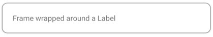
A Frame object typically wraps another control, such as a Label:
<Frame>
  <Label Text="Frame wrapped around a Label" />
</Frame>
The appearance of Frame objects can be customized by setting properties:
<Frame BorderColor="Gray"
       CornerRadius="10">
  <Label Text="Frame wrapped around a Label" />
</Frame>
The equivalent C# code is:
Frame frame = new Frame
{
    BorderColor = Colors.Gray,
    CornerRadius = 10,
    Content = new Label { Text = "Frame wrapped around a Label" }
};
The following screenshot shows the example Frame:
Create a card with a Frame
Combining a Frame object with a layout such as a StackLayout enables the creation of more complex UI.
The following XAML shows how to create a card with a Frame:
<Frame BorderColor="Gray"
       CornerRadius="5"
       Padding="8">
  <StackLayout>
    <Label Text="Card Example"
           FontSize="14"
           FontAttributes="Bold" />
    <BoxView Color="Gray"
             HeightRequest="2"
             HorizontalOptions="Fill" />
    <Label Text="Frames can wrap more complex layouts to create more complex UI components, such as this card!"/>
  </StackLayout>
</Frame>
The following screenshot shows the example card:

Round elements
The CornerRadius property of the Frame control is one approach to creating a circle image. The following XAML shows how to create a circle image with a Frame:
<Frame Margin="10"
       BorderColor="Black"
       CornerRadius="50"
       HeightRequest="60"
       WidthRequest="60"
       IsClippedToBounds="True"
       HorizontalOptions="Center"
       VerticalOptions="Center">
  <Image Source="outdoors.jpg"
         Aspect="AspectFill"
         Margin="-20"
         HeightRequest="100"
         WidthRequest="100" />
</Frame>
The following screenshot shows the example circle image:

Feedback
Coming soon: Throughout 2024 we will be phasing out GitHub Issues as the feedback mechanism for content and replacing it with a new feedback system. For more information see: https://aka.ms/ContentUserFeedback.
Submit and view feedback for