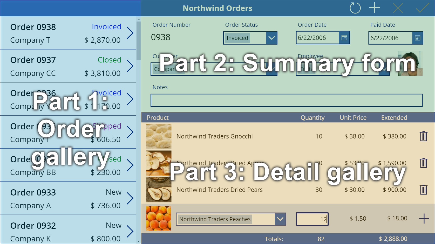
Create a summary form in a canvas app
Follow step-by-step instructions to create a summary form in a canvas app for managing fictitious data in the Northwind Traders database. This topic is part of a series that explains how to build a business app on relational data in Microsoft Dataverse. For best results, explore these topics in this sequence:
- Create an order gallery.
- Create a summary form (this topic).
- Create a detail gallery.
Prerequisites
- Install the Northwind Traders database and apps.
- Review the overview of the canvas app for Northwind Traders.
- Create the order gallery yourself, or open the Northwind Orders (Canvas) - Begin Part 2 app, which already contains that gallery.
Add a title bar
Across the top of the app, create a title bar, which will hold action buttons by the end of this topic.
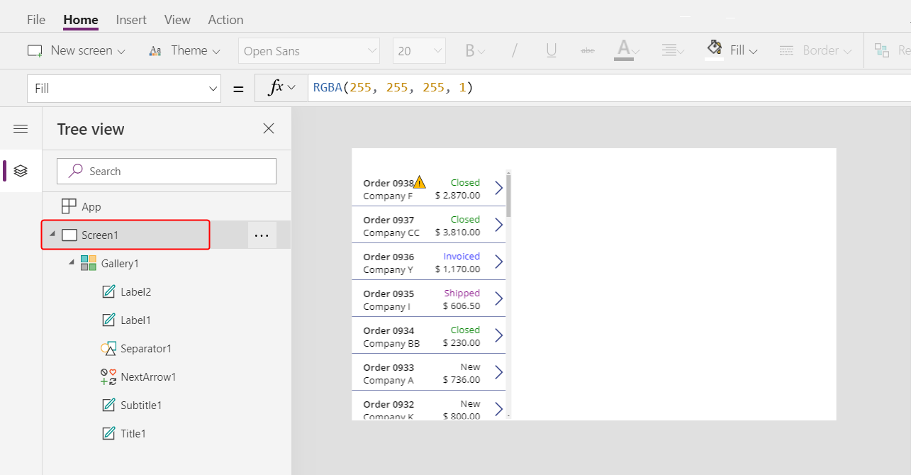
In the Tree view pane, select Screen1 to ensure that you don't accidentally add a control to the order gallery:
On the Insert tab, select Label to insert a Label control:
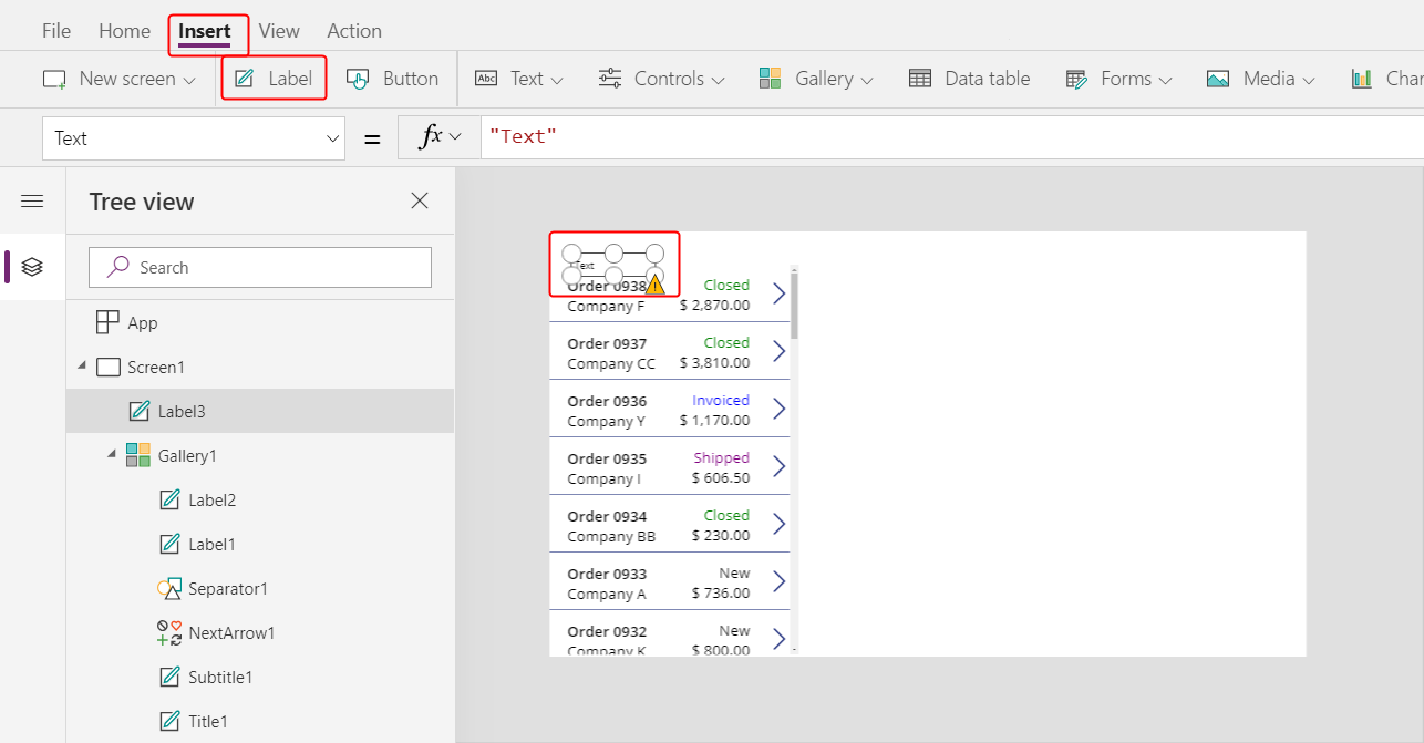
The new label should appear only once, above the gallery. If it appears in each item of the gallery, delete the first instance of the label, ensure that the screen is selected (as the previous step describes), and then insert the label again.
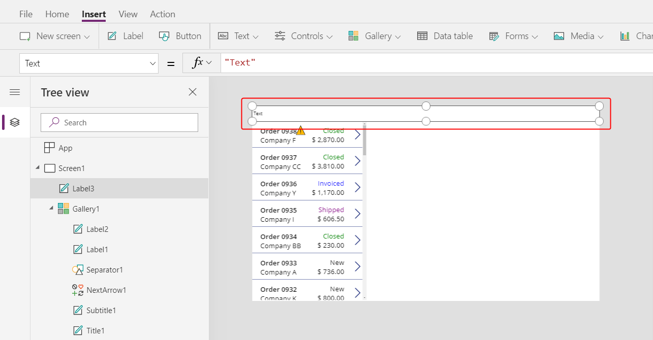
Move and resize the new label to span the top of the screen:
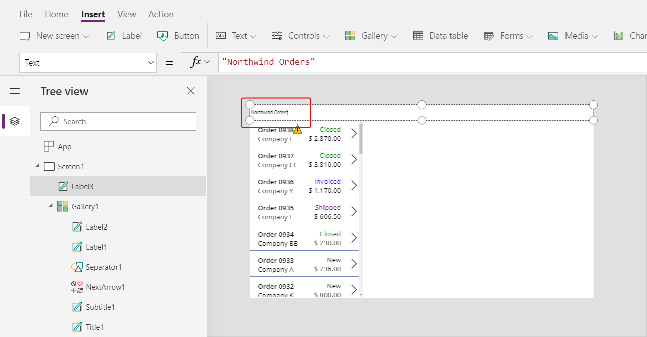
Double-click the text of the label, and then type Northwind Orders.
As an alternative, modify the Text property in the formula bar to achieve the same result:
On the Home tab, format the label:
- Increase the font size to 24 points.
- Make the text bold.
- Make the text white.
- Center the text.
- Add a dark-blue fill to the background.

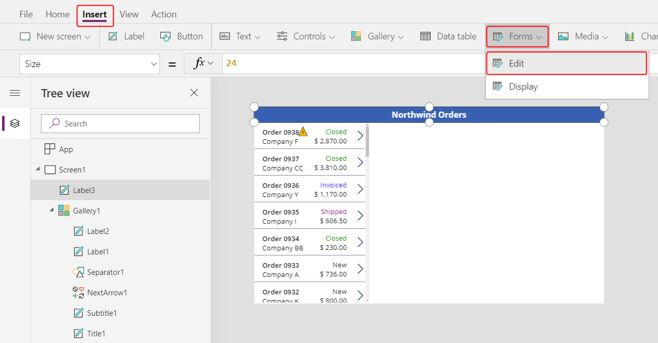
Add an Edit form control
In this section, you'll add controls to show a summary of any order that the user selects in the gallery.
On the Insert tab, insert an Edit form control:
By default, the form appears in the upper-left corner, where other controls might make it difficult to find:
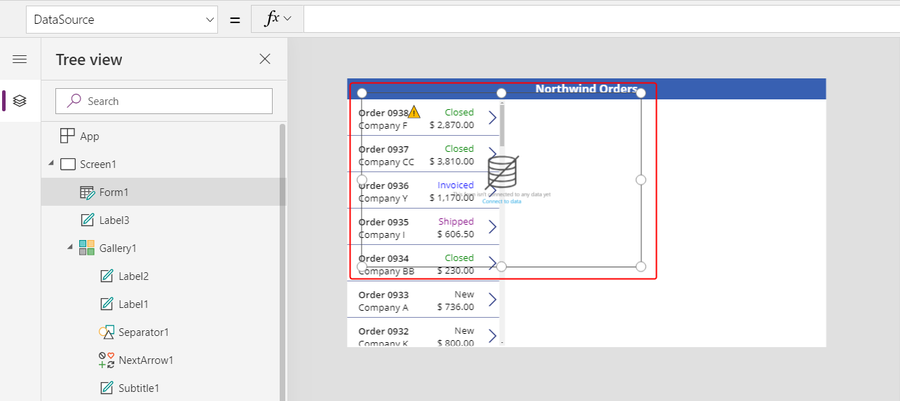
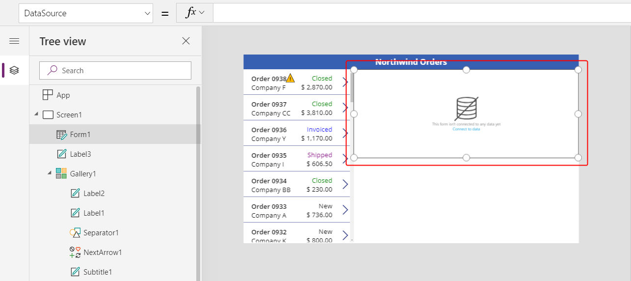
Move and resize the form to cover the upper-right corner of the screen under the title bar:
In the Properties pane, select the Data source drop down.
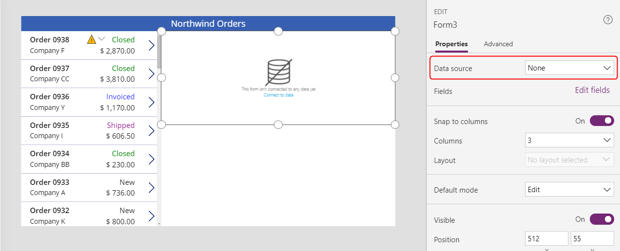
Select the Orders data source.
Add and arrange fields
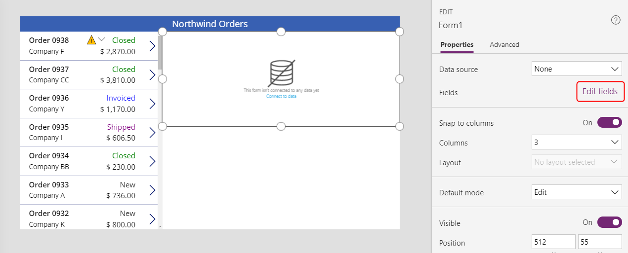
In the Properties tab near the right edge, select Edit fields to open the Fields pane.
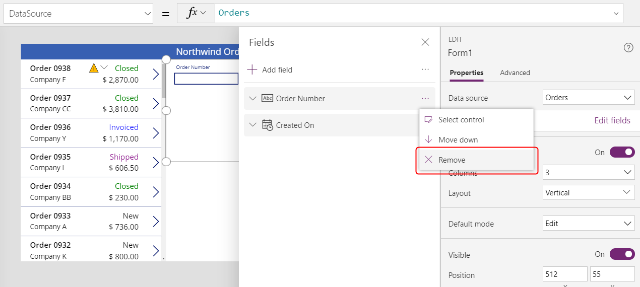
If the Fields pane is not empty, remove the fields that have already been inserted.
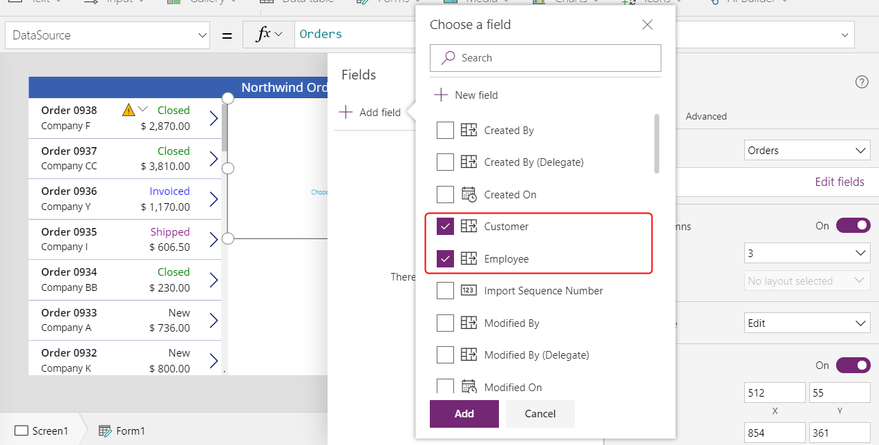
After the fields list is empty, select Add field, and then select the check boxes for the Customer and Employee fields.
Scroll down until these fields appear, and then select their check boxes:
- Notes
- Order Date
- Order Number
- Order Status
- Paid Date
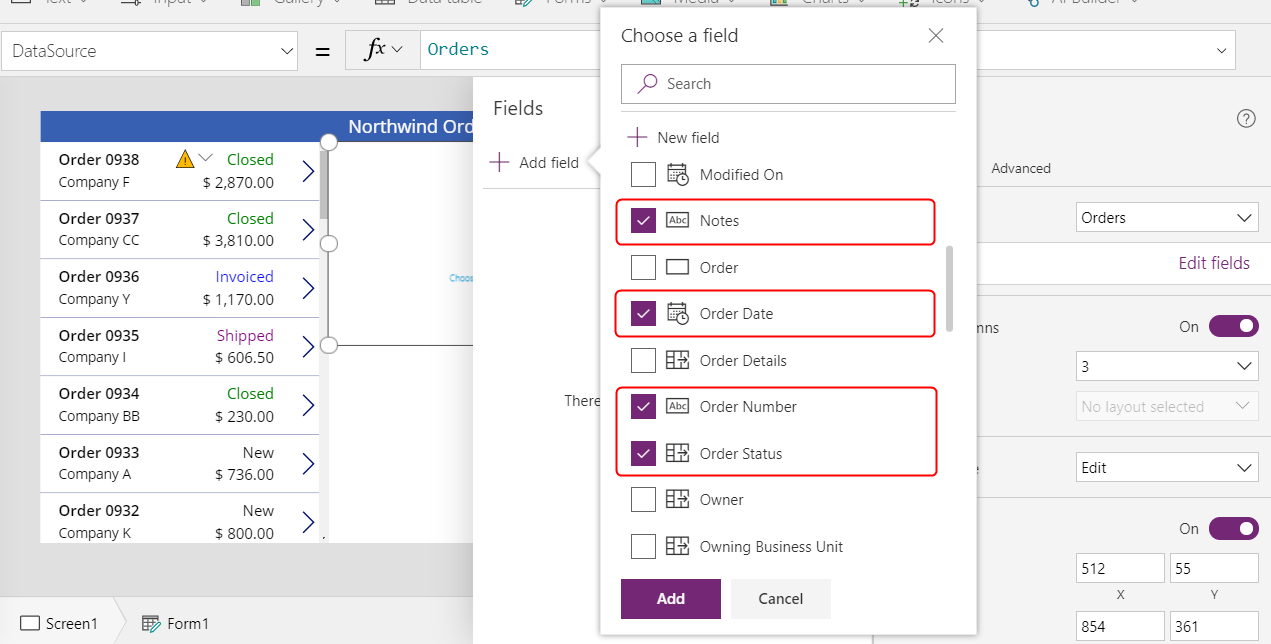
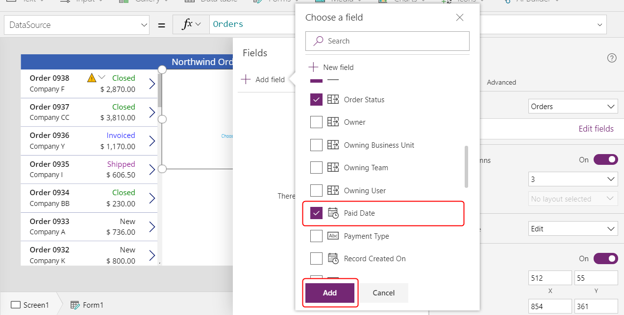
At the bottom of the Fields pane, select Add, and then close the Fields pane.
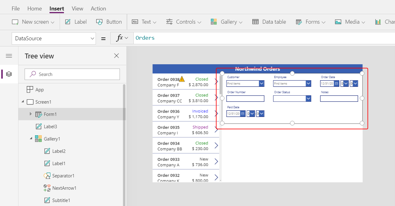
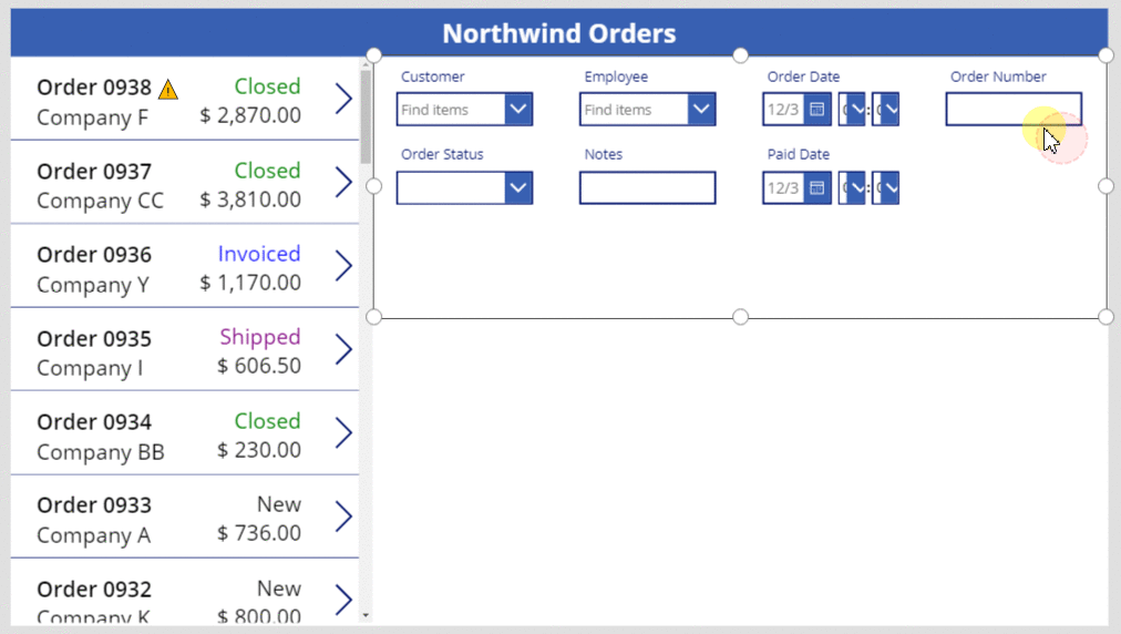
The form shows seven fields, which may be in a different order:
Note
If any field shows a red error icon, a problem might have occurred when data was pulled from the source. To resolve the error, refresh the data:
- On the View tab, select Data sources.
- In the Data pane, select Data sources.
- Next to Orders, select the ellipsis (...), select Refresh, and then close the Data pane.
If the combo box for the customer or employee name still shows an error, check the Primary text and SearchField of each box by selecting it and then opening the Data pane. For the customer box, both fields should be set to nwind_company. For the employee box, both fields should be set to nwind_lastname.
With the form selected, change the number of columns in the form from 3 to 12 in the Properties tab near the right edge.
This step adds flexibility as you arrange the fields:
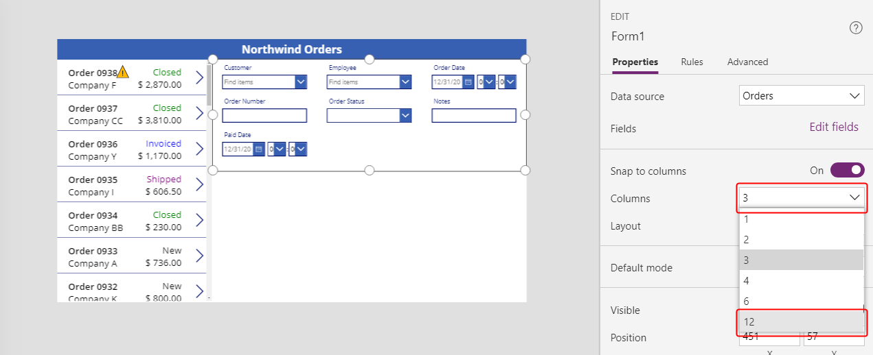
Many UI designs rely on 12-column layouts because they can evenly accommodate rows of 1, 2, 3, 4, 6, and 12 controls. In this topic, you'll create rows that contain 1, 2, or 4 controls.
Move and resize the fields by dragging their handles, just as you would any other control, so that each row contains these data cards in the specified order:
- First row: Order Number, Order Status, Order Date, and Paid Date
- Second row: Customer and Employee
- Third row: Notes
Note
You might find it easier to widen the Notes, Customer, and Employee data cards before you arrange them.
More information about how to arrange fields in a form: Understand data-form layout for canvas apps.
Hide time controls
In this example, you don't need the time portions of the date fields because that level of granularity can distract the user. If you delete them, you might cause problems in formulas that rely on those controls to update date values or determine the position of another control in the data card. Instead, you'll hide the time controls by setting their Visible property.
In the Tree view pane, select the Order Date data card.
The card might have a different name, but it contains Order Date.
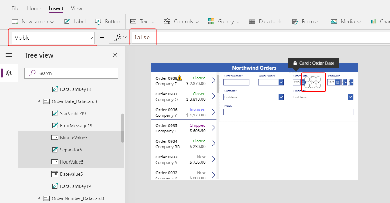
While holding down the Shift key, select the hour, minute, and colon-separator controls in the Order Date data card.
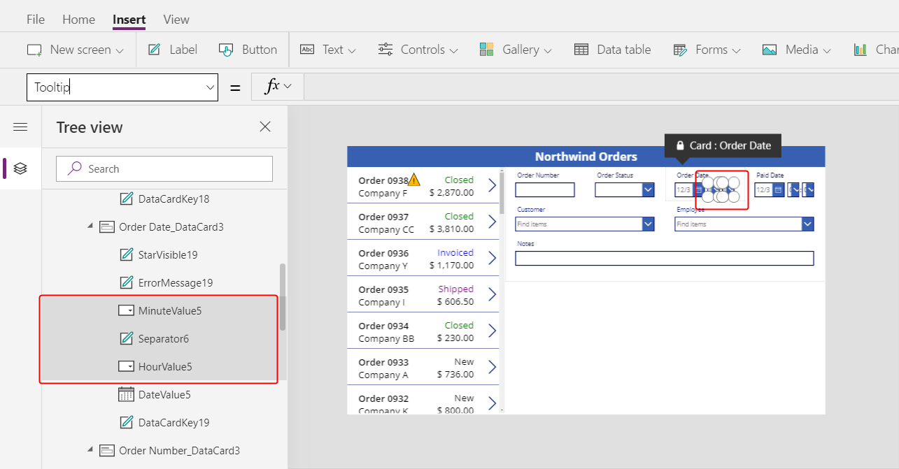
Set the controls' Visible property to false.
All selected controls disappear from the form:
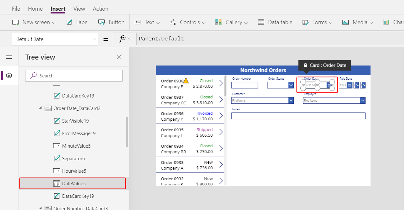
Resize the Date picker control to show the complete date:
Next, you'll repeat the last few steps for the Paid Date field.
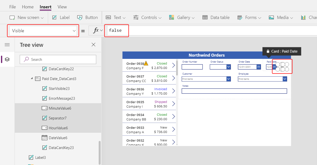
In the Tree view pane, select the time controls in the Paid Date data card:
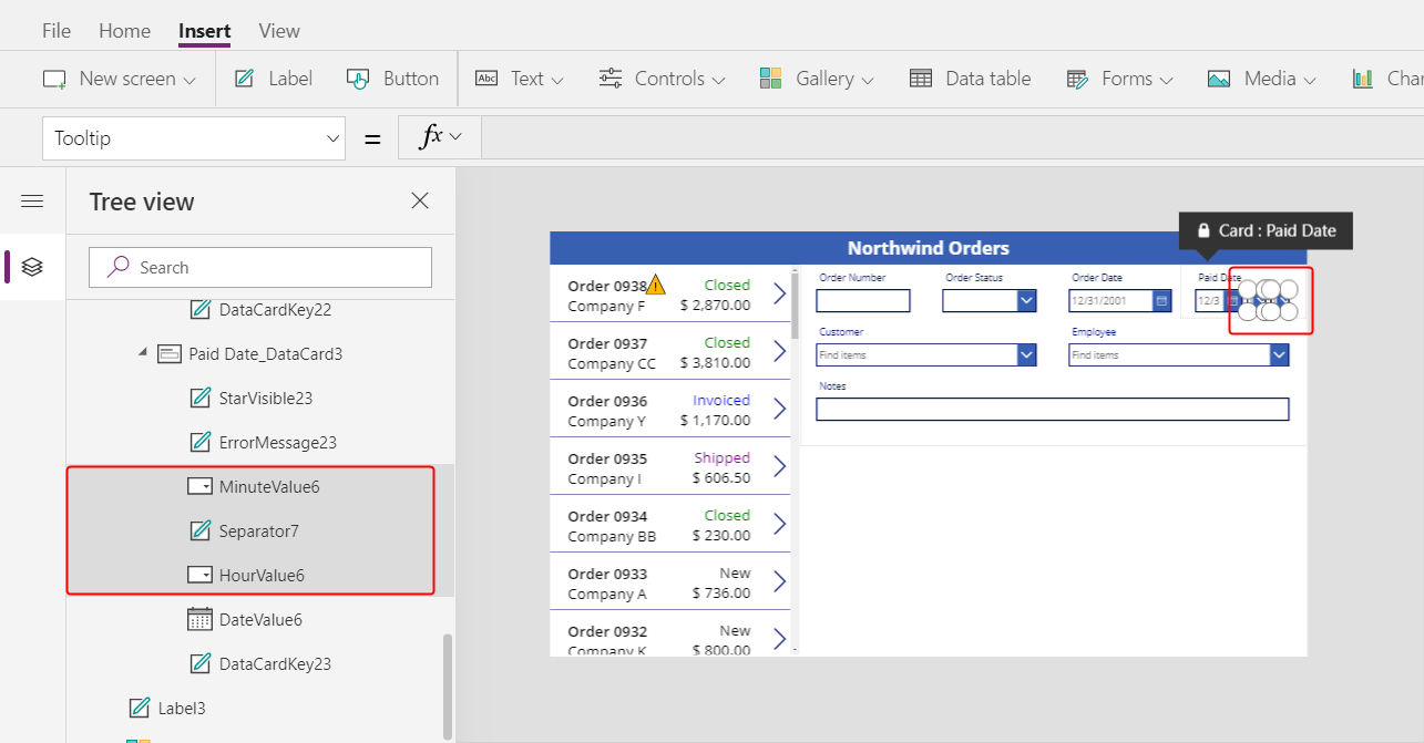
Set the selected controls' Visible property to false:
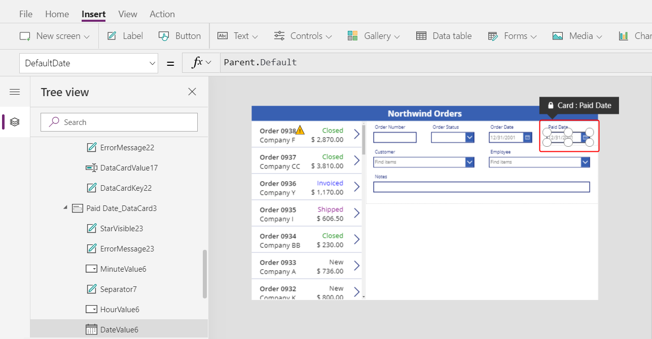
Resize the date picker in the Date Paid card:
Connect the order gallery
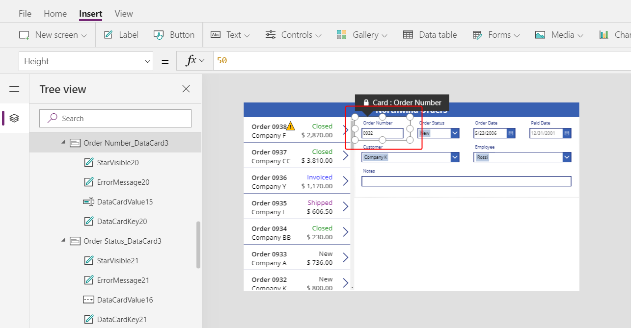
In the Tree view pane, collapse the form to more easily find the name of the order gallery, and then, if necessary, rename it to Gallery1.
Set the summary form's Item property to this expression:
Gallery1.Selected
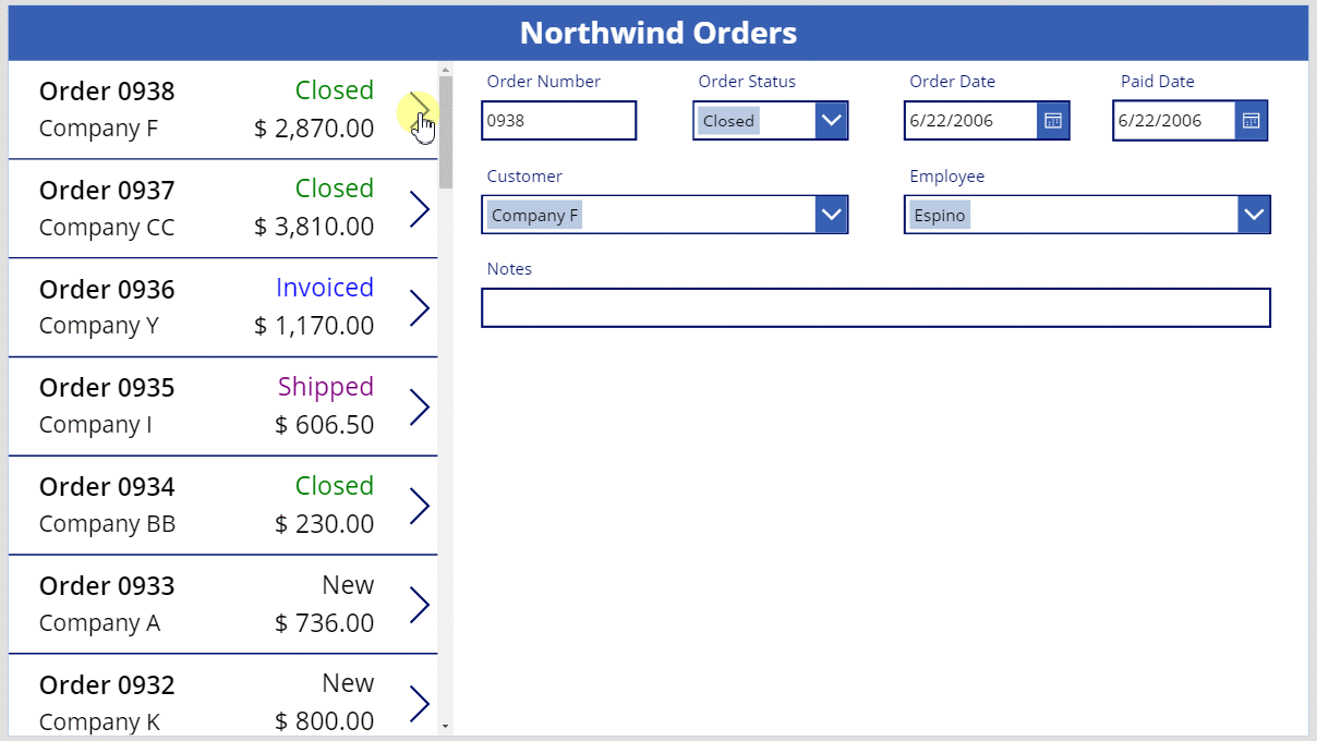
The form shows an summary of whatever order the app user selects in the list.
Replace a data card
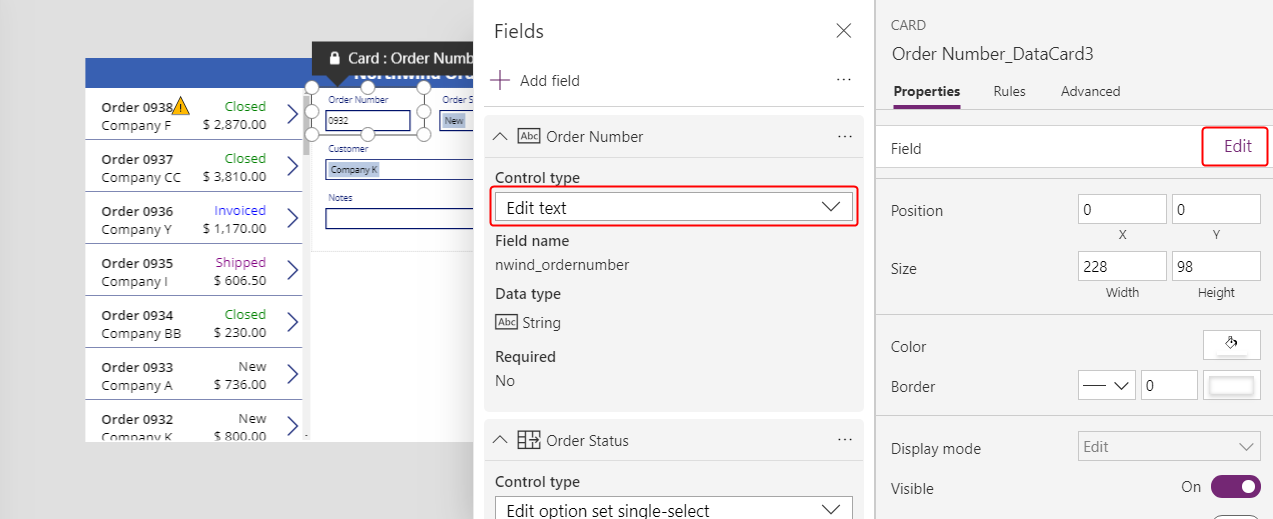
Order number is an identifier that Dataverse assigns automatically when you create a record. This field has a Text input control by default, but you'll replace it with a label so that the user can't edit this field.
Select the form, select Edit fields in the Properties tab near the right edge, and then select the Order number field:
Open the Control type list:
Select the View text data card:
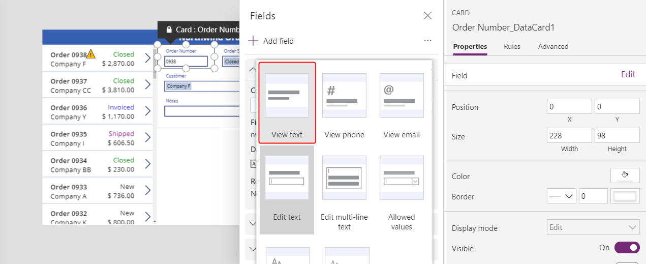
Close the Fields pane.
The user can no longer change the order number:

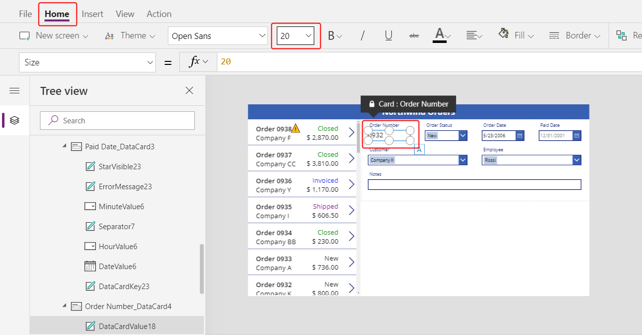
On the Home tab, change the order number's font size to 20 points so that the field is easier to find:
Use a many-to-one relationship
The Orders table has a many-to-one relationship with the Employees table: each employee can create many orders, but each order can be assigned to only one employee. When the user selects an employee in the Combo box control, its Selected property provides that employee's entire record from the Employees table. As a result, you can configure an Image control to show the picture of whatever employee the user selects in the combo box.
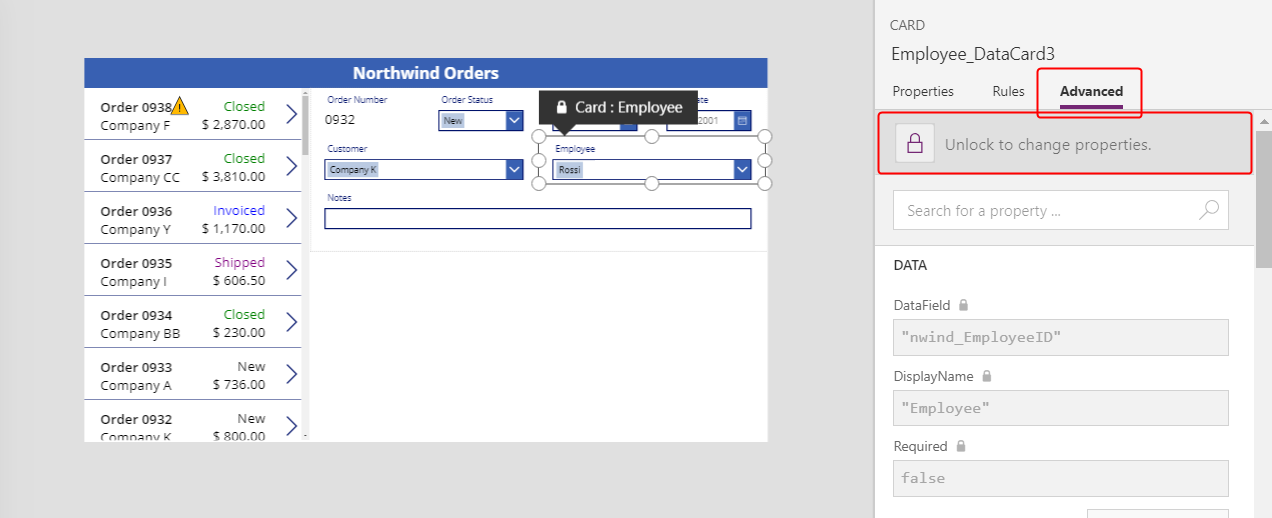
Select the Employee data card:
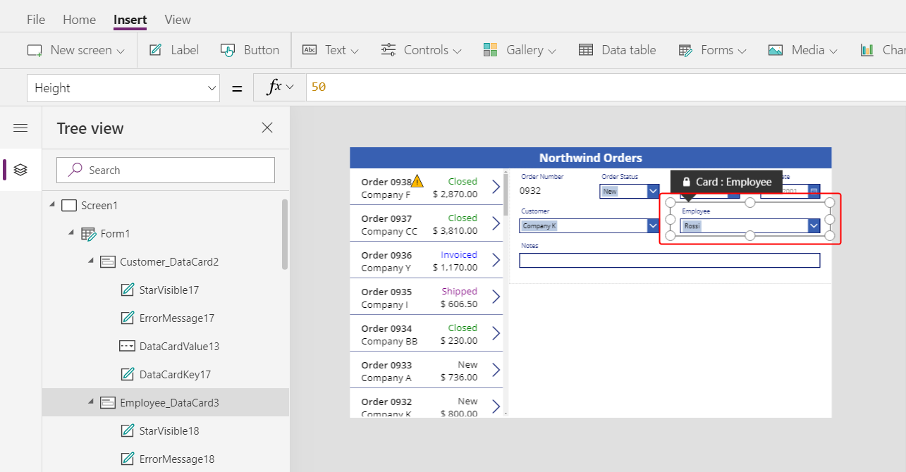
In the Advanced tab near the right edge, unlock the data card so that you can edit formulas that were previously read-only:
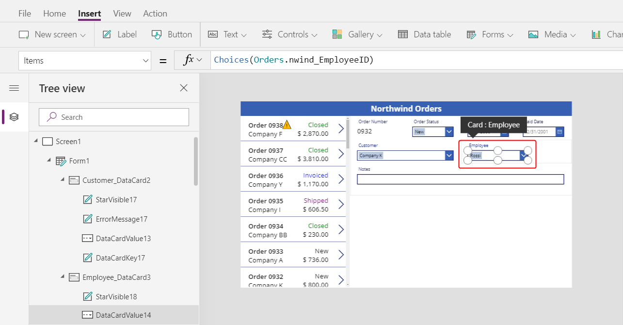
In the data card, reduce the width of the combo box to make room for the employee picture:
On the Insert tab, select Media > Image:
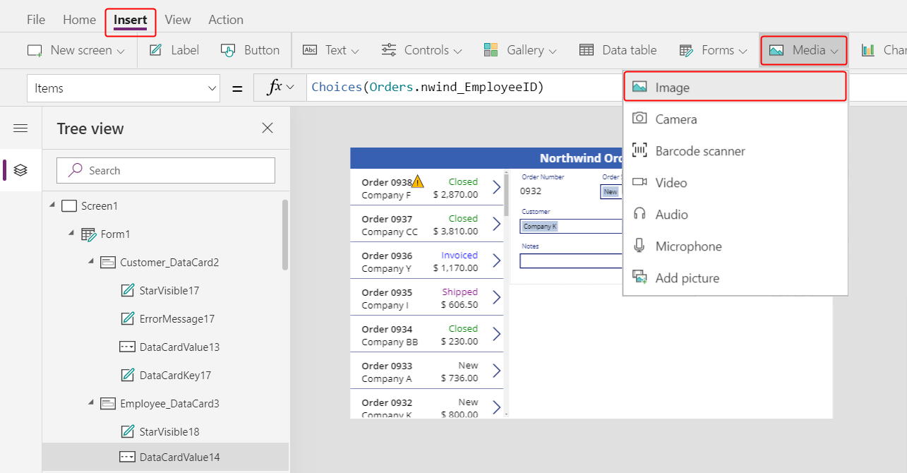
An image appears in the data card, which expands to accommodate it:
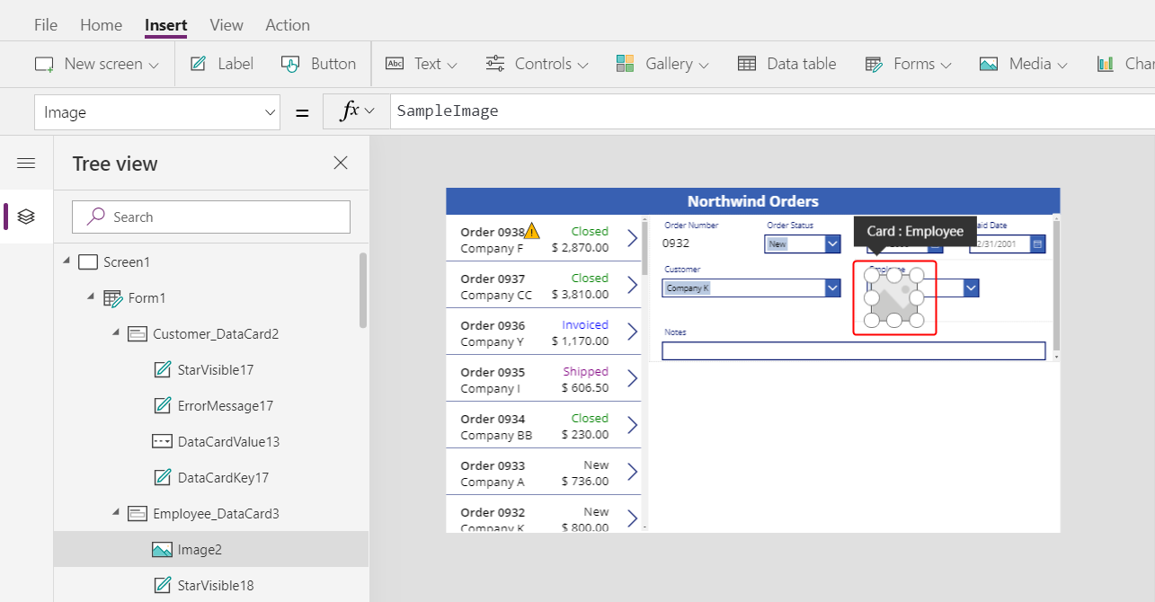
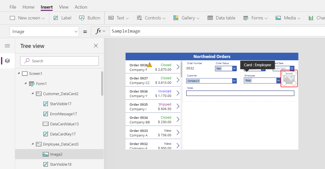
Resize the image, and move it to the right of the combo box:
Set the Image property of the image to this formula, replacing the number at the end of DataCardValue if necessary:
DataCardValue7.Selected.Picture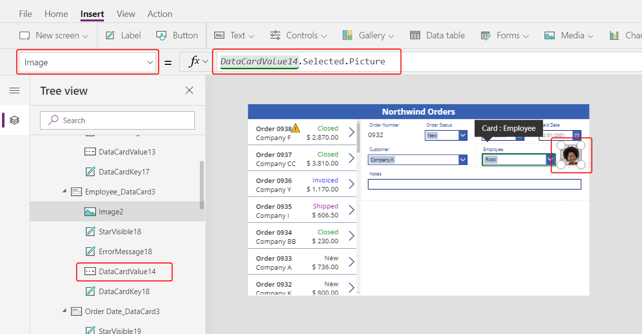
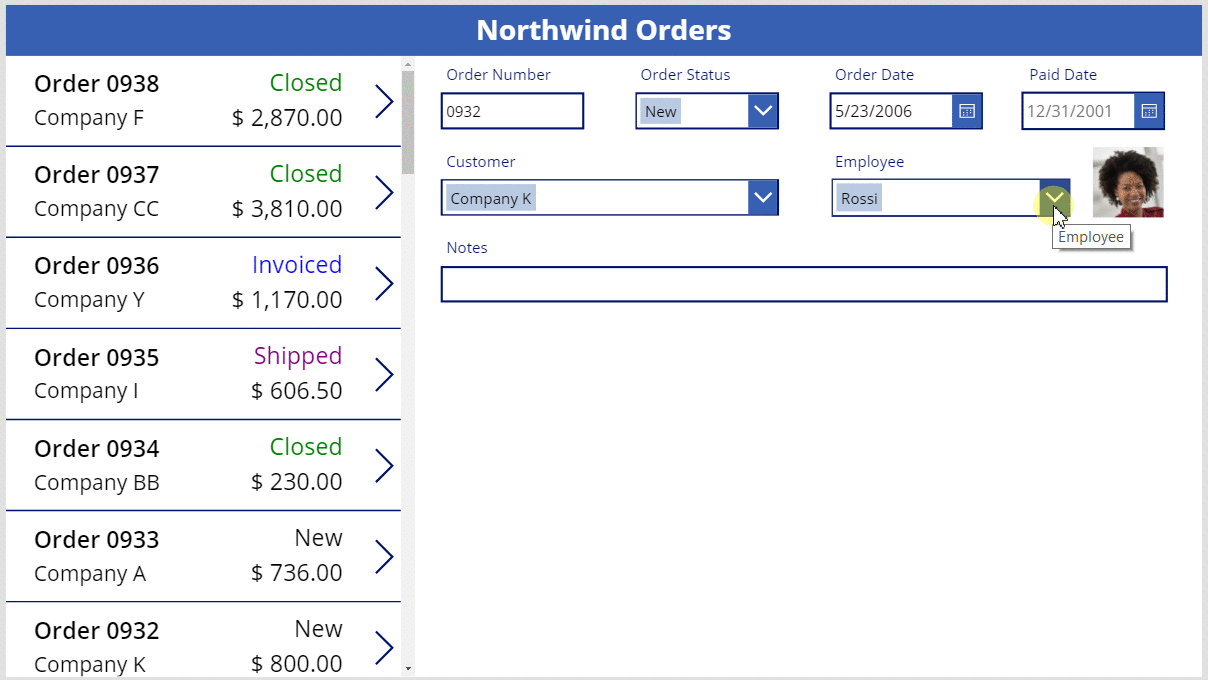
The picture of the selected employee appears.
While holding down the Alt key, select a different employee in the combo box to confirm that the picture also changes.
Add a Save icon
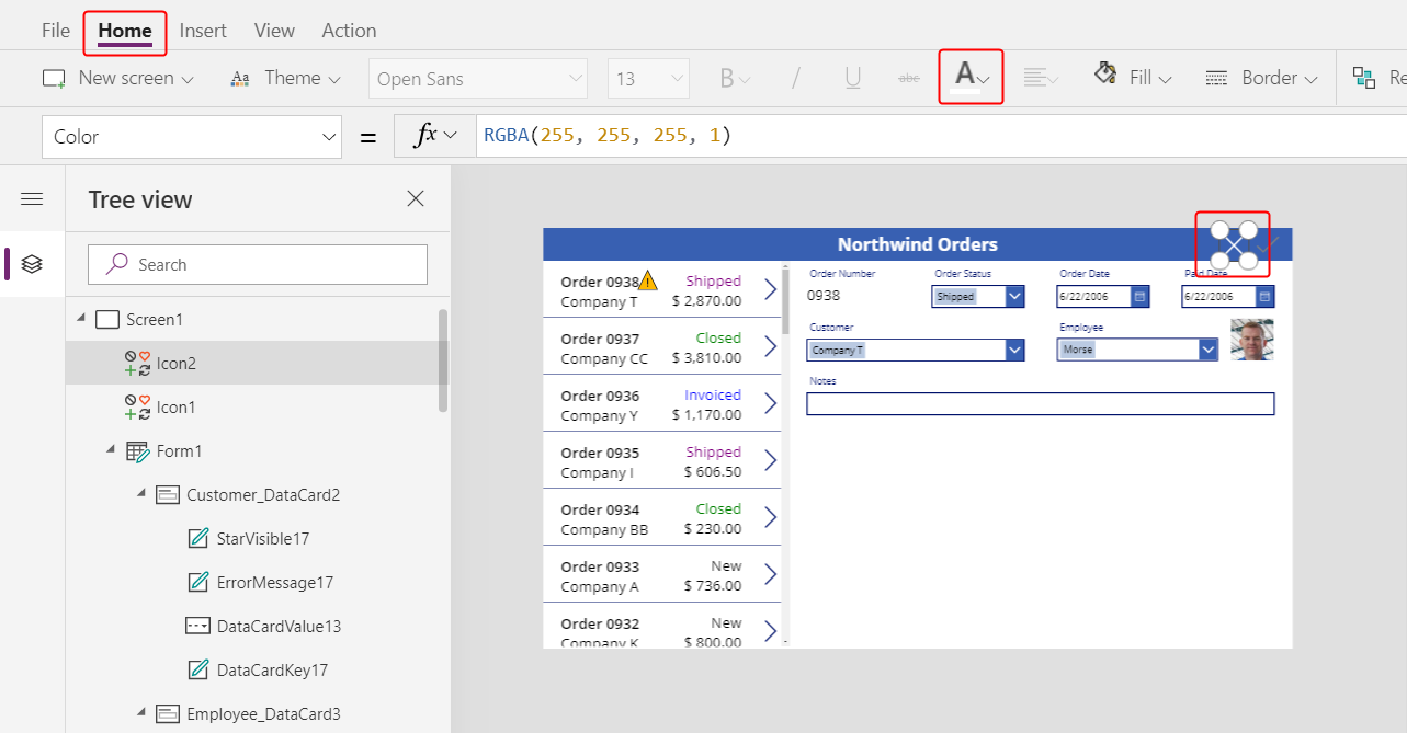
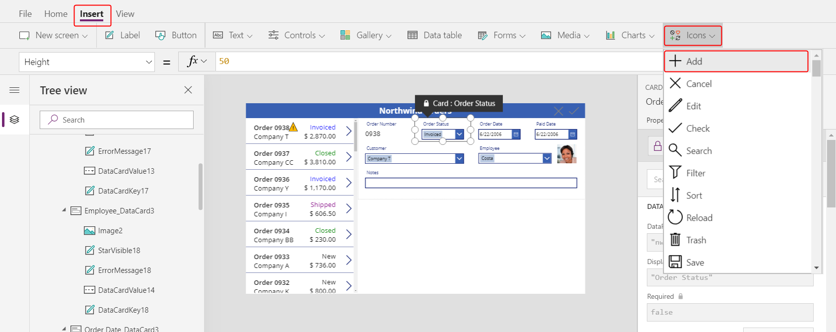
In the Tree view pane, select Screen1, and then select Insert > Icons > Check:
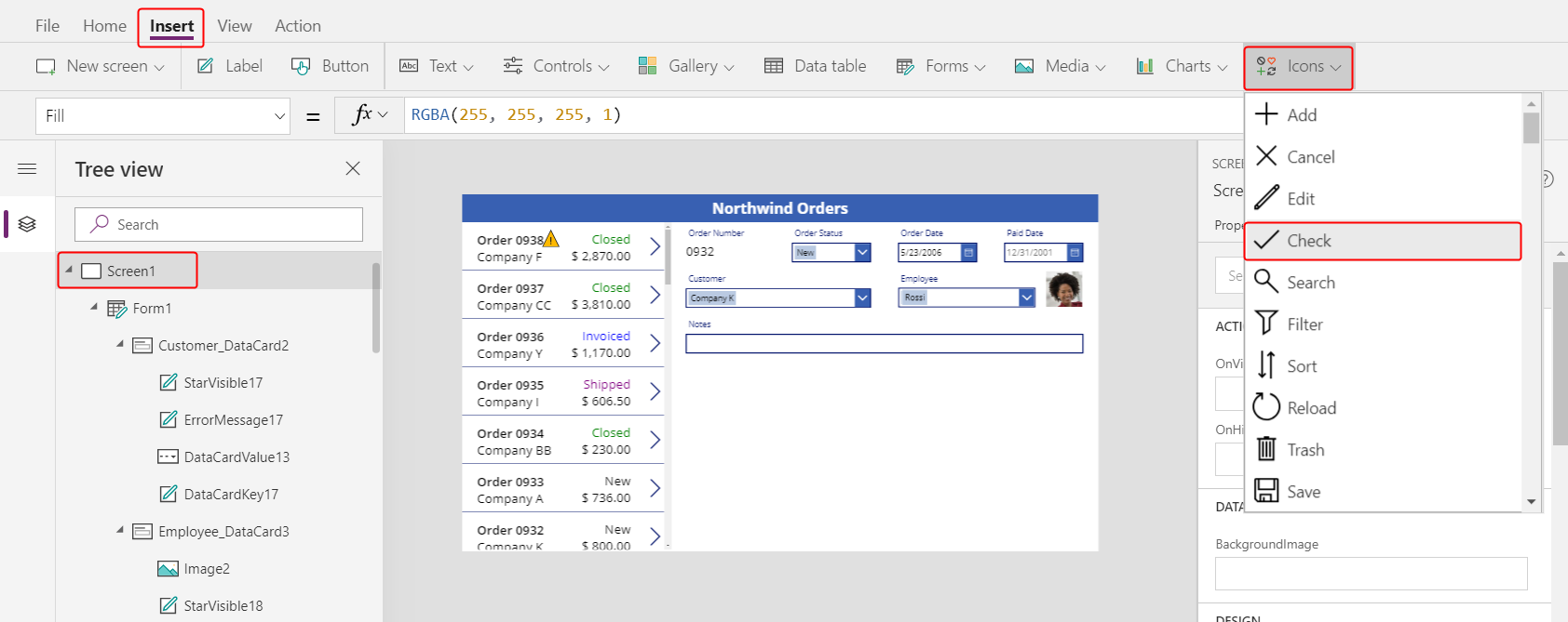
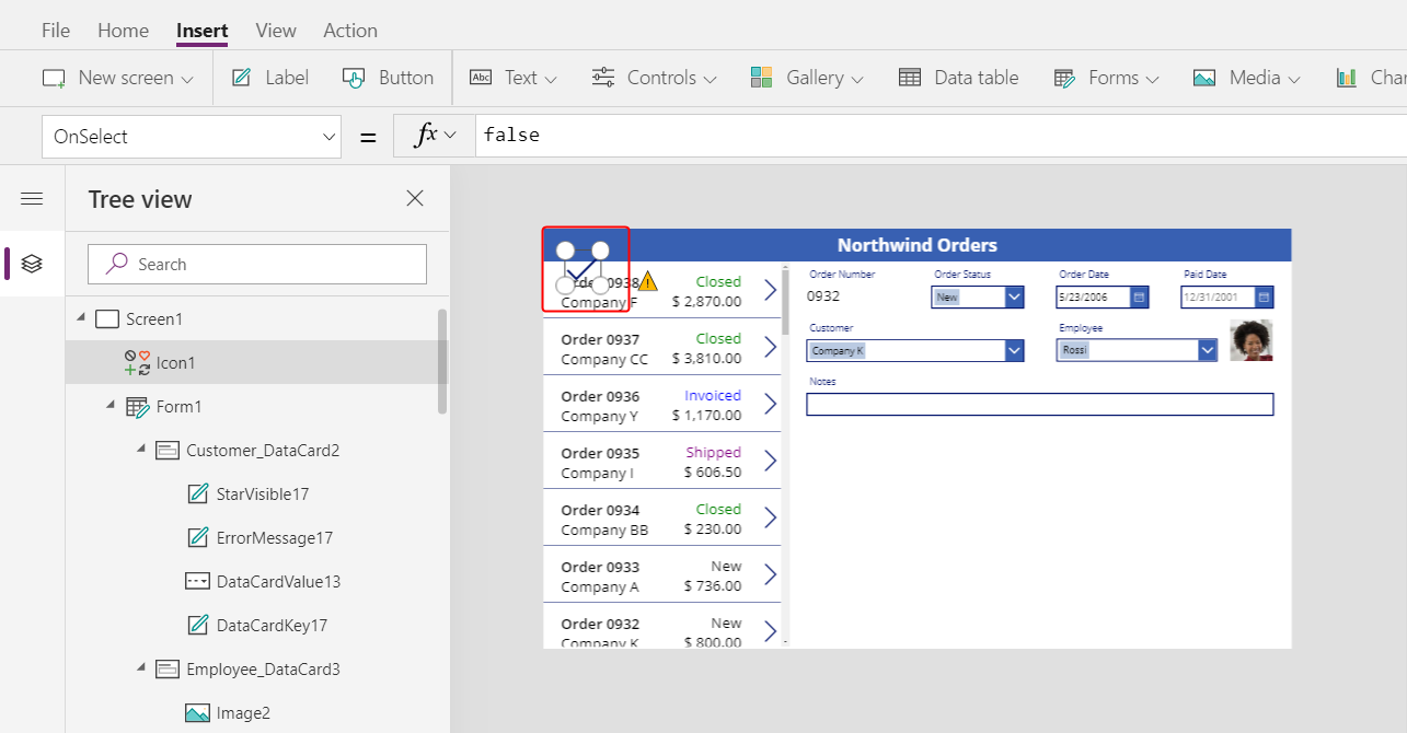
The Check icon appears in the upper-left corner by default, where other controls might make the icon difficult to find:
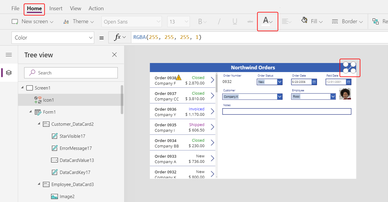
On the Home tab, change the Color property of the icon to white, resize the icon, and move it near the right edge of the title bar:
In the Tree view pane, confirm that the form's name is Form1, and then set the icon's OnSelect property to this formula:
SubmitForm( Form1 )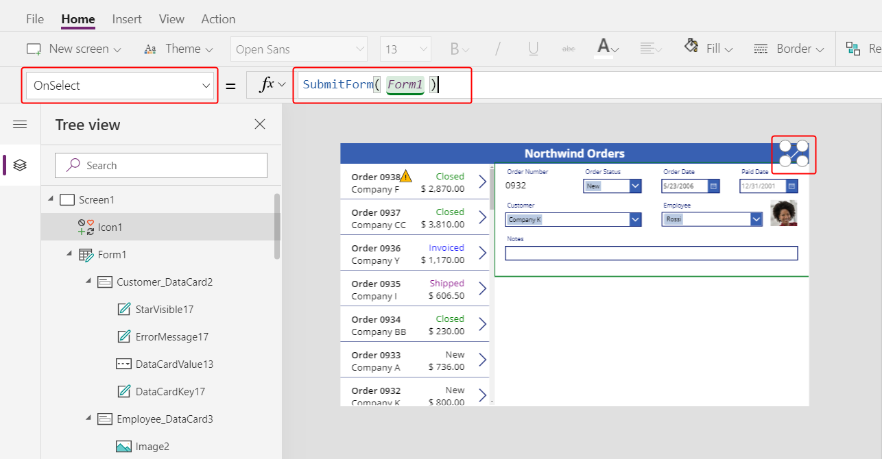
When the user selects the icon, the SubmitForm function gathers any changed values in the form and submits them to the data source. Dots march across the top of the screen as the data is submitted, and the order gallery reflects the changes after the process finishes.
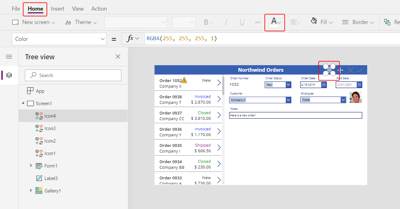
Set the icon's DisplayMode property to this formula:
If( Form1.Unsaved, DisplayMode.Edit, DisplayMode.Disabled )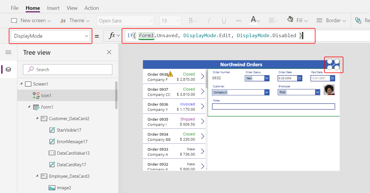
If all changes in the form have been saved, the icon is disabled and appears in the DisabledColor, which you'll set next.
Set the icon's DisabledColor property to this value:
Gray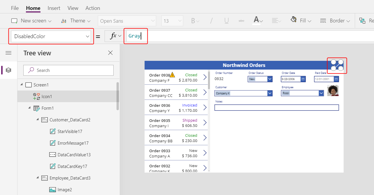
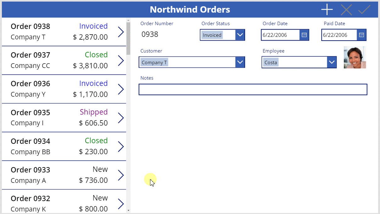
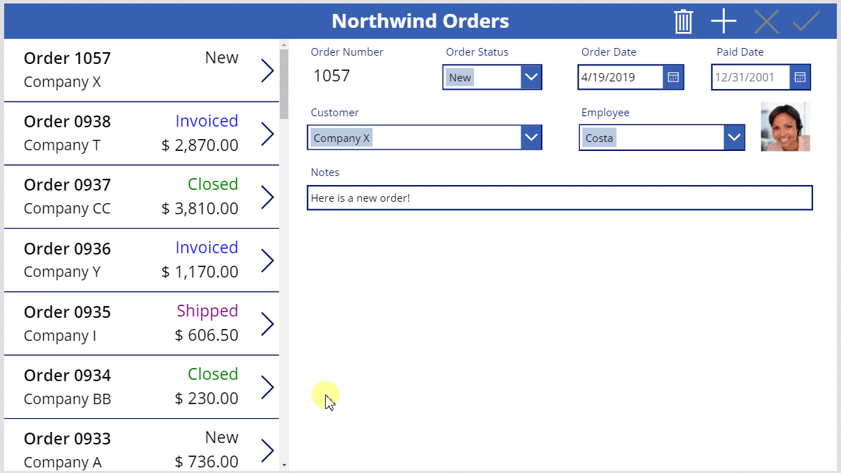
The user can save changes to an order by selecting the Check icon, which is then disabled and dimmed until the user makes another change:
Add a Cancel icon
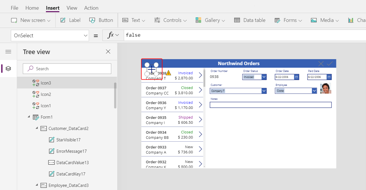
On the Insert tab, select Icons > Cancel:
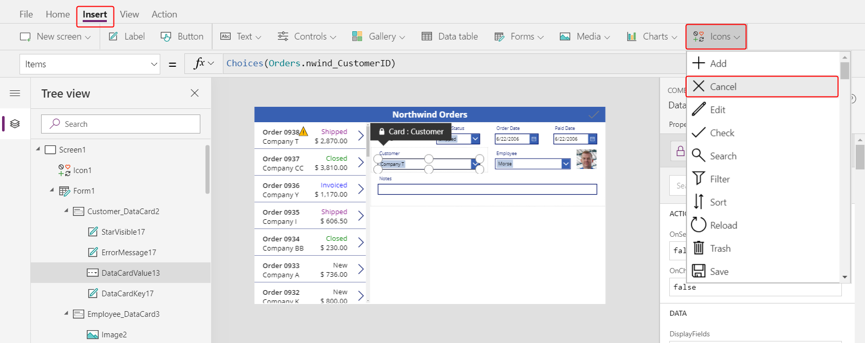
The icon appears in the upper-left corner by default, where other controls might make the icon difficult to find:

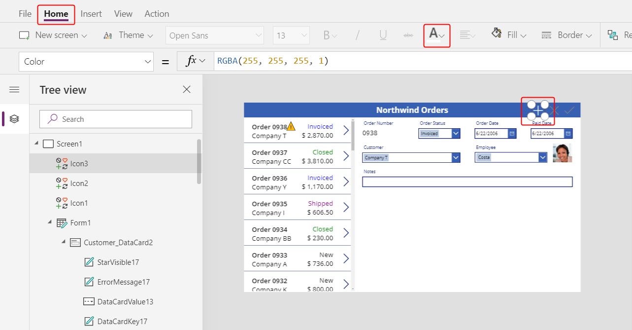
On the Home tab, change the icon's Color property to white, resize the icon, and move it to the left of the Check icon:
Set the Cancel icon's OnSelect property to this formula:
ResetForm( Form1 )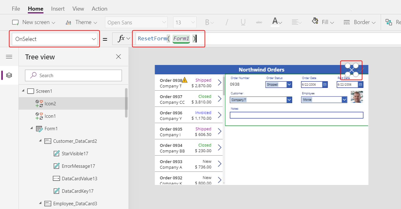
The ResetForm function discards all changes in the form, which returns it to its original state.
Set the Cancel icon's DisplayMode property to this formula:
If( Form1.Unsaved Or Form1.Mode = FormMode.New, DisplayMode.Edit, DisplayMode.Disabled )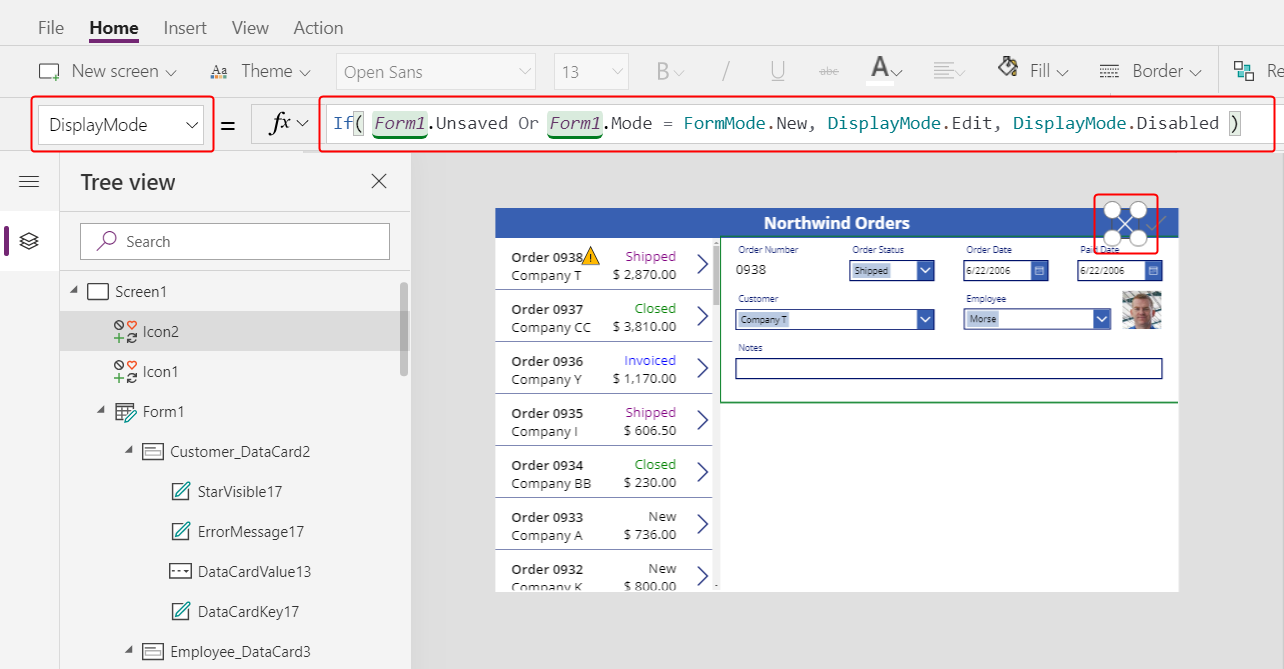
This formula differs slightly from the one for the Check icon. The Cancel icon is disabled if all changes have been saved or the form is in New mode, which you'll enable next. In that case, ResetForm discards the new record.
Set the Cancel icon's DisabledColor property to this value:
Gray
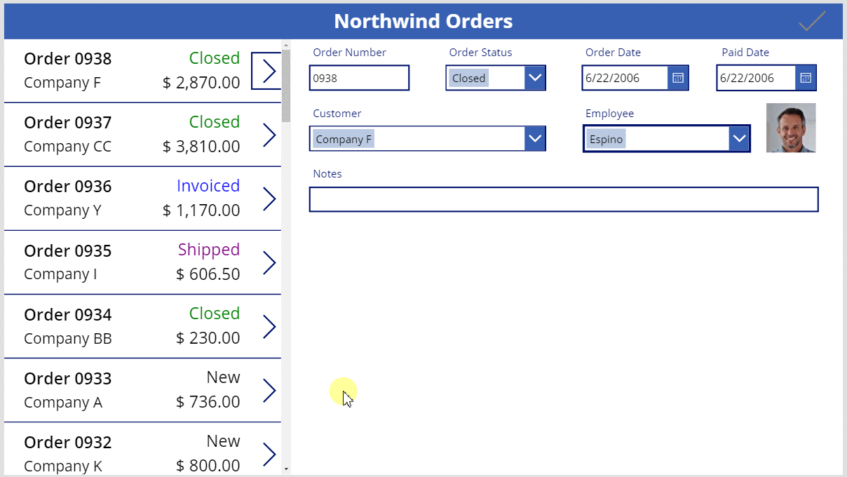
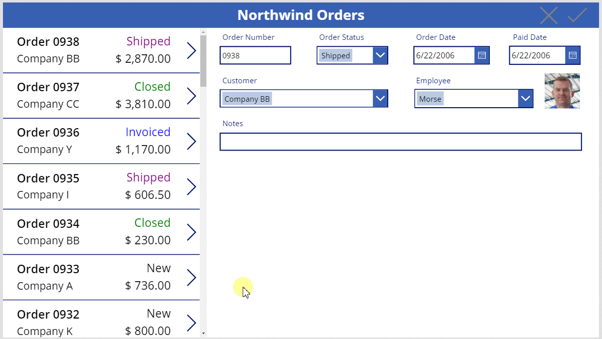
The user can cancel changes to an order, and the Check and Cancel icons are disabled and dimmed if all changes have been saved:
Add an Add icon
On the Insert tab, select Icons > Add.
The Add icon appears in the upper-left corner by default, where other controls might make it difficult to find:
On the Home tab, set the Color property of the Add icon to white, resize the icon, and move it to the left of the Cancel icon:
Set the Add icon's OnSelect property to this formula:
NewForm( Form1 )
The NewForm function shows a blank record in the form.
Set the Add icon's DisplayMode property to this formula:
If( Form1.Unsaved Or Form1.Mode = FormMode.New, DisplayMode.Disabled, DisplayMode.Edit )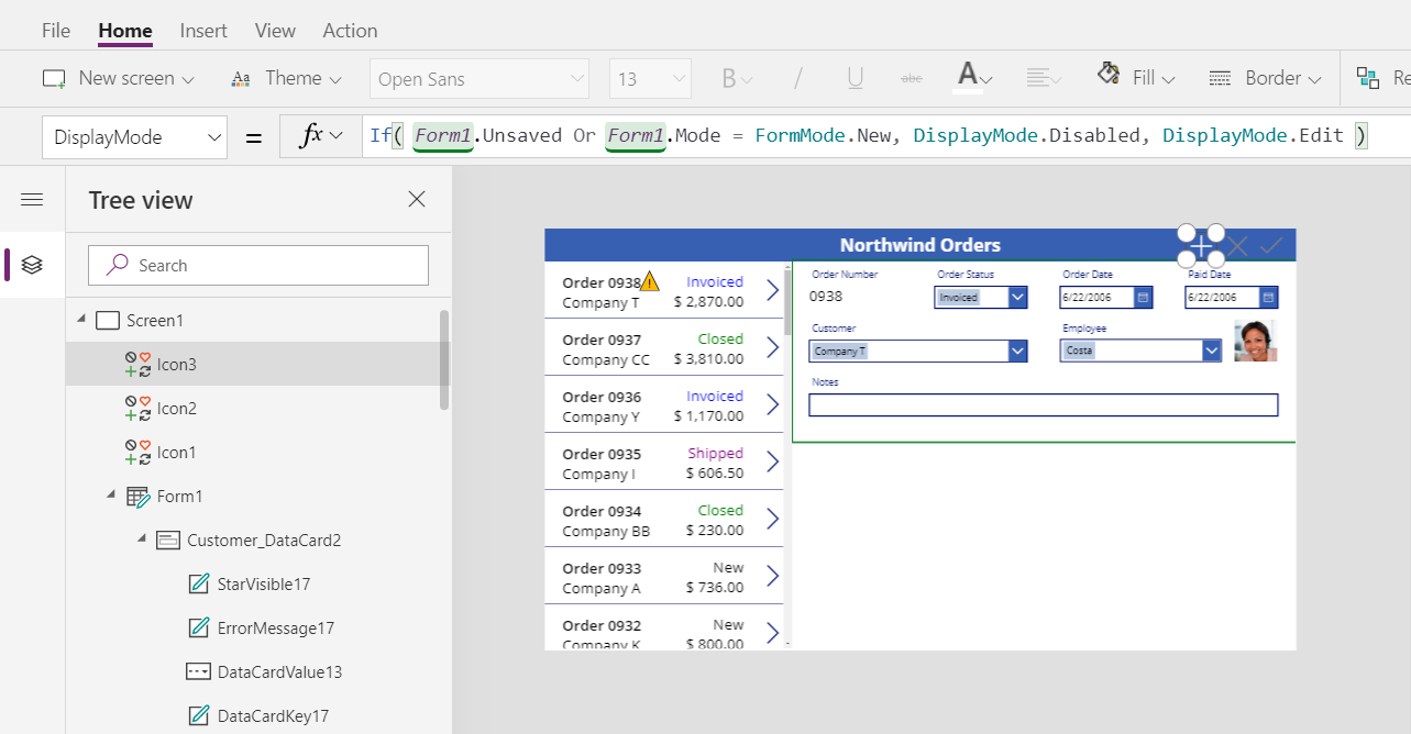
The formula disables the Add icon under these conditions:
- The user makes changes but doesn't save or cancel them, which is the opposite behavior from the Check and Cancel icons.
- The user selects the Add icon but makes no changes.
Set the Add icon's DisabledColor property to this value:
Gray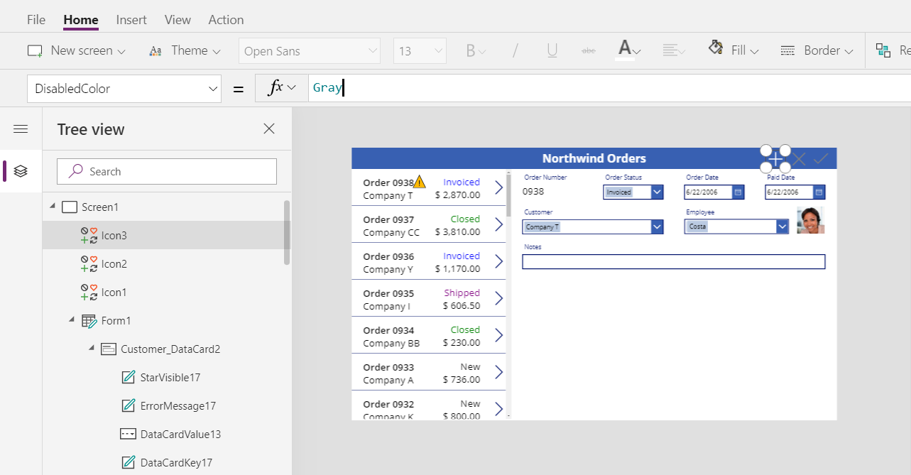
The user can create an order if they make no changes or they save or cancel any changes they've made. (If the user selects this icon, they can't select it again until they make one or more changes and then save or cancel those changes):
Note
If you create and save an order, you might need to scroll down in the order gallery to show your new order. It won't have a total price because you haven't added any order details yet.
Add a Trash icon
On the Insert tab, select Icons > Trash.
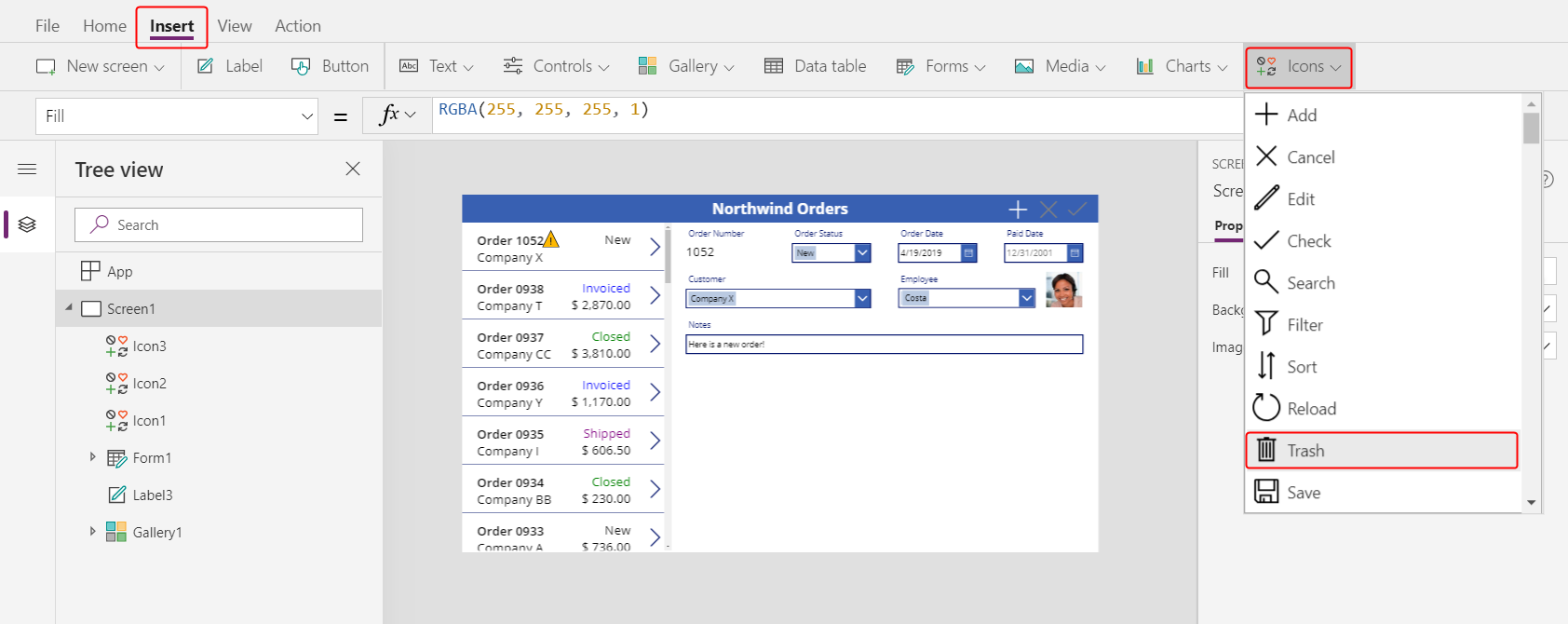
The Trash icon appears in the upper-left corner by default, where other controls might make it difficult to find:
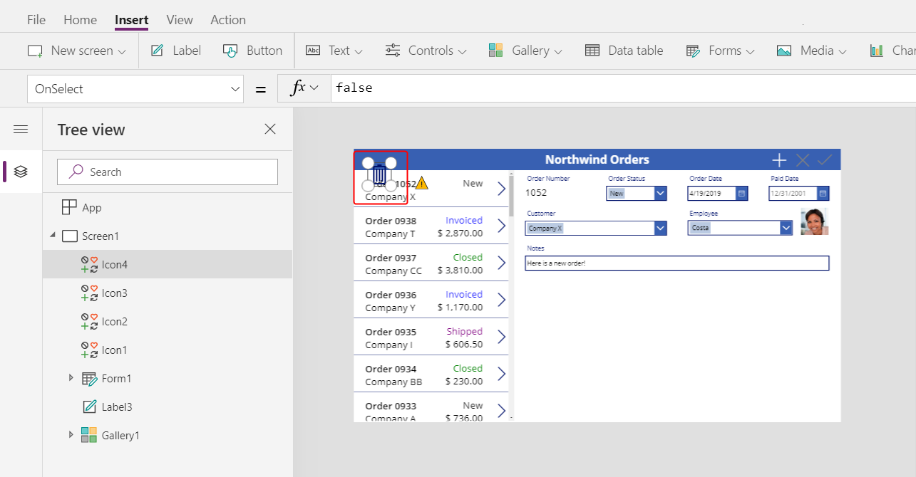
On the Home tab, change the Trash icon's Color property to white, resize the icon, and move it to the left of the Add icon:
Set the Trash icon's OnSelect property to this formula:
Remove( Orders, Gallery1.Selected )
The Remove function removes a record from a data source. In this formula, the function removes the record that's selected in the order gallery. The Trash icon appears near the summary form (not the order gallery) because the form shows more details about the record, so the user can more easily identify the record that the formula will delete.
Set the Trash icon's DisplayMode property to this formula:
If( Form1.Mode = FormMode.New, DisplayMode.Disabled, DisplayMode.Edit )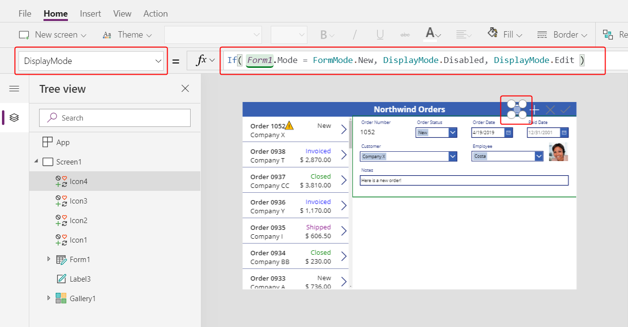
This formula disables the Trash icon if the user is creating a record. Until the user saves the record, the Remove function has no record to delete.
Set the Trash icon's DisabledColor property to this value:
Gray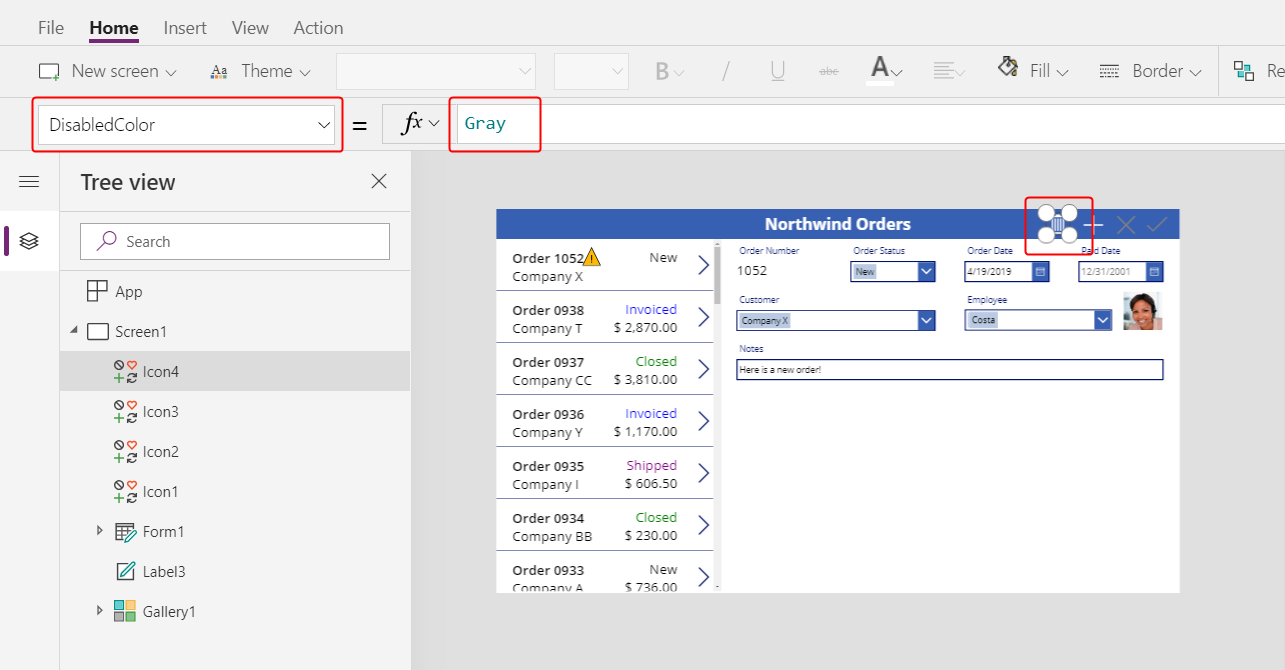
The user can delete an order.
Summary
To recap, you added a form in which the user can show and edit a summary of each order, and you used these elements:
- A form that shows data from the Orders table: Form1.DataSource =
Orders - A connection between the form and the order gallery: Form1.Item =
Gallery1.Selected - An alternate control for the Order number field: View text
- A many-to-one relationship to show the employee's picture in the Employee data card:
DataCardValue1.Selected.Picture - An icon to save changes to an order:
SubmitForm( Form1 ) - An icon to cancel changes to an order:
ResetForm( Form1 ) - An icon to create an order:
NewForm( Form1 ) - An icon to delete an order:
Remove( Orders, Gallery1.Selected )
Next step
In the next topic, you'll add another gallery to show the products in each order, and you'll change those details by using the Patch function.
Feedback
Coming soon: Throughout 2024 we will be phasing out GitHub Issues as the feedback mechanism for content and replacing it with a new feedback system. For more information see: https://aka.ms/ContentUserFeedback.
Submit and view feedback for