Tutorial: Create your own measures in Power BI Desktop
By using measures, you can create some of the most powerful data analysis solutions in Power BI Desktop. Measures help you by performing calculations on your data as you interact with your reports. This tutorial will guide you through understanding measures and creating your own basic measures in Power BI Desktop.
Prerequisites
This tutorial is intended for Power BI users already familiar with using Power BI Desktop to create more advanced models. You should already be familiar with using Get Data and Power Query Editor to import data, work with multiple related tables, and add fields to the report canvas. If you’re new to Power BI Desktop, be sure to check out Get Started with Power BI Desktop.
This tutorial uses the Contoso Sales Sample for Power BI Desktop file, which includes online sales data from the fictitious company, Contoso. Because this data is imported from a database, you can't connect to the datasource or view it in Power Query Editor. Download and extract the file on your computer.
Automatic measures
When Power BI Desktop creates a measure, it's most often created for you automatically. To see how Power BI Desktop creates a measure, follow these steps:
In Power BI Desktop, select File > Open, browse to the Contoso Sales Sample for Power BI Desktop.pbix file, and then choose Open.
In the Fields pane, expand the Sales table. Then, either select the check box next to the SalesAmount field or drag SalesAmount onto the report canvas.
A new column chart visualization appears, showing the sum total of all values in the SalesAmount column of the Sales table.
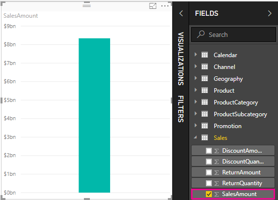
Any field (column) in the Fields pane with a sigma icon
 is numeric, and its values can be aggregated. Rather than display a table with many values (2,000,000 rows for SalesAmount), Power BI Desktop automatically creates and calculates a measure to aggregate the data if it detects a numeric datatype. Sum is the default aggregation for a numeric datatype, but you can easily apply different aggregations like average or count. Understanding aggregations is fundamental to understanding measures, because every measure performs some type of aggregation.
To change the chart aggregation, follow these steps:
Select the SalesAmount visualization in the report canvas.
In the Values area of the Visualizations pane, select the down arrow to the right of SalesAmount.
From the menu that appears, select Average.
The visualization changes to an average of all sales values in the SalesAmount field.

Depending on the result you want, you can change the type of aggregation. However, not all types of aggregation apply to every numeric datatype. For example, for the SalesAmount field, Sum and Average are useful, and Minimum and Maximum have their place as well. However, Count doesn't make sense for the SalesAmount field, because while its values are numeric, they’re really currency.
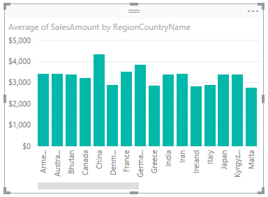
Values calculated from measures change in response to your interactions with your report. For example, if you drag the RegionCountryName field from the Geography table onto your existing SalesAmount chart, it changes to show the average sales amounts for each country/region.
When the result of a measure changes because of an interaction with your report, you've affected your measure’s context. Every time you interact with your report visualizations, you're changing the context in which a measure calculates and displays its results.
Create and use your own measures
In most cases, Power BI Desktop automatically calculates and returns values according to the types of fields and aggregations you choose. However, in some cases you might want to create your own measures to perform more complex, unique calculations. With Power BI Desktop, you can create your own measures with the Data Analysis Expressions (DAX) formula language.
DAX formulas use many of the same functions, operators, and syntax as Excel formulas. However, DAX functions are designed to work with relational data and perform more dynamic calculations as you interact with your reports. There are over 200 DAX functions that do everything from simple aggregations like sum and average to more complex statistical and filtering functions. There are many resources to help you learn more about DAX. After you've finished this tutorial, see DAX basics in Power BI Desktop.
When you create your own measure, it's called a model measure, and it's added to the Fields list for the table you select. Some advantages of model measures are that you can name them whatever you want, making them more identifiable. You can use them as arguments in other DAX expressions, and you can make them perform complex calculations quickly.
Quick measures
Many common calculations are available as quick measures, which write the DAX formulas for you based on your inputs in a window. These quick, powerful calculations are also great for learning DAX or seeding your own customized measures.
Create a quick measure using one of these methods:
From a table in the Fields pane, right-click or select More options (...), and then choose New quick measure from the list.
Under Calculations in the Home tab of the Power BI Desktop ribbon, select New Quick Measure.
For more information about creating and using quick measures, see Use quick measures.
Create a measure
Suppose you want to analyze your net sales by subtracting discounts and returns from total sales amounts. For the context that exists in your visualization, you need a measure that subtracts the sum of DiscountAmount and ReturnAmount from the sum of SalesAmount. There's no field for Net Sales in the Fields list, but you have the building blocks to create your own measure to calculate net sales.
To create a measure, follow these steps:
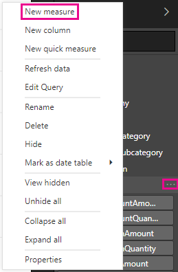
In the Fields pane, right-click the Sales table, or hover over the table and select More options (...).
From the menu that appears, choose New measure.
This action saves your new measure in the Sales table, where it's easy to find.
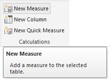
You can also create a new measure by selecting New Measure in the Calculations group on the Home tab of the Power BI Desktop ribbon.
Tip
When you create a measure from the ribbon, you can create it in any of your tables, but it's easier to find if you create it where you plan to use it. In this case, select the Sales table first to make it active, and then choose New measure.
The formula bar appears along the top of the report canvas, where you can rename your measure and enter a DAX formula.

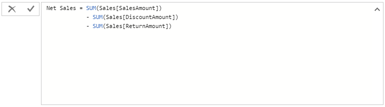
By default, each new measure is named Measure. If you don’t rename it, new measures are named Measure 2, Measure 3, and so on. Because we want this measure to be more identifiable, highlight Measure in the formula bar, and then change it to Net Sales.
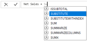
Begin entering your formula. After the equals sign, start to type Sum. As you type, a drop-down suggestion list appears, showing all the DAX functions, beginning with the letters you type. Scroll down, if necessary, to select SUM from the list, and then press Enter.
An opening parenthesis appears, along with a drop-down suggestion list of the available columns you can pass to the SUM function.
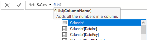
Expressions always appear between opening and closing parentheses. For this example, your expression contains a single argument to pass to the SUM function: the SalesAmount column. Begin typing SalesAmount until Sales(SalesAmount) is the only value left in the list.
The column name preceded by the table name is called the fully qualified name of the column. Fully qualified column names make your formulas easier to read.

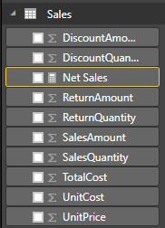
Select Sales[SalesAmount] from the list, and then enter a closing parenthesis.
Tip
Syntax errors are most often caused by a missing or misplaced closing parenthesis.
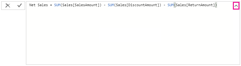
Subtract the other two columns inside the formula:
a. After the closing parenthesis for the first expression, type a space, a minus operator (-), and then another space.
b. Enter another SUM function, and start typing DiscountAmount until you can choose the Sales[DiscountAmount] column as the argument. Add a closing parenthesis.
c. Type a space, a minus operator, a space, another SUM function with Sales[ReturnAmount] as the argument, and then a closing parenthesis.

Press Enter or select Commit (checkmark icon) in the formula bar to complete and validate the formula.
The validated Net Sales measure is now ready to use in the Sales table in the Fields pane.
If you run out of room for entering a formula or want it on separate lines, select the down arrow on the right side of the formula bar to provide more space.
The down arrow turns into an up arrow and a large box appears.
Separate parts of your formula by pressing Alt + Enter for separate lines, or pressing Tab to add tab spacing.
Use your measure in the report
Add your new Net Sales measure to the report canvas, and calculate net sales for whatever other fields you add to the report.
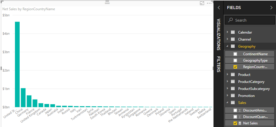
To look at net sales by country/region:
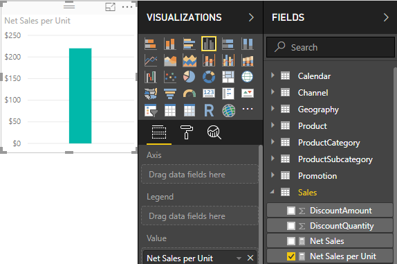
Select the Net Sales measure from the Sales table, or drag it onto the report canvas.
Select the RegionCountryName field from the Geography table, or drag it onto the Net Sales chart.
To see the difference between net sales and total sales by country/region, select the SalesAmount field or drag it onto the chart.
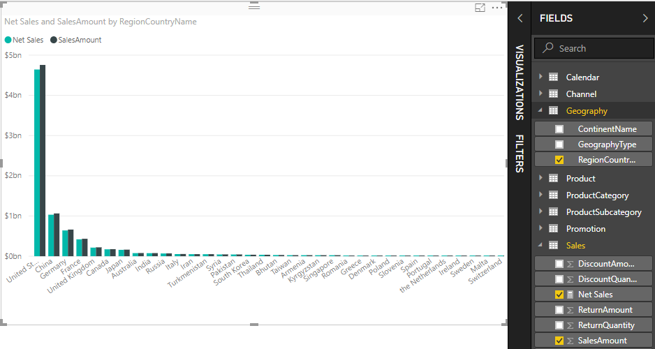
The chart now uses two measures: SalesAmount, which Power BI summed automatically, and the Net Sales measure, which you manually created. Each measure was calculated in the context of another field, RegionCountryName.
Use your measure with a slicer
Add a slicer to further filter net sales and sales amounts by calendar year:
Select a blank area next to the chart. In the Visualizations pane, select the Table visualization.
This action creates a blank table visualization on the report canvas.
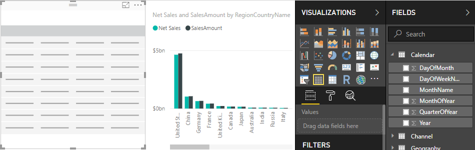
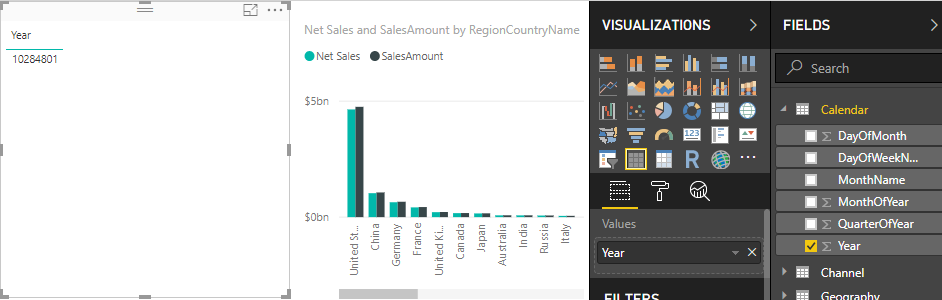
Drag the Year field from the Calendar table onto the new blank table visualization.
Because Year is a numeric field, Power BI Desktop sums up its values. This summation doesn’t work well as an aggregation; we'll address that in the next step.
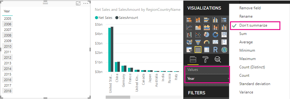
In the Values box in the Visualizations pane, select the down arrow next to Year, and then choose Don't summarize from the list. The table now lists individual years.
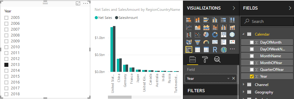
Select the Slicer icon in the Visualizations pane to convert the table to a slicer. If the visualization displays a slider instead of a list, choose List from the down arrow in the slider.

Select any value in the Year slicer to filter the Net Sales and Sales Amount by RegionCountryName chart accordingly. The Net Sales and SalesAmount measures recalculate and display results in the context of the selected Year field.
Use your measure in another measure
Suppose you want to find out which products have the highest net sales amount per unit sold. You'll need a measure that divides net sales by the quantity of units sold. Create a new measure that divides the result of your Net Sales measure by the sum of Sales[SalesQuantity].
In the Fields pane, create a new measure named Net Sales per Unit in the Sales table.
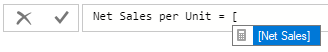
In the formula bar, begin typing Net Sales. The suggestion list shows what you can add. Select [Net Sales].
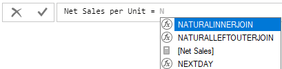
You can also reference measures by just typing an opening bracket ([). The suggestion list shows only measures to add to your formula.
Enter a space, a divide operator (/), another space, a SUM function, and then type Quantity. The suggestion list shows all the columns with Quantity in the name. Select Sales[SalesQuantity], type the closing parenthesis, and press ENTER or choose Commit (checkmark icon) to validate your formula.
The resulting formula should appear as:
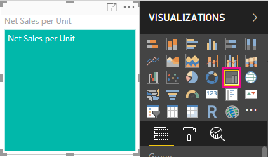
Net Sales per Unit = [Net Sales] / SUM(Sales[SalesQuantity])Select the Net Sales per Unit measure from the Sales table, or drag it onto a blank area in the report canvas.
The chart shows the net sales amount per unit over all products sold. This chart isn't informative; we'll address it in the next step.
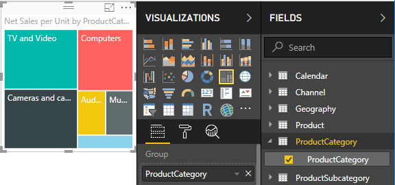
For a different look, change the chart visualization type to Treemap.
Select the Product Category field, or drag it onto the treemap or the Group field of the Visualizations pane. Now you have some good info!
Try removing the ProductCategory field, and dragging the ProductName field onto the chart instead.
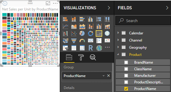
Ok, now we're just playing, but you have to admit that's cool! Experiment with other ways to filter and format the visualization.
What you've learned
Measures give you the power to get the insights you want from your data. You've learned how to create measures by using the formula bar, name them whatever makes most sense, and find and select the right formula elements by using the DAX suggestion lists. You've also been introduced to context, where the results of calculations in measures change according to other fields or other expressions in your formula.
Related content
To learn more about Power BI Desktop quick measures, which provide many common measure calculations for you, see Use quick measures for common calculations.
If you want to take a deeper dive into DAX formulas and create some more advanced measures, see Learn DAX basics in Power BI Desktop. This article focuses on fundamental concepts in DAX, such as syntax, functions, and a more thorough understanding of context.
Be sure to add the Data Analysis Expressions (DAX) Reference to your favorites. This reference is where you'll find detailed info on DAX syntax, operators, and over 200 DAX functions.
Other articles of interest:
Feedback
Coming soon: Throughout 2024 we will be phasing out GitHub Issues as the feedback mechanism for content and replacing it with a new feedback system. For more information see: https://aka.ms/ContentUserFeedback.
Submit and view feedback for