Tutorial: Build a bar chart
This tutorial shows you how to develop a Power BI visual that displays data in the form of a simple bar chart. This visual supports a minimal amount of customization. Other pages of this documentation explain how to add further customization like context menus, tool-tips, and more.
In this tutorial, you learn how to:
- Define the capabilities of your visual
- Understand the source code used to build a visual
- Render the visual
- Add objects to the properties pane
- Package the visual
Set up your environment
Before you start developing your Power BI visual, verify that you have everything listed in this section.
A Power BI Pro or Premium Per User (PPU) account. If you don't have one, sign up for a free trial.
Visual Studio Code (VS Code). VS Code is an ideal Integrated Development Environment (IDE) for developing JavaScript and TypeScript applications.
Windows PowerShell version 4 or later (for Windows). Or Terminal (for OSX).
An environment ready for developing a Power BI visual. Set up your environment for developing a Power BI visual.
This tutorial uses the US Sales Analysis report. You can download this report and upload it to Power BI service, or use your own report. If you need more information about Power BI service, and uploading files, refer to the Get started creating in the Power BI service tutorial.
Note
If the D3 JavaScript library wasn't installed as part of your setup, install it now. From PowerShell, run npm i d3@latest --save
Creating a bar chart visual involves the following steps:
- Create a new project
- Define the capabilities file -
capabilities.json - Create the visual API
- Package your visual -pbiviz.json
Create a new project
The purpose of this tutorial is to help you understand how a visual is structured and written. You can follow these instructions to create a bar code visual from scratch, or you can clone the source code repository and use it to follow along without creating your own visual.
Open PowerShell and navigate to the folder you want to create your project in.
Enter the following command:
pbiviz new BarChartYou should now have a folder called BarChart containing the visual's files.
In VS Code, open the [tsconfig.json] (visual-project-structure.md#tsconfigjson) file and change the name of "files" to "src/barChart.ts".
"files": [
"src/barChart.ts"
]
The tsconfig.json "files" object points to the file where the main class of the visual is located.
Your final tsconfig.json file should look like this.
The package.json file contains a list of project dependencies. Replace your package.json file with this one.
You should now have a new folder for your visual with the following files and folders:
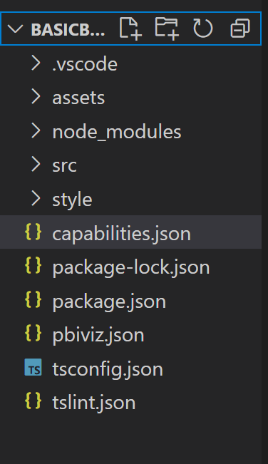
For a detailed explanation of the function of each of these files, see Power BI visual project structure.
The two files we focus on in this tutorial are the capabilities.json file, which describes the visual to the host, and the src/barchart.ts file, which contains the visual's API.
Define capabilities
The capabilities.json file is where we bind data to the host. We describe the kind of data fields it accepts and what features the visual should have.
Define data roles
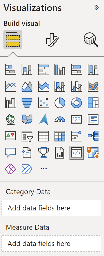
Variables are defined and bound in the dataRoles section of the capabilities file. We want our bar chart to accept two types of variables:
- Categorical data represented by the different bars on the chart
- Numerical, or measured data, which is represented by the height of each bar
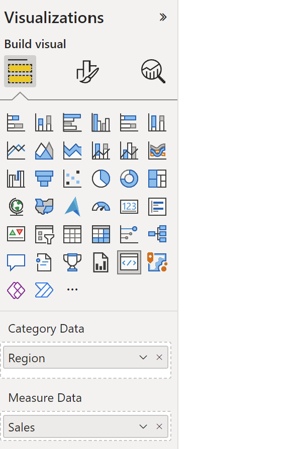
In Visual Studio Code, in the capabilities.json file, confirm that the following JSON fragment appears in the object labeled "dataRoles".
    "dataRoles": [
        {
            "displayName": "Category Data",
            "name": "category",
            "kind": "Grouping"
        },
        {
            "displayName": "Measure Data",
            "name": "measure",
            "kind": "Measure"
        }
    ],
Map the data
Next, add data mapping to tell the host what to do with these variables:
Replace the content of the "dataViewMappings" object with the following code:
"dataViewMappings": [
        {
            "conditions": [
                {
                    "category": {
                        "max": 1
                    },
                    "measure": {
                        "max": 1
                    }
                }
            ],
            "categorical": {
                "categories": {
                    "for": {
                        "in": "category"
                    }
                },
                "values": {
                    "select": [
                        {
                            "bind": {
                                "to": "measure"
                            }
                        }
                    ]
                }
            }
        }
    ],
The above code creates the "conditions" that each data-role object can hold only one field at a time. Notice that we use the data-role's internal name to refer to each field.
It also sets the categorical data mapping so that each field is mapped to the correct variable.
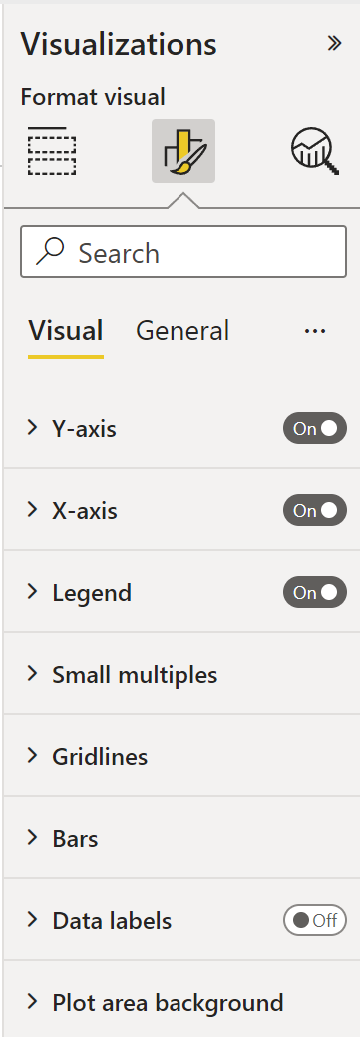
Define objects for the properties pane
The "objects" section of the capabilities file is where we define the customizable features that should appear on the format pane. These features don't affect the content of the chart but they can change its look and feel.
For more information on objects and how they work, see Objects.
The following objects are optional. Add them if you want to go through the optional sections of this tutorial to add colors and render the X-axis.
Replace the content of the "objects" section with the following code:
     "objects": {
        "enableAxis": {
            "properties": {
                "show": {
                    "type": {
                        "bool": true
                    }
                },
                "fill": {
                    "type": {
                        "fill": {
                            "solid": {
                                "color": true
                            }
                        }
                    }
                }
            }
        }
     },
Save the capabilities.json file.
Your final capabilities file should look like the one in this example.
Visual API
All visuals start with a class that implements the IVisual interface. The src/visual.ts file is the default file that contains this class.
In this tutorial, we call our IVisual file barChart.ts. Download the file and save it to the /src folder, if you didn't do so already. In this section, we go through this file in detail and describe the various sections.
Imports
The first section of the file imports the modules that are needed for this visual. Notice that in addition to the Power BI visual modules, we also import the d3 library.
The following modules are imported to your barChart.ts file:
import {
    scaleBand, scaleLinear
} from "d3-scale";
import {
    select as d3Select
} from "d3-selection";
import "./../style/visual.less";

import { axisBottom } from "d3-axis";

import powerbiVisualsApi from "powerbi-visuals-api";
import powerbi = powerbiVisualsApi;

type Selection<T1, T2 = T1> = d3.Selection<any, T1, any, T2>;

import DataViewCategoryColumn = powerbi.DataViewCategoryColumn;
import DataViewObjects = powerbi.DataViewObjects;
import Fill = powerbi.Fill;
import ISandboxExtendedColorPalette = powerbi.extensibility.ISandboxExtendedColorPalette;
import ISelectionId = powerbi.visuals.ISelectionId;
import IVisual = powerbi.extensibility.IVisual;
import IVisualHost = powerbi.extensibility.visual.IVisualHost;
import PrimitiveValue = powerbi.PrimitiveValue;
import VisualUpdateOptions = powerbi.extensibility.visual.VisualUpdateOptions;
import VisualConstructorOptions = powerbi.extensibility.visual.VisualConstructorOptions;

import { textMeasurementService } from "powerbi-visuals-utils-formattingutils";

import { dataViewWildcard } from "powerbi-visuals-utils-dataviewutils";
import { getCategoricalObjectValue, getValue } from "./objectEnumerationUtility";
Interfaces
Next, we define the viewmodel interfaces. The following three interfaces are used to describe our bar chart visual:
- BarChartDataPoint
- BarChartViewModel
- BarChartSettings
These interfaces are defined as follows:
/**
 * Interface for BarCharts viewmodel.
 *
 * @interface
 * @property {BarChartDataPoint[]} dataPoints - Set of data points the visual will render.
 * @property {number} dataMax                 - Maximum data value in the set of data points.
 */
interface BarChartViewModel {
    dataPoints: BarChartDataPoint[];
    dataMax: number;
    settings: BarChartSettings;
}

/**
 * Interface for BarChart data points.
 *
 * @interface
 * @property {number} value             - Data value for point.
 * @property {string} category          - Corresponding category of data value.
 * @property {string} color             - Color corresponding to data point.
 * @property {ISelectionId} selectionId - Id assigned to data point for cross filtering
 *                                        and visual interaction.
 */
interface BarChartDataPoint {
    value: PrimitiveValue;
    category: string;
    color: string;
    strokeColor: string;
    strokeWidth: number;
    selectionId: ISelectionId;
}

/**
 * Interface for BarChart settings.
 *
 * @interface
 * @property {{show:boolean}} enableAxis - Object property that allows axis to be enabled.
*/
interface BarChartSettings {
    enableAxis: {
        show: boolean;
        fill: string;
    };
}

let defaultSettings: BarChartSettings = {
    enableAxis: {
        show: false,
        fill: "#000000",
    }
};
Visual transform
Now that the data structures are defined, we need to map data onto them using the visualTransform function. This function receives data from the data view and transforms it to a format the visual can use. In this case, it returns the BarChartViewModel interface described in the previous section.
The DataView contains the data to be visualized. This data can be in different forms, such as categorical or tabular. To build a categorical visual like a bar chart, use the categorical property on the DataView.
This function is called whenever the visual is updated.
/**
 * Function that converts queried data into a viewmodel that will be used by the visual.
 *
 * @function
 * @param {VisualUpdateOptions} options - Contains references to the size of the container
 *                                        and the dataView which contains all the data
 *                                        the visual had queried.
 * @param {IVisualHost} host            - Contains references to the host which contains services
 */
function visualTransform(options: VisualUpdateOptions, host: IVisualHost): BarChartViewModel {
    let dataViews = options.dataViews;
    let viewModel: BarChartViewModel = {
        dataPoints: [],
        dataMax: 0,
        settings: <BarChartSettings>{}
    };

    if (!dataViews
        || !dataViews[0]
        || !dataViews[0].categorical
        || !dataViews[0].categorical.categories
        || !dataViews[0].categorical.categories[0].source
        || !dataViews[0].categorical.values
    ) {
        return viewModel;
    }

    let categorical = dataViews[0].categorical;
    let category = categorical.categories[0];
    let dataValue = categorical.values[0];

    let barChartDataPoints: BarChartDataPoint[] = [];
    let dataMax: number;

    let colorPalette: ISandboxExtendedColorPalette = host.colorPalette;
    let objects = dataViews[0].metadata.objects;

    const strokeColor: string = getColumnStrokeColor(colorPalette);

    let barChartSettings: BarChartSettings = {
        enableAxis: {
            show: getValue<boolean>(objects, 'enableAxis', 'show', defaultSettings.enableAxis.show),
            fill: getAxisTextFillColor(objects, colorPalette, defaultSettings.enableAxis.fill),
        }
    };

    const strokeWidth: number = getColumnStrokeWidth(colorPalette.isHighContrast);

    for (let i = 0, len = Math.max(category.values.length, dataValue.values.length); i < len; i++) {
        const color: string = getColumnColorByIndex(category, i, colorPalette);

        const selectionId: ISelectionId = host.createSelectionIdBuilder()
            .withCategory(category, i)
            .createSelectionId();

        barChartDataPoints.push({
            color,
            strokeColor,
            strokeWidth,
            selectionId,
            value: dataValue.values[i],
            category: `${category.values[i]}`,
        });
    }

    dataMax = <number>dataValue.maxLocal;

    return {
        dataPoints: barChartDataPoints,
        dataMax: dataMax,
        settings: barChartSettings,
    };
}
Note
The next few functions in the barChart.ts file deal with color and creating the X axis. Those are optional and are discussed further down in this tutorial. This tutorial will continue from the IVisual function.
Render the visual
Once the data is defined, we render the visual using the BarChart class that implements theIVisual interface. The IVisual interface is described on the Visual API page. It contains a constructor method that creates the visual and an update method that is called each time the visual reloads.
Before rendering the visual, we have to declare the members of the class:
export class BarChart implements IVisual {
    private svg: Selection<any>;
    private host: IVisualHost;
    private barContainer: Selection<SVGElement>;
    private xAxis: Selection<SVGElement>;
    private barDataPoints: BarChartDataPoint[];
    private barChartSettings: BarChartSettings;

    private barSelection: d3.Selection<d3.BaseType, any, d3.BaseType, any>;

    static Config = {
        xScalePadding: 0.1,
        solidOpacity: 1,
        transparentOpacity: 1,
        margins: {
            top: 0,
            right: 0,
            bottom: 25,
            left: 30,
        },
        xAxisFontMultiplier: 0.04,
    }
 }
Construct the visual
The constructor function is called only once, when the visual is rendered for the first time. It creates empty SVG containers for the bar chart and the X-axis. Notice that it uses the d3 library to render the SVG.
/**
     * Creates instance of BarChart. This method is only called once.
     *
     * @constructor
     * @param {VisualConstructorOptions} options - Contains references to the element that will
     *                                             contain the visual and a reference to the host
     *                                             which contains services.
     */
    constructor(options: VisualConstructorOptions) {
        this.host = options.host;

        this.svg = d3Select(options.element)
            .append('svg')
            .classed('barChart', true);

        this.barContainer = this.svg
            .append('g')
            .classed('barContainer', true);

        this.xAxis = this.svg
            .append('g')
            .classed('xAxis', true);
    }
Update the visual
The update method is called every time the size of the visual or one of its values changes.
Scaling
We need to scale the visual so that the number of bars and current values fit into the defined width and height limits of the visual. This is similar to the update method in the Circle card tutorial.
To calculate the scale, we use the scaleLinear and scaleBand methods that were imported earlier from the d3-scale library.
The viewModel.datamax value holds the largest value of all current data points. This value is used to determine the height of the y axis. The scaling for the width of the x axis is determined by the number of categories bound to the visual in the barchartdatapoint interface.
For cases where the X axis is rendered, this visual also handles word breaks in case there isn't enough room to write out the entire name on the X axis.
Other update features
In addition to scaling, the update method also handles selections and colors. These features are optional and are discussed later:
   /**
     * Updates the state of the visual. Every sequential databinding and resize will call update.
     *
     * @function
     * @param {VisualUpdateOptions} options - Contains references to the size of the container
     *                                        and the dataView which contains all the data
     *                                        the visual had queried.
     */
    public update(options: VisualUpdateOptions) {
        let viewModel: BarChartViewModel = visualTransform(options, this.host);
        let settings = this.barChartSettings = viewModel.settings;
        this.barDataPoints = viewModel.dataPoints;

        let width = options.viewport.width;
        let height = options.viewport.height;

        this.svg
            .attr("width", width)
            .attr("height", height);

        if (settings.enableAxis.show) {
            let margins = BarChart.Config.margins;
            height -= margins.bottom;
        }

        this.xAxis
            .style("font-size", Math.min(height, width) * BarChart.Config.xAxisFontMultiplier)
            .style("fill", settings.enableAxis.fill);

        let yScale = scaleLinear()
            .domain([0, viewModel.dataMax])
            .range([height, 0]);

        let xScale = scaleBand()
            .domain(viewModel.dataPoints.map(d => d.category))
            .rangeRound([0, width])
            .padding(0.2);

        let xAxis = axisBottom(xScale);

        const colorObjects = options.dataViews[0] ? options.dataViews[0].metadata.objects : null;
        this.xAxis.attr('transform', 'translate(0, ' + height + ')')
            .call(xAxis)
            .attr("color", getAxisTextFillColor(
                colorObjects,
                this.host.colorPalette,
                defaultSettings.enableAxis.fill
            ));

        const textNodes = this.xAxis.selectAll("text")
        BarChart.wordBreak(textNodes, xScale.bandwidth(), height);

        this.barSelection = this.barContainer
            .selectAll('.bar')
            .data(this.barDataPoints);

        const barSelectionMerged = this.barSelection
            .enter()
            .append('rect')
            .merge(<any>this.barSelection);

        barSelectionMerged.classed('bar', true);

        barSelectionMerged
            .attr("width", xScale.bandwidth())
            .attr("height", d => height - yScale(<number>d.value))
            .attr("y", d => yScale(<number>d.value))
            .attr("x", d => xScale(d.category))
            .style("fill", (dataPoint: BarChartDataPoint) => dataPoint.color)
            .style("stroke", (dataPoint: BarChartDataPoint) => dataPoint.strokeColor)
            .style("stroke-width", (dataPoint: BarChartDataPoint) => `${dataPoint.strokeWidth}px`);

        this.barSelection
            .exit()
            .remove();

    }

    private static wordBreak(
        textNodes: Selection<any, SVGElement>,
        allowedWidth: number,
        maxHeight: number
    ) {
        textNodes.each(function () {
            textMeasurementService.wordBreak(
                this,
                allowedWidth,
                maxHeight);
        });
    }
Populate the properties pane
The final method in the IVisual function is getFormattingModel. This method builds and returns a modern format pane formatting model object containing all the format pane components and properties. It then places the object inside the Format pane.
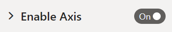
In our case, we create format cards for enableAxis and colorSelector, including formatting properties for show and fill, according to the "objects" in the capabilities.json file.
To build a formatting model, the developer should be familiar with all its components, Check out the components of the format pane in Format Pane.
To add a color picker for each category on the Property pane, add a for loop on barDataPoints and for each one add a new color picker format property to the formatting model.
    /** Gets the settings to display in the formatting pane */
    public getFormattingModel(): powerbi.visuals.FormattingModel {
        const enableAxisCard: powerbi.visuals.FormattingCard = {
            displayName: "Enable Axis",
            uid: "enableAxisCard_uid",
            topLevelToggle: {
                uid: "enableAxisCard_topLevelToggle_showToggleSwitch_uid",
                suppressDisplayName: true,
                control: {
                    type: powerbi.visuals.FormattingComponent.ToggleSwitch,
                    properties: {
                        descriptor: {
                            objectName: "enableAxis",
                            propertyName: "show"
                        },
                        value: this.barChartSettings.enableAxis.show
                    }
                }
            },
            groups: [{
                displayName: undefined,
                uid: "enableAxisCard_group1_uid",
                slices: [
                    {
                        uid: "enableAxisCard_group1_fill_uid",
                        displayName: "Color",
                        control: {
                            type: powerbi.visuals.FormattingComponent.ColorPicker,
                            properties: {
                                descriptor: {
                                    objectName: "enableAxis",
                                    propertyName: "fill"
                                },
                                value: { value: this.barChartSettings.enableAxis.fill }
                            }
                        }
                    }
                ],
            }],
            revertToDefaultDescriptors: [
                {
                    objectName: "enableAxis",
                    propertyName: "show"
                },
                {
                    objectName: "enableAxis",
                    propertyName: "fill"
                }
            ]
        };

        const colorSelectorCard: powerbi.visuals.FormattingCard = {
            displayName: "Data Colors",
            uid: "dataColorsCard_uid",
            groups: [{
                displayName: undefined,
                uid: "dataColorsCard_group_uid",

                slices: [],
            }]
        };

        if (this.barDataPoints) {
            this.barDataPoints.forEach(dataPoint => {
                (colorSelectorCard.groups[0] as powerbi.visuals.FormattingGroup).slices.push(
                    {
                        uid: `dataColorsCard_group_colorSelector${dataPoint.category}_uid`,
                        displayName: dataPoint.category,
                        control: {
                            type: powerbi.visuals.FormattingComponent.ColorPicker,
                            properties: {
                                descriptor: {
                                    objectName: "colorSelector",
                                    propertyName: "fill",
                                    selector: dataViewWildcard.createDataViewWildcardSelector(dataViewWildcard.DataViewWildcardMatchingOption.InstancesAndTotals),
                                    altConstantValueSelector: dataPoint.selectionId.getSelector(),
                                    instanceKind: powerbi.VisualEnumerationInstanceKinds.ConstantOrRule
                                },
                                value: { value: dataPoint.color }
                            }
                        }
                    });
            });

            colorSelectorCard.revertToDefaultDescriptors = [
                {
                    objectName: "colorSelector",
                    propertyName: "fill"
                }
            ]
        }
        return { cards: [enableAxisCard, colorSelectorCard] };
    }
(Optional) Populate the properties pane using the formatting model Utils
Populate the properties pane using the getFormattingModel API in the formatting model utils repository.
For the full code of a sample bar chart with formatting model utils, see the bar chart repository.
Declare formatting properties and their values in a formatting settings class:
import powerbi from "powerbi-visuals-api";
import { dataViewWildcard } from "powerbi-visuals-utils-dataviewutils";
import { formattingSettings } from "powerbi-visuals-utils-formattingmodel";
import { BarChartDataPoint } from "./barChart";

import FormattingSettingsCard = formattingSettings.SimpleCard;
import FormattingSettingsSlice = formattingSettings.Slice;
import FormattingSettingsModel = formattingSettings.Model;

/**
 * Enable Axis Formatting Card
 */
class EnableAxisCardSettings extends FormattingSettingsCard {
    // Formatting property `show` toggle switch (formatting simple slice)
    show = new formattingSettings.ToggleSwitch({
        name: "show",
        displayName: undefined,
        value: false,
        topLevelToggle: true,
        show: true
    });

    // Formatting property `fill` color picker (formatting simple slice)
    fill = new formattingSettings.ColorPicker({
        name: "fill",
        displayName: "Color",
        value: { value: "#000000" },
        show: true
    });

    name: string = "enableAxis";
    displayName: string = "Enable Axis";
    show: boolean = true;
    slices: Array<FormattingSettingsSlice> = [this.show, this.fill];
}

/**
 * Color Selector Formatting Card
 */

class ColorSelectorCardSettings extends FormattingSettingsCard {
    name: string = "colorSelector";
    displayName: string = "Data Colors";

    // slices will be populated in barChart settings model `populateColorSelector` method
    slices: Array<FormattingSettingsSlice> = [];
}

/**
* BarChart settings model class
*
*/
export class BarChartSettingsModel extends FormattingSettingsModel {

    // Create formatting settings model formatting cards
    enableAxis = new EnableAxisCardSettings();
    colorSelector = new ColorSelectorCardSettings();
    cards = [this.enableAxis, this.colorSelector];

    /**
     * populate colorSelector object categories formatting properties
     * @param dataPoints
     */
    populateColorSelector(dataPoints: BarChartDataPoint[]) {
        let slices = this.colorSelector.slices;
        if (dataPoints) {
            dataPoints.forEach(dataPoint => {
                slices.push(new formattingSettings.ColorPicker({
                    name: "fill",
                    displayName: dataPoint.category,
                    value: { value: dataPoint.color },
                    selector: dataViewWildcard.createDataViewWildcardSelector(dataViewWildcard.DataViewWildcardMatchingOption.InstancesAndTotals),
                    altConstantSelector: dataPoint.selectionId.getSelector(),
                    instanceKind: powerbi.VisualEnumerationInstanceKinds.ConstantOrRule
                }));
            });
        }
    }
}
Build and create the formatting settings service model in the visual's constructor method. The formatting settings service receives the barChart format settings and converts them into a FormattingModel object that's returned in the getFormattingModel API.
To use the localization feature, add the localization manager to the formatting settings service.
    import { FormattingSettingsService } from "powerbi-visuals-utils-formattingmodel";

    // ...
    // declare utils formatting settings service
    private formattingSettingsService: FormattingSettingsService;
    //...

    constructor(options: VisualConstructorOptions) {
        this.host = options.host;
        const localizationManager = this.host.createLocalizationManager();
        this.formattingSettingsService = new FormattingSettingsService(localizationManager);

        // Add here rest of your custom visual constructor code
    }
Update the formatting settings model using update API. Call the Update API each time a formatting property in the properties pane is changed. Create bar chart selectors data points and populate them in formatting settings model:
    // declare formatting settings model for bar chart
    private formattingSettings: BarChartSettingsModel;

    // ...

    public update(options: VisualUpdateOptions) {
        this.formattingSettings = this.formattingSettingsService.populateFormattingSettingsModel(BarChartSettingsModel, options.dataViews[0]);
        this.barDataPoints = createSelectorDataPoints(options, this.host);
        this.formattingSettings.populateColorSelector(this.barDataPoints);

        // Add the rest of your custom visual update API code here

    }
Finally, the new API getFormattingModel is a simple line of code using the formatting settings service and current formatting settings model that was created in the update API above.
    public getFormattingModel(): powerbi.visuals.FormattingModel {
        return this.formattingSettingsService.buildFormattingModel(this.formattingSettings);
    }
(Optional) Render the X axis (static objects)
You can add objects to the Property pane to further customize the visual. These customizations can be user interface changes, or changes related to the data that was queried.
You can toggle these objects on or off in the Property pane.
This example renders an X-axis on the bar chart as a static object.
We already added the enableAxis property to the capabilities file and the barChartSettings interface.
Add the following code to the barChart.ts file before the iVisual class to draw the X-axis:
function getAxisTextFillColor(
    objects: DataViewObjects,
    colorPalette: ISandboxExtendedColorPalette,
    defaultColor: string
): string {
    if (colorPalette.isHighContrast) {
        return colorPalette.foreground.value;
    }

    return getValue<Fill>(
        objects,
        "enableAxis",
        "fill",
        {
            solid: {
                color: defaultColor,
            }
        },
    ).solid.color;
}
(Optional) Add color (data-bound objects)
Data-bound objects are similar to static objects, but typically deal with data selection. For example, you can use data-bound objects to interactively select the color associated with each data point.
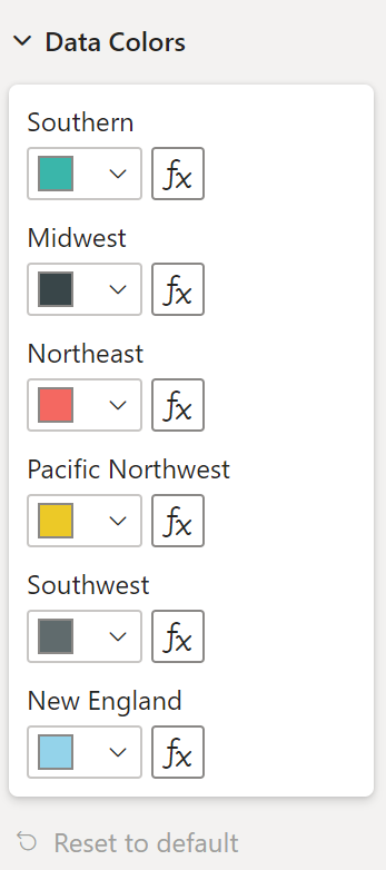
We already defined the colorSelector object in the capabilities file.
Each data point is represented by a different color. We include color in the BarChartDataPoint interface, and assign a default color to each data point when it's defined in IVisualHost.
function getColumnColorByIndex(
    category: DataViewCategoryColumn,
    index: number,
    colorPalette: ISandboxExtendedColorPalette,
): string {
    if (colorPalette.isHighContrast) {
        return colorPalette.background.value;
    }

    const defaultColor: Fill = {
        solid: {
            color: colorPalette.getColor(`${category.values[index]}`).value,
        }
    };

    return getCategoricalObjectValue<Fill>(
        category,
        index,
        'colorSelector',
        'fill',
        defaultColor
    ).solid.color;
}

function getColumnStrokeColor(colorPalette: ISandboxExtendedColorPalette): string {
    return colorPalette.isHighContrast
        ? colorPalette.foreground.value
        : null;
}

function getColumnStrokeWidth(isHighContrast: boolean): number {
    return isHighContrast
        ? 2
        : 0;
}
The colorPalette service, in the visualTransform function, manages these colors. Since visualTransform iterates through each of the data points, it's an ideal place to assign categorical objects like color.
For more detailed instructions on how to add color to your bar chart go to Add colors to your Power BI visual.
Note
Verify that your final barChart.ts file looks like this barChart.ts source code, or download the barChart.ts source code and use it to replace your file.
Object enumeration utility (optional)
Object property values are available as metadata in the dataView, but there's no service to help retrieve these values. ObjectEnumerationUtility is an optional set of static functions that iterate through the dataView and retrieve object values.
Create a file called objectEnumerationUtility.ts in the src folder and copy the following code into it:
/**
 * Gets property value for a particular object.
 *
 * @function
 * @param {DataViewObjects} objects - Map of defined objects.
 * @param {string} objectName       - Name of desired object.
 * @param {string} propertyName     - Name of desired property.
 * @param {T} defaultValue          - Default value of desired property.
 */
export function getValue<T>(objects: DataViewObjects, objectName: string, propertyName: string, defaultValue: T ): T {
    if(objects) {
        let object = objects[objectName];
        if(object) {
            let property: <T>T = object[propertyName];
            if(property !== undefined) {
                return property;
            }
        }
    }
    return defaultValue;
}

/**
 * Gets property value for a particular object in a category.
 *
 * @function
 * @param {DataViewCategoryColumn} category - List of category objects.
 * @param {number} index                    - Index of category object.
 * @param {string} objectName               - Name of desired object.
 * @param {string} propertyName             - Name of desired property.
 * @param {T} defaultValue                  - Default value of desired property.
 */
export function getCategoricalObjectValue<T>(category: DataViewCategoryColumn, index: number, objectName: string, propertyName: string, defaultValue: T): T {
    let categoryObjects = category.objects;

    if (categoryObjects) {
        let categoryObject: DataViewObject = categoryObjects[index];
        if (categoryObject) {
            let object = categoryObject[objectName];
            if (object) {
                let property: T = <T>object[propertyName];
                if (property !== undefined) {
                    return property;
                }
            }
        }
    }
    return defaultValue;
}
The function getCategoricalObjectValue provides a convenient way to access properties by their category index. You must provide an objectName and propertyName that match the object and property in capabilities.json.
See objectEnumerationUtility.ts for the source code.
Test the visual
Run the visual in the Power BI server to see how it looks:
In PowerShell, navigate to the project's folder and start the development app.
pbiviz startYour visual is now running while being hosted on your computer.
Important
Do not close the PowerShell window until the end of the tutorial. To stop the visual from running, enter Ctrl+C, and if prompted to terminate the batch job, enter Y, and then Enter.
View the visual in Power BI service by selecting the Developer visual from the Visualization pane.

Add data to the visual
Drag the edges of the visual to change the size and notice how the scale adjusts.
Toggle the X-axis on and off.
Change the colors of the different categories.
Add other features
You can further customize your visual by adding more features. You can add features that increase the visual's functionality, enhance its look and feel, or give the user more control over its appearance. For example, you can:
- Add Selection and Interactions with Other Visuals
- Add a property pane slider that controls opacity
- Add support for tooltips
- Add a landing page
- Add local language support
Package the visual
Before you can load your visual into Power BI Desktop or share it with the community in the Power BI Visual Gallery, you have to package it.
To prepare the visual for sharing, follow the instructions in Package a Power BI visual.
Note
For the full source code of a bar chart with more features, including tool-tips and a context menu, see Power BI visuals sample bar chart.
Related content
Feedback
Coming soon: Throughout 2024 we will be phasing out GitHub Issues as the feedback mechanism for content and replacing it with a new feedback system. For more information see: https://aka.ms/ContentUserFeedback.
Submit and view feedback for