Create small multiples in Power BI
APPLIES TO: ![]() Power BI Desktop
Power BI Desktop ![]() Power BI service
Power BI service
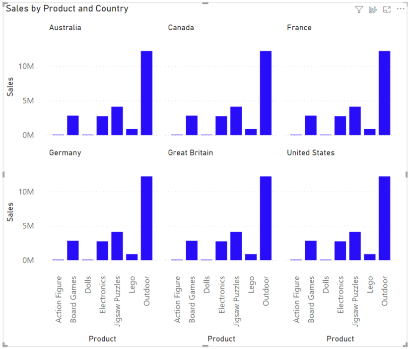
Small multiples, or trellising, splits a visual into multiple versions of itself. The versions are presented side by side, with data divided across these versions by a chosen dimension. For example, a small multiple could split a “sales by product” column chart across countries/regions or customer segments.
Create small multiples
For live connected data models, this feature requires a version of AS which supports the second generation of DAX queries, also known as SuperDAX: for tabular models, AS 2016 or newer; and for multidimensional models, AS 2019 or newer.
Currently, you can create small multiples on bar, column, line, and area charts.
To get started, create one of the above visuals and choose a field along which you'd like to partition its data. Drag that field into the Small multiples well in the Fields section of the Visualizations pane.
Your chart splits into a 2×2 grid, with the data divided along your chosen dimension. The grid fills with the small multiples charts. They're sorted by your chosen sort order, from left to right, then top to bottom.

You see that the axes are synchronized. There's one Y axis at the left of each row, and one X axis at the bottom of each column.
Now that you've created small multiples, see how you Interact with small multiples in Power BI.
Format a small multiples visual
Some options in the formatting pane let you control the look and feel of the grid.
Change the grid dimensions
You can change the dimensions of the grid in the Small multiples card:
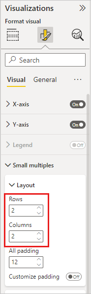
The default is a 2×2 grid of small multiples, but you can adjust the number of rows and columns up to 6×6. Any multiples that don't fit in that grid, load as you scroll down.
Adjust the small multiples titles
As with other visual titles, you can adjust the style and position of the small multiple titles in the Small multiple title card.
Considerations and limitations
Here are some current limitations.
Fields pane
- Show items with no data: The option still exists, but the behavior may not align with your expectations.
Visual interactions
- Scroll to load more on the Categorical axis: In standard visuals with many categories in the axis, when you scroll to the end of the axis, the visual loads more categories. Currently, a small multiples visual doesn't load more categories.
- Right click/context menu -> Analyze: disabled for now.
- Right click/context menu -> Summarize: disabled for now.
- Selecting multiple data points with rectangular select: disabled for now.
- Axis zoom: disabled for now.
Formatting options
General
- High-density sampling: for line charts, the high-density sampling toggle still exists, but it isn't currently supported by small multiples.
Axis
- Concatenate labels: disabled for now.
Total labels
- Total labels for stacked charts: disabled for now.
Zoom slider
- Zoom sliders: disabled for now.
Analytics pane
- Trend lines: disabled for now.
- Forecasting: disabled for now.
Share your feedback
Let us know your thoughts about the small multiples visual:
Related content
Feedback
Coming soon: Throughout 2024 we will be phasing out GitHub Issues as the feedback mechanism for content and replacing it with a new feedback system. For more information see: https://aka.ms/ContentUserFeedback.
Submit and view feedback for