Sparklines for table and matrix visuals
Important
This content is archived and is not being updated. For the latest documentation, go to What's new in Power BI?. For the latest release plans, go to Dynamics 365 and Microsoft Power Platform release plans.
| Enabled for | Public preview | General availability |
|---|---|---|
| Admins, makers, marketers, or analysts, automatically |  Dec 31, 2021
 |
- |
Business value
Microsoft Excel is the most widely used tool for exploring data and has set the standard for how data is visualized for Power BI users. We want to make it easier for users who love Excel to feel at home in Power BI. A critical area for this is making sure authors can visualize tables and matrices in Power BI in a familiar and beautiful way. We started with the ability to expand and collapse rows, conditional formatting, and data bars. We're continuing that evolution with the addition of sparklines.
Feature details
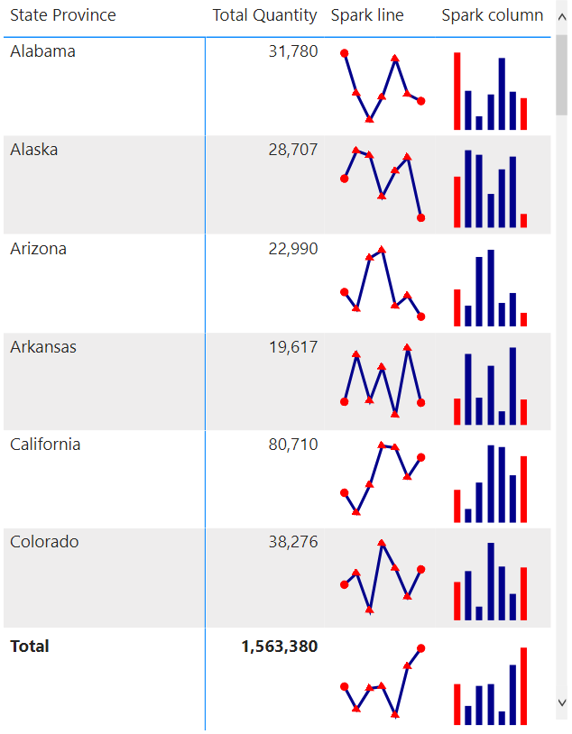
We're further extending the capabilities of tables and matrixes with the introduction of sparklines. Similar to the capability available in Excel, this will allow report creators to add a sparkline column to a table or matrix visual. This extra column will display a trending line chart for each row in the visual. Users will be able to quickly see key trends without the need to create two separate visuals. Sparklines will support a variety of formatting options and will be quick to create and integrate solely through the formatting UI.

Thank you for your idea
Thank you for submitting this idea. We listened to your idea, along with comments and votes, to help us decide what to add to our product roadmap.
See also
Create sparklines in a table or matrix in a Power BI report (docs)