Data table control in Power Apps
Shows a set of data in a tabular format.
Description
The Data table control shows a dataset in a format that includes column headers for each field that the control shows. As an app maker, you have full control over which fields appear and in what order. Like the Gallery control, the Data table control maintains a Selected property that points to the selected row. Therefore, you can link the Data table control to other controls.
Limitations
The data table control has these limitations:
- If you copy and paste a Data Table control for which the Items property is set to a formula that contains a Filter function, the formula for the Items property on the new Data Table control ends up with field names that contain a _1 suffix. This makes the field names invalid and results in no data showing up in the data table. To work around this issue, before you copy the control, confirm that the Filter function doesn't reference any field in the data source that has the same name as a column in the Data Table control. If it does, rename the column in the Data Table control. Alternatively, remove the _1 suffix from the invalid field names so that they match the names in the table.
Capabilities
Power Apps introduced the Data table control on May 5, 2017. This section provides information about capabilities that are supported and capabilities that aren't supported.
Now available
- Data in a Data table control is read-only.
- A single row is always selected in a Data table control.
- Link a Data table control to a connected or local data source.
- Adjust column widths in a Data table control while you run the app, though your changes aren't saved.
- A set of default fields appear in a Data table control when you link it to a connector that has implemented this capability, such as the Microsoft Dataverse. You can then show or hide these fields and others as necessary.
- Customize column width and heading text.
- Show hyperlinks in a Data table control.
- Copy and paste a Data table control.
Not yet available
- Customize the styling of individual columns.
- Add a Data table control in a form control.
- Change the height of all rows.
- Show images in a Data table control.
- Show fields from related tables.
- Use built-in functionality to filter and sort data by column heading.
- Add a Data table control in a Gallery control.
- Edit data in the Data table control.
- Select multiple rows.
Known issues
- No data appears if you use the FirstN function in the Items property.
Key properties
- Items – The source of data that appears in the Data table control.
- Selected – The selected row in the Data table control.
Other properties
- AutoWidth - The property of a column inside a data table to define if the column width should be automatic, or manual.
- BorderColor – The color of the Data table control's border.
- BorderStyle – The style of the Data table control's border. The options are Solid, Dashed, Dotted, and None.
- BorderThickness – The thickness of the Data table control's border.
- Color – The default text color for all data rows.
- FieldDisplayName - The property of a column inside a data table that defines display name for the selected column.
- Fill – The default background color for all data rows.
- Font - The default font for all data rows.
- FontWeight – The default font weight for all data rows.
- HeadingColor – The text color for the column headings.
- HeadingFill – The background color of the column headings.
- HeadingFont – The font of the column headings.
- HeadingFontWeight – The font weight of the column headings.
- HeadingSize – The font size of the column headings.
- Height – The distance between the Data table control's top and bottom edges.
- HoverColor – The text color for the row that the mouse pointer is pointing at.
- HoverFill – The background color of the row that the mouse pointer is pointing at.
- IsHyperlink - The property of a column inside a data table that defines whether the selected column should be in hyperlink format or not.
- NoDataText – The message that the user receives when there are no records to show in the Data table control.
- Order - The property of a column inside a data table that determines order of the column respective to other columns. The order starts from left to right with first column order value of 1.
- SelectedColor – The color of the text in the selected row.
- SelectedFill – The background color of the selected row.
- Size – The default font size for all data rows.
- Text - The property of a column inside a data table that defines text value of the data to be displayed inside the selected column.
- Visible – A value that determines whether the Data table control appears or is hidden.
- Width – The distance between the Data table control's left and right edges.
- X – The distance between the left edge of the Data table control and the left edge of its parent container (or the left edge of the screen if there is no parent container).
- Y – The distance between the top edge of the Data table control and the top edge of its parent container (or the top edge of the screen if there is no parent container).
Related functions
- Filter(DataSource, Formula)(DataSource, Formula)
- Search(DataSource, SearchString, Column)(DataSource, SearchString, Column)
Examples
Basic usage
Create a blank tablet app.
On the Insert tab, click or tap Data table.
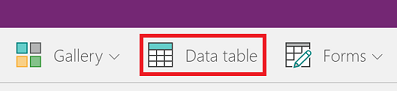
A Data table control is added to the screen.
Rename the Data table control SalesOrderTable, and resize it so that it covers the whole screen.
In the right pane, select Data sources, and select Sales orders. If the table isn't listed, search for the table, and connect to Microsoft Dataverse.
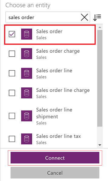
The Data table control is now attached to the Sales order data source. Several initial fields appear in the Data table control, because we're using a connector that supports that capability.
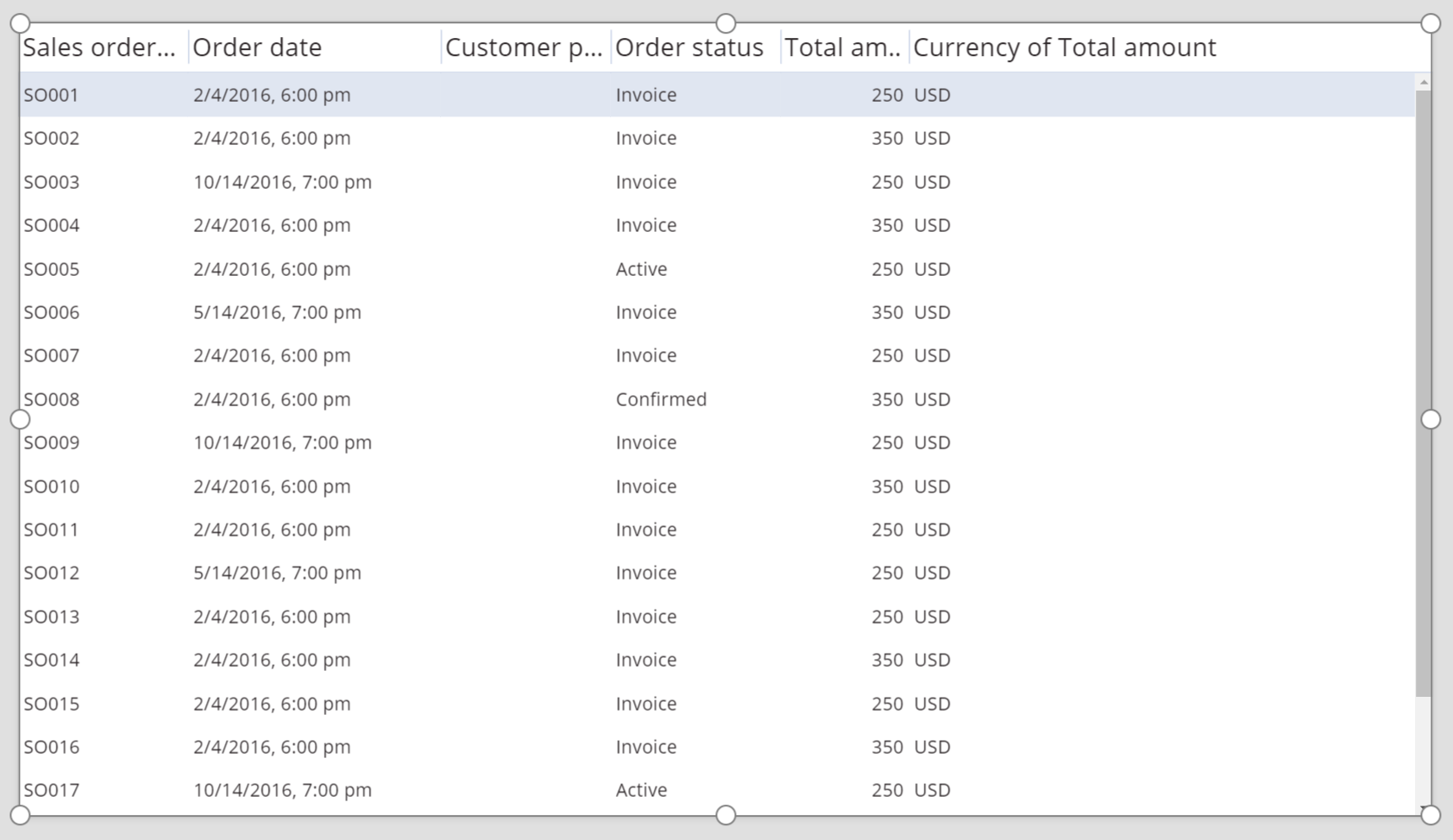
In the right pane, select one or more check boxes to show or hide individual fields.
For example, select the check box next to CustomerPurchaseOrderReference to hide this field.
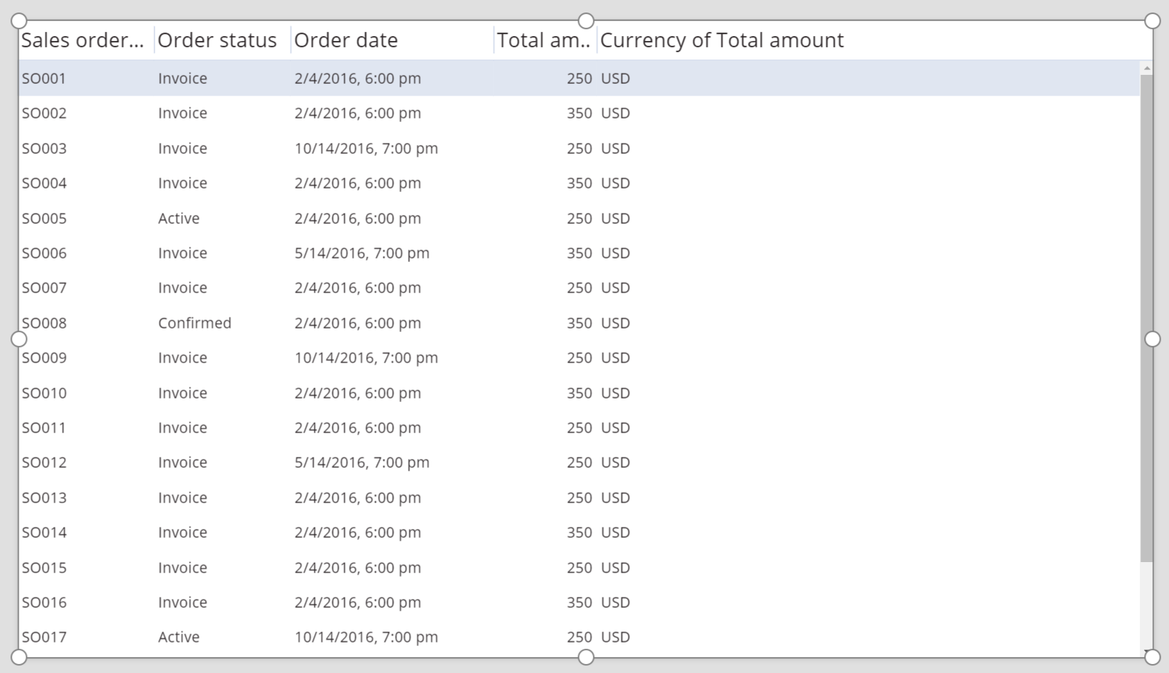
In the right pane, reorder the fields by dragging them up or down.

The SalesOrderTable control shows the fields in the order that you specified.
Restyle the header for the Data table control
While the Data table control is selected, in the right pane, click or tap the Advanced tab.
Click or tap the field for the HeadingFill property, and then change the value to RGBA(62,96,170,1).
Click or tap the field for the HeadingColor property, and then change the value to White.
Click or tap the field for the HeadingSize property, and then change the value to 14.

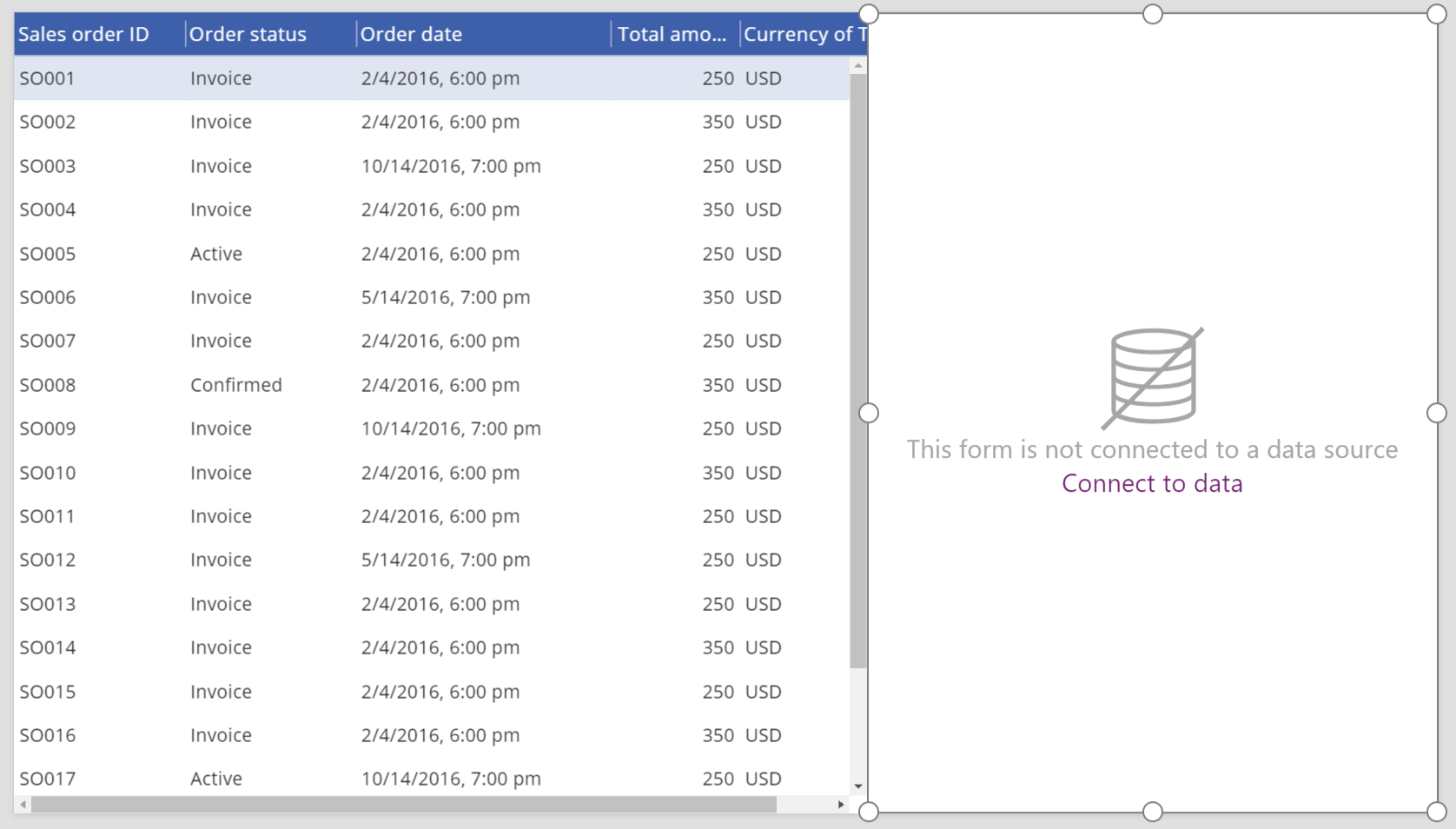
Connect a Data table control to another control
Add an Edit form control to the screen.
Resize the Data table and Edit form controls so that the Data table control appears in the left part of the screen and the Edit form control appears in the right part of the screen.
While Form1 is selected, in the right pane, change the number of columns to 1.
Connect Form1 to the Sales order data source.
Several initial fields appear in Form1.
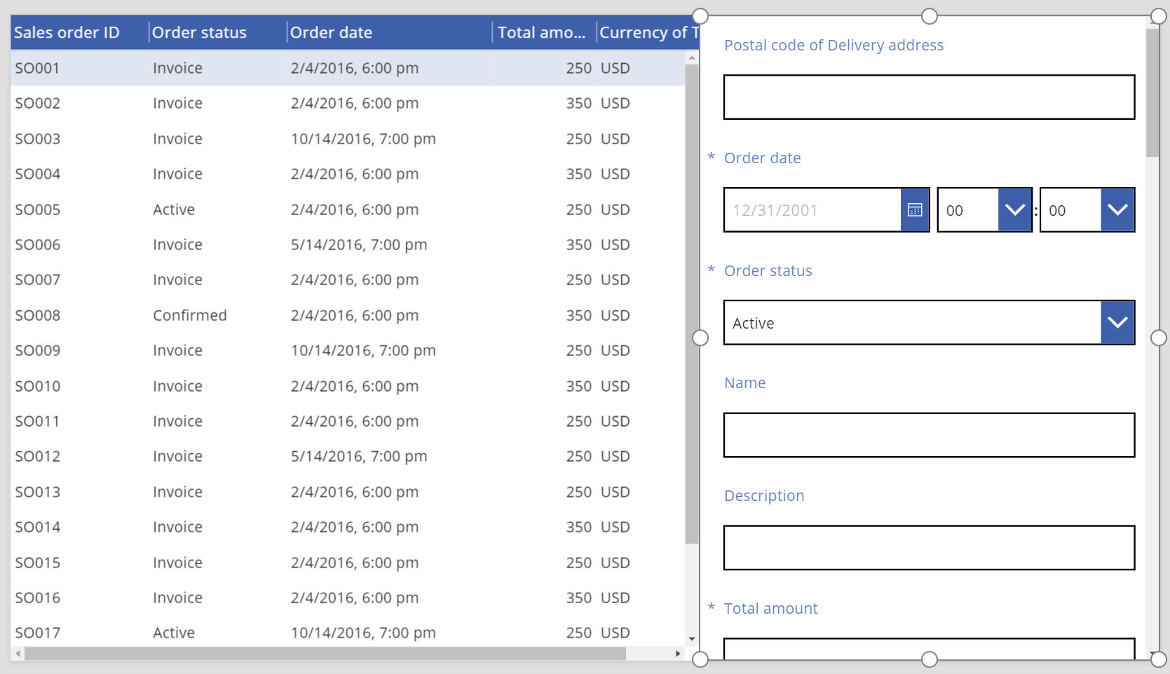
In the right pane, click or tap the Advanced tab.
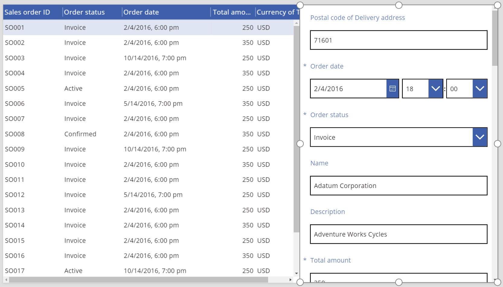
Set the Item property for Form1 to SalesOrderTable.Selected.
Form1 shows information from the row that's selected in the Data table control.
Accessibility guidelines
Color contrast
There must be adequate color contrast between:
- Color and Fill
- HeadingColor and HeadingFill
- SelectedColor and SelectedFill
- HoverColor and HoverFill
This is in addition to the standard color contrast requirements.
Screen reader support
- NoDataText must be present.
Feedback
Coming soon: Throughout 2024 we will be phasing out GitHub Issues as the feedback mechanism for content and replacing it with a new feedback system. For more information see: https://aka.ms/ContentUserFeedback.
Submit and view feedback for