Use the menubar control
This page shows different samples about the menubar control.
Go to API Reference for more details.
Tip
Check out our newest documentation on extension development using the Azure DevOps Extension SDK.
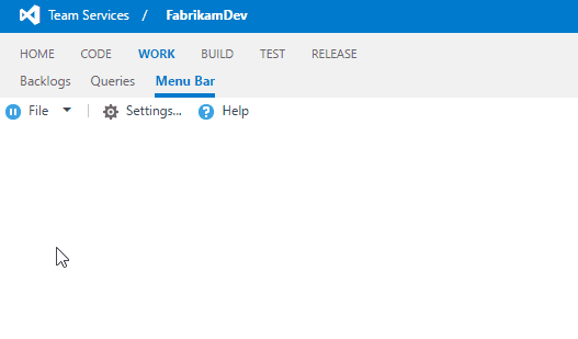
Basic menubar
This sample shows the basic usage of the toolbar. Notice how text is added to the separators which becomes a group text for sub menus.
import Controls = require("VSS/Controls");
import Menus = require("VSS/Controls/Menus");

var container = $(".sample-container");

var menuItems: Menus.IMenuItemSpec[] = [
  { id: "file", text: "File", icon: "icon-pause", childItems: [
    { separator: true, text: "NEW" }, // Separator as group text
    { id: "new-tab", text: "New tab", icon: "icon-info" },
    { id: "new-file", text: "New file", icon: "icon-commented-file" },
    { separator: true, text: "SAVE" }, , // Separator as group text
    { id: "save-file", text: "Save file", icon: "icon-save" },
    { id: "save-file-close", text: "Save file & close", icon: "icon-save-close" },
    { separator: true}, // Default separator
    { id: "save-all", text: "Save all", icon: "icon-save-all" },
    { separator: true, text: "MISC"}, // Separator as group text
    { id: "recent-files", text: "Recent files", icon: "icon-play", childItems: [
      { id: "file1", text: "file1.txt", icon: "icon-restricted" },
      { id: "file2", text: "file2.txt", icon: "icon-restricted" },
      { id: "file3", text: "file3.txt", icon: "icon-restricted" }
    ]},
    { id: "exit", text: "Exit" }
  ]},
  { separator: true }, // Default separator
  { id: "settings", text: "Settings...", icon: "icon-settings" },
  { id: "help", text: "Help", icon: "icon-help", tag: "test" }
];

var menubarOptions = {
  items: menuItems
};

var menubar = Controls.create<Menus.MenuBar, any>(Menus.MenuBar, container, menubarOptions);
VSS.require(["VSS/Controls", "VSS/Controls/Menus"], function(Controls, Menus) {
  var container = $("#sample-container");


  var menuItems = [
    { id: "file", text: "File", icon: "icon-pause", childItems: [
      { separator: true, text: "NEW" }, // Separator as group text
      { id: "new-tab", text: "New tab", icon: "icon-info" },
      { id: "new-file", text: "New file", icon: "icon-commented-file" },
      { separator: true, text: "SAVE" }, , // Separator as group text
      { id: "save-file", text: "Save file", icon: "icon-save" },
      { id: "save-file-close", text: "Save file & close", icon: "icon-save-close" },
      { separator: true}, // Default separator
      { id: "save-all", text: "Save all", icon: "icon-save-all" },
      { separator: true, text: "MISC"}, // Separator as group text
      { id: "recent-files", text: "Recent files", icon: "icon-play", childItems: [
        { id: "file1", text: "file1.txt", icon: "icon-restricted" },
        { id: "file2", text: "file2.txt", icon: "icon-restricted" },
        { id: "file3", text: "file3.txt", icon: "icon-restricted" }
      ]},
      { id: "exit", text: "Exit" }
    ]},
    { separator: true }, // Default separator
    { id: "settings", text: "Settings...", icon: "icon-settings" },
    { id: "help", text: "Help", icon: "icon-help", tag: "test" }
  ];

  var menubarOptions = {
    items: menuItems
  };

  var menubar = Controls.create(Menus.MenuBar, container, menubarOptions);

 });

VSS.notifyLoadSucceeded();
Actions of the menubar
This sample uses executeAction delegate to react menubar commands.
import Controls = require("VSS/Controls");
import Menus = require("VSS/Controls/Menus");

var container = $(".sample-container");

var menuItems: Menus.IMenuItemSpec[] = [
  { id: "new-tab", text: "New tab", icon: "icon-info" },
  { separator: true },
  { id: "save-all", text: "Save all", icon: "icon-save-all" },
  { separator: true },
  { id: "exit", text: "Exit", noIcon: true }
];

var menubarOptions = {
  items: menuItems,
  executeAction: function (args) {
    var command = args.get_commandName();
    switch (command) {
        case "new-tab":
          alert("Opening new tab!");
          break;
        case "save-all":
          alert("Saving all!");
          break;
        case "exit":
          alert("Exit!");
          break;
        default:
          alert("Unhandled action: " + command);
          break;
    }
  }
};

Controls.create<Menus.MenuBar, any>(Menus.MenuBar, container, menubarOptions);
VSS.require(["VSS/Controls", "VSS/Controls/Menus"], function(Controls, Menus) {
  var container = $("#sample-container");


  var menuItems = [
    { id: "new-tab", text: "New tab", icon: "icon-info" },
    { separator: true },
    { id: "save-all", text: "Save all", icon: "icon-save-all" },
    { separator: true },
    { id: "exit", text: "Exit", noIcon: true }
  ];

  var menubarOptions = {
    items: menuItems,
    executeAction: function (args) {
      var command = args.get_commandName();
      switch (command) {
          case "new-tab":
            alert("Opening new tab!");
            break;
          case "save-all":
            alert("Saving all!");
            break;
          case "exit":
            alert("Exit!");
            break;
          default:
            alert("Unhandled action: " + command);
            break;
      }
    }
  };

  var menubar = Controls.create(Menus.MenuBar, container, menubarOptions);

 });

VSS.notifyLoadSucceeded();

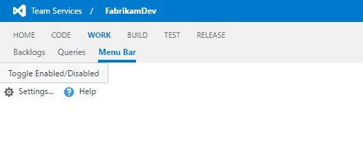
Toggle enabled/disabled
This sample shows how the menu items can be enabled/disabled.
<button id="btnToggle">Toggle Enabled/Disabled</button>
import Controls = require("VSS/Controls");
import Menus = require("VSS/Controls/Menus");

var container = $(".sample-container");

var menuItems: Menus.IMenuItemSpec[] = [
  { id: "settings", text: "Settings...", icon: "icon-settings" },
  { id: "help", text: "Help", icon: "icon-help", tag: "test" }
];

var menubar = Controls.create(Menus.MenuBar, container, { items: menuItems });

$("#btnToggle").click(function (e) {
  // Get the menu item first
  var settingsItem = menubar.getItem("settings");

  // Update the disabled state
  menubar.updateCommandStates([
    { id: "settings", disabled: !(settingsItem.getCommandState() & Menus.MenuItemState.Disabled) },
  ]);
});
VSS.require(["VSS/Controls", "VSS/Controls/Menus"], function(Controls, Menus) {
  var container = $("#sample-container");

  var menuItems = [
    { id: "settings", text: "Settings...", icon: "icon-settings" },
    { id: "help", text: "Help", icon: "icon-help", tag: "test" }
  ];

  var menubar = Controls.create(Menus.MenuBar, container, { items: menuItems });

  $("#btnToggle").click(function (e) {
    // Get the menu item first
    var settingsItem = menubar.getItem("settings");

    // Update the disabled state
    menubar.updateCommandStates([
      { id: "settings", disabled: !(settingsItem.getCommandState() & Menus.MenuItemState.Disabled) },
    ]);
  });
});

VSS.notifyLoadSucceeded();
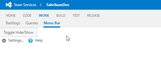
Toggle visible/hidden
This sample shows how the menu items can be made visible/hidden.
<button id="btnToggle">Toggle Show/Hide</button>
import Controls = require("VSS/Controls");
import Menus = require("VSS/Controls/Menus");

var container = $(".sample-container");

var menuItems: Menus.IMenuItemSpec[] = [
  { id: "settings", text: "Settings...", icon: "icon-settings" },
  { id: "help", text: "Help", icon: "icon-help", tag: "test" }
];

var menubar = Controls.create(Menus.MenuBar, container, { items: menuItems });

$("#btnToggle").click(function (e) {
  // Get the menu item first
  var helpItem = menubar.getItem("help");

  // Update the command state
  menubar.updateCommandStates([
    { id: "help", hidden: !(helpItem.getCommandState() & Menus.MenuItemState.Hidden) }
  ]);
});
VSS.require(["VSS/Controls", "VSS/Controls/Menus"], function(Controls, Menus) {
  var container = $("#sample-container");


 var menuItems = [
      { id: "settings", text: "Settings...", icon: "icon-settings" },
    { id: "help", text: "Help", icon: "icon-help", tag: "test" }
  ];

  var menubar = Controls.create(Menus.MenuBar, container, { items: menuItems });

  $("#btnToggle").click(function (e) {
    // Get the menu item first
    var helpItem = menubar.getItem("help");

    // Update the command state
    menubar.updateCommandStates([
      { id: "help", hidden: !(helpItem.getCommandState() & Menus.MenuItemState.Hidden) }
    ]);
  });
});

VSS.notifyLoadSucceeded();