Key web part examples
Web parts are the building blocks of your page.
This is a visual overview of Communication site and Team site templates, highlighting how web parts work together to create a coherent overall design. Use these pages as reference when designing a SharePoint web part.
It is important to consider how the web part will look and function when sitting next to other web parts on a page. Follow the patterns in this documentation and on the Office UI Fabric site to ensure consistency in layout and grid alignment, font size and hierarchy, commanding, empty states, and more.
Communication sites
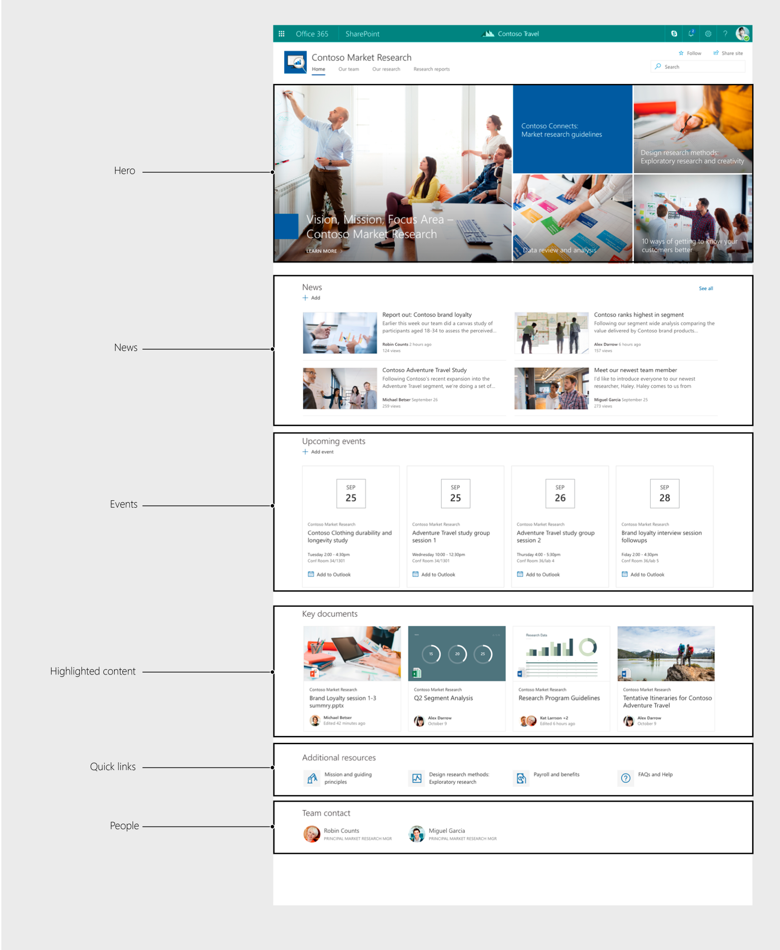
Topic design
The Topic design is used when you have a lot of information to share, such as news, events, reports, and other content. It is built from the Hero, News, Events, Highlighted content, Quick links, and People web parts.
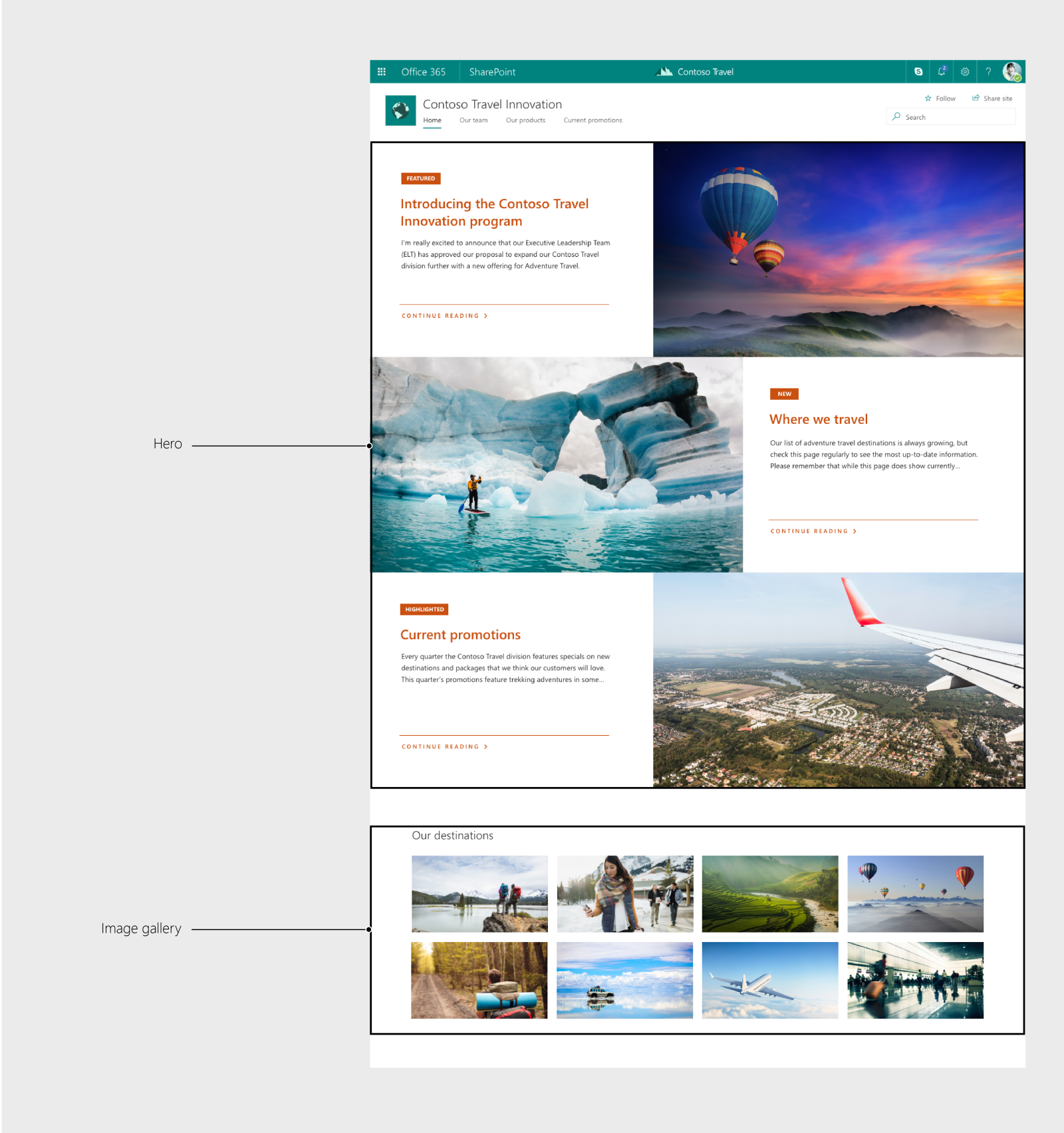
Showcase design
The Showcase design is used to feature a product, team, or event. It leverages the Hero and Image gallery web parts to show rich visual content.
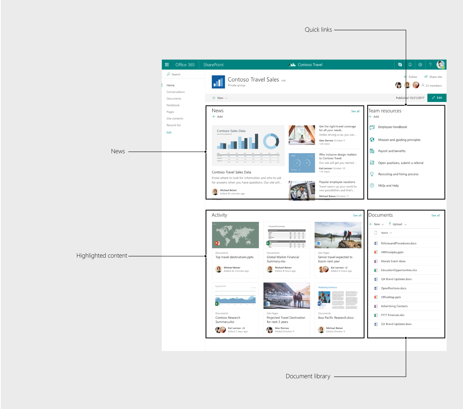
Team sites
The Team site design is the default layout for any new team. It features the News, Quick links, Highlighted content, and Document library web parts.
These example site and web part designs have been added to the SharePoint toolkit and can be used as reference when designing web parts. For more information, see the SharePoint toolkit.
Feedback
Coming soon: Throughout 2024 we will be phasing out GitHub Issues as the feedback mechanism for content and replacing it with a new feedback system. For more information see: https://aka.ms/ContentUserFeedback.
Submit and view feedback for