Use page placeholders from Application Customizer (Hello World part 2)
Application Customizers provide access to well-known locations on SharePoint pages that you can modify based on your business and functional requirements. For example, you can create dynamic header and footer experiences that render across all the pages in SharePoint Online.
This model is similar to using a UserCustomAction collection in a Site or Web object to modify the page experience via custom JavaScript. The key difference to SharePoint Framework (SPFx) Extensions is that your page elements won't change if changes are made to the HTML/DOM structure in SharePoint Online.
This article describes how to extend your Hello World extension to take advantage of page placeholders.
You can also follow these steps by watching the video on the Microsoft 365 Platform Communtiy (PnP) YouTube Channel:
Get access to page placeholders
Application Customizer extensions are supported with Site, Web, and List scopes. You can control the scope by deciding where or how the Application Customizer is registered in your SharePoint tenant.
Note
Feature XML based registration of Application Customizer is only supported with web or list level. You can however activate Application Customizer more widely either using tenant wide deployment of extensions capability or by associating Application Customizer to the UserCustomAction collection on the Site object.
When the Application Customizer exists in the scope and is being rendered, you can use the following method to get access to the placeholder.
// Handling the Bottom placeholder
if (!this._bottomPlaceholder) {
  this._bottomPlaceholder =
    this.context.placeholderProvider.tryCreateContent(
      PlaceholderName.Bottom,
      { onDispose: this._onDispose });
...
}
After you get the placeholder object, you have full control over what is presented to the end user.
Notice that you're requesting a well-known placeholder by using the corresponding well-known identifier. In this case, the code is accessing the footer section of the page by using the Bottom option on the PlaceholderName enum.
Modify the Application Customizer to access and modify placeholders by adding custom HTML elements
Install the @microsoft/sp-office-ui-fabric-core package to enable importing from SPFabricCore.scss. We'll use this for defining rendering styles for our place holders.
npm install @microsoft/sp-office-ui-fabric-coreCreate a new file named ./src/extensions/helloWorld/AppCustomizer.module.scss.
Update AppCustomizer.module.scss as follows:
Note
These are the styles that are used in the HTML output for the header and footer placeholders.
@import '~@microsoft/sp-office-ui-fabric-core/dist/sass/SPFabricCore.scss';

.app {
  .top {
      height:60px;
      text-align:center;
      line-height:2.5;
      font-weight:bold;
      display: flex;
      align-items: center;
      justify-content: center;
      background-color: $ms-color-themePrimary;
      color: $ms-color-white;

  }

  .bottom {
      height:40px;
      text-align:center;
      line-height:2.5;
      font-weight:bold;
      display: flex;
      align-items: center;
      justify-content: center;
      background-color: $ms-color-themePrimary;
      color: $ms-color-white;
  }
}
In Visual Studio Code (or your preferred IDE), open ./src/extensions/helloWorld/HelloWorldApplicationCustomizer.ts.
Add the
PlaceholderContentandPlaceholderNameto the import statement from @microsoft/sp-application-base by updating the import statement as follows:import { BaseApplicationCustomizer, PlaceholderContent, PlaceholderName } from '@microsoft/sp-application-base';Also add the following import statements after the
stringsimport at the top of the file:import styles from './AppCustomizer.module.scss'; import { escape } from '@microsoft/sp-lodash-subset';You'll use
escapefunction to escape Application Customizer properties. You'll create style definitions for the output in the following steps.Note
After pasting in the code snippet above you might be presented with an error if you use Visual Studio Code. These errors will disappear after you build the solution when the scss file is compiled into a class.
In the HelloWorldApplicationCustomizer.ts file, update the
IHelloWorldApplicationCustomizerPropertiesinterface to add specific properties for Header and Footer, as follows:Note
If your Application Customizer uses the
ClientSideComponentPropertiesJSON input, it is deserialized into theBaseExtension.propertiesobject. You can define an interface to describe it.export interface IHelloWorldApplicationCustomizerProperties { Top: string; Bottom: string; }Add the following private variables inside the
HelloWorldApplicationCustomizerclass. In this scenario, these can just be local variables in anonRender()method, but if you want to share them with other objects, define them as private variables.export default class HelloWorldApplicationCustomizer extends BaseApplicationCustomizer<IHelloWorldApplicationCustomizerProperties> { // These have been added private _topPlaceholder: PlaceholderContent | undefined; private _bottomPlaceholder: PlaceholderContent | undefined; // ... }Update the
onInit()method code as follows:public onInit(): Promise<void> { Log.info(LOG_SOURCE, `Initialized ${strings.Title}`); // Wait for the placeholders to be created (or handle them being changed) and then // render. this.context.placeholderProvider.changedEvent.add(this, this._renderPlaceHolders); return Promise.resolve(); }Create a new
_renderPlaceHolders()private method with the following code:private _renderPlaceHolders(): void { console.log("HelloWorldApplicationCustomizer._renderPlaceHolders()"); console.log( "Available placeholders: ", this.context.placeholderProvider.placeholderNames .map(name => PlaceholderName[name]) .join(", ") ); // Handling the top placeholder if (!this._topPlaceholder) { this._topPlaceholder = this.context.placeholderProvider.tryCreateContent( PlaceholderName.Top, { onDispose: this._onDispose } ); // The extension should not assume that the expected placeholder is available. if (!this._topPlaceholder) { console.error("The expected placeholder (Top) was not found."); return; } if (this.properties) { let topString: string = this.properties.Top; if (!topString) { topString = "(Top property was not defined.)"; } if (this._topPlaceholder.domElement) { this._topPlaceholder.domElement.innerHTML = ` <div class="${styles.app}"> <div class="${styles.top}"> <i class="ms-Icon ms-Icon--Info" aria-hidden="true"></i> ${escape( topString )} </div> </div>`; } } } // Handling the bottom placeholder if (!this._bottomPlaceholder) { this._bottomPlaceholder = this.context.placeholderProvider.tryCreateContent( PlaceholderName.Bottom, { onDispose: this._onDispose } ); // The extension should not assume that the expected placeholder is available. if (!this._bottomPlaceholder) { console.error("The expected placeholder (Bottom) was not found."); return; } if (this.properties) { let bottomString: string = this.properties.Bottom; if (!bottomString) { bottomString = "(Bottom property was not defined.)"; } if (this._bottomPlaceholder.domElement) { this._bottomPlaceholder.domElement.innerHTML = ` <div class="${styles.app}"> <div class="${styles.bottom}"> <i class="ms-Icon ms-Icon--Info" aria-hidden="true"></i> ${escape( bottomString )} </div> </div>`; } } } }Note the following about this code:
- Use
this.context.placeholderProvider.tryCreateContentto get access to the placeholder. - Extension code shouldn't assume that the expected placeholder is available.
- The code expects custom properties called
TopandBottom. If the properties exist, they render inside the placeholders. - Notice that the code path for both the top and bottom placeholders is almost identical. The only differences are the variables used and the style definitions.
- It's possible to use the class names defined in the style sheet directly but it isn't recommended. In case no style sheet reference defined in the
stylesvariable is found in the code, the style sheet won't get added to the page. This is because unused references will get removed during build process.
- Use
Add the following method after the
_renderPlaceHolders()method. In this case, you simply output a console message when the extension is removed from the page.private _onDispose(): void { console.log('[HelloWorldApplicationCustomizer._onDispose] Disposed custom top and bottom placeholders.'); }
You're now ready to test your code in SharePoint Online.
Test your code
In the ./config/serve.json file, update properties section in the file to have Top and Bottom messages.
{
  "$schema": "https://developer.microsoft.com/json-schemas/spfx-build/spfx-serve.schema.json",
  "port": 4321,
  "https": true,
  "serveConfigurations": {
    "default": {
      "pageUrl": "https://sppnp.sharepoint.com/sites/mySite/SitePages/myPage.aspx",
      "customActions": {
        "54328ea6-0591-4fbd-aadb-5dc51fd53235": {
          "location": "ClientSideExtension.ApplicationCustomizer",
          "properties": {
            "Top": "Top area of the page",
            "Bottom": "Bottom area of the page"
          }
        }
      }
    },
    "helloWorld": {
      "pageUrl": "https://sppnp.sharepoint.com/sites/mySite/SitePages/myPage.aspx",
      "customActions": {
        "54328ea6-0591-4fbd-aadb-5dc51fd53235": {
          "location": "ClientSideExtension.ApplicationCustomizer",
          "properties": {
            "Top": "Top area of the page",
            "Bottom": "Bottom area of the page"
          }
        }
      }
    }
  }
}
Note
The GUID in the above JSON excerpt is the unique ID of the SPFx extension component. This is defined in the component's manifest. The GUID in your solution will be different as every component ID is unique.
Switch to the console window that is running gulp serve and check for errors. Gulp reports any errors in the console; you'll need to fix them before you continue. If you have the solution already running, restart it, so that we get the updated settings applied from the serve.json file.
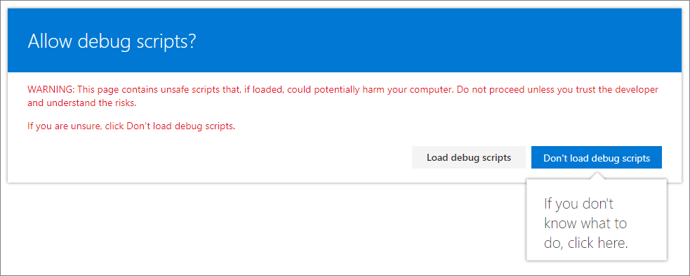
gulp serveSelect Load debug scripts to continue loading scripts from your local host.
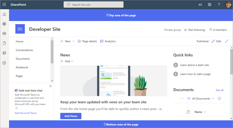
You should now see the custom header and footer content in your page.
Next steps
Congratulations, you built your own custom header and footer using the Application Customizer!
To continue building out your extension, see Deploy your extension to SharePoint (Hello World part 3). You'll learn how to deploy and preview the Hello World extension in a SharePoint site collection without using Debug query parameters.
Feedback
Coming soon: Throughout 2024 we will be phasing out GitHub Issues as the feedback mechanism for content and replacing it with a new feedback system. For more information see: https://aka.ms/ContentUserFeedback.
Submit and view feedback for