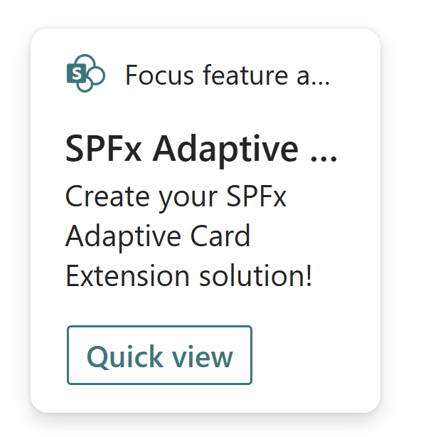
Create an Adaptive Card Extension with focus feature
Scaffold an Adaptive Card Extension project
Create a new project directory for your project and change your current folder to that directory.
Create a new project by running the Yeoman SharePoint Generator from within the new directory you created:
yo @microsoft/sharepoint
When prompted, enter the following values (select the default option for all prompts omitted below):
- What is your solution name? focus-feature
- Which type of client-side component to create? Adaptive Card Extension
- Which template do you want to use? Geneic Card Template
- What is your Adaptive Card Extension name? HelloWorld
At this point, Yeoman installs the required dependencies and scaffolds the solution files. This process might take few minutes.
Before moving forward, update the title and description fields of your ACE to give it a personal touch.
{
  "$schema": "https://developer.microsoft.com/json-schemas/spfx/adaptive-card-extension-manifest.schema.json",
  "id": "2c2fb587-a351-40f9-83f7-0840e3ee857f",
  "alias": "HelloWorldAdaptiveCardExtension",
  "componentType": "AdaptiveCardExtension",

  // The "*" signifies that the version should be taken from the package.json
  "version": "*",
  "manifestVersion": 2,

  // If true, the component can only be installed on sites where Custom Script is allowed.
  // Components that allow authors to embed arbitrary script code should set this to true.
  // https://support.office.com/en-us/article/Turn-scripting-capabilities-on-or-off-1f2c515f-5d7e-448a-9fd7-835da935584f
  "requiresCustomScript": false,
  "supportedHosts": ["Dashboard"],
  "preconfiguredEntries": [{
    "groupId": "bd067b1e-3ad5-4d5d-a5fe-505f07d7f59c", // Dashboard
    "group": { "default": "Dashboard" },
    "title": { "default": "Focus feature advanced I" },
    "description": { "default": "Focus feature advanced I" },
    "iconImageUrl": "https://res.cdn.office.net/files/fabric-cdn-prod_20230308.001/assets/brand-icons/product-monoline/svg/vivaconnections_32x1.svg",
    "properties": {
      "title": "Focus feature advanced I"
    },
    "cardSize": "Large"
  }]
}
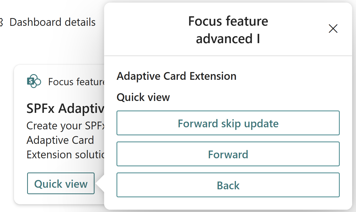
Next, run gulp serve from the command line in the root of the project to start the build and debugging process. In the hosted workbench, you'll see the FocusFeature card:
Add focus feature to your Adaptive Card Extension Quick View
At this point, we have out of the box Adaptive Card Extension code. Now it's time to flare things up with focusing on elements in the Quick view.
In the Quick View, we'll introduce buttons for two actions:
- Move to the next quick view
- Move to the previous quick view
We'll first define the template of the Quick View. For this, locate and open the following file in your project: ./src/adaptiveCardExtensions/focusFeature/quickView/template/QuickViewTemplate.json
Replace the content of this file as below:
{
  "schema": "http://adaptivecards.io/schemas/adaptive-card.json",
  "type": "AdaptiveCard",
  "version": "1.5",
  "body": [
    {
      "type": "TextBlock",
      "weight": "Bolder",
      "text": "${title}",
      "id": "quick-view-title"
    },
    {
      "type": "ColumnSet",
      "columns": [
        {
          "type": "Column",
          "items": [
            {
              "type": "TextBlock",
              "weight": "Bolder",
              "text": "${subTitle}",
              "id": "quick-view-sub-title",
              "wrap": true
            }
          ]
        }
      ]
    },
    {
      "type": "ActionSet",
      "actions": [
        {
          "type": "Action.Submit",
          "title": "Forward skip update",
          "data": {
            "id": "forward-skip"
          }
        },
        {
          "type": "Action.Submit",
          "title": "Forward",
          "data": {
            "id": "forward"
          }
        },
        {
          "type": "Action.Submit",
          "title": "Back",
          "data": {
            "id": "back"
          }
        }
      ]
    }
  ]
}
Next let's implement the logic that will allow us to navigate to the next quick view. We'll use the QuickViewNavigator to manipulate the view stack.
public onAction(action: IActionArguments): void {
  if (action.type === 'Submit') {
      const { id } = action.data;
      if (id === 'back') {
          this.quickViewNavigator.pop();
      } else if (id === 'forward-skip') {
          this.quickViewNavigator.push(QUICK_VIEW_REGISTRY_ID_2, true);
      } else {
          this.quickViewNavigator.push(QUICK_VIEW_REGISTRY_ID_2, false);
      }
  }
}
Create a new template file for the second quick view: ./src/adaptiveCardExtensions/focusFeature/quickView/template/QuickViewTemplate2.json
{
   "schema":"http://adaptivecards.io/schemas/adaptive-card.json",
   "type":"AdaptiveCard",
   "version":"1.5",
   "body":[
      {
         "type":"TextBlock",
         "weight":"Bolder",
         "text":"${title}",
         "id": "quick-view-title"
      },
      {
         "type":"TextBlock",
         "text":"${subTitle}",
         "id": "quick-view-sub-title",
         "wrap":true
      },
      {
         "type":"ActionSet",
         "actions":[
            {
               "type":"Action.Submit",
               "title":"Forward skip update",
               "data":{
                  "id":"forward-skip"
               }
            },
            {
               "type":"Action.Submit",
               "title":"Forward",
               "data":{
                  "id":"forward"
               }
            },
            {
               "type":"Action.Submit",
               "title":"Back",
               "data":{
                  "id":"back"
               }
            }
         ]
      }
   ]
}
Create a new file for the second quick view: ./src/adaptiveCardExtensions/focusFeature/quickView/QuickView2.ts
We'll add the following onAction function.
public onAction(action: IActionArguments): void {
  if (action.type === 'Submit') {
      const { id } = action.data;
      if (id === 'back') {
          this.quickViewNavigator.pop();
      } else if (id === 'forward-skip') {
          this.quickViewNavigator.push(QUICK_VIEW_REGISTRY_ID_3, true);
      } else {
          this.quickViewNavigator.push(QUICK_VIEW_REGISTRY_ID_3, false);
      }
  }
}
Create a new template file for the third quick view: ./src/adaptiveCardExtensions/focusFeature/quickView/template/QuickViewTemplate3.json
{
  "schema":"http://adaptivecards.io/schemas/adaptive-card.json",
  "type":"AdaptiveCard",
  "version":"1.5",
  "body":[
     {
        "type":"TextBlock",
        "weight":"Bolder",
        "text":"${title}",
        "id":"quick-view-title"
     },
     {
        "type":"TextBlock",
        "text":"${subTitle}",
        "id":"quick-view-sub-title",
        "wrap":true
     },
     {
        "type":"ActionSet",
        "actions":[
           {
              "type":"Action.Submit",
              "title":"Back",
              "data":{
                 "id":"back"
              }
           }
        ]
     }
  ]
}
Create a new file for the third quick view: ./src/adaptiveCardExtensions/focusFeature/quickView/QuickView3.ts
We'll add the following onAction function.
public onAction(action: IActionArguments): void {
  if (action.type === 'Submit') {
      const { id } = action.data;
      if (id === 'back') {
          this.quickViewNavigator.pop();
      }
  }
}
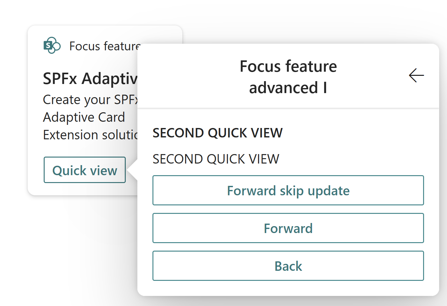
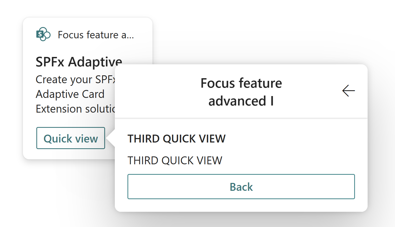
After adding these changes, your Quick Views will look like:
Second quick view as
Third quick view as
Implement the focusParameters function
So far we'e modified our quick views to have a simple title, subtitle, and respective buttons to navigate to other quick views. Now we can finally implement the focusParameters function, which gives the ability to the third-party developer to decide what they wish to set focus on in the quick view.
For this, open each respective QuickView file (./src/adaptiveCardExtensions/focusFeature/quickView/QuickView.ts) and import the IFocusParameters interface, as follows:
import { IFocusParameters } from '@microsoft/sp-adaptive-card-extension-base';
Finally, introduce the following focusParameters() function in the QuickView class so that we set focus on an element. Each QuickView should look as follows:
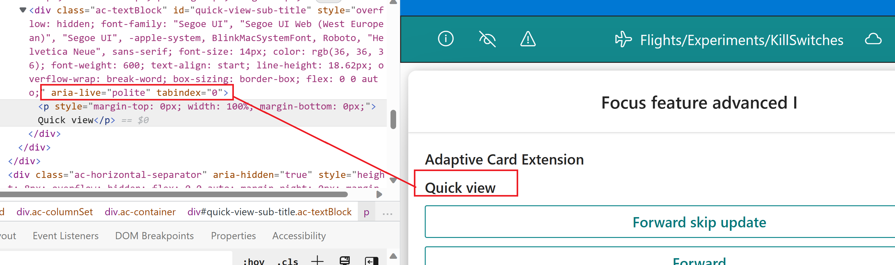
public get focusParameters(): IFocusParameters {
  return {
    focusTarget: 'quick-view-sub-title',
    ariaLive: 'polite'
  }
}
At this point, you can run gulp serve again and see how all the changes you made so far came together.
This is it! Congratulations on successfully creating you Adaptive Card Extension with the focus feature.
Notes with screen readers
When loading your card for the first time, you'll notice that the contents of the first quick view are read in their entirety. This is the default behavior when a screen reader sees a dialog as it treats it as navigation. Subsequent loads of the quick view stack won't run into this. As you navigate back and forth threw quick views, you'll notice that the element target is focused and will be the only thing to be read.
See Also
Feedback
Coming soon: Throughout 2024 we will be phasing out GitHub Issues as the feedback mechanism for content and replacing it with a new feedback system. For more information see: https://aka.ms/ContentUserFeedback.
Submit and view feedback for